
16 little UI design tips that make a big impact
Use, High-Quality Images and Graphics; Offer Easy Access to Help or Support


Introduction: Why Small UI Details Matter
Good UI design isn’t about just making things look nice; it’s about creating a seamless, engaging, and user-friendly experience. Even minor adjustments to a website or app’s interface can significantly improve usability, making it easier for users to navigate, understand, and enjoy. Below are 16 small UI design tips that can have a huge impact on user experience and satisfaction.
What is User Interface (UI) Design?
UI Design Covered
UI design focuses on everything the user interacts with visually on a digital platform, including buttons, menus, and icons. It ensures that the design is both aesthetically pleasing and functional, giving users an intuitive way to navigate through digital spaces.
Importance of UI in Digital Experience
A well-thought-out UI can reduce confusion, improve user engagement, and even increase conversion rates. A pleasant UI experience helps retain users by making them feel comfortable and guided.
1. Keep Navigation Simple
The Power of a Straightforward Menu
Navigation should be intuitive. Keep menu options to a minimum and only show what’s essential. Users should be able to find what they’re looking for without confusion.
Tips for Minimalist Navigation Design
Focus on categories and subcategories that make sense. Use simple, descriptive labels and avoid jargon to ensure users understand exactly where they’re going.
2. Use Consistent Colors and Fonts
Importance of Color Consistency
Consistency in color scheme ties the design together and builds trust. Using similar colors across the app or website helps create a cohesive look and feel.
Best Practices for Font Use
Stick to one or two fonts throughout your interface. Having too many fonts can distract users and make your site look unorganized. Select fonts that are legible and visually appealing.
3. Provide Clear Feedback for User Actions
Feedback in Buttons and Clicks
When users click a button or submit a form, make sure there’s a response, whether through color changes, loading icons, or brief animations.
Using Color Changes and Animation for Feedback
Animations and color shifts make it clear that their action has been recognized. For instance, a button changing color when clicked confirms that it’s been activated.
4. Make Buttons Recognizable and Accessible
Standard Button Styles
Buttons should look like buttons! Use familiar shapes and styles so users recognize what to click.
Improving Button Accessibility
Buttons should be large enough to tap easily, especially on mobile devices, and should have sufficient contrast to be visible to all users.
5. Maintain Proper Spacing for Readability
Why Spacing Matters
Spacing isn’t just about aesthetics; it’s also about readability. Crowded text can be overwhelming, while well-spaced content allows for easier reading and interaction.
Balancing White Space in Design
Leave enough white space between sections to allow the eye to rest, making it easier to focus on each part individually.
6. Ensure a Clear Visual Hierarchy
Importance of Visual Hierarchy in UI
Users should be able to understand the most important elements on the page instantly. Visual hierarchy guides the user’s attention, leading them from one section to another logically.
Using Size, Color, and Placement for Emphasis
Play with font sizes, colors, and placements to emphasize the most important parts of your page, whether that’s a call-to-action or main headline.
7. Optimize Loading Times with Visual Cues
Visual Cues for Loading Feedback
Loading cues like spinners, progress bars, or animation reassure users that the system is working.
Reducing Loading Times
Aim for speedy load times by optimizing images and code, since long waits can result in users abandoning the page.
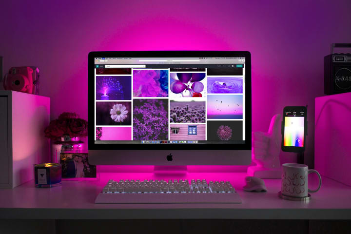
8. Use High-Quality Images and Graphics
Importance of Quality Visuals
Images can make a design visually appealing, but quality is key. Low-quality images can make a design look unprofessional.
Choosing Appropriate Images
Select images that resonate with your brand, align with the content, and are high resolution.
9. Create a Mobile-Responsive Design
Why Mobile Responsiveness Matters
With so many users on mobile, a design that adapts to smaller screens is essential.
Tips for Optimizing Mobile Layout
Ensure that text, images, and buttons resize well on mobile. Test on various screen sizes to make sure everything remains user-friendly.
10. Utilize Intuitive Icons and Symbols
Understanding Iconography
Icons are essential visual tools, but they must be clear. An icon’s meaning should be obvious without a label.
Best Practices for Icon Use
Limit icon use to universally recognized symbols, like a magnifying glass for search. Overly complex or abstract icons can confuse users.
11. Keep Forms Short and Simple
Reducing Form Complexity
Users are less likely to fill out long forms. Only ask for essential information and keep the form easy to understand.
Using Autofill and Smart Fields
Integrate autofill options and provide examples in input fields to reduce the time it takes for users to complete forms.
12. Incorporate Micro-Interactions for Engagement
Definition of Micro-Interactions
Micro-interactions are small animations or effects that respond to user actions, like a heart icon filling in when liked.
Examples of Effective Micro-Interactions
Small animations, sound effects, and transitions make an app more enjoyable. Use micro-interactions to guide, reward, or offer feedback to users.
13. Prioritize Readable Typography
Typography and Readability
Clear typography makes your content easy to consume. Use fonts that are clean, without unnecessary flourishes.
Choosing Fonts for Accessibility
Choose high-contrast colors for text and background, and pick fonts that can be read easily on different screen sizes.
14. Add a Touch of Animation Mindfully
Enhancing UX with Subtle Animation
Animation can highlight transitions or changes. However, they should be used sparingly to avoid overwhelming the user.
Avoiding Overuse of Animation
Too many animations can make a design look unprofessional. Only add animation where it supports functionality.

15. Offer Easy Access to Help or Support
The Role of In-App Support
Users appreciate quick access to help or support, especially if they’re stuck or confused.
Placing Help Options in UI
Add a visible help button or chat option so that users know where to find assistance without needing to search.
16. Test and Iterate Regularly
Importance of Usability Testing
Regular testing uncovers user pain points and areas for improvement.
Adjusting Based on User Feedback
Gathering user feedback helps improve design quality and adapt to users’ changing needs over time.
Conclusion: Small Tweaks, Big Changes
Small changes in UI design can transform the user experience. Implementing these little tips doesn’t require a massive overhaul but can result in a big payoff in terms of usability and user satisfaction.
FAQs
What is the difference between UI and UX design?
UI design focuses on the look and feel, while UX (User Experience) design is about functionality and user flow.
How can I make my UI more accessible?
Use high-contrast colors, readable fonts, and make sure all interactive elements are easy to navigate for those using screen readers.
Why is feedback important in UI design?
Feedback reassures users that their actions are recognized, reducing frustration and improving usability.
How often should UI design be updated?
Regularly test and gather feedback, updating when necessary to meet users’ evolving needs.
What are micro-interactions in UI design?
Micro-interactions are small, functional animations that enhance the experience, like a loading spinner or a button hover effect.
About the Creator
Muhammad Nadeem
Hello! I'm your go-to resource for the oddball, the curious, and the simply fascinating. You can find me exploring the more bizarre areas of the internet. I investigate everything while maintaining a healthy dose of curiosity and humor.
Keep reading
More stories from Muhammad Nadeem and writers in Writers and other communities.
The Crossroads Of Should And Must
Introduction Life presents us with countless decisions - choices that range from daily routines to life-altering moves. But among these decisions, there's a key difference between the things we feel we should do and the things we feel we must do. This "crossroad of should and must" is where we face the tension between external expectations and our inner calling. Many of us stand at this crossroad more often than we realize, wondering if we're living the life we truly want or merely following a path that feels familiar and safe.
By Muhammad Nadeemabout a year ago in Writers
It's Winter
Anne Bernays and Pamela Painter — What If? Writing Exercise for Fiction Writers prompts The Exercise —Write a scene involving two characters. Have the point-of-view character presume something entirely different about the situation from what the other character's overt behavior seems to imply. For example, a landlord comes to visit, and the tenant suspects that it isn't a visit but an inspection. Make up several situations in which one character can fantasize or project or suspect or even fear what another character is thinking. The Objective - To show how your characters can use their imaginations to interpret the behavior and dialogue of other characters.
By Denise E Lindquist18 days ago in Writers
Why You Should Write Love Letters to Yourself
The term of endearment hyperbole, ‘I Love You to the Moon and Back’, which I often tell my daughter, with the additional elongated: ‘and back again, beyond infinity’, is believed to have originated from Sam McBratney’s 1994 children’s book: ‘Guess How Much I Love You’.
By Chantal Christie Weiss5 days ago in Writers


Comments
There are no comments for this story
Be the first to respond and start the conversation.