
Best and Worst MLB City Connect Hats
Which hat did and did not make the grade?

As someone who has a small handful of Texas Rangers hats and an avid hathead, I'm eager for Opening Day to begin. In my previous stories, I've critiqued and rated the best and worst City Connect jerseys. I'll have links to both stories at the end of this story. In this story, however, I'll be critiquing one City Connect hat that I love and one that I'm not feeling at all. Please note that teams will have more than one hat design and not all hats will be featured on here.
BEST: Cincinnati Reds
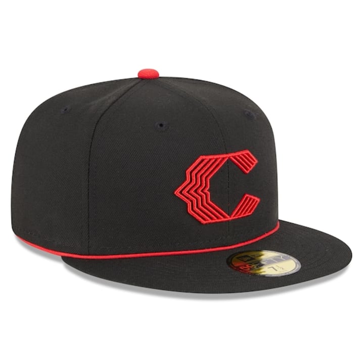
Let's start with this amazing black Reds hat. Red and black definitely go together, especially wearing an outfit. The red "C" is bold. Overall appearance: 10/10.
WORST: Philadelphia Phillies
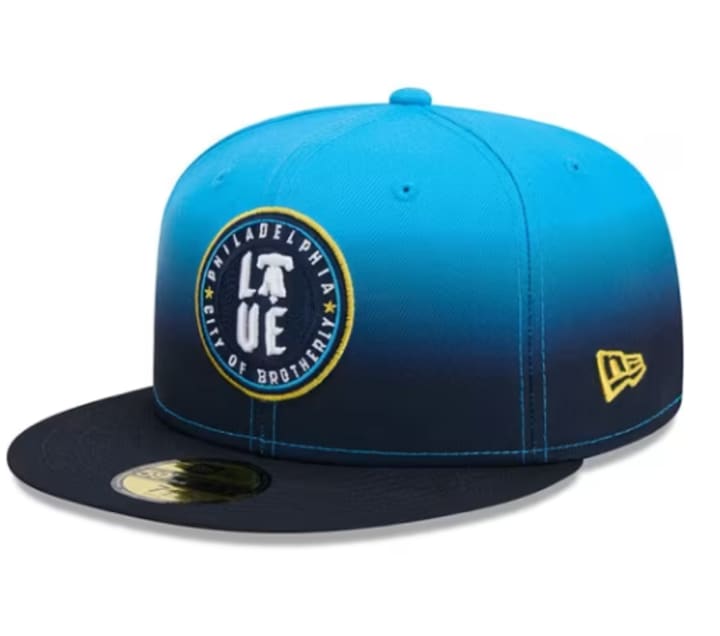
If you thought their City Connect jersey looked terrible, this hat is ten times as worse. The colors look unappealing and as far as the design in the middle of the hat, it doesn't feel right to me. I would've preferred the hat to be half red and white and the design to display the cracked bell and "Brotherly Love" around the bell in the same font as their regular jerseys.
BEST: St. Louis Cardinals
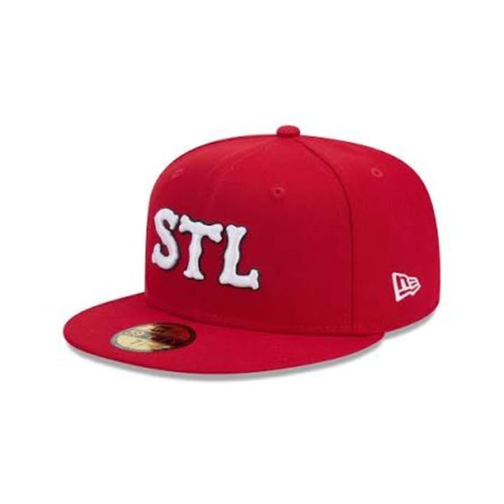
I gave high marks for their City Connect jersey in my one of my last stories and I'm doing the same for their hat. The "STL" in this font showed that they've stayed true to their city roots. As for the overall appearance of this hat, I'll give it the same grade as the Reds City Connect hat.
WORST: Chicago White Sox
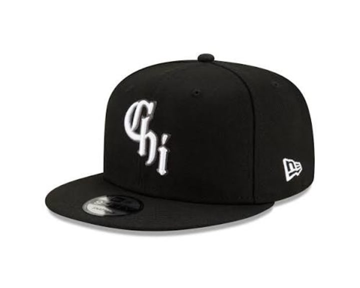
I would've preferred to have a sock logo in the middle of the hat, as opposed to the word "Chi". I know that's the city's nickname, but I'd love to see a bit more creativity to make this hat stand out a lot more. Overall appearance: 6/10.
BEST: Miami Marlins
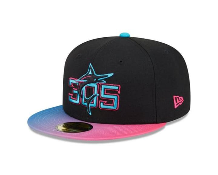
Their City Connect jersey gave me Miami Vice vibes and loved the colors and designs for it. For the hat, it instantly got my attention. The colors for the brim of the hat are attractive. The design in the middle of the hat, especially the "305", stands out perfectly. I give the overall appearance of this hat a Perfect 10.
WORST: Los Angeles Dodgers
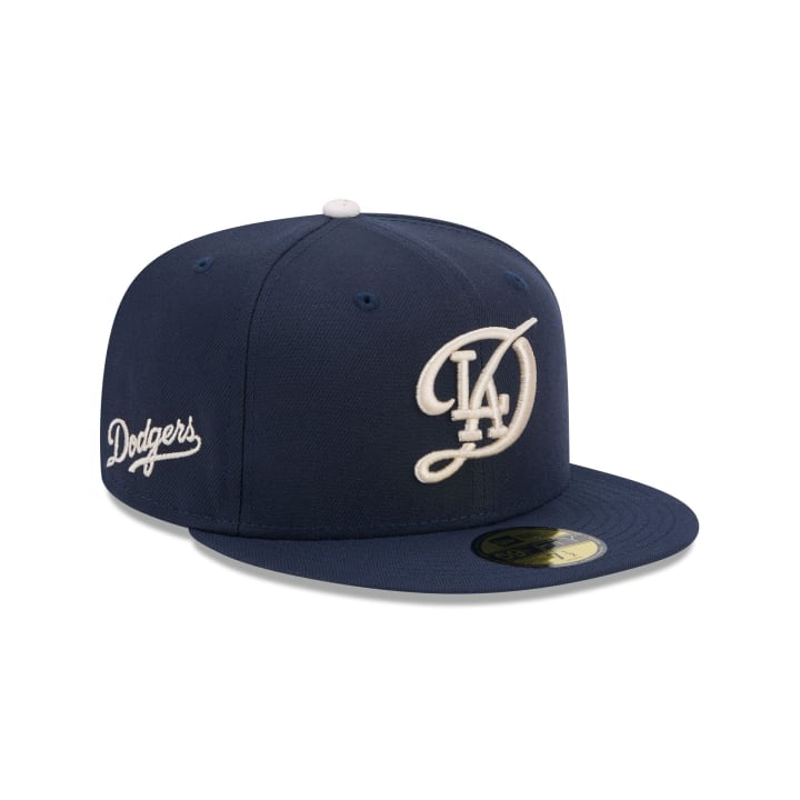
Disclaimer: I'm not a Dodgers apologist or supporter by any means. I already heavily dislike this team with a passion and many of my readers and subscribers have full knowledge of this.
As for the hat: The Dodgers logo on the right side of the hat and the color of it are two positives about the hat I like. However, the design in the middle of the hat had me scratching my head. It doesn't seem like a good fit for a hat design. It should've had "Hollywood" in the same font as the aforementioned logo on the right side of the hat. Overall appearance: 5/10.
BEST: Seattle Mariners
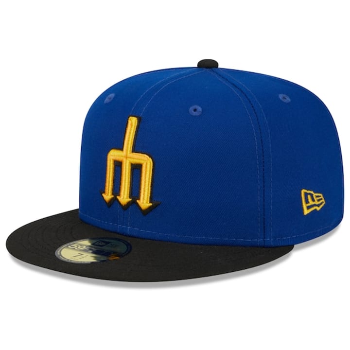
The reigning American League West champions had a spectacular run during the 2025 Postseason, reaching the ALCS. Cal Raleigh had an outstanding record-breaking season, despite losing the AL MVP award to Aaron Judge. Despite all of this, they're eager to defend their division crown in 2026. Let's talk about their City Connect hat. Certain color combinations catch my eye for some reason. Blue and yellow are just one of those examples. The brim of the hat is black, the hat is blue, and the logo, an "M" resembling a trident is spot on. I hope the organization keeps the hat and their jersey forever. No other jersey design would ever top that if they were to release another one in the future.
WORST: Houston Astros
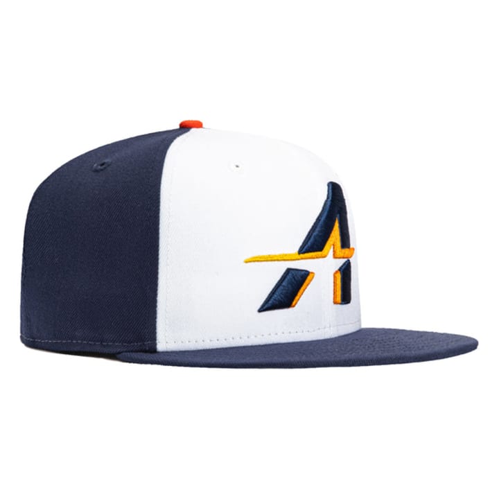
Their current City Connect jersey I featured in one of my previous stories and this hat both belong in the nearest garbage can. Yes, I made a snide reference to their cheating scandal, but I don't care. By the way, I wasn't joking about the hat and jersey belonging in the trash. The overall appearance of the hat, especially the logo, aren't appealing to me. It looks so dull. Honestly, I liked their last City Connect jersey and no, I'm not being an Astros apologist or caping for them. I still dislike them. Overall appearance: 3/10.
If you enjoyed this story, please give it a like. Make sure you follow me on my socials. Finally, please leave a generous one-off tip. It'll be found at the end of this story. Big or small, your tips will support creators like me so we can keep publishing new stories and share them with everyone.
About the Creator
Mark Wesley Pritchard
You can call me Wesley. Former cosplayer, retro gaming fanatic, die-hard Texas Rangers fan, and nostalgic freak. Need I say more?
Threads: @misterwesleysworld
Instagram: @misterwesleysworld
Keep reading
More stories from Mark Wesley Pritchard and writers in Unbalanced and other communities.
The Worst MLB City Connect Jerseys
Greetings, baseball nerds! Spring Training will be here before you know it. In my previous story, I've selected some of my favorite City Connect jerseys that stood out to me. I'll have a link to that story down below. With the good comes the bad, so I'll be highlighting six of the worst City Connect jerseys that didn't vibe well with me. We can all agree to disagree with the following selections, but if you didn't see a jersey that made the list, please comment down below. Just like my previous story, I'm only going to focus on the jerseys themselves, not the hats. A list of the best and worst City Connect hats will be featured on here in a later story.
By Mark Wesley Pritchard 9 days ago in Unbalanced
Wild Card Weekend Recap: What Happens Now?
I think I figured out why I love Wild Card Weekend so much. It's because it's the first playoff anything of the calendar year. The NFL season starts in the fall, and once upon a time, the champion was crowned either on or slightly before New Year's. The evolution of the NFL schedule has resulted in the playoffs starting just into the New Year, and currently, the final week of the season falls on the first weekend of the New Year, with Wild Card Weekend coming a week after that. So yes, chronologically, the NFL's Wild Card Weekend serves as the first playoff anything of the calendar year.
By Clyde E. Dawkins5 days ago in Unbalanced
Christian Kirk: From Rising Prospect to Proven NFL Playmaker
Christian Kirk has steadily carved out a reputation as one of the NFL’s most reliable wide receivers, blending speed, versatility, and consistency to become a key offensive weapon. While he may not always dominate national headlines, Kirk’s journey reflects the value of development, adaptability, and quiet professionalism in modern American football.
By Asad Ali5 days ago in Unbalanced


Comments
There are no comments for this story
Be the first to respond and start the conversation.