
Cracker Barrel New Logo: A Fresh Look or a Risky Break from Tradition?
A new logo sparks old questions: can a brand built on nostalgia survive modern reinvention?


When Cracker Barrel quietly revealed its new logo, the internet didn’t stay quiet for long. A brand that has always thrived on nostalgia—wooden rocking chairs, checkerboard tables, and warm biscuits—suddenly thrust itself into a storm of debates. For some, the redesign is a refreshing breath of modern air. For others, it feels like the slow unraveling of a beloved American tradition.
Logos might seem like small things, but in today’s culture, they’re battlegrounds. They don’t just decorate menus or storefronts; they embody identities, trigger emotions, and shape public trust. And for Cracker Barrel, a company that has long defined itself by old-fashioned comfort, a new logo signals more than a change in fonts or colors—it signals a crossroads.
A Brand Built on Nostalgia
Cracker Barrel isn’t just another roadside restaurant chain; it’s a cultural institution. Born in the American South in 1969, the brand built its empire on the promise of “home away from home.” Every location was carefully designed to feel like stepping into a country store from a bygone era—fireplaces, rocking chairs, vintage décor, and shelves lined with candies your grandmother once bought for a nickel.
That nostalgic charm wasn’t just decoration—it was the brand. While competitors like IHOP and Denny’s chased modernity, Cracker Barrel doubled down on tradition, positioning itself as a timeless refuge from the fast pace of modern life.
So when the company unveiled a new logo, people asked: is Cracker Barrel abandoning the very thing that made it special?
The Old vs. the New
The original Cracker Barrel logo was unmistakable: a rustic image of a bearded man leaning on a wooden barrel, accompanied by a warm, vintage-style wordmark. It wasn’t sleek. It wasn’t minimalist. It wasn’t trendy. But it screamed authenticity.
The new logo, however, trims away some of that detail. Gone is the heavily detailed illustration; in its place, a cleaner, simplified design. The typography has been sharpened, the palette brightened, and the overall look nudges closer to the sleek logos that dominate today’s branding world.
To some, this update is exactly what Cracker Barrel needed. “It looks fresh, approachable, and modern without losing its roots,” one brand strategist explained. But to others, the changes feel like betrayal. “This is another case of a company sanding down its soul to fit into a cookie-cutter corporate mold,” a fan tweeted.
Why Logos Spark Strong Emotions
At first glance, it might seem silly to argue over a logo. But think about it: logos are shortcuts to identity. They’re visual triggers that summon memories, emotions, and trust. When you see the golden arches, you don’t just think of McDonald’s—you remember childhood Happy Meals, road trip stops, or late-night fries.
For Cracker Barrel, the logo was part of its storytelling. It wasn’t just about food—it was about heritage, history, and a slower way of life. Altering that symbol feels, to many, like rewriting the story.
This is why logo redesigns often ignite firestorms. Just ask Gap, which in 2010 rolled out a new logo only to scrap it a week later after a wave of backlash. Or Tropicana, which changed its orange juice cartons so drastically that sales plummeted by 20% in less than two months.
In the branding world, change is risky—and Cracker Barrel is now walking that tightrope.
The Psychology of Change
Why do people resist logo redesigns so fiercely? Psychologists point to a concept called “status quo bias”—the human tendency to prefer things as they are, even when change might be beneficial.
For loyal customers, the old Cracker Barrel logo wasn’t just a design. It was a ritual. It was road trips with family, biscuits with gravy, and evenings spent rocking on the porch after dinner. Changing that symbol feels, in a way, like erasing part of their own history.
Yet brands can’t stand still forever. In a world dominated by digital platforms, clean and simple logos often perform better on apps, websites, and social media. The Cracker Barrel logo that worked on a wooden sign in 1975 might not scale well to a smartphone screen in 2025.
The question is: can the company modernize without alienating its core audience?
The Suspense of Public Reaction
When the logo debuted, Cracker Barrel didn’t expect the internet to explode—but explode it did. Within hours, social media filled with memes, critiques, and think pieces. Some praised the change as “bold,” others derided it as “soulless.”
One viral post compared the redesign to “repainting grandma’s farmhouse with neon colors.” Another suggested the new look made Cracker Barrel resemble “just another fast-casual chain.”
But not all the reactions were negative. Younger customers—many of whom view the brand as outdated—welcomed the shift. “Finally,” one college student wrote, “it looks like a place I’d actually want to go eat at instead of just somewhere my parents drag me.”
This generational divide might be at the heart of Cracker Barrel’s gamble: can it attract new diners without losing the old ones?
What’s at Stake for Cracker Barrel
At first glance, a logo change might not seem like a life-or-death matter. But in the restaurant industry—already shaken by shifting tastes, rising costs, and the aftershocks of the pandemic—brand perception is everything.
Cracker Barrel has long positioned itself as more than food—it sells comfort, tradition, and Americana. If the new logo signals a departure from that identity, the company risks diluting its most valuable asset.
On the other hand, clinging too tightly to nostalgia could make it seem outdated in an era where millennials and Gen Z value modern design, inclusivity, and innovation.
In short, Cracker Barrel’s new logo is more than a design update—it’s a strategic gamble with the brand’s very future.
Lessons from Other Brands
History offers plenty of cautionary tales.
Gap (2010): Their new logo lasted only six days before public outrage forced them back to the old one.
Tropicana (2009): Redesigning its packaging tanked sales, costing the brand millions.
Burger King (2021): In contrast, Burger King returned to a retro-inspired logo, winning praise for blending nostalgia with freshness.
Cracker Barrel now stands at a crossroads. Will its redesign be remembered as a smart evolution—or as a misstep that alienated its most loyal base?
The Road Ahead
For now, the company is standing by its decision. Executives have framed the redesign as a careful balance: keeping the essence of the brand while updating it for modern times. In official statements, Cracker Barrel insists the logo still honors its roots while preparing for the future.
But the real verdict won’t come from boardrooms or press releases—it will come from customers. If diners keep coming, the redesign will quietly become the new normal. If they don’t, Cracker Barrel could face the same fate as Gap and Tropicana.
The suspense lies in whether the brand can convince people that the logo is simply a new chapter in the same story—not the end of the story itself.
A Final Thought: More Than Just a Logo
At the end of the day, a logo is only as powerful as the story it carries. For Cracker Barrel, that story has always been about warmth, tradition, and a sense of belonging. The challenge now is ensuring the new symbol carries those same values.
Because for many customers, the question isn’t just, “Do I like the new logo?” The deeper question is, “Does Cracker Barrel still feel like Cracker Barrel?”
And that answer, in the end, won’t be drawn in lines or colors—it will be written in the hearts of the people who walk through its doors.
About the Creator
Fazal Ur Rahman
My name is Fazal, I am story and latest news and technology articles writer....
read more and get inspire more............
Keep reading
More stories from Fazal Ur Rahman and writers in The Swamp and other communities.
NEWS: California Supreme Court Green Lights Democratic Redistricting Effort
The gavel struck in Sacramento, and with it, a new chapter in California politics began. In a ruling that could shift the balance of power for years to come, the California Supreme Court has officially greenlit the Democratic Party’s push for redistricting—a move hailed as a victory by some and condemned as a dangerous precedent by others.
By Fazal Ur Rahman7 months ago in The Swamp
Parallel Protests
I haven't written for quite some time, but I have A LOT of thoughts about yesterday's protest rally against our government's involvement and complicity in America's war on Iran, on the harbourside of my home city Bristol, and I need to put them somewhere. My gorgeous girlfriend is always a loving and listening ear and sharing it all with her will always be a healthy and happy way of processing the mental and emotional weight, but getting it straight in my brain to share means writing it all down in straight lines, so, here we are and thanks for being here.
By Steph Cole9 days ago in The Swamp
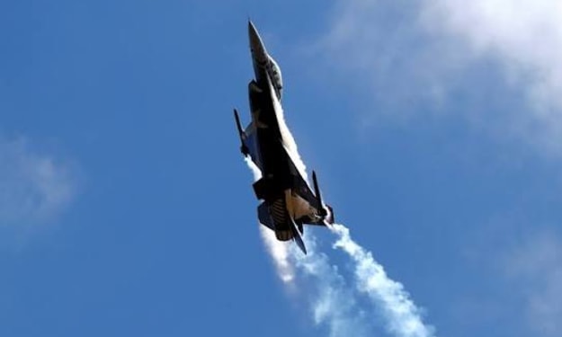
Turkey Considering Deployment of F-16s to Cyprus, Ministry Source Says
Ankara signals potential military escalation as tensions rise in the Eastern Mediterranean. Turkey is reportedly considering the deployment of F-16 fighter jets to Cyprus, according to a source within the Turkish Ministry of Defence. The potential move comes amid heightened regional tensions and ongoing disputes over airspace and territorial waters in the Eastern Mediterranean. The source, who requested anonymity due to the sensitivity of the issue, stated that Ankara is evaluating options to strengthen its military presence on the island in response to what it perceives as growing threats and provocative actions by neighboring states. While no final decision has been made, Turkish defence officials are reportedly assessing the logistics, operational readiness, and strategic implications of such a deployment. Strategic Context in the Eastern Mediterranean Cyprus has long been at the center of geopolitical disputes, particularly involving Turkey, Greece, and other regional powers. Turkey maintains a military presence in the northern part of the island, which it recognizes as the self-declared Turkish Republic of Northern Cyprus. Greece and the internationally recognized Republic of Cyprus consider such actions a violation of sovereignty. The consideration of deploying F-16s reflects Ankara’s intent to assert air superiority in contested areas and strengthen deterrence against perceived encroachments by neighboring forces. Turkish military analysts suggest that stationing fighter jets on the island could provide rapid response capabilities and enhanced surveillance of maritime zones in the Eastern Mediterranean, where energy exploration and military activity have created ongoing disputes. Potential Regional Reactions The announcement has already sparked concern among Greece, Cyprus, and other European states with interests in regional stability. Analysts warn that any increase in Turkish military assets on the island could exacerbate tensions and risk accidental clashes in congested airspace. Greek officials have historically expressed strong opposition to military expansions by Turkey in Cyprus, emphasizing that such deployments could violate international agreements and heighten the risk of confrontation. Similarly, the Republic of Cyprus has warned that any escalation could undermine ongoing diplomatic efforts to manage territorial disputes. European Union diplomats have also noted the importance of de-escalating military posturing in the region. In recent months, Brussels has called on all parties to exercise restraint, warning that heightened tensions in the Eastern Mediterranean could disrupt regional trade, energy exploration, and broader security cooperation. F-16 Capabilities and Operational Impact The Turkish Air Force operates a fleet of F-16 fighter jets capable of air defense, ground attack, and surveillance operations. Deploying these jets to Cyprus would enhance Turkey’s ability to respond rapidly to regional incidents, including aerial incursions, maritime disputes, or potential conflicts over energy exploration zones. Military analysts highlight that F-16s, when combined with advanced radar and command systems, provide significant operational reach and flexibility. They can conduct patrols, intercept aircraft, and support naval operations in contested areas. Such capabilities would reinforce Turkey’s position and demonstrate its readiness to protect strategic interests. Diplomatic Considerations While Turkey’s defence ministry has not officially confirmed the deployment, international observers are closely monitoring the situation. Analysts emphasize that a unilateral military build-up could provoke a response from neighboring states, potentially triggering a cycle of escalation. Diplomats from Greece, Cyprus, and the EU have reportedly begun consultations to coordinate messaging and assess contingency plans. Regional security experts note that ongoing military exercises, coupled with potential deployments, require careful management to avoid accidental clashes or miscalculations. Broader Implications The Eastern Mediterranean has emerged as a flashpoint for regional power competition, with multiple countries asserting claims over territorial waters and airspace. Energy exploration, maritime boundaries, and longstanding historical disputes contribute to the complexity of the situation. Turkey’s consideration of deploying F-16s to Cyprus underscores the delicate balance between deterrence and provocation. While Ankara frames the move as defensive, neighboring states view it as a potential escalation that could destabilize the region further. The international community is urging all parties to pursue diplomatic channels and confidence-building measures to prevent unintended incidents. Observers warn that missteps in the coming weeks could have far-reaching consequences, not only for Cyprus and Turkey but for broader regional security in the Eastern Mediterranean.
By Fiaz Ahmed 5 days ago in The Swamp


Comments
There are no comments for this story
Be the first to respond and start the conversation.