
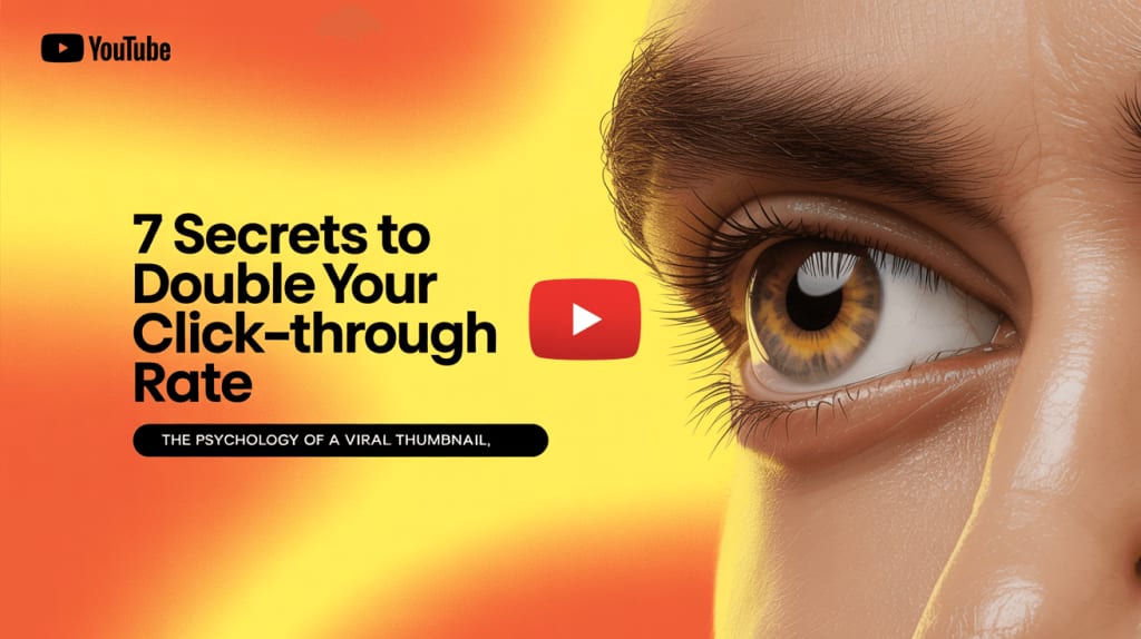
The Psychology of a Viral YouTube Thumbnail: 7 Secrets to Double Your Click-Through Rate
Learn how to leverage color, emotion, and text to stop the scroll, win the click, and convince the YouTube algorithm you're worth watching.

Are you spending hours, or even days, perfecting a video only to see it get lost in the vast ocean of YouTube content? You've checked your audio, polished your editing, and written a great description, but the views just aren't coming.
The problem might not be your video. It might be its digital front door: the thumbnail.
Did you know that an estimated 90% of the best-performing videos on YouTube use a custom thumbnail? That's not a coincidence. A thumbnail is the single most important factor that determines whether a potential viewer clicks on your video or scrolls right past it.
But what separates a mediocre thumbnail from a clickable masterpiece? The answer lies in psychology.
In this guide, we'll move beyond basic design tips and unlock the psychological secrets behind viral thumbnails. These 7 actionable secrets will help you create designs that grab attention, spark curiosity, and can seriously boost your video's Click-Through Rate (CTR).
First, What is CTR and Why Is It Your Golden Metric?
Before we dive in, let's quickly talk about Click-Through Rate (CTR). In simple terms, CTR is the percentage of people who saw your thumbnail (Impressions) and actually clicked on it (Clicks).
CTR = (Total Clicks ÷ Total Impressions) x 100
A high CTR is a powerful signal to the YouTube algorithm. It says, "Hey, people are interested in this content!" In response, YouTube will show your video to even more people, creating a snowball effect of views. As YouTube's own experts confirm, a great thumbnail is your first step to winning over the algorithm. For more details, you can check out the official YouTube Creators guide on thumbnails.
The 7 Psychological Secrets to a High-CTR Thumbnail
Here are the proven psychological triggers you can use to make your thumbnails irresistible.
Secret #1: The Irresistible Power of Human Faces
It's just human nature - our brains are wired to connect with faces. A thumbnail featuring a clear, expressive face instantly creates a human connection and draws the eye.
How to use it: Use a high-quality, close-up shot of a face showing a strong, clear emotion. Surprise, shock, joy, and intense concentration all work incredibly well. The emotion on the thumbnail sets the emotional expectation for the video.
Secret #2: The Science of Color and Contrast
In a crowded feed, your thumbnail is fighting for attention. The fastest way to win that fight is with smart use of color.
How to use it: Use bright, saturated, and high-contrast color combinations. Think bold yellows, electric blues, and vibrant greens set against dark or muted backgrounds. This makes your thumbnail "pop" off the page.
Red: Evokes energy, excitement, or urgency.
Blue: Conveys trust, authority, and calm.
Green/Yellow: Associated with happiness, positivity, and money/growth.
Secret #3: The "3-Word Rule" for Text
Many creators clutter their thumbnails with text. Remember, most users are on mobile, where thumbnails are tiny. They don't have time to read a sentence.
How to use it: Follow the "3-Word Rule." Use 3-5 powerful words at most. The text should be big, bold, and incredibly easy to read. It should communicate the video's core benefit or create curiosity. For example, instead of "How I Built This Incredible Thing," try "I BUILT THIS!"
Secret #4: Create an Unbearable "Curiosity Gap"
The curiosity gap is the psychological space between what we know and what we want to know. A great thumbnail opens this gap and makes the viewer feel like they must click to close it.
How to use it: Use visual cues like arrows, circles, or question marks to highlight something specific. You can also blur or censor a part of the image. This teases the outcome and makes the viewer desperate for the reveal.
Secret #5: Build Trust with Branding & Consistency
Why can you instantly recognize a video from your favorite creator without even reading the title? Because of consistent branding.
How to use it: Develop a consistent visual style. Use the same font, color palette, or logo placement in all your thumbnails. Viewers who enjoyed your previous content are more likely to click on something they recognize.
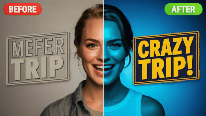
Secret #6: The Magic of "Before & After"
Our brains love transformations. A "before and after" thumbnail is a powerful storytelling tool that instantly communicates value by showing a problem and a solution in one image.
How to use it: This is perfect for DIY, fitness, cleaning, tutorials, and business content. Show the "messy" before and the "perfect" after. The visual contrast is incredibly satisfying and promises a valuable outcome for the viewer.
Secret #7: Do Your Work with Competitive Analysis
You don't have to reinvent the wheel. The best way to learn is to study what's already working in your niche. Analyze the thumbnails of top-performing videos and ask yourself why they are effective.
How to use it: To do this properly, you need to see the design details up close. This is where a high-quality thumbnail downloader becomes an essential research tool. With a free service like GetYTThumb, you can instantly download the full HD version of any thumbnail. This allows you to analyze the color choices, font styles, and composition of your competitors, inspiring your own clickable designs.
Case Study: Deconstructing a MrBeast Thumbnail

Let's look at a classic MrBeast thumbnail. You'll almost always see:
- A highly expressive face (Secret #1): MrBeast with his mouth wide open in shock or excitement.
- Extreme color contrast (Secret #2): Bright objects and text against a contrasting background.
- Minimal, huge text (Secret #3): Words like "$1 vs $100M."
- A clear story (Secret #4): An image of a giant object or an extreme situation that creates an immediate question in your mind.
He masterfully combines all these psychological triggers into one image, making a click almost unavoidable.
Conclusion: You're Ready to Get More Clicks
A great thumbnail isn't about luck; it's about strategy. It's about understanding the psychology of what makes people click.
- To recap, here are your seven secrets:
- Use Expressive Faces
- Master Color & Contrast
- Follow the "3-Word Rule"
- Create a Curiosity Gap
- Stay Consistent with Branding
- Showcase Transformations
- Analyze Your Competitors
Now that you're equipped with this knowledge, it's time to take action. Start designing your next thumbnail with these principles in mind and watch your CTR - and your channel - soar.
What is your biggest thumbnail challenge? Share it in the comments below!
About the Creator
Zoey Angelina
Hi! 👋 I'm sharing proven strategies to grow your social media🚀. Stay with me to boost your presence until you become famous!✨! My mission is to provide actionable advice that empowers digital creators to win in this online world.
Keep reading
More stories from Zoey Angelina and writers in Proof and other communities.
What is the Best Time to Post on Instagram for Likes in UK
Instagram is now the new outlet for sharing moments, building brands, and reaching the audience worldwide. Have you ever asked why some posts have received so many likes? It has been proven that the key here is timing. When is the best time to post on Instagram to achieve significant engagement? Let's discuss further.
By Zoey Angelinaabout a year ago in Journal
Crafting the Perfect Personalized Cocktail
Creating a personalized cocktail is like painting your own masterpiece in a glass. It’s about mixing flavors that speak to your unique taste, mood, and occasion. Whether you prefer something sweet, sour, bitter, or a little spicy, a personalized cocktail is all about you. It’s the art of balancing ingredients to make a drink that feels tailor-made.
By Aisha Patel6 days ago in Proof
Understanding the Meaning of Melting Ice in Cocktails
When it comes to cocktails, melting ice is more than just a slow drip in your glass. It’s a crucial part of the drinking experience that affects flavor, temperature, and even texture. But what exactly does melting ice mean in the world of mixology, and why should you care?
By Ava Mitchell6 days ago in Proof


Comments
There are no comments for this story
Be the first to respond and start the conversation.