
Unconventional Wizardy of the Photograph
Or how to edit photos like a self taught non-professional
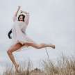
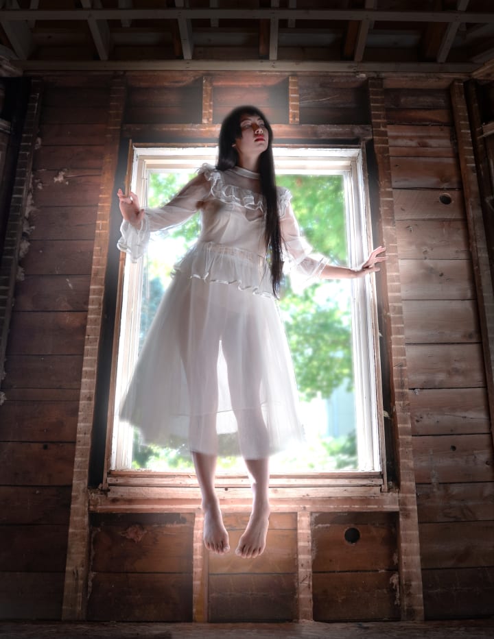
So you took some pictures and they’re perfect! brilliant! visionary!… or the idea was at least. Well don’t worry, you’re not done yet! In fact, I would say, you’ve only just begun! Look at the photo below (don’t strain your neck). There’s a concept behind it: a haunting figure floating in through the window, captivating yet foreboding. There are a few flaws that we can catch right off the bat (besides, of course, the roatation). The model (who is definitely not me) is on a bucket, for starters. The camera bag is in frame (whoops), and the backlight from the window has put the model in shadow; her head is hardly discernible from the background. But that’s okay! No need to start over, we can fix it in post!
Now you can use any photo editing software you want, but not all of them can do everything. I’m going to be switching between a few different programs as I’m using an outdated iPad. Here’s what I’ll use:
- Photoshop Mix (iOS)
- Photoshop Express (iOS)
- Procreate (iOS)
- Photoshop fix (iOS)
If you’re on a computer, you can do it all with Photoshop! But on mobile the program is split into a few different apps so we have to switch around. I’ve used a few other mobile editing apps but ultimately these are my favorites. Make sure you use a program that works at the full resolution, otherwise you will lose image quality every time you make a save.
Before we get started, here’s my obligatory disclaimer: I’m not a photographer. I started using Photoshop as a digital artist so I approach photo editing as a painter. The techniques you’re about to see are exclusive to my own brand of curated skills forged through years of artistic fumbling!
Okay! First things first, I had a vision and it did not involve a bucket! I’m going to use Photoshop Mix for mobile to remove the bucket and fix the foot that’s standing on the bucket. To do this, I have another photo with the opposite foot flexed which I will use to replace my standing foot. To remove the bucket, I have a photo of the background wall sans bucket that I will use to cover it up! These are issues I anticipated during the photo session so I would be prepared when it came time to edit. Sometimes we don’t always think ahead though, and that’s okay, you can still use the techniques I’ll be talking about, you’ll just have to be more flexible.
CREATING A COMPOSITE PHOTO
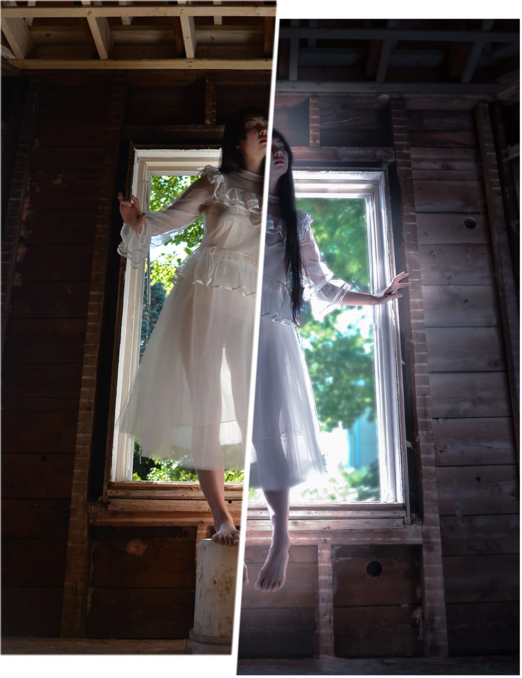
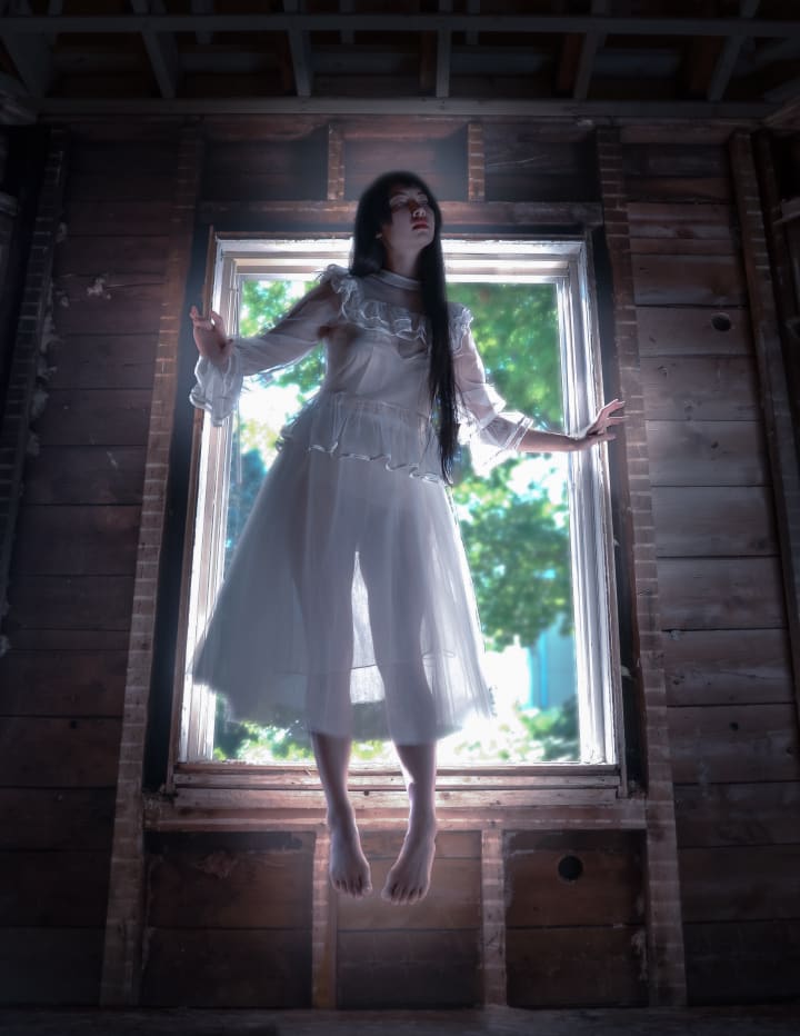
Now you’ll notice that the photo above is taken at a slightly different angle. If you’re going to make a composite photo (a photo consisting of multiple photos put together) ideally every photo would be taken at the exact same angle to make editing easier. Of course nobody’s perfect and we were just winging it through the photo shoot so we have to work with what we’ve got.
PROTIP: When making a composite photo, combine your photos into one photo before applying major light/color/effect edits! It’s much easier to do your compositing first than having to match your exact edits for each piece of the photo after the fact!
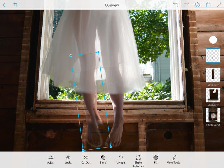
Let’s get this leg where it belongs! Load both photos into Photoshop Mix (or the editing program of your choice. You could honestly do all of this in Procreate or any digital painting software. You could even use MS Paint if you have a very steady hand and a lot of patience). Put the photo with the replacement leg on the higher layer so it will be seen on top of the main photo. Now use the “Cut Out” tool (or the selection tool in another program) to cut out the leg.
We’re not done with the leg yet, but let's get the background looking right before we move on. Remember when I said I took a picture of the wall so I could easily paste it over the bucket in post? Well I kinda lied. I do have other photos but the bucket’s in all of them. Oops! I’ll have to combine a few different sections of the wall from a few different photos to make one cohesive photo. What a pain. Of course you can try using the “healing” tool but it does essentially the same thing and it isn’t perfect. It takes another section of the photo to patch what you’re covering up, but it doesn’t always choose the right section to patch it with. If you’re covering up something small, the healing tool is great, but for something big like my bucket, I’m going to have to go deeper.
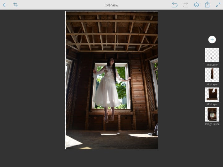
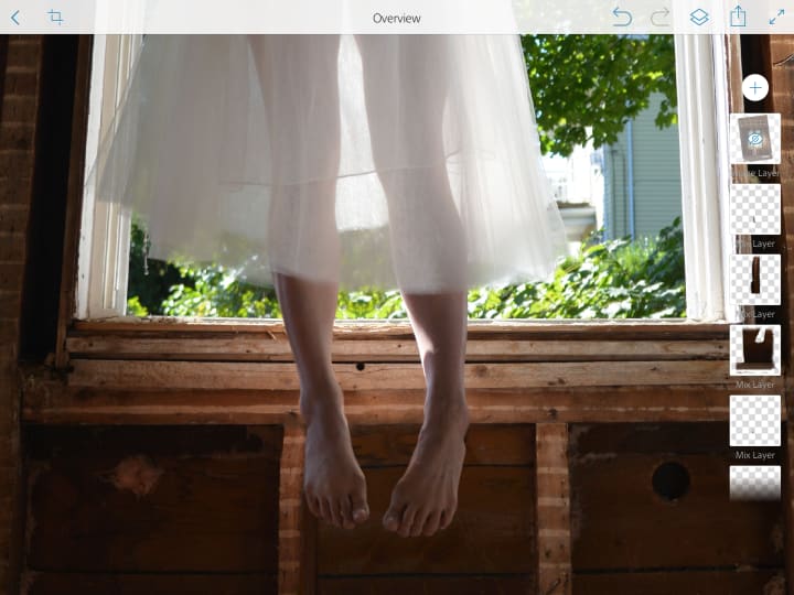
Take a look at the layers to the right of the image. Each of those layers is a whole photo similar to the original photo, but I used the “Cut Out” tool to only show the parts that I needed (in this case, the wall). Ideally, I’d only need one layer to accomplish this, but as I said, I had to merge a bunch of photos to make the background wall. The top layer is still the foot, the second layer is the wooden stud on the wall to the left of my fake foot, the third layer is the wall, and the fourth layer is the original photo. Now the stud and the wall are actually merged composites of a couple more layers that I had to cheat together. I also edited the color/saturation and brightness/contrast on these individual layers to get them to match the original photo. Hopefully you won’t have to do this because you thought ahead while you were still on set taking photos. But if you’re an airhead like me, there’s always a way. Worst comes to worst - Google a stock image of wooden walls and paste that into your photo (just make sure it’s free to use and not copyrighted!!!).
PROTIP: When using the selection or “Cut Out” tool, utilize advanced features, usually called “Refine” or “Refine Edge” where you can find the “feather” tool. The “feather” effect blurs the selection edge for a smooth finish. If you’re using a selection brush, play with the brush size, hardness, and opacity to obtain an edge as similar to the natural edges in the photo as you can. This will make your “cut outs” blend seamlessly into the original photo. No one will ever know your photo is a composite!
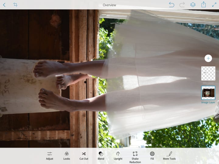
Okay! Now that we’ve abolished that blasted bucket, let's return to the floating foot! Go to the foot layer and reduce the opacity so that you can see through to the original foot. Line the foot up and adjust the size so that it matches the size of the original foot. An easy way to make sure it’s proportional in this case is to make sure the knee and ankle line up. Now, keeping the foot translucent, align the foot so that it falls naturally with the way the original leg is positioned. I aligned the leg at the knee as you can see below.
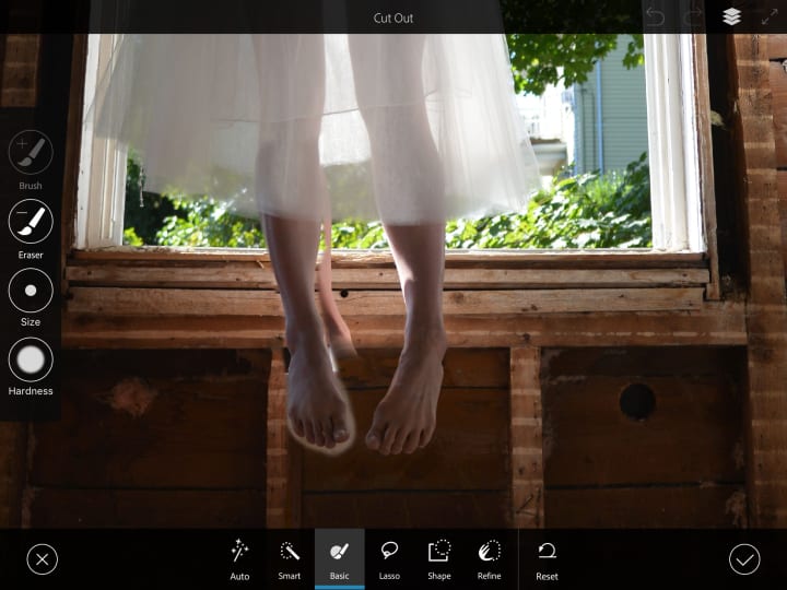
Now that the leg is the right size and aligned, we can refine the edges and make sure it blends into the rest of the image! Bring that opacity back to 100% and, using the skills I mentioned above, cut out the excess around the leg and foot until it blends seamlessly into the background. I found that with Photoshop Mix, the “feather edge” tool under “refine” was too powerful. I used the “basic” tool on a small brush size with hardness at 0 to get precise, soft edges.
Once you’ve finished cutting out the foot, you’ll have to remove the original foot from the photo. You can use a “healing” tool in photoshop, or cut out and replace sections from this photo or another reference photo to cover up the foot, much like we did earlier with the wall. I cut out a few sections from the window frame on the original photo and I flipped them horizontally so the texture of the wood matched, then feathered the edges and lined them up. I did a few adjustments on light and color to get the sections to match fairly seamlessly. What do you think?
I did it! I made a composite photo! I’d say the left edge of the fake foot is a little soft, it’s not completely perfect, but I have more edits to do so I’m ready to move on.
CROPPING AND COMPOSITION
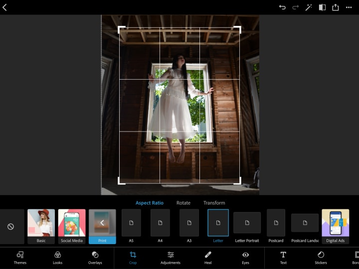
This is the part where I crop the photo! “Finally!” You’re thinking, “Isn’t that supposed to be the first step?” Well, it could have been, but I’ll tell you why it wasn’t. Since this is a composite of several photos, it was much easier for me to work with all of the images at the original size where everything is relatively proportional. If I had cropped this photo first, I would have had to do more work resizing and making the pieces fit. Also, I don’t like cropping the photo until the contents of the image look the way they’re meant to.
Now to crop the photo, utilize the handy dandy grid to best compliment your subject. In this case, I want the window to be centered and the model to be fairly centered along with it. If your subject is not centered, follow the “rule of thirds” to obtain a visually compelling composition! I moved the photo into Photoshop Express, but you can crop the photo in any photo editing app.
ADJUST LIGHT AND COLOR
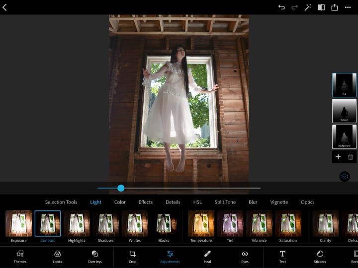
This is where the fun begins! We’re finally going to play with light and color! Now the first thing I’m going to do is some lighting correction. I mentioned earlier that the top of the model’s head blended into the back wall. The issue with the lighting (which is quite common when something is backlit, or with very bright natural light) is that the lights are too bright, almost overexposed, and the darks are too dark. The details in these light and dark areas are almost completely lost! But fear not! This is any easy fix!
Go ahead and dramatically decrease the contrast and see how much detail comes out. Yes, the image looks more flat, but we can deal with that later. For now, lets decrease contrast until we can see the level of detail that we desire.
Here’s what I did:
- Exposure - no change
- Contrast - decreased dramatically to bring out details
- Highlights - slight decrease to make the bright areas darker
- Shadows - slight increase to lighten the shadows
- Whites - slight increase to bring the contrast of the brightest sections up
- Blacks - slight decrease to darken the darkest sections and bring up the contrast
These lighting edits are my method of enhancing detail without making the image look flat. I reduced the contrast dramatically and then brought it back slightly with the “White” and “Black” edits.
Next, the color edits:
- Temperature: Slightly cooler
- Tint: Slightly more magenta
- Vibrance: Slight increase
- Saturation: Slight increase
These color edits are ultimately up to your personal preference and vision for the image.
I also increased the clarity and sharpness and decreased color and luminance noise. (The last two features are only possible with the paid Photoshop subscription but they can make a huge difference if you’re working with a low resolution photo. It gently blurs smooth sections of the image to remove noise - it’s also a great way to gently smooth skin without it looking obvious. These tools are not really necessary for most photos but can be quite handy when you need them.)
At this point I’m pretty much done with Photoshop Express (for now) so I exported the photo and opened it in Procreate. For those who are unfamiliar, Procreate is a digital painting app that I believe is only available for iPad. It costs something like $15 (one time payment) which I’d say is a pretty good deal if you enjoy drawing or editing images (far cheaper than Photoshop).
CREATE SPECIAL EFFECTS
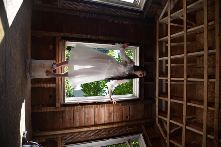
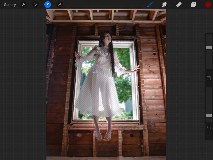
In the image above I’ve made one adjustment, can you tell? I blurred the window! (There’s actually no glass there, it’s just a gaping hole... fun!) This gives the image a little depth and makes the outside world less distracting from the subject.
Here’s how I did it:
I used the selection tool! In the Nia Tang school of photo editing, you’re gonna be using this bad boy a LOT. I have an Apple Pencil and an iPad which makes the selecting process easier. I’d recommend using a stylus and tablet if possible, but you can use your fingers, or a mouse, or trackpad if you must. I used the freehand selection tool to select the window area around the model’s body. Now you can use the magic wand selection tool, but I don’t trust that thing as far as I can throw it (which is admittedly quite far if I’m on mobile). I find that when I use the auto-selection magic wand thingy I have to spend so much time cleaning and fixing the selection area that I might as well have done the whole thing by hand from the start. You may have better luck - especially if there’s a high contrast between your subject and the background. The technology is always improving, and you can adjust the sensitivity of the magic wand, so give it a try and if you hate the results, do it by hand.
Anyway. I selected the window area. (I tried using the auto tool at first and if you zoom into the photo you can see where it screwed up and I didn’t catch it before I took the screenshot). With the desired area selected, I went to the adjustments tab and selected “Gaussian Blur” and adjusted the blur level to be just right! Wrong. Okay so if you’re on Photoshop CC, use “Lens Blur” and it will look beautiful. Gaussian blur, well, I love to hate it. It makes things fuzzy, blurry, muddy. Lens blur maintains the crispness of the image while making it soft and out of focus. That’s what we want! Gaussian blur just doesn't do that. But I don’t have lens blur so here’s the rough fix: duplicate the layer. On the bottom you have the original photo with no blur. On the top, you have the image with the blurred window. Reduce the opacity to around 50% and voila! The window is blurry without being too muddy.
PROTIP: Layers are your secret weapon. One part of your photo is darker than the other? Duplicate layer. Adjust the top layer to be brighter. Erase/cut out everything except the part of the photo that you want to fix (make sure the edges are soft so they blend seamlessly). FIXED. I like to over-do the fix and play with the layer opacity to get it looking perfect. Warning: this is a very unconventional method. The benefit of this method is that you always have the original photo in your bottom layer (instead of editing directly on the photo) so it’s extremely easy to go back and change each of your edits if you notice a mistake or change your mind.
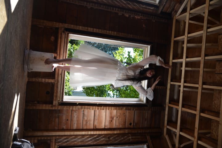
Okay, window is blurred, great. What’s next? I want the model to glow. Yes. I’m talking ethereal, ghostly, magical sh*t. Let’s make it happen! I already have the window around the model selected, so lets select everything else surrounding the model. (If you think you lost your selection area, long press the selection tool icon (highlighted blue in the above photo) and it should recall your last selected area). In procreate, the non-selected area is indicated with moving stripes (as seen above, sans animation). And of course we’re going to make sure the edge is nicely feathered. In this case I want the feathering to overlap around the model slightly so that it really looks like she’s glowing.
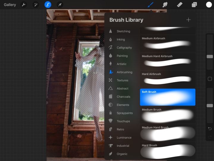
So how do I make her glow? This is where you’re going to summon your inner painter. It’s okay if you’ve never painted before, the selection area will do the hard work for you! Create a new empty layer. Go to the brush tool and select the softest brush you’ve got. In Procreate, go to “airbrushing” and select “soft brush.” If you’re on another painting program, turn your brush hardness to zero. Make your brush fairly large. In this case, make the diameter about a third of the photo’s width. It seems huge but because the brush is so soft, only a small area of the brush will be colored. Turn the opacity down to about half. I find it’s much easier to work with a large, soft, translucent brush when editing than it is to work with a more precise, more opaque brush.
With your weapon in hand, draw a soft glow around the subject using the color white. I like to work with just black and white while editing, I can always add colors afterwards.
Once the desired amount of glow is achieved, go into the layers tab to adjust the settings. There are many “blend mode” options that can be attributed to a layer. These modes affect how the current layer interacts with the layers below it. The default mode is “normal” which essentially makes the current layer cover up whatever is underneath it. I don’t want that. I want the glow to lighten the area around the model without losing any details, just like an actual light source.
In the layer tab on Procreate each layer shows a preview image of the layer, the layer name, a letter, and a check mark. The check mark indicates whether the layer is visible or not and the letter indicates the blend mode. When you click on the letter the layer expands to give you a number of layer options, including opacity and blend mode. At the bottom there are blend mode options to “Darken” and “Lighten,” as well as a few others. Darkening blend modes will make your current layer darken the layers beneath it based on the color and darkness of the image in the current layer. These are great features to play with which are available in most painting/editing programs that have layers. I’m going to select a lightening mode. My secret technique to select a layer mode is thus: click on each mode until you find the one that looks the best! It’s very technical.
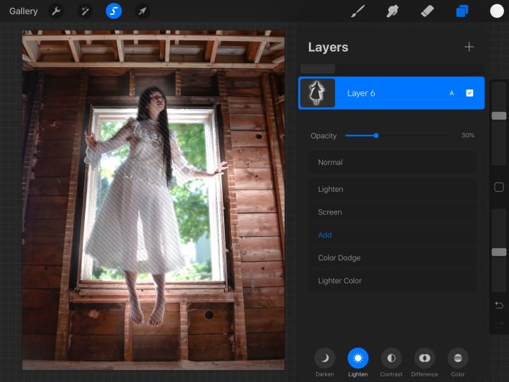
As you can see in the above image, I have the opacity turned down to 30%. I went a bit overboard with the glowing brush and decided to make it more subtle by reducing the opacity. That’s the benefit of working with layers! I chose the blend mode “add” (Linear Dodge in Photoshop), because it actually brightens the colors underneath it without losing saturation.
So now we have a glowing model, what more is there to do? “So much!” I say, “So much!” This is the part where you can really get bogged down with the details.
DETAILS, DETAILS, DETAILS!
Let’s look at the photo and think about what I want. I want the model to be the primary focus of this image. She’s already glowing and floating, but there are some things in the background that are too distracting. For example, the ceiling! The ceiling is too bright. Also, the right side of the wall is much shinier than the left side. I don’t like it! But that’s okay, I have the power of Photoshop/Procreate and with a wave of my wand I can make the image bend to my whims!
Starting with the ceiling, I’m once again whipping out the selection tool to select the ceiling area. Next, I go to the adjustments tab and select “Hue, Saturation, and Brightness.”
Let’s make that ceiling DARK.
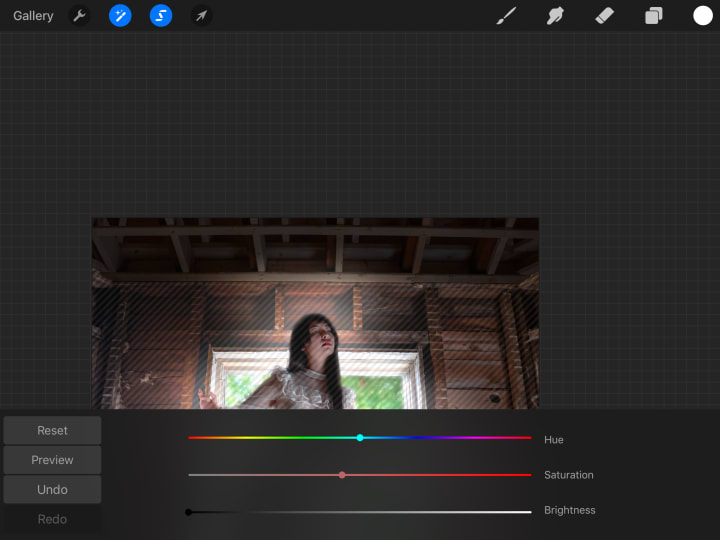
Procreate has a nice brightness algorithm that makes the ceiling look quite natural even though the brightness is turned all the way down. I’ll do the same thing to the floor and the far right panel on the wall.
Next, I’m going to pull out the trick I mentioned earlier with the layers to make the walls look more even, I’ll brighten the left side of the wall and darken the right side of the wall, then I’m going to reduce the saturation of the walls around the model until I’m satisfied.
HIDING THE UGLY TRUTH
The last step, though it could have been done at any time really, is to load the photo into Photoshop Fix and fix my face adjust facial details!! (Most people wouldn’t show you this step, but not me! I have no shame!!)
Now give me a second to pull out my pedestal. Ahem. While tempting, avoid using the liquify tool to distort your face/body - especially your face. It is extremely tempting to slim down your cheeks, adjust your jaw line, etc. The thing is, when you do this, you’re changing your bone structure. You’re changing your face in a way that anyone who knows you will instantly recognize. It will look unnatural. There’s more leeway when it comes to modifying your body. Now, I’m not going to tell you not to do it, but I’m firmly in the camp of “Real Bodies Are Beautiful” and “Photoshop In The Media Is Literally Killing People.” I don’t think it’s healthy to look at your face/body in a photo and want to change it. I also don’t think it’s good to Photoshop yourself and publish an unrealistic image of yourself that other people will see and judge themselves next to. That being said, I’m not going to tell you not to do it. I know first hand that sometimes it does help to have a picture of yourself that you can look at and love even if it’s edited. At the end of the day, it’s not us little people that are poisoning our collective self-esteem, it’s the mass media that’s setting unrealistic expectations of beauty. We can push back this trend by normalizing our supposed “imperfections” and showing our meager instagram followers that our bodies are normal and we love them the way they are.
Okay, let me put my pedestal away. Now I’m going to tell you how to edit your face/body without making it look unnatural [que hysterical laughter]. LOOK MAYBE IT’S WRONG, but you know I know you know that you still wanna know how to do it.
Here’s my secret - adjust the lighting. More specifically, play with highlights and shadows. Oh, you have a double chin in your photo? Well if I draw a shadow beneath your chin and blend it in real nice, NO ONE WILL KNOW. Shadows under your eyes? ERASE them with a soft, white brush (just like the glow we did above). Your eyes look great in this photo but the rest of your face is round like a full moon? CONTOUR. Take a soft brush and add shadows around your face following your natural facial structure. Make those cheekbones POP. It’s not YOU that’s the problem, it’s the LIGHTING. Watch a YouTube video of a makeup artist contouring their nose and apply those techniques to your photo. Hell, you forgot to wear eyeliner during the photoshoot, or you don’t like the color of your lipstick. Easy fixes in Photoshop. Just be careful to keep the shadows and highlights consistent with the rest of the photo.
Phew! I’m not here to judge you, I want you to be happy with the photos that you create. I don’t care if you delete a pimple or lighten the circles under your eyes. Now, do I want you to change your bone structure to be happy? NO! But a few adjustments to the shadows won’t hurt. If we could, we’d hire a professional lighting crew to follow us around all day to perfectly wash out the bags under our eyes while adding defining shadows to our cheekbones and jaw. Unfortunately, we’re lucky if we can get a buddy to hold her smartphone to shine down on us while we attempt to snap a decent selfie for Tinder (or whatever the kids are using these days).
Whatever. You’ve got your damn selfie and you just want to look good enough to make a decent match! NO PROBLEM. Load up Photoshop Fix (free!) and avoid the temptation of the liquify tool. Go to the “Light” tab. Use the brush to lighten up and soften the shadows and add shadows to contour where needed. In this case, I softened the shadows under the model’s eyes and around her mouth. I also added a little bit of a shadow under her jaw to give it a little more definition. Don’t go overboard, most of the time less is more. There’s also a healing tool which you can utilize to zap any unwanted pimples.
PROTIP: The lighten tool in Photoshop Fix has a tendency to desaturate while the darkening brush oversaturates. To compensate for this, there’s a “Color” tab that you can use to desaturate or resaturate any areas that need it.
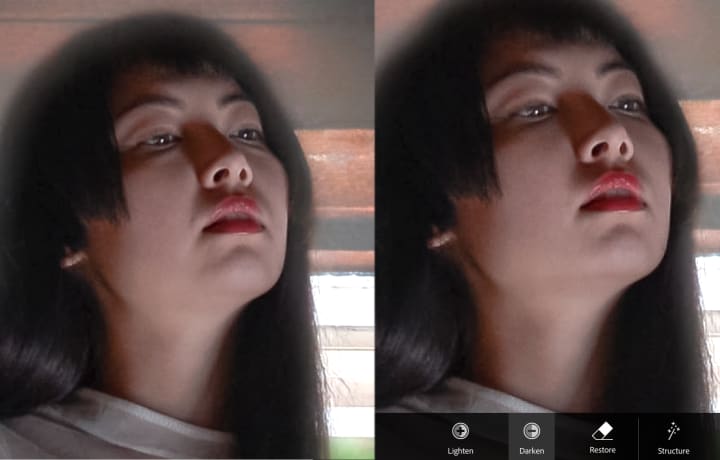
I made some pretty minor changes in the photo but it made quite a big difference!
At this point I’ve done pretty much every technical thing I needed to do with this photo. I cropped it, removed the bucket and fixed her leg, adjusted light and color, blurred the window, made her glow, made the background walls less distracting, and softened the shadows on her face. Wow!
REALIZE YOUR VISION THROUGH PLAY
I think I’m pretty much done. I’m quite happy with the photo. So now I have to ask, is this what I envisioned? Honestly, my concept for this photo was for the model to be a ghost haunting the house. In this photo she looks more like a fairy, which isn’t bad, just not what I was originally going for.
Now art is funny in the way that concepts can change as you make progress with your work. You might start with an idea that changes into something completely different by the time you’re done with it, and that’s great! That’s wonderful! That’s creation in action! But just for fun, I’m going to load this photo into Photoshop Express again and play around to see if there’s anywhere else I can take this picture.
Here’s my extremely technical method: Go through each adjustment tab and move the slider left and right until you find the setting that looks best.
Here’s what I did:
- Exposure: Slightly darker
- Contrast: Slightly lower
- Highlights: Slightly higher
- Shadows: Slightly lower
- Whites: Slightly higher
- Blacks: Slightly lower
- Temperature: Cooler
- Tint: Slightly more magenta
- Vibrance: Slightly higher
- Saturation: Slightly lower
- Clarity: Slightly higher
Overall, I made very minor adjustments except to temperature! Making the image just a bit cooler created a very dramatic change and made the picture much more moody. My final adjustment was with “Split Tone” (a paid feature in Photoshop Express but available in other free editing apps). Split Tone lets you assign a colored tint to the shadows and the highlights and adjust the balance between them. It’s a very fun tool to play with! I wanted the shadows to be more blue, but I wanted the highlights to stay mostly white so I didn’t assign a color to the highlights. You can achieve some very interesting effects by giving the shadows a cool color and the highlights a warm color, or vice-versa.
And there we have it! What a journey! I really hope you learned something from my convoluted and unconventional methods.
I will leave you all with a parting word of wisdom: do as much as you possibly can while the camera is in hand. The less you have to do in post, the better. A few extra minutes setting up lighting, or framing the composition, or taking background reference pictures, could save you hours of editing. At the end of the day, the edits we make aren’t real, and a trained eye can tell. Get your raw photo as close to your concept as possible to achieve the best results. Challenge yourself as a photographer! Yes, almost anything is possible with photoshop, but that doesn’t mean you should rely on editing to fix your lighting and composition. Rely on Photoshop for the effects you can’t achieve with your camera alone, and when it comes time to edit, keep an open mind to the possibilities!
About the Creator
Nia Tang
You’ll find my writing scattered across the internet (and other places...) Most of it is terribly embarrassing but will I stop? Never.
Keep reading
More stories from Nia Tang and writers in Photography and other communities.
My Year, in Prattling and Photos
It's been a year since... last year. Ironically, it seems I've found myself a new tradition of getting sick during the New Year holidays. At least, this year (that is, this inter-year period remarkable for its shiny decorations in the streets and houses, and closed supermarkets and pretty much everything), I'm doubtlessly doing better: I've managed to come visit my friends in Germany for Christmas (which I failed to do last year) and—after having some good quality time eating machanka, playing Munchkin and swinging machetes (the last one obviously crept into this checklist only for the sake of the phonological form)—I came back home via proverbial Deutche Bahn and probably less known Schweizerische Bundesbahnen, my body hosting a family of viruses, virions and who knows what other tiny critters somewhere inside my chest.
By Andrei Z.17 days ago in Photography
The People We Meet on Vacation: Moments, Connections, and Lasting Impressions
The People We Meet on Vacation: Moments, Connections, and Lasting Impressions Vacations are more than a break from daily routines. They are a unique social experience where people from different backgrounds cross paths in unexpected ways. The people we meet during a holiday often leave strong impressions, even if the interaction lasts only a few minutes. These encounters can shape memories, influence perspectives, and sometimes turn into lifelong friendships. Understanding who we meet on vacation helps explain why travel feels so meaningful to many people.
By America today 6 days ago in Photography


Comments
There are no comments for this story
Be the first to respond and start the conversation.