
Exploring the Best Colors That Go With Orange
Exploring the Best Colors That Go With Orange

Orange is that brilliant flaming color on the rainbow between the warmth of red and the brightness of yellow. It is related to enthusiasm, creativity, and energy, making it an attractive option for doing everything from graphic design to architectural interior design. But before creating beautiful and balanced pieces, learn about the right combinations of orange and other colors.
This article will cover everything about the orange color, its components to different shades, and complementary color pairings. Such knowledge will come in handy while leveraging the real-world benefits of how orange reacts with other colors to transform the ordinary in your creative work.
What is the Orange Color?
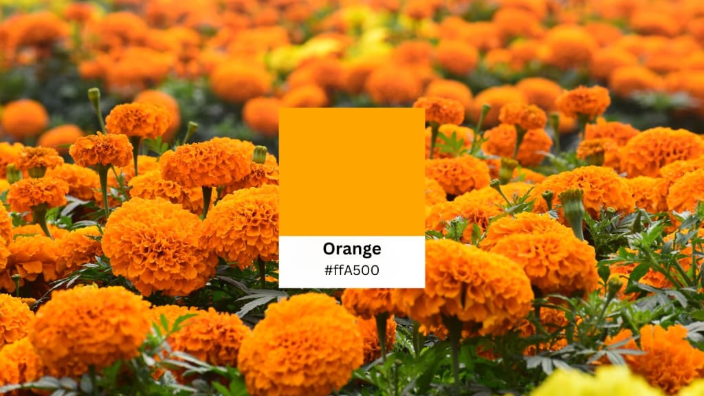
Orange is a vivid color formed by adding an equal measure of yellow to that of red: warm, vibrant, and alive. The hex code is #FFA500, and it represents warmth, excitement, and energy. It conjures thoughts of sunsets, tropical fruits, autumn leaves, and exciting summer days. Bright orange is a very noticeable color that is used commonly in warning symbols, safety equipment like life jackets, and even in astronaut suits made of plastic.
The characterization of yellow-red was used originally before the name "orange" was believed to have entered the English language around 1512. The plant's naturally orange fruit is where the name originates. In various cultures, orange has its meanings in one culture, the symbolic meaning is told as of spiritual and religious importance, while in another, it is just warmth, creativity, or merely an excitement factor.
Cut out faces in photos with PhotoCut’s Face Cutout Tool.
How is Orange Created?
Orange is a secondary color created by a perfect mixture of red and yellow; indeed a primary color compound. Adjusting the concentration of red and yellow could give rise to many different variations of orange. More yellow to red would create fresher, lighter tones, while more red gives an enriched and deeper one.
Orange can dramatically change different moods and can signify different styles of design. Some of the well-known shades are:
- Mustard Brown (#CC8400): This hue matches very well with the earthy tones of other neutrals.
- Philippine Gold (#B37400): An ocherous golden hue for most opulent designs.
- Gamboge Orange (#996300): A very deep brownish orange with an antique effect.
- Dark Bronze (#805300): An orange-toned color with a bronze-like finish.
- Violin Brown (#664200): A very dark, muted tone of orange and applies for a fantastic vintage style.
Similar Colors to Orange
Orange is a unique color and one which can have many variations. There are many hues akin to orange, such as:
- Bright Orange (#FF8B28): An intensely pure bold and bright orange color.
- Yellow Orange (#D56F00): A reddish-orange but a bit more yellow-hued.
- Burnt Orange (#BF5700): A darker, reddish-orange giving that rustic feel.
- Pastel Orange (#F17829): A very light orange with subdued energy.
- Rust Orange (#B7410E): Reddish brown with an undertone of orange that defines designs for fall perfectly.
- Neon Orange (#FF9E3D): A fluorescent orange used to capture eyes in design.
- Light Orange (#FBBF77): A pastel pale orange that has a more powerful relaxed and joyous mood.
- Jaffa Orange (#D86E39): Mainly found in red-orange colors of fruits and nature.
- Sky Orange (#F79802): A bright orange that carries more golden undertones.
What is the Complementary Color of Orange?
Blue is the complementary color of orange. Place one next to the other and watch how these colors made for brightness render each other brighter. This makes the combination especially great in designs that need to be noticed, making warm orange and cool blue very nice to look at together.
When used in tandem, however, they can be construed as having too much contrast. This can be remedied by splitting them into complementary colors, where orange is worn with a muted blue-green or bluish-violet hue. Such a combination creates a softer contrast to the obvious intensity of orange.
Create unique album covers with PhotoCut’s AI Album Cover Generator.
Colors That Go Well With Orange
While orange is a bold color on its own, it can also work beautifully in combination with a variety of other hues. Here are eight great color pairings with orange:
1. Orange + Blue
As mentioned earlier, blue is the complementary color to orange. It creates an extravagant and high-voltage duel. The coolness of blue brings the warm orange alive and makes both stand out. Combine bright orange and dark navy for a rich contrast, or with lighter blues like turquoise for an easy-going beach charm.
2. Orange + Purple
On the color wheel, orange and purple lie next to each other, and both are warm fiery colors. While orange and purple may not be a classic match, they sure complement each other. The vivacious orange tone pairs flawlessly with the richest mix of purple since this hue puts on an air of royalty. This combination especially works for creative and artistic projects.
3. Burnt Orange + Cream
Burnt orange is a deep and earthy hue whose warm, friendly ambiance in-house paired with cream creates an interesting setting. The creamy softness vouches against the outré character of burnt orange, making the pairing apt for interior decoration, autumn-themed parties, or vintage graphics.
4. Orange + Gray
Gray gives a neutral tone and richness in design. The orange-in-gray paired effect could mute that gusto but retain focus on the orange itself. The outcome is a modern, highly professional look that would suit an office, a website, or a logo perfectly.
5. Orange + Pink
Because this color set is naturally found, it gives one a very simple inspiration for outdoor fun. Orange with pink will always seem to be available there as science happens, the sunsets on fire, the tropical flowers bursting into bloom. This is a fine pairing-hearty and boisterous for anything needing a little cheer or energy. Orange and pink, what a color combination for summer events or dramatic fashion statements.
6. Orange + Black
The bright orange glaringly raises the shade of dark black, producing sight-stirring visuals. Hence, the effectiveness of association is mostly for logos, posters, and product packaging. The most notable applications of this combination are in Halloween designs and also in bold, high-contrast projects.
7. Orange + Chartreuse + Ferrari Red
One can mix orange using chartreuse and Ferrari red for a dissimilar and daring appearance. These analogous colors blend harmoniously together but still retain an adequate contrast to maintain the design dynamically. This color scheme is particularly useful for creative, energetic designs.
8. Orange + Sky Blue + Electric Ultramarine
This split-complementary color scheme combines orange with sky blue and electric ultramarine. This is a lively, breezy, and much-in-demand combination of web and graphic designs. This warm accent is orange that the eye is naturally drawn to, amid two contrasting blue shades that add depth and harmony to the overall design.
How to Create Stunning Graphic Designs with Orange
When it comes to adding orange to your graphic design, the palette generator of PhotoCut is a great place to play with color combinations. Here is how you can do it:
- You can upload your picture onto the PhotoCut platform.
- Click on the element whose color you want to change by selecting a different hue from the color menu.
- Play with various colors and combinations until you find your favorites.
- Download your design with the new colors when it meets your expectations.
Read about the Scarlet Color and how to use it in designs.
Conclusion
Orange is an energetic color that brings vigor, innovation, and warmth to any design. Explaining the characteristics of this color and its good combinations with others will allow you to create spectacular graphics in all areas including graphic design, home decor, fashion, and much more. The possibilities are endless, which means classic complementary orange + blue to bold mixes of orange pink, purple, and black. So, do not hesitate and try experimenting with it, discovering new ways of introducing orange into your projects.
Explore the simplest ways to add multiple photos to your Instagram story.
FAQs
Q1. What colors go best with orange?
Ans. Orange goes well with blue (its complementary color), purple, gray, cream, pink, and black. Orange can also be paired with colors in the same family, such as chartreuse and red, for a bright, cohesive effect.
Q2. Can I use orange in professional designs?
Ans. Yes! Orange can work, especially when paired with other neutrals, like cream or gray. It is perfect for modern marketing materials, website designs, and logos that need to stand out without being obnoxious.
Q3. The best shade of orange for a calming atmosphere?
Ans. For a cozy, soothing effect, a gentler orange tone, like sky orange or pastel orange, would work. These softer shades provide warmth and an easy-going environment without anything too garish.
Q4. How do I create a balanced design using orange?
Ans. Orange may be used to create a balanced design by reducing its intensity with reduced or neutral hues. Orange and white or gray, for instance, can be used to produce a classy and well-balanced design.
Q5. Is orange a good brand color?
Ans. Yes! Orange is a great color for branding, especially for companies looking to elicit feelings of energy, creativity, and warmth. It works great for the entertainment, food, tech, and travel industries.
About the Creator
PhotoCut
AI Photo Editing Tool - Remove or Change your Background & Enhance Product Photos
Keep reading
More stories from PhotoCut and writers in Photography and other communities.
Everything You Need to Know About Discord Profile Pictures
Discord is an online platform for chatting via text, voice, and video, connecting people with a big community of gamers, creators, companies, and fans. For every community, your profile picture or Discord avatar is an important aspect of your online identity. It's a visual representation of who you are in the community. If you're new or simply updating your profile picture, everything between creating one and managing it is in this guide on your Discord avatar.
By PhotoCutabout a year ago in Photography
Gold Chrysotype Photography Is Back and the Colours Are Breathtaking
There is a moment when a chrysotype print is lifted from its chemical bath and held up to the light stops people mid-breath. The colours that bloom across the surface — soft dusty pinks fading into deep magenta, rich cyans pooling at the edges, velvety blacks settling into the grain of the paper — look less like a photograph and more like something pulled from a dream.
By CurlsAndCommas4 days ago in Photography


Comments
There are no comments for this story
Be the first to respond and start the conversation.