
Everything You Should Know About the Color Violet
Everything You Should Know About the Color Violet

One of the most distinctive and fascinating purple hues is violet, which can be utilized to add a hint of mystery and elegance to a variety of designs. Though far more vivid than indigo, it is not as gaudy as the lighter purples. We've covered all you need to know about violet in this article, including its definition, significance, and artistic applications.
What is Violet?
Violet is one of those colors that's commonly associated with mystery and luxury and, generally, an unknown depth. Violet is one color between blue and ultraviolet on the spectrum of visible light. Violet does not mean a blend of blue and red. Instead, violet is a completely independent color from a different angle with its background. It occurs at the other end of the visible spectrum range that is more easily detectable for human eyes, but shorter.
In other words, violet is an extremely saturated color, being almost blue-purple. Thus, it's quite bold but calming at the same time. For that reason, people use this color to create designs, which seem to be mysterious or elegant.
A derivative name from the deep, rich color known as the color of the purple flower violet; the name speaks of a quality that can only be beautiful when delicate and in an interesting way.
What Color is Violet?
In optics, violet is known as a spectral color. It is created by a single wavelength of light. Although violet closely resembles purple, it is a distinct entity because purple is the product of red and blue light combined while violet is the wavelength of pure light at the visible spectrum end.
The violet color usually consists of red and blue light with more emphasis on blue. It is sometimes used synonymously with purple in common tongue but the two colors differ in a little composition.
Remove unwanted objects from your photos using PhotoCut’s AI object remover.
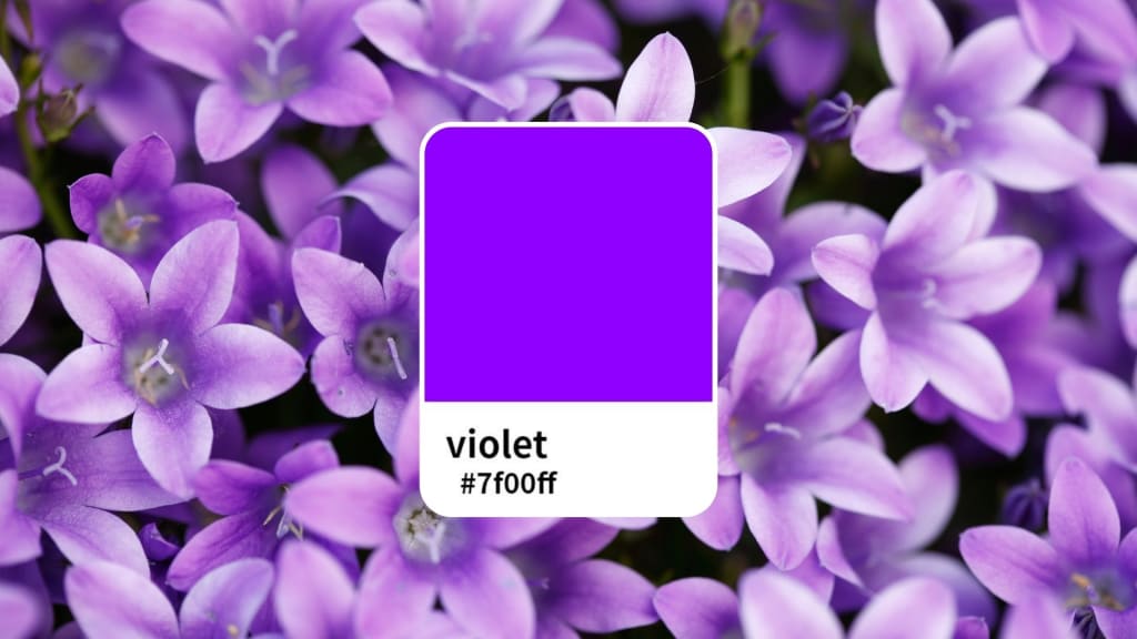
Violet Color Code
If you’re designing and need the exact color code for violet, it is identified with the hex code #7F00FF. This is the precise color used in many graphic design projects. Violet is composed of 127 red, 0 green, and 255 blue in the RGB model. This gives it 33% red, 0% green, and 67% blue.
For the violet color model, for the printers, and the physical medium, the CMYK color model is applied. The value for violet CMYK is given by C: 50, M: 100, Y: 0, and K: 0. This will represent that it employs 50% cyan and 100% magenta in conjunction with 0% yellow and 0% black ink.
Violet on the HSV/HSB scale ranges from 270° with 100% saturation and 100% brightness. These values give violet its deep, full color.
Violet Color vs Indigo Color
Violet is sometimes considered the same color as indigo, though both are colors. If violet is assigned the hex code #7F00FF, indigo has a hex code of #4B0082. In history, this is the color associated with the dye derived from the Indigofera tinctoria plant.
Indigo is a more mellow color, much dully and darker, whereas violet is so much more colorful and bright and light. Violet is located in between indigo and blue but appears more like a blue color very often.
The last color in the visible spectrum is violet and is very vibrant and obvious, being much brighter and more luminous than indigo, which is dark, colorless, and flat.
Learn two easy ways to change your photo backgrounds to white.
How to Make Violet?
If you want to make the color violet, there is nothing especially difficult about how to do it because violet is an unmixed, pure color made by mixing the colors blue and red in the proper ratio.
A good violet pigment should not include yellow or green.
The combination of red with blue will show whether your violet is warm, cool, warm, or cooler.
- The more red you add, the warmer and reddish your violet will be.
- The more blue you add, the cooler and bluish the violet will become.
- If it is either too bright or too dark to your preference, you simply add some white to the blend to lighten the hue.
In a few color mixes of red, blue, and white, dozens of colors can be realized. Some violet shades will take a little experimenting to get it just right, but once you have patience, you can get it perfectly.
What Color Goes With Violet?
Violet is versatile and can be applied with a mix of various other colors. Below are a few color schemes that incorporate well with violet:
Violet and French White
French white is a warm-toned version of white, and it is a great complement to violet. The combination of violet and French white creates a sense of calm and coziness. The warm undertones of French white balance out the cool, mysterious feel of violet, making it a wonderful pairing for designs that aim to create a peaceful and inviting atmosphere.
When designing with violet and French white, you can achieve a soft, tranquil, and slightly mysterious look. This pairing works well for both modern and traditional designs.
Change your image colors easily using PhotoCut’s color changer.
Violet and Orange
Violet with orange seems to be an odd combination but work perfectly together. These are colours, orange, and violet that are opposite one another on the color wheel and thus make artistic combinations with vibrant, energetic contrasts.
The cool, reserved tone of violet is nicely offset by the warm, vibrant tone of orange. This combination is often used to make a statement or grab attention. Whether in home décor or digital designs, using violet and orange together will add vibrancy and excitement.
Spiritual Symbolic Meaning of Violet
Violet is also beautiful but symbolic, representing something, other than aesthetics, to numerous cultures. More often, the color symbolizes spirituality, serenity, or peace.
Fulfillment and Peace
Violet has a calming quality. It's a color that can help soothe the mind and bring one into a more peaceful and balanced state. It is said to be very meditative, thus allowing one to relax and focus on his or her center. That's why violet is used in locations where peace and calm are called for, like in meditation rooms or designs aimed at creating a more relaxed atmosphere.
Mysterious and Deep
The color violet represents mystery. As a color that has been associated with the unknown for so long, it is very often used to create designs wanting to evoke a mystery. Violet beckons people, making them want to dig deeper to understand what this color is. It is quite perfect for making mysterious or even enigmatic images.
Create your own VTuber characters using PhotoCut’s AI VTuber Maker.
Wealth and Luxury
Violet has been associated with wealth, luxury, and power throughout history. This is probably because purple dyes were rare and expensive in the past, so purple clothes signified high social status. To this day, violet is still a color of royalty, luxury, and prosperity.
Spiritual Reflection
As it contains qualities that calm the brain of most thinkers, numerous philosophers and scientists are drawn to violet. Usually, such color aids human beings to induce a state for meditation purposes by focusing inward for thoughts or any other human act. It is seen as a color that can promote deep thinking and self-reflection.
How to Make Designs with Violet Color?
If you are working on a design and want to incorporate violet, PhotoCut’s color generator can be a helpful tool. Here’s how you can easily access the violet color and use it in your design:
- First, go to the PhotoCut website to get started with your design.
- Once you’re editing your design, look for the color palette in the editing area.
- You’ll see a color option in the top toolbar. Click on this box to open the color selection tool.
- In the color palette, there’s an option to enter the hex code. Type in the hex code for violet (#7F00FF) to get the exact shade of violet you want.
- Once you’ve selected violet, you can apply it to your design and make adjustments as needed.
Using PhotoCut’s color generator makes it easy to access and use violet and other colors in your designs. You can also experiment with different color combinations to create striking and beautiful artwork.
Conclusion
Violet is an exquisite color and can give the impression of depth, mystery, and elegance to your designs. It's also a color that is linked to spirituality, peace, and luxury. If you're going to evoke the feeling of being in a quiet atmosphere, to have bold contrasts, or to represent something that represents money and royalty, violet will be one of the excellent colors for your designs.
By knowing the concept of the color violet, its meaning, and how to form and combine them with other colors, they can use creativity in their pieces of art in designing graphics, painting, decorating rooms, or completing a new design. Violet has something special inside it that makes new creations.
FAQs
Q1. Is violet the same as purple?
Ans. Violet and purple are not the same thing. Violet is a blue-end hue created from a single wavelength of light, whereas purple is a combination of red and blue.
Q2. Is violet a warm or cool color?
Ans. Cool hues include violet. It tends to have a relaxing, calming effect and is closer to blue on the color wheel.
About the Creator
PhotoCut
AI Photo Editing Tool - Remove or Change your Background & Enhance Product Photos
Keep reading
More stories from PhotoCut and writers in Photography and other communities.
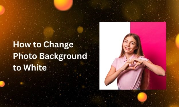
Two Easy Ways to Change a Photo Background to White for Beginners
A clean, white background can look very professional with your photos. Be you doing product photography, portrait shots, or posting on social media, a white backdrop just keeps your focus on what matters and truly makes your subject stand out. You've come to the correct spot if you've ever wondered how to acquire a simple white backdrop for your pictures without breaking the bank. In this article, we'll discuss two easy methods for turning a photo's backdrop white. We'll show you how to accomplish it with Photoshop and free internet tools, regardless of your level of experience or need for a fast fix.
By PhotoCut12 months ago in Photography
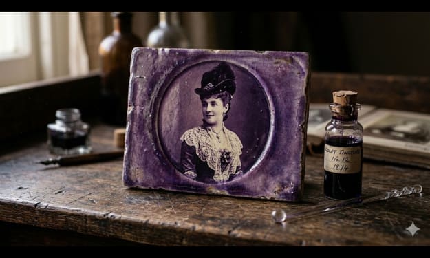
Gold Chrysotype Photography Is Back and the Colours Are Breathtaking
There is a moment when a chrysotype print is lifted from its chemical bath and held up to the light stops people mid-breath. The colours that bloom across the surface — soft dusty pinks fading into deep magenta, rich cyans pooling at the edges, velvety blacks settling into the grain of the paper — look less like a photograph and more like something pulled from a dream.
By CurlsAndCommas4 days ago in Photography


Comments
There are no comments for this story
Be the first to respond and start the conversation.