Choose the Best Backgrounds for Headshots
Expert Tips for Professional Results
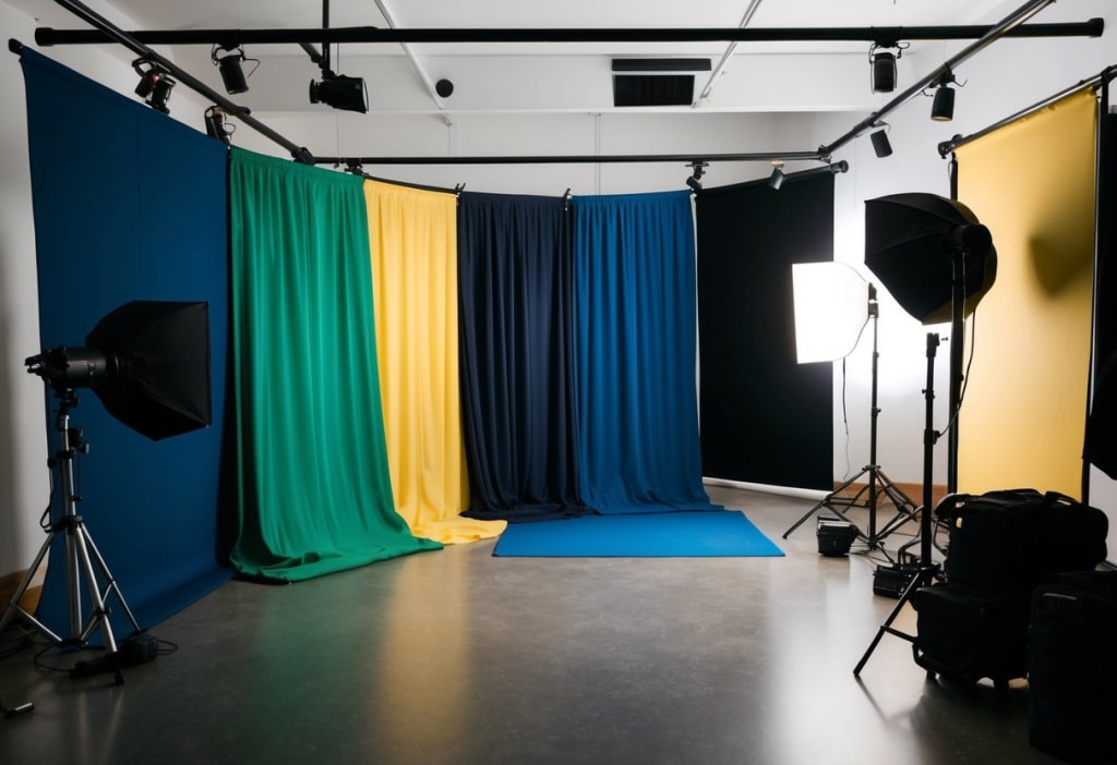
Choosing the right background for headshots can make all the difference in creating a memorable and professional image. When I'm selecting a background, I consider whether it complements the subject and enhances their features without causing distraction. A light gray or white background is often the best choice because it keeps the photo clean and puts the focus entirely on the person.
I know that there's no one-size-fits-all solution, though, and that's why experimenting with different backgrounds can be essential. Natural elements or cityscapes, when used correctly, can add depth and personality to a headshot. It's crucial that the chosen background aligns with the intended message of the photo.
By understanding the technical elements like lighting and depth of field, I can ensure that the headshot stands out. The key is in matching the background to the person and what they represent. In this way, every headshot tells its own unique story.
Key Takeaways
- White or light gray backgrounds highlight the subject.
- Natural and urban settings can add personality.
- Align the background with the subject’s message.
- Importance of Choosing the Right Background
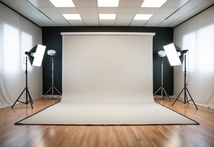
Importance of Choosing the Right Background
Choosing the right background for a headshot can greatly affect how the photo is perceived. It isn't just about aesthetics; the background influences viewer impressions, interacts with the subject, and aligns with personal or brand image.
Impact on Viewer Perception
The background in a headshot can shape how a viewer perceives the subject. Different colors and textures have unique effects. For instance, a simple white or light gray background, as explained by Path, minimizes distractions. This directs focus onto the person in the photo. An interesting or visually appealing background can make the image more engaging. By choosing backgrounds wisely, I can guide the viewer’s focus and help create a specific mood or feel for the headshot. Bright colors can convey energy, while darker tones might suggest seriousness.
Interaction With Subject
A background should complement and not overshadow the subject. This involves balancing the elements in the photo. For instance, a busy background might clash with intricate clothing or hairstyles. In contrast, a neutral background, such as those suggested by Capturely, allows more freedom in these choices, ensuring the subject stands out. If the background is too detailed or colorful, it might distract viewers from the main focus of the headshot. The right balance can create a visually pleasing image and ensure the subject remains at the forefront.
Consistency With Personal or Brand Image
Consistency is key when using headshots for professional purposes. The background should reflect the individual’s personal style or the brand’s image. For instance, a tech company might prefer a sleek, modern background, while an artist could choose something more creative. Using environments like offices or cityscapes, mentioned in the Shotkit guide, enriches the context of the photo, hinting at the subject’s profession or interests. I find that maintaining this consistency helps convey a clear and coherent message, building trust and recognition with the viewer.
Technical Considerations for Background Selection
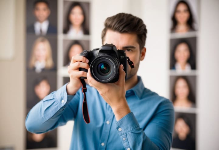
When choosing a background for headshots, it's essential to think about how lighting, color, and focus will interact. These elements can affect how a photograph looks and feels, impacting the final visual impression. By understanding the technical aspects, I can ensure my headshots are professional and engaging.
Lighting and Shadows
Lighting plays a critical role in photography. When I choose a background, I must think about how light interacts with it. Natural light can create soft shadows, while artificial light gives me more control. Shadows can add depth, but harsh shadows might distract from the subject.
Key Considerations:
- Natural vs. Artificial Lighting: Natural light is softer, while artificial light gives me consistency.
- Direction of Light: I watch how light hits the background to avoid unwanted shadows.
- Reflective Surfaces: Backgrounds like metal or glass need careful lighting to prevent glare.
With these points in mind, I make sure the lighting highlights my subject, not the background.
Color Theory and Backgrounds
Color in a background can majorly influence how the image is perceived. I choose colors that work well with my subject's look or the purpose of the photo. For example, a white or light gray background is neutral and often keeps the focus on the person being photographed.
Color Choices:
- Neutral Colors: White or gray offers a clean and formal appearance.
- Bold Colors: Bright colors work if I want a dynamic look, ensuring they don’t overpower the subject.
- Color Harmony: Choosing colors that complement the subject’s clothing or skin tone is key.
By considering these factors, I create a harmonious and tasteful image.
Depth of Field and Focus
Depth of field affects how much of the background is in focus. A shallow depth of field can blur the background, making the subject stand out more. I decide on the depth of field based on the background's texture and detail.
Factors to Consider:
- Aperture Settings: A wider aperture gives a blurred background, perfect for isolating the subject.
- Camera Distance: Adjusting my distance from the subject changes the background’s appearance.
- Background Detail: If the background is detailed, I may blur it intentionally.
By controlling focus and depth of field, I ensure the viewer's attention stays on the subject while the background enhances the shot.

Background Types and Their Applications
When selecting a background for headshots, different environments can highlight various aspects of a subject's personality or profession. Each background type offers its own unique benefits and suits different needs, from bringing out professional qualities to adding a creative touch to a photo.
Solid Color Backgrounds
Solid color backgrounds are a classic choice for headshots. They create a clean and professional look, focusing attention entirely on the subject. White or light gray backgrounds are popular because they minimize distractions and ensure that the person is the star of the photo. These backgrounds are particularly useful when you aim for a formal style.
Colors can subtly affect perception. Blue might evoke trustworthiness, while red can convey energy. In portraits for creative fields, I might choose bold hues to make a statement. Solid backgrounds are also an excellent option for easily editing in post-processing, as they offer a clean slate for digital enhancements.
Natural Settings
Opting for natural settings can add warmth and authenticity to headshots. Trees, gardens, or any outdoor backdrop provide a relaxed vibe. These shots are perfect for people in creative or freelance industries who want to express a more approachable, casual persona. An element like a sunset or a blooming garden can add mood to the portrait.
Natural settings also provide the opportunity to use bokeh effects, where the background is blurred to highlight the subject. It's important to choose a location where the natural scenery complements rather than distracts from the person. Balancing these elements can create headshots that feel both personal and professional.
Office or Corporate Environments
Choosing an office or corporate setting for headshots is ideal for those in business or formal professions. These backgrounds communicate expertise and reliability, sending a strong message to potential employers or clients. Capturing elements of the workspace, like a desk or a conference room, provides context that reinforces your professional image.
A modern office with clean lines and minimal distractions can work well. Including subtle corporate branding elements can also boost personal branding efforts. This setting is particularly fitting for profession-specific headshots where showing one's work environment reflects their career focus. Office settings are a dependable choice for projecting authority and competence through a headshot.
Frequently Asked Questions
When choosing a background for headshots, there are specific considerations like color, setting, and editing techniques that can make a big difference. Each situation, from professional to outdoor, requires unique strategies for the best results.
How should I select a background color for my headshot?
I consider the industry and personal branding when selecting a background color. For instance, white or light gray is often used because it minimizes distractions and keeps the focus on the subject. Black can offer a formal look without competing for attention.
What are the optimal background settings for professional headshots?
For professional headshots, settings like clean and neutral backgrounds work best. Black or dark shades are popular for creating a polished image. These choices help maintain focus on the subject, ensuring a sharp and clear photo.
Which backgrounds are ideal for outdoor headshots?
Outdoor headshots benefit from natural settings. Simple backgrounds such as parks or gardens work well. Shooting with city lights at night can create an urban effect with bokeh, adding a stylish twist.
Can virtual backgrounds be effectively used for professional headshots?
Yes, virtual backgrounds can work if done right. I recommend using technology that allows you to remove and replace the background smoothly. AI tools can offer unique designs, though simplicity often works best for a professional look.
What are the best practices for editing a headshot background?
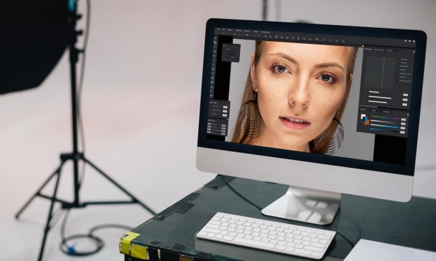
When editing, I find it helpful to use tools that allow precise background removal and replacement. It's crucial to maintain natural lighting and shading to avoid a fake appearance. Tools are available that make it easy to fine-tune the color and texture of the background.
Are there specific backgrounds recommended for acting headshots?
For acting headshots, I prefer backgrounds that match the type of role sought. Neutral colors, particularly those not drawing attention, are preferred. Varied textures can add depth, and these shots often stick with a classic look.
About the Creator
Biju
I am a graphic designer with 10+ years of experience, specializing in creating clean and captivating product photos for e-commerce websites.
Reader insights
Good effort
You have potential. Keep practicing and don’t give up!
Top insight
Expert insights and opinions
Arguments were carefully researched and presented




Comments
There are no comments for this story
Be the first to respond and start the conversation.