
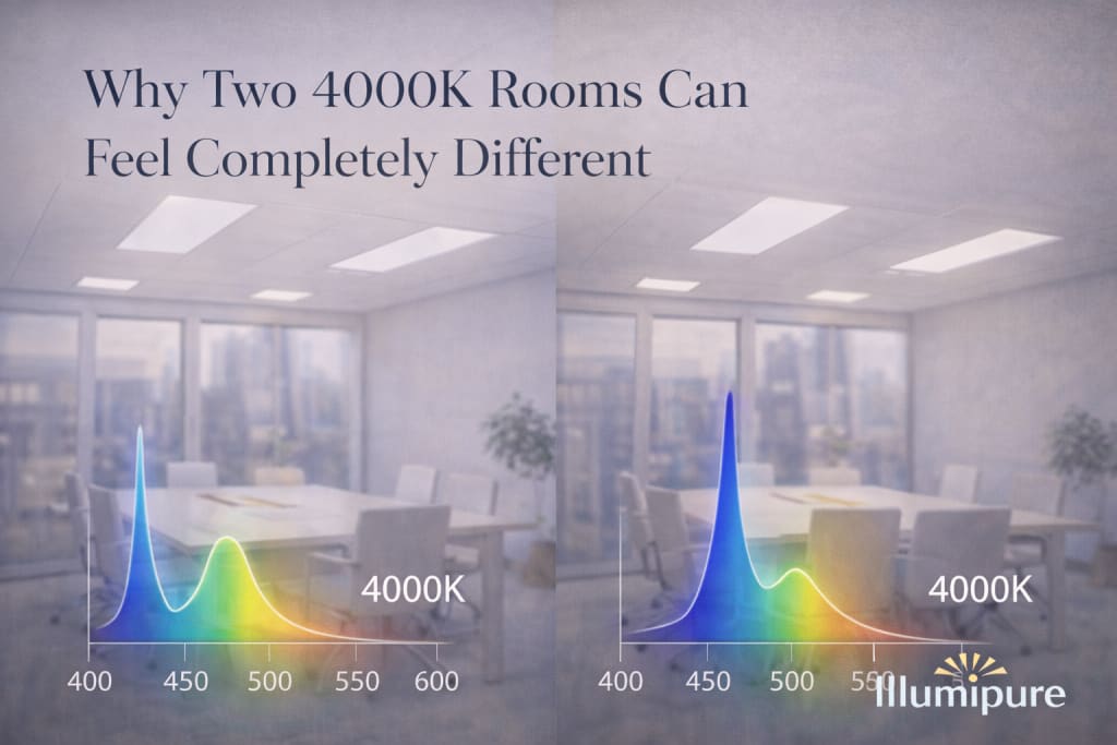
Why Two 4000K Rooms Can Feel Completely Different
On paper, they are identical.

Why Two 4000K Rooms Can Feel Completely Different
On paper, they are the same.
Both rooms are labeled 4000K.
Both meet lighting standards.
Both use modern LED fixtures.
Both appear clean, neutral, and professionally illuminated.
And yet, when you spend time in them, something feels different.
In one room, your eyes relax. You feel focused without strain. The space feels steady.
In the other, you feel slightly on edge. The light seems sharper. Your eyes tire faster. You may not consciously notice why, but by the end of the day, you feel it.
If the color temperature is identical, how can the experience be so different?
Because 4000K describes appearance — not biology.
And appearance is only the surface of the story.
What 4000K Actually Tells You
Correlated Color Temperature (CCT) is a visual metric.
It measures how warm or cool a light appears when compared to an idealized blackbody radiator. Lower numbers (2700K–3000K) feel warm and amber. Higher numbers (5000K+) feel cool and daylight-like.
4000K sits in the middle — neutral white.
It has become a standard in offices, healthcare environments, schools, and commercial buildings because it balances brightness and clarity.
But CCT does not describe how energy is distributed across wavelengths.
It does not tell you how much energy sits at 450 nanometers versus 405 nanometers.
It does not tell you how sharp or balanced the spectrum is.
It does not tell you how your retina will respond.
For that, you need something deeper.
The Spectrum Beneath the White
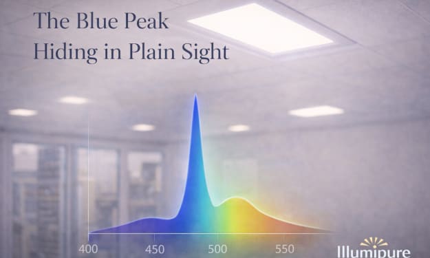
Every light source has a Spectral Power Distribution (SPD).
Think of it as the fingerprint of the light. It shows how much power is emitted at every wavelength across the visible spectrum.
Two fixtures can both read 4000K on a specification sheet.
Yet one may contain a strong, narrow 450nm blue spike — common in traditional phosphor-coated LEDs.
The other may shift energy toward 405nm violet and distribute energy more evenly across green and red wavelengths.
Visually, they look nearly identical.
Biologically, they are not.
The difference lies in where energy is concentrated.
And the human eye is remarkably sensitive to that concentration.
Why the Eye Notices What the Label Does Not
Short-wavelength light — particularly in the 440–455nm range — behaves differently inside the eye.
It scatters more than longer wavelengths.
It penetrates deeper into retinal tissue.
It interacts strongly with melanopsin-containing retinal ganglion cells — the cells involved in regulating circadian rhythm and alertness.
When a room contains a pronounced 450nm spike, the visual system works harder to process incoming light. Not consciously — but physiologically.
The results may include:
• Increased perceived glare
• Faster visual fatigue
• Slightly elevated mental stimulation
• Difficulty fully relaxing in the space
The room still meets code.
It still looks white.
But the biological load is subtly different.
Why One Room Feels Sharper
You may describe one 4000K room as “crisp.”
That crispness often comes from higher short-wavelength concentration.
Edges appear sharper. Contrast feels higher. Details seem more defined.
But sharpness is not the same as comfort.
Over hours of exposure, that same sharpness can translate into:
Dryness
Eye strain
Low-grade headaches
A sense of being alert but not fully at ease
Meanwhile, another 4000K room with a more balanced spectral profile may feel softer without appearing dim.
You feel focused — but not stimulated.
Clear — but not tense.
The difference is not brightness.
It is distribution.
The Circadian Layer
There is another dimension to this experience.
Blue wavelengths — especially around 450nm — signal wakefulness. They suppress melatonin production and reinforce daytime alertness.
In morning hours, this signal can be beneficial.
But if a space uses strong blue-emphasized lighting throughout the entire day — and into evening — the biological signal becomes prolonged.
The brain does not easily distinguish between natural sunlight and artificial spectral spikes.
Two rooms with the same 4000K label may send very different circadian signals depending on how much energy is concentrated in that region.
That difference can influence how you feel later — even outside the room.
Why This Matters Now
Modern indoor life has amplified exposure.
We spend nearly 90% of our time indoors.
We work under ceiling light for hours.
We look at screens that also emit strong blue peaks.
The cumulative effect matters.
Lighting was once designed primarily for efficiency — maximizing lumens per watt.
But efficiency does not guarantee biological alignment.
Two 4000K rooms can meet identical energy codes and look visually similar, yet produce different physiological responses.
And once you notice that difference, you cannot unsee it.
The New Question
Perhaps the future of lighting is not just about asking:
“What color temperature is this?”
But instead:
“How is that white built?”
What wavelengths dominate?
How sharp is the spectral spike?
Is energy evenly distributed or concentrated?
Does the light support the human visual and circadian system over long exposure?
Because in the end, the experience of a room is not defined by its label.
It is defined by how your body responds within it.
And sometimes, two rooms that appear identical
are telling your biology two completely different stories.
About the Creator
illumipure
Sharing insights on indoor air quality, sustainable lighting, and healthier built environments. Here to help people understand the science behind cleaner indoor spaces.
Keep reading
More stories from illumipure and writers in Journal and other communities.
Doctor of Medicine and Surgery (MD) Program with Clinical and Advanced Practice
The landscape of healthcare education is undergoing a fundamental shift. In decades past, the journey of a medical student was largely confined to lecture halls and libraries, with practical experience often coming late in the academic cycle. However, the complexity of modern medicine and the increasing globalization of healthcare systems have demanded a more integrated approach. Today, the most effective educational models are those that fuse rigorous clinical sciences with immediate, practical training, creating a seamless transition from the classroom to the clinic.
By Muhammad Owais SEO4 days ago in Journal


Comments
There are no comments for this story
Be the first to respond and start the conversation.