
Story Telling with Data: Using Data Visualization Tools for Storytelling
Data storytelling aims to explain complex information straightforwardly. Data is represented via data visualizations, which are often graphs or charts.
Data storytelling is developing a narrative using your gathered data and analytics to support the story's premise. You present a coherent narrative that offers a concluding message and a course of action, much like when you tell a story to someone else orally.
When asked which of the nine roles most closely matched their profession, respondents who selected Employee or Freelance were asked whether data visualization was the main emphasis of their work, a significant side component, or neither. From 30% in 2020 to 34% in 2021 and 35% in 2022, the percentage of responders who say data visualization is their primary emphasis has somewhat increased.
The skills needed to transition to this strategic advisor role differ from those generally learned in traditional accounting education. To exploit the digital transformation of business, finance, and accounting, professionals need to be able to explore new ways to manage, analyze, and extract value from data, to apply analytical and critical thinking abilities to deal with strategic problems, and, particularly, to be able to articulate the "narrative" in the facts successfully.
Having such data visualization skills enables management accountants to tell the stories needed to propel business growth, transform product and service offerings, and ensure the supported organizations are sustained over the long term.
Importance of Data Story Telling
Data visualization and narrative are crucial components of the insurance industry. However, using the right data to persuade your audience and potential customers is more important than using numbers to tell a story. This will help you build a connection and commitment with them.
Tales are effective because they draw listeners, arouse feelings, and spur action. Data storytelling can achieve all three goals by presenting information in a narrative style, which makes it simpler for people to understand and relate to.
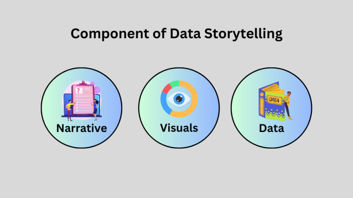
Data storytelling aims to explain complex information straightforwardly. Data is represented via data visualizations, which are often graphs or charts. They assist people in spotting patterns and trends in data that they might not otherwise be able to notice.
To understand data, data storytelling tells a tale that motivates action. Data storytelling emphasizes the narrative more than typical data visualization does on presentation and giving an overview. For the story's significance, it delves further into it and tells a specific story that can be illustrated with charts and graphs.
In addition to using images to convey tales about data, data visualization also does so, but it does so using ideas and approaches that are distinct from those of data storytelling. The two approaches can be combined for a more effective and immersive experience.
Different Use Cases Showing Storytelling with New Capabilities
What developments in data visualization and how businesses interact with their internal and external audiences should they watch, and where? You can find first-hand information, updates, and highly regarded data visualization consulting services by taking real-time data visualization, AI, and Machine learning (ML) data. In the meantime, here are the top three trends that our analysis revealed:
• Video Infographics, Video Ads, and Video Visualization - One study found that video helped people retain information better. In this study, around 67% of participants preferred watching a video to reading or looking at photos to learn about something.
• Visualization in Real-time - Static charts are gradually becoming obsolete since real-time visualization allows businesses to identify issues with brand presence, client retention, and company strategy early. Real-time Data Visualization relies on two primary components:
• Storytelling with Mobile and Social Data Visualization - Given the expanding number of individuals using mobile devices to access the Internet, it is obvious that enterprises are becoming increasingly interested in this form of data visualization services. It can be used, for instance, to increase consumer attraction and retention.
• Businesses employ data storytelling to summarize annual reports, investment pitches, sustainability and impact reports, awareness campaigns, infographic content, and other marketing materials. It allows them to stand out and engage us with brand storytelling.
• Newspapers and other media outlets commonly utilize data storytelling to augment live TV broadcasts or tell stories that aren't feasible for print. Data storytelling allows for the more creative presentation of data and numbers.
• Data storytelling forces information in front of us, emphasizing its significance and causing us to stop, think about it, and recognize its relevance rather than hastily scrolling by, whether web journalism, sales, or marketing content.
• Today's insurance sector is complicated, with many products, rates, and hazards. Businesses in the sector must be able to make data-driven decisions that are in the best interests of shareholders because consumers' preferences and needs fluctuate.
• An insurance firm's main responsibility is maximizing profits for its clients by offering appropriate and reasonable coverage. Yet, a company's ability to assess risk and offer each customer the right coverage directly affects how much money it makes. Business owners may achieve this with a comprehensive data visualization solution powered by AI and machine learning techniques, enabling them to base their decisions on client information, risks, and claims. This prevents businesses from over- or under-insuring themselves,
Practical Examples Showcasing the Usability of Storytelling
UNODC Organisation - A global health problem has resulted from the overuse of synthetic medicines like painkillers and methamphetamine. The United Nations Office created this awareness page on Drugs and Crime (UNODC) to demonstrate its global impact.
This Vev-created interactive page is rife with data storytelling. A world map is just a few lines from the home page. As you scroll down, you'll see detail after detail concerning drug production and usage that links to the nations involved. By the end of this page, the entire map is dot-dotted with this information, driving home the point that this problem affects the entire world.
Chit Chat Collections is arguably one of the most entertaining collections of data visualization services that we've seen. The entire purpose of this website is to highlight the creative ways that data can be made to come to life, from science to gastronomy.
Spotify uses listening patterns- Users are always impressed by Spotify's data-driven storytelling. We receive the Spotify Wrapped at the end of the year, which uses information about our listening patterns to create an engaging audio and visual experience. They put much effort into building relationships with their listeners while demonstrating their concern for their artists. This 2022 Fan Study informs artists how listeners' behaviors and engagements can impact their fan base and the frequency with which their music is streamed.
The majority of us take the items we use daily for granted. But everything that is produced generates invisible waste. This complex tool-built data storytelling example illustrates how trash is produced by items like cell phones, laptops, and even shoes.
Key Points To be Noted While Using Storytelling
I'll give you a few useful pointers for storytelling to make your arguments now that you know the circumstances in which we can do so.
• Always give the title of your plot and label your axes.
• Legends should be used when needed.
• Employ hues that are proportionate and easier on the eyes.
• Refrain from including extraneous details in your visualization, such as unreadable backdrops or themes.
• The simultaneous encoding of two quantitative values based on a horizontal and vertical location can only be done with a point.
• When encoding time series, never use points for visualization.
Conclusion
The success of data presentation is correlated with storytelling and data visualization. It would help if you tried to learn these non-technical data science abilities to convey data effectively. Combined, these two abilities can aid in bridging the gap between knowledge and data. It will help if you become an expert in every aspect of this profession to succeed as a data scientist.
To get effective data visualization consulting services through the best data visualization consulting company, it's time to focus on Hexaview Technologies for enhanced and advanced trusted services.
About the Creator
James Wilson
James Wilson is a passionate application engineer with a keen eye on the latest trends in the technology domain. Currently, he is associated with Hexaview Technologies and is constantly solving business challenges using technology.
Keep reading
More stories from James Wilson and writers in Journal and other communities.
What are MLOPs, and How do MLOPs Work?
Introduction A key part of machine learning engineering, MLOps is concerned with expediting the process of putting machine learning models into use, then maintaining and monitoring them. Data scientists, DevOps engineers, and IT frequently work together in MLOps, which is a collaborative role.
By James Wilson3 years ago in Journal
~ Fired ~
— Ai Intrusion ~ Are you Next ~ Is Ai Evolution after your job? — Few workplaces haven't been affected. Ai is in supermarkets, at doctors' offices, and even monitoring farms. I just can't think of anything this machine is not getting into, can you? For instance: Education ~ Law and Tech jobs will one day have a major influence or be taken over by these inanimate machines, with accuracy and vigor. From mechanics' diagnoses to a wide variety of everyday jobs, including fast food workers, with this input having the ability to cut their unnecessary work hours. I'm certain all of us have been touched by this with our short stories and colorful headings, have you? Even comments are very questionable 'Non-Robot' insertions.
By Jay Kantor4 days ago in Journal
The Ultimate Guide to Choosing the Best Grout Cleaner
Introduction Cleaning the bathroom and kitchen and all the tiled surfaces can be really tough. This is especially true when the grout starts to get dirty or moldy. Beautiful tiles can look really dull if the grout lines are not clean. So it is very important to find a good grout cleaner. This will help keep your home clean and healthy. In this guide we will talk about how to find the best grout cleaner for your tiles. We will also look at the difference between grout and caulk.. We will learn when you need to fix your grout.
By Alice Carrya day ago in Journal
Writing About Writing: The Rainbow Trap
The good thing about living in modern times is that LGBTQ representation in media is increasing. Not just in niche and Independant media, either, but also in mainstream media. Books, movies, TV shows, comics... they're finally catching on that LGBTQ+ people form a significant part of their audience, and deserve to see themselves on screen and in fiction, not just as victims in documentaries and true crime shows.
By Natasja Roseabout 18 hours ago in Writers


Comments
There are no comments for this story
Be the first to respond and start the conversation.