
A Color Revolution? Why 'Coffee,' 'Purple,' and 'Burgundy' Signal a New Era for the iPhone 18 Pro
My First Look at the Rumored New Hues: Is Apple Finally Ditching the Status Quo?

Hello, tech enthusiasts! For years, we’ve talked about chips, cameras, and display tech, but today, we’re focusing on something much more visible, something deeply personal: color.
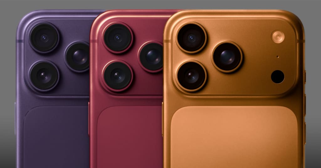
The latest, most persistent whispers about the upcoming iPhone 18 Pro suggest Apple is finally ready to break free from the traditional, often muted, aesthetic of the 'Pro' line. Sources, including the reliable Instant Digital, are pointing to the introduction of three rich, brand-new hues: Coffee, a deep, sophisticated Purple, and a luxurious Burgundy.
If these rumors hold true, this isn't just a color refresh; it's a fundamental shift in how Apple views its most premium device. Let’s dive into why these colors matter, and which one I think will be the must-have shade of 2026.
The Problem with 'Pro' Colors
Before we get excited, let's acknowledge the history. The iPhone Pro lineup has always played it safe. We get Space Black, Silver/White, and one yearly "signature" color (Deep Purple, Sierra Blue, Natural Titanium). While these colors are undeniably elegant, they often lack the personality and pop that users crave. They are professional, yes, but sometimes bordering on sterile.
The introduction of Coffee, Purple, and Burgundy suggests a mature, yet adventurous, palette. Apple seems to be moving away from cold, metallic tones and embracing warmer, earthier, and richer colors that carry a sense of depth and luxury.
Unpacking the New Palette: Aesthetics and Ambition
The significance of these colors goes beyond simple paint choice; it’s about material science and finish. Considering the 18 Pro will likely utilize an advanced metal frame (be it titanium or aluminum), the execution of these deep tones will define the phone's aesthetic success.
1. Coffee: The Dark Horse Contender
This is perhaps the most intriguing rumor. A Coffee iPhone suggests a deep brown or bronze finish. Think less "Gold" (which can look tacky) and more "Smoked Cocoa."
Why it works: This color offers a stunning middle ground. It's dark enough to appear black in low light, providing that 'Pro' stealth factor, but reveals a beautiful, warm metallic sheen under bright lighting. It’s mature, unisex, and inherently unique in the current smartphone market. I predict Coffee will be the biggest surprise hit, offering a sophisticated alternative to the classic Space Black.
2. Purple: The Pro Evolution
We’ve seen Purple before, but a Pro Purple is always different. The 14 Pro's Deep Purple was moody and atmospheric. For the 18 Pro, I anticipate this new Purple will lean towards a warm, dark Violet or a deep Amethyst.
Why it works: It maintains a link to the current generation while refining the shade. It’s an easy-to-wear color—distinctive without being distracting. If Apple coats the glass back with a slightly translucent finish, this Purple could catch the light in a truly stunning way, providing depth that flat colors simply cannot match.
3. Burgundy: The Luxurious Statement
This is my personal favorite on the list. Burgundy—a deep, luxurious wine-red that carries undertones of brown and purple—is the definition of premium.
Why it works: Red has always been polarizing (often associated with the loud Product Red). Burgundy, however, is a statement of understated luxury. It conveys richness, power, and high quality. Paired with the rumored, more robust 18 Pro chassis (which we know is thicker and heavier), the Burgundy color would create a complete package of perceived durability and expense. It replaces the loudness of bright red with the quiet confidence of a fine wine.
Color and Design Synergy
These colors aren't being launched in a vacuum. They coincide with other major design shifts on the 18 Pro, most notably:
Weight and Thickness: The increase in bulk (up to 243 grams for the Pro Max) makes the device feel more substantial. A deep, rich color like Burgundy enhances this feeling—a lightweight, bright phone might look cheap, but a heavy phone in a rich, deep hue looks expensive.
The Back Glass: Rumors suggest the back glass treatment might be more unified, lessening the stark two-tone appearance often seen on previous models. Rich colors like Coffee and Burgundy thrive in this environment, allowing the shade to dominate and create a seamless aesthetic from the rails to the back panel.
My Final Take: Which Color to Buy?
For years, I’ve defaulted to the standard black/grey Pro option. But with the 18 Pro, Apple is finally tempting me to switch.
The Coffee hue offers the best combination of novelty and class, providing a unique look without being too flashy. The Burgundy offers an incredible level of richness for those who want a strong statement.
This color palette represents Apple finally aligning the aesthetics of the Pro model with its technological capability. The 18 Pro series won't just be the most powerful; it will finally be the most visually compelling.
About the Creator
Florida Business Insurance Requirements
Running a business in Florida means operating in one of the most dynamic—and complex—risk environments in the country. Between climate exposure, legal requirements, contractual obligations, and industry-specific risks, insurance is not just a formality. It is a structural component of how a business survives disruptions, disputes, and unexpected losses.
By American US Insurance2 days ago in Journal


Comments (1)
tks :*