
9 basic principles of responsive web design
Distinction between responsive design and adaptive design

Are you familiar with the distinction between responsive design and adaptive design? While there is some debate over which approach is superior, responsive design is generally considered the preferred solution for addressing multi-screen challenges. Therefore, it's important for designers to be well-versed in the concepts and fundamental principles of responsive design.
Fortunately, San Francisco's Froont, a web design company, has created a series of animated GIFs to help simplify our comprehension of these principles.
The basic principles of responsive design
Responsive vs adaptive web design
While the two approaches may appear similar, they are not identical. Instead of pitting them against each other, both approaches can be used together in a complementary manner. Ultimately, it's best to let the content guide the decision-making process, as there is no universally "correct" way to approach this.
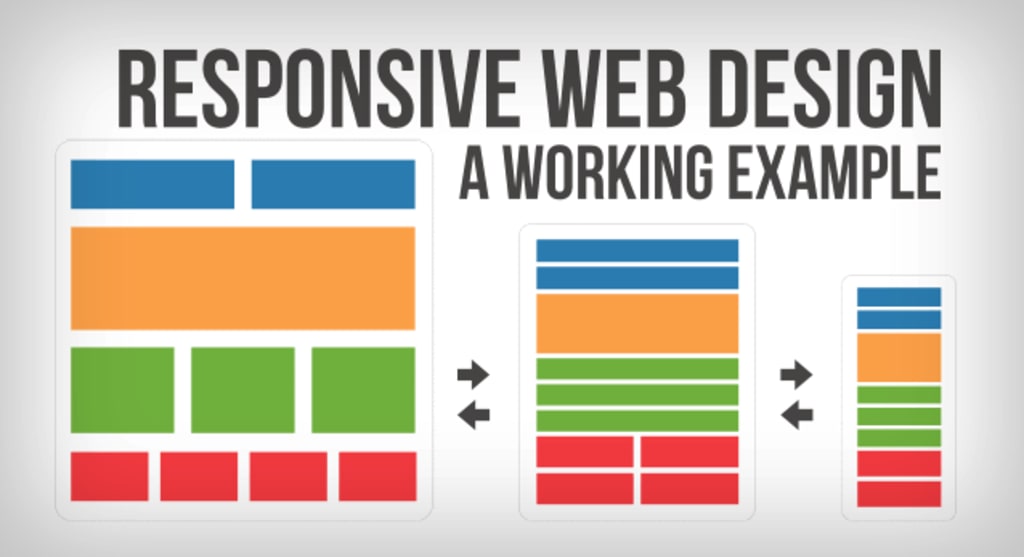
Responsive design flow
As screen sizes become smaller, content starts to take up more vertical space and anything below will be pushed down, it's called the flow. That might be tricky to grasp if you are used to design with pixels and points, but makes total sense when you get used to it.
Relative units
The canvas can be a desktop, mobile screen or anything in between. Pixel density can also vary, so we need units that are flexible and work everywhere. That's where relative units like percents come in handy. So making something 50% wide means it will always take half of the screen (or viewport, which is the size of the opened browser window).
Breakpoints
Breakpoints allow the layout to change at predefined points, i.e. having 3 columns on a desktop, but only 1 column on a mobile device. Most CSS properties can be changed from one breakpoint to another. Usually where you put one depends on the content. If a sentence breaks, you might need to add a breakpoint. But use them with caution – it can get messy quickly when it's difficult to understand what is influencing what.
Max and min values
Sometimes it's great that content takes up the whole width of a screen, like on a mobile device, but having the same content stretching to the whole width of your TV screen often makes less sense. This is why Min/Max values help. For example having width of 100% and Max width of 1000px would mean that content will fill the screen, but don't go over 1000px.
Nested objects in responsive design
Remember the relative position? Having a lot of elements depending on each other would be difficult to control, therefore wrapping elements in a container keeps it way more understandable, clean and tidy. This is where static units like pixels can help. They are useful for content that you don't want to scale, like logos and buttons.
Mobile or desktop first
Technically there isn't much of a difference if a project is started from a smaller screen to a bigger (mobile first) or vice versa (desktop first). Yet it adds extra limitations and helps you make decisions if you start with mobile first. Often people start from both ends at once, so really, go and see what works better for you.
Webfonts vs system fonts
Wanna have a cool looking Futura or Didot on your website? Use webfonts! Although they will look stunning, remember that each will be downloaded and the more you'll have, the longer it will take to load the page. System fonts on the other hand are lightning fast, except when the user doesn't have it locally, it will fall back to a default font.
Images vs vectors
Does your icon have lot of details and some fancy effects applied? If yes, use an image. If not, consider using a vector image. For images use a jpg, png or a gif, for vectors the best choice would be a SVG or an icon font. Each has some benefits and some drawbacks. However keep in mind the size -- no pictures should go online without optimization. Vectors on the other hand often are tiny, but some older browsers won't support it. Also, if it has lots of curves, it might be heavier than an image, so choose wisely.
Images Source: [http://blog.froont.com/9-basic-principles-of-responsive-web-design/]
Feel that we left out something important? Let us know in the comments!
About the Creator
UX Design Club
We share the latest UX design trends, best practices, and case studies to help you create impactful designs. Join our community and stay up-to-date on the latest in UX design.
Keep reading
More stories from UX Design Club and writers in Humans and other communities.
UI/UX Mistakes That Surprised Us with Their Costliness
In today's digital age, user experience (UX) and user interface (UI) have become essential elements that determine the success or failure of a product. Even the slightest mistake in UI/UX design can lead to catastrophic consequences that can cost companies millions of dollars. Let's take a look at some of the most expensive UI/UX mistakes that have surprised us.
By UX Design Club3 years ago in Humans
Seven Socially Acceptable Behaviors That Secretly Kill Your Potential.
You follow rules taught as polite and mature. Society rewards these behaviors with approval. Praise feels safe. Progress slows. The danger hides in habits nobody questions. These habits look responsible. They drain growth over time.
By Wilson Igbasi5 days ago in Humans


Comments
There are no comments for this story
Be the first to respond and start the conversation.