
How Medical Apps Influence Decisions Without Being Noticed?
How timing, defaults, and interface design subtly shape medical decisions without users ever realizing it.


Medical apps don’t shout.
They whisper.
That’s what makes them powerful, and a little unsettling if you think about it too long. They don’t tell clinicians what to decide. They don’t tell patients what to choose. They just arrange information, timing, and defaults in a way that nudges decisions forward.
Quietly.
Most users would swear the app is neutral. Just data. Just guidance. Just reminders.
But neutrality is mostly an illusion.
Decisions happen faster when friction disappears
In healthcare, speed is often framed as a virtue. Faster access to records. Faster alerts. Faster documentation.
And yes, speed saves time. Sometimes it saves lives.
But speed also compresses reflection.
Harvard research on clinical decision making shows that reducing friction in information access increases decision speed, even when uncertainty remains. Clinicians act sooner because the system makes it easier to do so.
That’s not manipulation. It’s momentum.
A lab result that surfaces immediately invites action. One that requires extra navigation invites pause. Same data. Different timing.
The app didn’t tell anyone what to do. It just removed a pause that used to exist.
Defaults decide more than instructions
Medical apps love defaults.
Recommended dosages. Preselected options. Standard pathways. Suggested follow ups.
Defaults save time. They reduce cognitive load. They prevent errors when used carefully.
WHO research on clinical systems shows that default selections significantly influence treatment paths, especially under time pressure. Users follow defaults more often than they realize.
That influence isn’t malicious. It’s practical.
But it still shapes outcomes.
Changing a default doesn’t feel like changing a rule. It feels minor. Yet behavior shifts immediately.
This is the first contradiction I won’t clean up.
Defaults protect users.
Defaults also guide them.
Both are true.
Alerts shape urgency, not judgment
Push notifications, banners, and alerts feel informational.
“Abnormal result.”
“Follow up recommended.”
“Reminder due.”
The wording matters. The color matters. The timing matters.
CDC studies on clinical alert systems show that alert frequency and phrasing affect clinician response rates and urgency perception. Too many alerts create fatigue. Too few delay action.
An alert that interrupts a workflow feels urgent. One that waits quietly feels optional.
Medical apps constantly tune this balance. Most users never notice the tuning.
They just feel pressure. Or calm.
What shows up first feels more important
Medical apps prioritize information. They have to.
Problem lists. Recent notes. Trends. Flags. Risk scores.
Whatever appears first gets attention first.
Pew Research Center research on information hierarchy in professional tools shows that users consistently overweight top positioned data, even when they know other data exists elsewhere.
So surfacing one metric prominently can shift focus away from others without ever hiding them.
The app isn’t lying. It’s highlighting.
But highlighting is influence.
Patients are influenced differently than clinicians
Patients experience medical apps emotionally. Clinicians experience them operationally.
A symptom checker that lists serious conditions early increases anxiety. One that emphasizes common explanations reassures.
WHO research on digital health tools shows that presentation order affects patient perception of severity, even when final recommendations are identical.
So two apps with the same logic can lead to very different emotional responses based purely on flow.
That emotional response affects decisions. When to seek care. Whether to wait. Whether to worry.
The app didn’t advise. It framed.
Visual trends change confidence
Graphs feel authoritative.
A line trending up or down invites interpretation, even when context is missing.
Harvard studies on data visualization in healthcare show that visual trends influence clinician confidence, sometimes more than raw values.
A stable looking chart reassures. A jagged one alarms. Even if both represent acceptable ranges.
Design choices become decision cues.
Colors. Smoothing. Time windows.
None of these are neutral.
Timing nudges action more than content
When information arrives matters more than what it says.
A reminder in the morning lands differently than one at night. A result delivered during a consultation feels collaborative. One delivered alone feels alarming.
McKinsey research on digital health engagement found that timing of notifications significantly affects follow through on medical tasks, sometimes more than message content.
Medical apps schedule behavior.
Not explicitly. Subtly.
A familiar scenario hiding in plain sight
Picture a team doing mobile app development Miami based, building tools for remote patient monitoring or clinician workflows.
They focus on accuracy. Compliance. Reliability. All the right things.
Then usage data shows patterns. Patients check readings more often after certain alerts. Clinicians act faster when results appear inline instead of behind tabs.
No logic changed. No rules changed.
Just presentation.
The app shaped behavior without anyone noticing.
Why this influence is rarely discussed
Because it’s uncomfortable.
Healthcare likes clear lines. Advice vs information. Tool vs authority.
But medical apps sit in between.
Pew research on trust in digital health systems shows that users often overestimate objectivity of software tools, assuming neutrality where design choices exist.
Discussing influence feels like admitting bias.
So teams talk about usability. Engagement. Adoption.
They don’t talk about behavioral shaping.
The second contradiction that never resolves
Medical apps must guide users.
Medical apps must not decide for them.
Every design choice sits in that tension.
Too little guidance causes confusion. Too much guidance feels prescriptive.
There is no perfect balance. Only careful tradeoffs.
Why influence increases as apps improve
As apps get smoother, faster, and clearer, their influence grows.
Less friction means less hesitation. Less hesitation means quicker decisions.
That’s not inherently bad. Often it’s the goal.
But it means responsibility increases with polish.
The better the app, the more it shapes outcomes.
Quietly.
What responsible influence looks like
Not denial. Awareness.
- Transparent defaults with rationale
- Adjustable alert thresholds
- Clear separation between data and recommendation
- Visuals that show uncertainty, not just trends
- Continuous review of behavioral effects
These don’t remove influence. They make it intentional.
And intention matters when decisions affect health.
Why users rarely notice, and that’s the point
If influence were obvious, it would break trust.
Medical apps succeed because they feel supportive, not directive. Helpful, not controlling.
So the best ones influence gently. Through structure. Through timing. Through emphasis.
Users don’t feel pushed. They feel informed.
And yet, decisions shift.
That’s the power.
And the responsibility.
FAQs
How do medical apps influence decisions?
Through defaults, alert timing, information hierarchy, and visual presentation that shape urgency and focus.
Are medical apps neutral tools?
No. Design choices always influence behavior, even when the underlying data is unbiased.
Is this influence intentional?
Sometimes. Often it emerges unintentionally as usability improves.
Can influence be harmful?
Yes, if defaults, alerts, or visuals create unnecessary anxiety or rush decisions.
How can teams manage this responsibly?
By studying behavioral impact, making influence transparent, and designing for reflection as well as speed.
About the Creator
Keep reading
More stories from Samantha Blake and writers in Geeks and other communities.
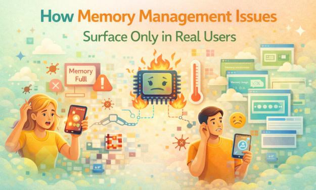
How Memory Management Issues Surface Only in Real Users?
I realized something was wrong when the phone felt heavier than it should have. Not physically heavier, but slower in the hand, like it needed encouragement to keep up. I hadn’t opened many apps. I hadn’t done anything unusual. Still, scrolling felt thick, as if the device was wading through something unseen.
By Samantha Blake2 months ago in Geeks
A Knight of the Seven Kingdoms Series Review (Season 1)
As one of the biggest properties in fantasy, A Song of Ice and Fire remains immensely popular with audiences. After reaching far into the past with House of the Dragon, a second spin-off was on the cards. A Knight of the Seven Kingdoms serves up a bite-sized slice of action and drama, but it still claims a spot among the best small-screen titles.
By Robert Caina day ago in Geeks
When the Shelter Closes
Across the street from my house, a man slept under a tree, his dog by his side. My first, naive thought: he must be traveling through. But he kept coming back, often sleeping there during the day. Then it hit me—that person might not have a home.
By Bride of Sound3 days ago in Humans


Comments
There are no comments for this story
Be the first to respond and start the conversation.