
Data Visualization — Netflix Data Set
Welcome to the First Post in the series of Data Visualization, of one of the best time pass and Entertainment for the people around the globe — Netflix. We will be going through the dataset and having an overview of the content present on Netflix.


Let’s have an overview of the dataset
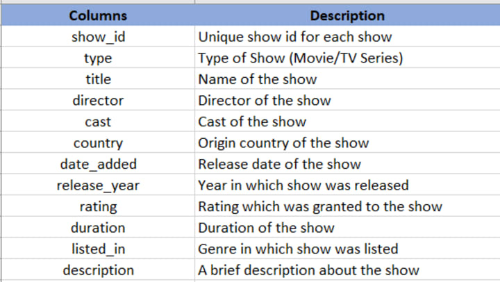
Moving on.. and giving a look at the data present in these columns

Let’s Move forward and start with visualizing the data and get some insights about the data.
Firstly, let's see the number of shows based on the type present with us.

From the above graph, we can notice we have around 5400 Movies data and 2400 TV Shows data present with us.
It indicates that No. of movies released on Netflix is higher than the No. of TV Shows released & we can say Netflix is considered more to cinema halls rather than TV sets.
*****
Now let’s have a look at the countries producing the most No. of shows for Netflix.

We can notice that the no. of shows originating from the USA is quite huge as compared to other countries. 2nd highest is India with around 1/3rd shows of the USA.
Also, we can see NA at 3rd position, don’t confuse it with North America, it's actually the blank values present in the dataset. i.e. we have missing country data for around 509 rows/shows. We need to handle these missing data before doing some actual analysis of this dataset.
*****
Now let's have a look at the No. of Movies and TV Shows produced in these countries.

We can see No. of Movies from USA and India is higher than the No. of TV Shows produced in these countries whereas No. of TV Shows is higher than the No. of Movies for UK, Japan and South Korea but among these TV shows from Japan and South Korea is much higher than the Movies.
Interesting.. isn’t it..!!!
*****
Moving on further… Let’s bifurcate the data based on Year and try to get some insights from there.
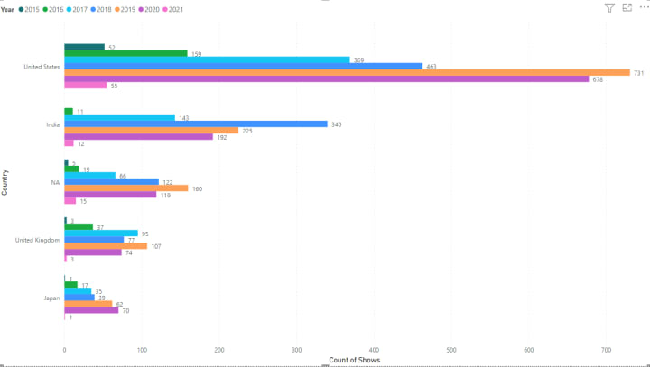
The above graph shows the top 5 countries and the No. of shows produced by them each year.
Note:- I have purposely included NA in the graphs to show the impact if we directly remove these rows without properly handling the missing values
We can see the USA produced the most No. of shows in the year 2019, and India in 2018.
Despite a lockdown in most of the world, we can see a high No. of shows being produced in 2020 by the USA and personal highest for Japan as compared to previous years.
*****

The above graph is a bit similar to the previous graph, it represents the No. of shows produced in the last 7 years across all countries(including NA).
We can see there has been a continuous rise in No. of TV shows similar to movies also but there has been a downfall in 2020, which might be due to COVID-19 restrictions.
*****
Now let’s explore a bit more on this data and see the different ratings for the shows on Netflix.

We can see there are a high no. of shows under TV-MA(Mature audience only) followed by TV-14(Parents strongly cautioned), TV-PG(Parental Guidance Suggested) and R(Restricted, Children).
We can see most of the shows in the list belong to a restricted and mature audience, thus we can say that Netflix has more mature content and should be restricted for children.
*****
We have seen countries producing the most No. of shows, so why not have a look at these shows based on ratings.

This graph is an enhanced version of the previous graph depicting the No. of shows produced by each country under each rating.
We can see the USA has the highest No. of TV-MA, TV-14 and R whereas India produces mostly TV-14 rating shows followed by TV-MA.
Similarly, for UK and Japan also there is high No. of TV-MA and TV-14 shows.
*****
Let’s have a look at the ideal duration of these Netflix shows.

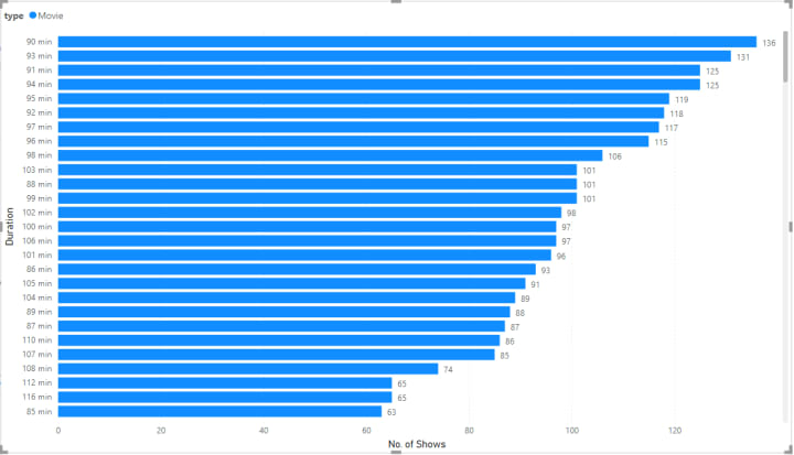
I have divided the graph into two separate visuals for TV Shows and Movies better clarity.
For TV Shows, we can see the most preferred duration is 1 season(contains various episodes) whereas, for Movies, looking at the graph(Fig 11b). we can say it is ~90–100 mins.
*****

We can see we have few movies as short as 8–9 mins.
Note:- We need to verify these data for correctness. It may be due to some error at the time of data collection.
*****

The Longest movie on the Netflix is about 312 min long followed by 253 min long movie, hope so content of it is good enough to keep the person glued. 😉
Would be great to read your reviews about any of these movies… Do Share them…
*****

The above graph shows the top 10 categories of the shows hosted on Netflix.
Interestingly we can notice that Documentaries is the highest category if we recall from above, we had TV-MA and TV-14 as the highest rating for shows.
*****
That’s all from this Netflix Dataset Please comment down below for getting the dataset.
I hope you liked the article please like, share and leave a comment about your views, points for improvement Or anything specific you would like me to analyze for you.
Always Happy to Help.
Thanks a lot, Guys… See You soon with some more interesting analysis…
Know more about me:- About Me
Happy Learning… !!! 🙂
About the Creator
Shashank Singhal
Big Data & Machine Learning | www.linkedin.com/in/shashank-singhal-1806 | Blog — https://quickdatascienceds.blogspot.com
Keep reading
More stories from Shashank Singhal and writers in Geeks and other communities.
COVID-19 — A battle more to be fought by Mind than Medicines
Starting with a Big Sorry to all my followers and friends for being away for some time from here as I was down with the COVID for past few weeks. Here I would like to share my experience of How it started and the remedies that we took to overcome this. Also, I would like to share the lessons that I learned from it.
By Shashank Singhal5 years ago in Motivation
The Politics of Playing Dress-Up
Well, to start off I'd like to say a happy world book day to all who celebrate. I know I haven't really posted anything on my socials about it but I'm not a jubilant kind of person. I lay low most of the time. Let's start off with a popular anecdote from the vaults...
By Annie Kapur2 days ago in Geeks
Spider-Man Rogues Gallery Power Rankings
Spider-Man’s world isn’t just defined by great power — it’s shaped by the enemies determined to break him. The rogues gallery of Spider-Man is one of the most iconic in comic history, filled with brilliant scientists, monstrous experiments, criminal masterminds, and deeply tragic figures. Some rely on raw strength, others on genius-level intellect, advanced technology, or psychological warfare — but all of them have pushed Peter Parker to his absolute limits.
By Top Ranked5 days ago in Geeks


Comments
There are no comments for this story
Be the first to respond and start the conversation.