
Colors in Logos
How the World's Strongest Brands Do It

Choosing the perfect colors for your logo can feel like a daunting task. Should you go with classic blue, bold red, or perhaps a more unconventional hue like purple or brown? Let's dive into how the world's top 100 brands have navigated this colorful landscape and what you can learn from them.
This article is a summary of the article Colors in Logo Design: A Case Study of the 100 Most Valuable Brands published by Rule of 3. Read the full article here.
The Psychological Impact and Role of Colors in Logo Design
Color isn't just a visual choice—it's a powerful tool for evoking emotions and conveying messages. Imagine stepping into a room bathed in red, green, or blue light. Each color creates a different vibe, right?
Emotional Response: Red might make you feel energized or even a bit anxious, while blue could calm you down, and green might make you think of nature and peace.
Symbolism: Colors are packed with meaning. Red says stop or danger, green signals go or safety, and blue often suggests trust and dependability.
Industry Connections: Colors also carry industry-specific connotations. Blue is a tech favorite, green screams health and wellness, and black, silver, and gold ooze luxury.
What We Can Learn from Leading Brands
Instead of drowning in color theory, let's look at what the big players are doing. We analyzed the logos of Forbes' top 100 brands of 2024, and here's what we found:
Simplicity Rules:
50% of these logos stick to a single color.
38% mix in two colors.
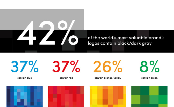
Blue and red reign supreme, each appearing in 37% of logos.
Monochrome Magic: 18% of logos are black or gray, keeping it sleek and simple against a white background.
The Favorite Colors
Blue: Trusted by 37% of brands.
Red: Also chosen by 37%.
Yellow/Orange: Adds warmth and energy, featured in 26% of logos.
Green: A go-to for 8% of brands.
Industry-Specific Trends
Different industries have their color quirks:
Banking/Finance: You'd expect a lot of blue for trust, but surprise! Red and orange pop up frequently.
Technology: While blue is a staple, companies like Google and Microsoft embrace colorful palettes.
Luxury: Black is the king, conveying elegance and sophistication.
Automotive: Dominated by black, gray, and dark blue, with a few outliers like Toyota's red logo.
Design Trends
Flat Design: Clean and simple is the name of the game. Most logos keep it straightforward.
Gradients: Only 7% use them, preferring solid, bold colors.
Skeuomorphism: Rare these days, with Porsche and Mercedes-Benz being notable exceptions.
Conclusion
So, what’s the takeaway for you? When considering the role of colors in logo design, think about the emotions and messages you want to convey, and don't be afraid to break the mold. Simplicity often wins, but a splash of unexpected color can set you apart. Look at industry trends, but ultimately, your brand's personality should shine through. Go ahead, make your logo a true reflection of your brand’s essence!
This article is a summary of the article Colors in Logo Design: A Case Study of the 100 Most Valuable Brands published by Rule of 3. Read the full article here.
About the Creator
Martin Karlsson
Art director, developer, journalist.
Keep reading
More stories from Martin Karlsson and writers in Geeks and other communities.
Social Media Manifesto For A Better Internet
Never in history have the conditions been better for reaching and touching others. Today, anyone can start a blog, website, or social media account and, in theory, connect with millions through their creations, stories, and opinions. In reality though, things are different. People's short-term hunt for attention, validation, and money, combined with the poorly constructed mechanisms of social media, floods us with meaningless, generic content. What is real, interesting, honest, and unique drowns or adapts to the point of being unrecognizable. We become watered-down copies of ourselves - digital waste without value or substance. Spam without genuine senders.
By Martin Karlssonabout a year ago in Humans
US aircraft carrier enters Middle East region, officials say
In a significant military movement that underscores the fragility of Middle East dynamics, a United States Navy aircraft carrier strike group has entered the Middle East region, according to senior U.S. officials. The deployment comes at a time of heightened political tensions between Washington and Tehran, following months of unrest inside Iran and contentious diplomatic rhetoric that has reverberated across the broader Middle East. The centerpiece of the deployment is the USS Abraham Lincoln (CVN‑72), a Nimitz‑class nuclear‑powered aircraft carrier, accompanied by a group of guided‑missile destroyers. The group has entered the area of responsibility overseen by the U.S. Central Command — a designation covering strategic maritime and land zones in the Gulf and surrounding waters. U.S. military officials describe the movement as a reinforcement of existing forces rather than the beginning of immediate combat operations. They say the presence of additional naval assets gives U.S. leaders increased capacity to defend American personnel and interests and offers a broader set of options should escalation occur. Context: Rising Tensions and Domestic Unrest in Iran The deployment follows a period of intense domestic unrest inside Iran, where widespread protests over economic conditions and government policies have repeatedly drawn international attention. Human rights groups and activists estimate thousands of civilian casualties over the past weeks, prompting global concern. The United States and other nations have publicly criticized Tehran’s response to these demonstrations. President Donald Trump has repeatedly suggested that forceful repression of protesters could warrant a range of responses, including military options, although U.S. officials stress the current posture is defensive. Trump told reporters recently that a “massive fleet” was moving toward the region but emphasized the hope that it would not be used in combat. Iran’s leadership has responded with resolute language. A senior Iranian official warned that any attack on Iranian territory would be considered an “all‑out war.” Such rhetoric reflects long‑standing mistrust between Tehran and Washington, dating back decades and compounded by recent sanctions, nuclear tensions, and proxy conflicts in neighboring countries. Wider Regional Responses The carrier’s arrival has drawn responses from several key regional actors. The United Arab Emirates (UAE) — which hosts U.S. air bases — has publicly stated it will not allow its territory, airspace, or waters to be used for any actions hostile to Iran. This marks a clear diplomatic effort to maintain neutrality and avoid escalating conflict around its borders. Meanwhile, Iranian‑aligned militias in Yemen and Iraq, such as the Houthis and Kataib Hezbollah, have issued warnings of retaliation, including threats to target international shipping or American forces if hostilities break out. These groups have previously been involved in confrontations with U.S. interests and allied shipping lanes, adding another layer of complexity to an already tense situation. Military Capabilities and Strategic Posture Modern U.S. aircraft carriers like the Abraham Lincoln operate as mobile airbases at sea, capable of launching and recovering dozens of fighter jets, surveillance aircraft, and support planes. They also serve as platforms for Tomahawk cruise missiles and are protected by destroyers equipped with advanced radar, missile defenses, and anti‑submarine systems. The presence of such a complex strike group is intended to communicate strategic capability and resolve. In addition to the carrier group, U.S. military moves include the deployment of fighter jets and air defense systems to the region, aimed at enhancing readiness and deterrence. A planned multinational exercise within the U.S. Central Command area of responsibility is underway, designed to demonstrate the ability to deploy and sustain airpower across the region. Diplomacy and the Prospects for De‑escalation Despite the military buildup, there are ongoing discussions about diplomatic engagement. U.S. officials have stated they are prepared to engage with Iranian counterparts if conditions allow. President Trump has repeatedly stressed his preference for avoiding armed conflict, even as he maintains that pressure — including the naval deployment — is necessary to uphold regional security and deter further repression. Inside Iran, there are mixed signals. Some government representatives continue to reject foreign pressure and accuse the U.S. of psychological tactics, while other factions hint at willingness to return to dialogue under specific circumstances. However, talks remain strained, and mutual distrust is high. What This Means for the Region The carrier’s presence adds a visible and powerful element to an already complex geopolitical landscape. For allies like Israel and Jordan, broader U.S. military deployments offer assurances of continued strategic cooperation. For adversaries or skeptical neighbors, it may reinforce perceptions of external intervention. For ordinary citizens across the region, the deployment stokes concerns about possible escalation and the prospects of instability affecting everyday life.
By Saboor Brohi 6 days ago in Geeks


Comments
There are no comments for this story
Be the first to respond and start the conversation.