
The Importance of Testing in PSD to Mobile Conversion
PSD to Mobile Conversion

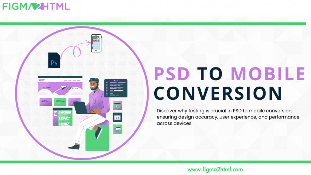
Converting a Photoshop Document (PSD) into a mobile-friendly design is a critical step in modern web development. As mobile devices continue to dominate internet traffic, ensuring that your designs look and function perfectly on these devices is more important than ever. However, simply converting a PSD file to a mobile format is not enough. Testing plays a vital role in this process, as it ensures that your design not only looks good but also provides an excellent user experience. Let’s explore why testing is essential in the PSD to mobile conversion process.
1. Ensuring Design Accuracy
One of the primary reasons for testing during the PSD to mobile conversion is to ensure that the final output accurately reflects the original design.
Pixel Perfection: Designers work meticulously to create pixel-perfect layouts in PSDs. During conversion, elements may shift, resize, or misalign due to differences in screen sizes, resolutions, or coding practices. Testing helps identify these discrepancies and allows for adjustments.
Consistency Across Devices: Different mobile devices have varying screen sizes, resolutions, and aspect ratios. Testing your converted design on multiple devices ensures that it maintains visual integrity across all platforms.
2. User Experience (UX) Validation
The ultimate goal of any design is to provide a seamless user experience. Testing is crucial to validating that your mobile conversion achieves this.
Navigation and Interactivity: Mobile users interact with designs differently than desktop users. Testing allows you to evaluate touch targets, navigation flows, and interactive elements to ensure they are intuitive and responsive.
Performance Evaluation: Mobile devices often have limited resources compared to desktops. Testing helps identify performance bottlenecks, such as slow loading times or unresponsive features, ensuring that your design performs well even on lower-end devices.
3. Responsive Design Verification
Responsive design is about ensuring that your layout adapts well to different screen sizes and orientations. Testing is essential for verifying that your PSD conversion meets these responsive design principles.
Breakpoints and Media Queries: Testing helps to ensure that your CSS media queries work effectively at different breakpoints. This ensures that your layout adapts correctly, whether users are holding their devices in portrait or landscape mode.
Flexible Elements: It’s important to check how images, buttons, and other UI elements respond to varying screen sizes. Testing allows you to confirm that these elements resize and reposition appropriately, maintaining the design’s usability and aesthetics.
4. Accessibility Compliance
In today's digital world, accessibility is a crucial aspect of web design. Testing ensures that your mobile design is accessible to all users, including those with disabilities.
Screen Reader Compatibility: Testing can help confirm that your mobile design is compatible with screen readers and other assistive technologies. This includes checking that alt texts for images, proper heading structures, and ARIA labels are correctly implemented.
Color Contrast and Font Sizes: Accessibility testing helps verify that text is legible against backgrounds and that font sizes are adequate for reading on smaller screens. This is vital for users with visual impairments.
5. Identifying and Fixing Bugs Early
Bugs and errors are inevitable during any development process. However, identifying and fixing them early can save time and resources later on.
Catch Errors Early: Comprehensive testing allows developers to catch issues early in the conversion process. This reduces the risk of launching a mobile site that has critical functionality issues, which can lead to a poor user experience.
Feedback Loops: Implementing a feedback loop during testing helps gather insights from users and stakeholders, allowing for necessary adjustments before the final release. This ensures that the final product meets user expectations.
6. Optimizing for Search Engines
Testing also plays a role in ensuring that your mobile design is optimized for search engines, which is crucial for driving organic traffic.
Page Speed: Search engines like Google consider page speed as a ranking factor. Testing helps identify any performance issues that could slow down your mobile site, allowing you to implement optimizations.
Mobile-Friendliness: Tools like Google’s Mobile-Friendly Test can be used to evaluate how well your converted design performs in terms of mobile usability. Regular testing helps maintain search engine optimization (SEO) standards.
7. User Testing and Feedback
Finally, involving real users in the testing process can provide invaluable insights that go beyond technical evaluations.
Real-World Usage: Conducting user testing sessions allows you to observe how actual users interact with your mobile design. This feedback can highlight areas of improvement that might not be obvious during development.
Iterative Improvements: User feedback is essential for making iterative improvements. By continuously testing and refining your design based on user experiences, you can enhance usability and ensure higher user satisfaction.
Conclusion
Testing is not merely a step in the PSD to mobile conversion process; it is a crucial element that determines the overall success of the project. By ensuring design accuracy, validating user experience, confirming responsive behavior, and adhering to accessibility standards, thorough testing can help you create a mobile design that meets the needs of users while maintaining the integrity of the original PSD. In an era where mobile devices are the primary means of accessing the internet, neglecting testing can lead to missed opportunities and frustrated users. Prioritize testing in your conversion process to deliver a polished, user-friendly mobile experience that truly resonates with your audience.
About the Creator
Mark Wong
Hi,
I am a creative web developer as well as a designer at Figma2HTML.
Virginia was once a mega-state until it gave up most of its land
The year 2026 marks the 250th anniversary of the Declaration of Independence. According to Cardinal News, Virginia was originally much larger than it is today. Virginia came out of the Revolutionary War much smaller than it was when it went in.
By Margaret Minnicks5 days ago in FYI


Comments
There are no comments for this story
Be the first to respond and start the conversation.