
From Flip Phones to Fluid Design: The Untold Story of Mobile Web Evolution
How 20 Years of Mobile Design Changed the Way We Build for the Web


In the early 2000s, browsing the internet on a phone felt like decoding a riddle through a keyhole. Websites weren’t just slow—they were nearly unusable. Pages loaded agonizingly slow, navigation was a clunky afterthought, and the user experience was frustrating at best. Back then, mobile browsing was viewed as a niche—something for “on the go” or emergency use, far removed from the rich, interactive desktop experiences businesses carefully crafted.
But over the past two decades, we've witnessed a remarkable transformation in mobile web design—one that has reshaped not only user expectations but also how businesses think about marketing, engagement, and conversion worldwide.
As someone deeply involved in web development and digital strategy, I’ve watched this evolution unfold firsthand, and it’s been nothing short of revolutionary. Mobile web design hasn’t just evolved technically—it’s fundamentally redefined how we build, brand, and connect online.
The Primitive Web: WAP, Tables, and Pain

As mobile device adoption accelerated, developers scrambled to find solutions. The answer? m-dot websites—separate, stripped-down versions of desktop sites, hosted at a subdomain like m.example.com.
Think of m-dot sites as a Band-Aid: a quick fix that delivered mobile-friendly content but required maintaining two separate codebases and often offered inconsistent user experiences. They were clunky, difficult to update, and sometimes frustrating for users forced to switch between mobile and desktop sites.
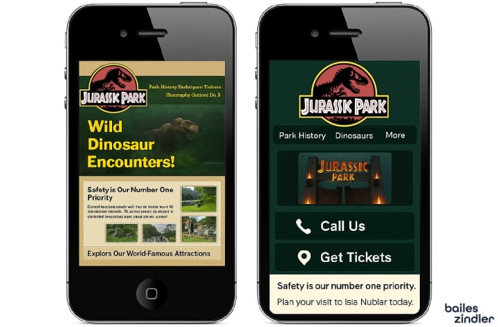
A good example of this transition is a comparison of Jurassic Park’s early mobile presence, where the original m-dot site was cluttered and hard to navigate, compared to modern responsive designs that streamline content and prioritize user actions like “Call Us” or “Get Tickets.”
Despite their flaws, m-dot sites made one thing clear—mobile mattered. They pushed the industry to invest in better, more unified solutions.
The Rise (and Fall) of m-dot Sites
As mobile device adoption accelerated, developers scrambled to find solutions. The answer? m-dot websites—separate, stripped-down versions of desktop sites, hosted at a subdomain like:
m.example.com
Think of m-dot sites as a Band-Aid: a quick fix that delivered mobile-friendly content but required maintaining two separate codebases and often offered inconsistent user experiences. They were clunky, difficult to update, and sometimes frustrating for users forced to switch between mobile and desktop sites.
A good example of this transition is a comparison of Jurassic Park’s early mobile presence, where the original m-dot site was cluttered and hard to navigate, compared to modern responsive designs that streamline content and prioritize user actions like “Call Us” or “Get Tickets.”
Despite their flaws, m-dot sites made one thing clear—mobile mattered. They pushed the industry to invest in better, more unified solutions.
Responsive Design Changes Everything
Everything changed in 2010, when Ethan Marcotte introduced the concept of responsive design. This approach allowed a single website to dynamically adjust to any screen size or orientation—whether desktop, tablet, or phone—using flexible grids, fluid images, and CSS media queries.
By 2015, mobile traffic had surpassed desktop for the first time. Responsive design became the gold standard, eliminating the need for separate m-dot sites and providing a seamless, consistent experience across devices.
Tools like Bootstrap and Flexbox made implementing responsive layouts faster and easier, helping developers focus on user experience instead of juggling multiple versions.
At Bailes + Zindler, we adopted responsive design early, guiding clients through the transition and helping them avoid the pitfalls of slow-loading, fragmented mobile sites that alienated users and tanked search rankings.
Mobile-First Becomes Business-First

Today, mobile traffic dominates the web. Google’s mobile-first indexing means your site’s mobile version is what search engines primarily evaluate for ranking and indexing.
The stakes are higher: mobile user experience directly impacts conversion rates, bounce rates, and ultimately revenue. Slow pages, complicated navigation, and poor checkout flows cost businesses real money.
That’s why modern mobile design emphasizes:
- Core Web Vitals to benchmark user experience
- Progressive Web Apps (PWAs) for app-like performance
- Mobile-optimized checkout flows to reduce friction
Mobile design isn’t optional anymore—it’s the foundation of a successful online presence.
What’s Next for Mobile Web Design?
As technology advances, mobile web design continues to evolve:
- AI-Generated Layouts: Platforms like Framer and Wix are experimenting with AI that can draft personalized, responsive designs instantly, lowering barriers for small businesses and solo entrepreneurs.
- Voice Interfaces: With smart assistants becoming ubiquitous, designing content that works without screens is an emerging frontier.
- 5G Experiences: Lightning-fast speeds unlock possibilities for rich media, immersive AR/VR experiences, and dynamic data visualizations on mobile devices.
At Bailes + Zindler, we don’t see these trends as buzzwords—they’re real opportunities to craft smarter, more human-centered digital experiences that meet users where they are.
Final Thought: Design Like Everyone’s Watching (Because They Are)
Whether you’re a designer, developer, marketer, or founder, your mobile experience is your brand experience. The journey from clunky WAP sites to sophisticated responsive designs isn’t just technical—it’s philosophical. It’s about empathy, usability, and delivering value without friction.
We’ve come a long way from m-dot. The future is mobile-first, user-first, and design-driven.
Want a mobile strategy that actually performs? Let’s talk.
About the Creator
Bailes Zindler
Bailes Zindler helps businesses grow through high-converting websites, powerful SEO, and paid ads that deliver real ROI. Based in East Texas, we bring strategy, speed, and results to every digital move you make.
Keep reading
More stories from Bailes Zindler and writers in FYI and other communities.
Why 'Looking Like You Know What You’re Doing' Isn’t Enough
I recently caught a GoDaddy commercial with a catchy new slogan: “It’s like you know what you’re doing.” It’s clever. It taps into what most business owners want—a site that looks sharp, polished, and professional.
By Bailes Zindler8 months ago in FYI
How to Succeed at the Benson Directory®
Congratulations and welcome to the Benson Directory® employee #22391! As our newest call handler, you will have the privilege of speaking with dozens of unique and interesting people on a daily basis as well as the opportunity to earn bonuses for high performance. Contained within this handbook you will find a set of ease to follow instructions designed to help you settle in to your new role and begin paving the way to success.
By S. A. Crawforda day ago in Fiction


Comments
There are no comments for this story
Be the first to respond and start the conversation.