Why We Had to Destroy Our Old Identity to Build a New Future
Rebranding isn't just about a logo. It’s about aligning your face with your soul. The story behind ARK DEV's visual evolution.

When I founded ARK DEV in Santiago, Chile, back in 2024, the primary goal was simple: survival. Like many tech startups born in a garage mentality, we were obsessed with the backend of the business. We focused entirely on writing clean, functional code, solving immediate problems for our first clients, and proving that we could deliver on tight deadlines.
In those early days, we didn't care much about "visual identity," color psychology, or branding philosophies. To be honest, we viewed those things as distractions. We just wanted to work. Our image was functional, perhaps a bit generic, but it did the job. It was the face of a company trying to find its footing in a competitive ecosystem.
The Shift: From Survival to Strategy
By 2025, the landscape changed. Moving our headquarters and operations to La Paz, Bolivia, was more than just a change of address; it was a strategic shift that altered our DNA. The altitude wasn't the only thing that got higher—our ambitions did too.
We weren't just surviving anymore; we were growing at a pace we hadn't anticipated. We started tackling complex cybersecurity challenges for larger enterprises and developing custom AI solutions that required more than just technical skill—they required vision and architectural foresight.
However, a friction began to develop. Every time I looked at our old logo or our previous visual assets, I felt a profound disconnect. It was a jarring feeling, like looking in a mirror and seeing a stranger.
The company had matured. We were handling critical infrastructure, protecting sensitive financial data, and designing systems that powered entire business operations. Yet, our image felt stuck in the "scrappy startup phase." It was too friendly, too colorful, too safe. It was like wearing a hoodie and sneakers to a black-tie diplomatic event. We had successfully outgrown our own skin, and the old identity was starting to suffocate the new reality of who we were.
The Decision to Embrace the Dark
In early 2026, we made the hard, expensive, and risky decision to scrap everything visual we had built over the last two years and start over. We didn't want a "refresh." We wanted a rebirth.
We explicitly rejected the idea of a colorful, friendly tech logo. The world of high-level technology isn't always colorful; it is complex, sometimes chaotic, and full of unknown variables. In the realm of cybersecurity, the stakes are incredibly high.
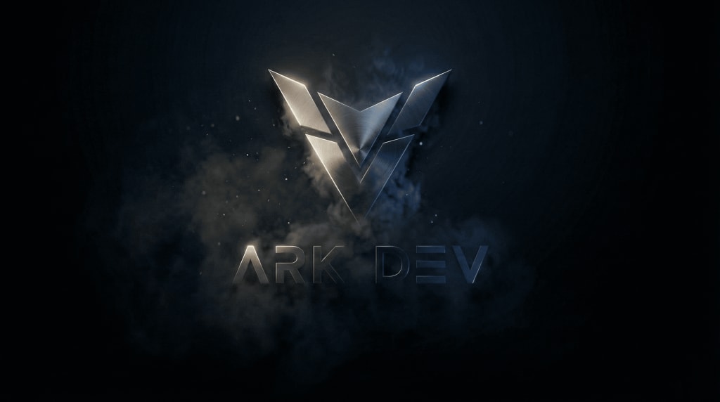
We chose a new aesthetic: a metallic structure emerging from absolute darkness.
Why darkness? Because that is where the real work happens. In cybersecurity, the threats hide in the dark, waiting for a vulnerability. In software development, the true solutions are found in the depths of complex logic, often late at night, in the "black box" of the code. We wanted our new identity to represent the act of bringing order to that chaos. The metallic sharp edges of our new symbol represent the tools we use to cut through the noise and build structures that last.
Efficiency Over Noise
We live in a digital world that is constantly screaming for attention. Competitors use bright gradients, flashy animations, and buzzwords to distract clients. We decided to go the opposite direction. We decided to go silent.
Black and white. Metal and shadow.
This wasn't a marketing gimmick or a trend we copied from a design blog. It was a reflection of how we operate now. We realized that our clients—whether they are in finance, health, or heavy industry—don't pay us for "noise." They don't pay us to be entertaining. They pay us for clarity. They pay us to be the solid, unshakeable structure that holds their operations together when things get tough. The new brand reflects a "military-grade" precision: no fluff, just results.
A New Era for Latin American Tech
This rebranding, which we are launching now in February 2026, is also a political and cultural statement about our region.
For too long, there has been a misconception that Latin American tech firms are merely "outsourcing hubs"—places where companies from the Global North go to find cheap labor. With this new, imposing identity, we are challenging that narrative. We are asserting that we are not just implementers; we are creators, architects, and innovators.
We are entering a new phase of expansion, looking at bio-engineering (through our upcoming ARK BIO initiative) and deeper AI integration that goes beyond simple chatbots. The new "ARK DEV" is designed to be a vessel for that future—imposing, elegant, and ready for the long haul.
To our partners and clients who have been with us since the early Santiago days: thank you for trusting the process. To those joining us now: welcome to the new structure.
We are no longer just writing code. We are building the future, and this time, we are dressed for the occasion.


Comments
There are no comments for this story
Be the first to respond and start the conversation.