
Unleashing the Power of Data: A Journey with Power BI
by Diya Baig

Unleashing the Power of Data: A Journey with Power BI
In the ever-evolving landscape of data analytics, my recent venture into Power BI has been nothing short of transformative. As I delved into the world of Business Intelligence, I found myself navigating through the complexities of ETL processes, data cleaning, and analytics, all leading in the creation of visually stunning dashboards. In this blog, I'm excited to share my journey and discoveries with you.
Digging into the Data Basics
Creating good visuals starts with something called ETL—basically getting the right data, making it right, and putting it where you need it. This part had its challenges, like dealing with messy data and figuring out good connections. But each challenge helped me get better at ETL and prepared me for what came next.
As I dove into ETL, it was like putting together pieces of a puzzle. Imagine you have a bunch of puzzle pieces (that's your data), and you need to arrange them just right to see the full picture. Sometimes the pieces are messy, and you must clean them up, but this process of making everything fit and connect smoothly is what ETL is all about.
Cleaning Up Data
There's a saying, "If you put junk in, you get junk out." So, I spent time carefully cleaning up the data. Power BI has tools that helped me find and fix mistakes in the data. This step made sure my analyses were right, and it made me feel confident about the dashboards I was creating.
Cleaning up data is like tidying up your room. If there's clutter everywhere, finding what you need becomes a headache. Power BI's tools acted like magical organizers, helping me tidy up the data space so that everything was neat and in its place.
Analysing with DAX and M Language Tricks
Once the data was clean, Power BI really showed its power. I used things called DAX and M language for advanced analytics. Don't let the names scare you—they're like special tools that help you dig deeper into the data and find important things hidden within.
Imagine DAX as your detective partner, helping you uncover secrets in the data. It's like having a magnifying glass that lets you zoom in on trends, patterns, and outliers. And M language is like having a helper who prepares the backstage—making sure everything is set up for your analysis to shine.
These helped me find important things hidden in the data. I could create special calculations and measures, making it fun to explore trends, patterns, and outliers. It's like solving a mystery where the clues are numbers, and DAX and M language are your trusty detectives uncovering the story hidden within the digits.
Creating Stories with Visuals
The best part of Power BI is turning raw data into cool visuals. With all the insights from analysing, I started designing dashboards. They don't just show information; they tell a story. Picking the right colours and visuals made the dashboards look good and catch the eyes of the people using them.
Think of the dashboards as your favourite picture book. Instead of a wall of numbers, you have engaging visuals that speak to you. It's like turning a boring data report into an exciting adventure, where each graph or chart is a page in your data storybook.
Lessons and the Road Ahead
Looking back, I learned a lot. From solving problems in ETL to becoming better at DAX and M language, each step taught me something new. It's like levelling up in a video game—you face challenges, conquer them, and gain new skills along the way.
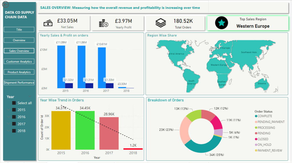
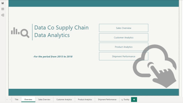
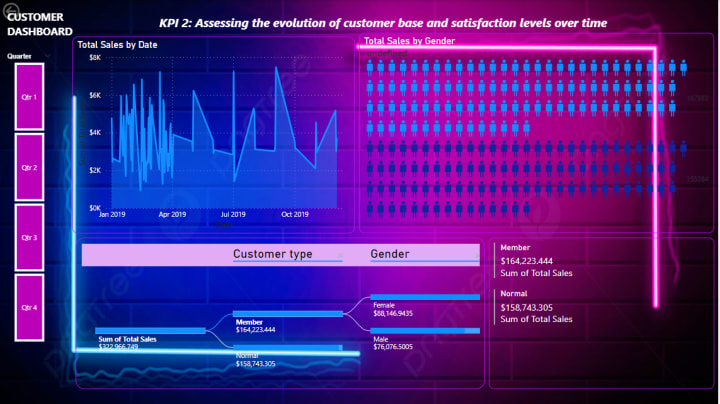
I'm excited to share bits of this journey with you through pictures of the cool dashboards I made. It's like flipping through a photo album, reminiscing about the challenges I tackled and the victories I celebrated.
I'm eager about what Power BI can still do. It keeps pushing what's possible with data. In the end, using Power BI was like going on an adventure into what data can do. I hope this blog inspires others who love data like I do. The world of data is wide, and with Power BI, there's so much we can explore.
Cheers to Your Data Exploration!
About the Creator
Diya Baig
Explore Finance, Tech, and Accountancy with me on Vocal. I am passionate about Data management, UI Designing, and Fintech. Let's dive into insights at the crossroads of these diverse fields.
Keep reading
More stories from writers in Education and other communities.
The One Lighting Move That Instantly Makes Your Photos Look Better
Photography advice often focuses on complex settings, advanced editing, or buying better equipment. While those things can help, they often distract from something far more powerful and immediate. One simple lighting habit can dramatically improve almost every photo you take, whether you’re shooting with a phone or a professional camera.
By Kelln Small6 days ago in Education
Managing Anxiety During Exams: A Student’s Guide
Exams are one of the most common sources of stress for students at every level. Even the most prepared individuals often feel nervous before or during a test. Exam anxiety is natural — it’s the body’s way of preparing for a challenge — but excessive stress can interfere with focus, memory recall, and overall performance. Understanding the causes of anxiety and learning effective coping strategies can make a significant difference. This guide provides practical, evidence-based techniques to manage stress before, during, and after exams.
By Games Mode On8 days ago in Education
🅼🅸🅳🅽🅸🅶🅷🆃 🆂🅽🅰🅲🅺🆂
"It's 10 in Tuscon! We all know what that means... It's Time for Midnight Snacks with your man, Gerald Gee! Ready to spend the night together? Me too! I'm full of snacks and can't wait to regurgitate them all back into your hungry ears. Crack a brew! Pop some corn! Anything to get ready for one hell of a show where the talk maybe cheap but the words cut deep...
By Lamar Wiggins4 days ago in Fiction


Comments (1)
This writing was Fantastic!!!. I liked it a lot and couldn't find any flaws. You're welcome! on vocal May you have a day full of smiles, always!