
Top 10 Mistakes in Data Visualizations That Could Ruin Your Assignment Score
Avoid common data visualization mistakes that can hurt your grades. Learn the top 10 errors and how to fix them in your data science assignments

Introduction
Data visualization plays a crucial role in communicating insights clearly and effectively in any data science assignment. But while visualizations are meant to make data easier to understand, poor execution can do just the opposite—mislead, confuse, or even completely derail your message. Students often turn to Data Science Assignment help when they struggle with visualizing their data correctly. Unfortunately, even with great analysis, common visualization mistakes can cost you valuable marks.
In this article, we’ll cover the top 10 data visualization errors students make—and how to avoid them—to ensure your data science assignment stands out for the right reasons.
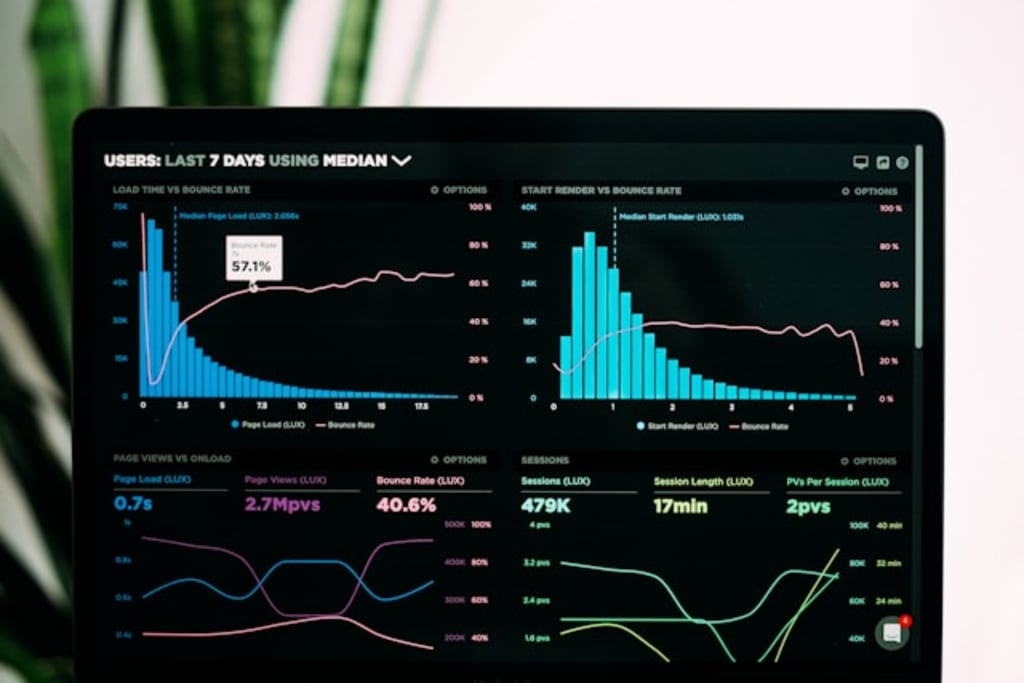
Why Clean Visuals Matter in Data Science Assignments
Data Science is all about extracting meaning from raw data, and visualizations are how you tell that story. Clean, accurate, and well-labeled visuals make your work more understandable and impactful.
- A good data visualization should:
- Represent data truthfully and clearly
- Highlight key patterns or insights
- Be easy to interpret, even by non-experts
- Complement your analysis and support conclusions
Let’s look at the mistakes that can prevent your visualizations from doing just that.
1.Using the Wrong Chart Type in Data Science
Using a pie chart to show trends over time or a line graph for categorical data can completely misrepresent your findings.
Fix:
Choose chart types based on the data structure—bar charts for categories, line graphs for trends, scatter plots for relationships, etc.
2. Overcrowding Your Visuals in Data Science
Stuffing too many elements—lines, bars, colors—into a single chart can overwhelm your audience.
Fix:
Simplify. Break complex information into multiple visuals, and use legends and spacing effectively.
3. Ignoring Axis Labels and Units in Data Science Charts
Without proper axis titles or scales, viewers can't interpret your chart correctly. It’s one of the most common rookie mistakes.
Fix:
Always label your axes, mention units (e.g., $, %, years), and use consistent scales.
4. Misleading Scales in Data Science Graphs
Starting your y-axis at something other than zero (without a clear reason) can exaggerate trends and mislead readers.
Fix:
Stick to zero-based scales unless a non-zero baseline is justified—and always indicate it clearly.
5. Overusing 3D Effects in Data Science Visuals
While 3D charts may look impressive, they often distort data and make interpretation harder.
Fix:
Stick with 2D charts unless the third dimension is essential and accurately rendered.
6. Using Inconsistent or Confusing Color Schemes in Data Science
Random or harsh color choices make your charts visually jarring and hard to follow.
Fix:
Use accessible, colorblind-friendly palettes. Reserve bright colors for key highlights only.
7. Failing to Include a Legend in Data Science Visuals
Without a clear legend, viewers can’t identify what different colors, lines, or patterns represent.
Fix:
Add legends to all visuals with multiple data categories or series. Make sure they’re easy to read.
8. Ignoring Data Distribution in Data Science Charts
Averages alone can be misleading if your data has outliers or skewness, yet students often miss this.
Fix:
Use histograms, boxplots, or violin plots to show distribution alongside summary statistics.
9. Using Too Many Visualizations in a Data Science Assignment
More isn't always better. Cluttering your report with charts can dilute your message.
Fix:
Be selective. Only include visuals that support your core insights and remove redundancy.
10. Forgetting to Explain the Chart in Your Data Science Assignment
A great chart means nothing without interpretation. Some students insert visuals without any context.
Fix:
Accompany every visualization with a brief explanation of what it shows and why it matters.
Browse this resource for more helpful articles, guides, and insights
Conclusion
Visualizations are one of the most powerful tools in a data science assignment—but only when used correctly. By avoiding these top 10 mistakes, you can ensure your visuals are clear, accurate, and impactful. Whether you're seeking Data Science Assignment help or striving to refine your presentation skills, mastering good visualization practices will significantly boost your grades and the clarity of your work.
About the Creator
Katherine Salvator
I’m Katherine Salvator — a writer at Rapid Assignment Help with a love for words, research, and storytelling. I write to inspire, inform, and connect through articles on education, fashion, lifestyle, and everything in between..
Keep reading
More stories from Katherine Salvator and writers in Education and other communities.
Top Tips for Writing a High-Scoring Healthcare Assignment
Healthcare assignments are more than just academic exercises; they are opportunities to demonstrate your understanding of critical concepts, analytical skills, and ability to address real-world challenges in a rapidly evolving field. Achieving a high score requires a strategic approach that goes beyond simply fulfilling the basic requirements. For many students, mastering these intricate demands often leads them to seek Healthcare Assignment Help, realizing the value of expert insights. This guide is designed to equip you with the essential tips to not only tackle your healthcare assignments but to ensure they consistently earn top marks.
By Katherine Salvator7 months ago in Education
What Caused the Big Bang?
Understanding the Big Bang Theory The Big Bang does not describe an explosion in space. Instead, it describes an expansion of space itself. At the beginning, all matter, energy, space, and time were compressed into an extremely small, hot, and dense state.
By shahkar jalal3 days ago in Education
Eating with Purpose: How Smart Nutrition Transforms Health and Lifestyle
Smart nutrition has emerged as a critical element of modern wellness, emphasizing intentional, balanced, and sustainable dietary choices. Unlike restrictive or fad diets that prioritize short-term results, smart nutrition focuses on long-term health, encouraging a thoughtful approach to the foods we consume daily. By understanding how nutrients affect the body, individuals can enhance energy, optimize performance, and foster mental clarity. This holistic approach reshapes not only physical health but also lifestyle habits, creating meaningful and lasting transformations.
By Matthew Pothoff4 days ago in Education


Comments
There are no comments for this story
Be the first to respond and start the conversation.