
The World is Loosing Colours
The Rise of the Neutral Era
Walk into a modern home, scroll through Instagram, or browse a clothing store today, and you’ll notice something curious: the world has gone neutral. Beige walls, grey sofas, white sneakers, black outfits, taupe coffee cups. Everywhere you look, the world seems to be draining itself of colour. While it may feel chic, minimalist, or sophisticated, it begs the question—are we losing something vital along the way?
Aesthetic Minimalism, Emotional Minimalism?
The trend toward neutrals in fashion, interior design, branding, and even lifestyle is unmistakable. Gone are the days of bold colour blocking, bright wallpapers, and daring fashion statements. Today, it’s about soft whites, earthy browns, dusty greys, and muted tones. The world feels like it’s been dipped in oat milk.
This shift isn’t just aesthetic—it reflects a deeper cultural mood. Neutrals are safe. They don’t offend. They blend in. They represent calm, control, and order. In an increasingly chaotic world, choosing a quiet colour palette can feel like taking a deep breath. But when everything starts to look the same, don’t we lose a bit of the vibrancy that makes life exciting?
Where Did the Colour Go?
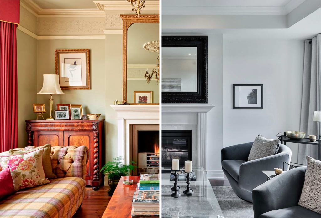
There was a time when homes were painted with mustard yellows and aquamarine blues, when people wore bright scarves and patterned shirts, when ads were loud, bold, and overflowing with energy. Today’s world is more polished, more curated, and often more subdued.
Social media has played a role. A neutral palette photographs well. It’s aesthetically cohesive, easy to match, and tends to get more likes. Influencers and brands have built entire identities around “beige-core” or “greige” aesthetics. But in chasing timelessness and perfection, we risk falling into sameness.
Fashion, But Make It Monochrome
In fashion, neutral tones have become a go-to for their versatility and elegance. Black and white are wardrobe staples. Beige is considered “elevated.” But where are the fuchsias, the electric blues, the bold reds? Colour used to be an expression of identity, culture, rebellion—even joy. Today, wearing colour can feel like an act of defiance in a sea of monochrome outfits.
Design and the Fear of Standing Out
Interior design follows the same path. The rise of Scandinavian minimalism, modern farmhouse, and industrial aesthetics has made white walls, light wood, and grey furnishings the norm. Homes look clean and serene—but sometimes sterile. Colourful, eclectic homes used to tell stories. Now, many look like magazine covers, polished but impersonal.
Why This Matters
Colour is not just decoration—it’s emotion. It evokes memories, feelings, and energy. A red dress can boost confidence. A yellow room can lift your mood. A splash of green can feel grounding. When we strip our surroundings and ourselves of colour, we risk dulling not only our environments but also our emotional expression.
Reclaiming the Spectrum
It’s not about rejecting neutrals—they have their place and beauty. But maybe it’s time to reintroduce colour into our lives, intentionally. Paint one wall in a daring hue. Wear a vibrant scarf. Pick up a piece of art that clashes a little. Let life be messy, expressive, and yes—colourful.
In a world that’s learning to value subtlety, calm, and restraint, let’s not forget the thrill of vividness, the power of contrast, and the joy of colour. Because life isn’t meant to be lived entirely in beige.
About the Creator
Keep reading
More stories from writers in Education and other communities.
Colors and Such
Before I retired in 2020, I worked as a Nursing instructor in one of the nation's largest community colleges. It was a job I thoroughly enjoyed for fifteen years because I had a heart for the students and genuinely wanted to invest in them and their futures.
By Shirley Belk6 days ago in Education
The Living Language of Creativity: Why Art Continues to Shape Human Experience
Art has existed for as long as humans have sought to express meaning beyond survival. Universal creative dialogue allows people to communicate emotions, beliefs, and ideas that cannot always be captured through words alone. From early symbolic markings to contemporary visual culture, art reflects how individuals and societies understand themselves and the world around them.
By Marissa Haugh2 days ago in Education


Comments
There are no comments for this story
Be the first to respond and start the conversation.