
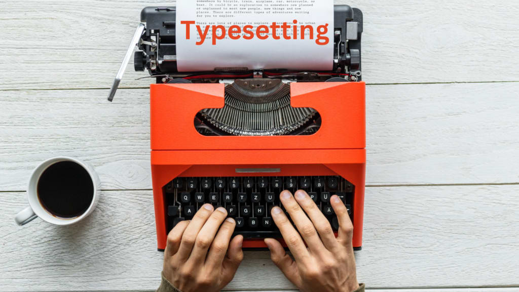
How Typesetting Improves Our Reading Experience
How Typesetting Improves
Introduction
Typesetting refers to the manner in which text is set out either on the printed or computer screen. It has a very central contribution in the way we interpret texts. Proper typesetting factors enhance the mode of reading encouraging people towards increased reading. By so doing, it assists readers on understanding the message without interference of other details. In this blog, let me share you some of the ways on how typesetting enhances the reading process.
1. Makes Text Easier to Read
The task of typesetting must lead to correct placement of letters to make the text easily readable. Proper font size, lines and Margins enable students read comfortably without straining their eyes on a piece of text.
Example: When there has been an adequate amount of space between the lines and large fonts it makes reading very easy.
Tip: The font should also be 12-14 points and one point five line spacing for ease of reading.
2. Helps Readers Find Important Points
Typesetting lays down the format of the text, both for easy search and to draw attention to important data. With right headings and sub headings properly implemented along with bold texts, a reader can locate what he or she is looking for very easily.
Why It’s Important: Organized text is efficient and makes the reader stay focused.
Tip: Headings should be clear such that there are clear breaks of text alongside use of short paragraphs for readability.
3. Keeps Readers Focused
Lack of complicated design makes the readers pay their attention to the content of an article. Sometimes, eliminating all the paraphernalia in the text also makes comprehension easier.
Tip: Do not choose more than two designs of font style and color, and avoid the use of decorations on your text.

4. Improves the Look of the Page
It helps the page to appeal to the eye most especially when proper typesetting is used. It is recalled that well-placed margins, evenly aligned text, and proper spacing of the content makes the material more interesting to peruse.
Tip: White space is effectively used to make your site look professional and uncluttered.
5. Sets the Right Tone
Styles can set the mood of your content Type setting applied can match the special theme of the content of the document. For instance, professionalism font such as Times New Roman is applicable for business reports while kid’s activities font such as the Comic Sans is applicable where it is intended for children’s books.
Tip: When using the text, it is advisable to stick to the right choice of fonts that will correspond to the content’s message.
6. Supports Accessibility
It is nice to see that creating proper typesetting of the material means that it would be accessible by everyone. Backgrounding text to give clear distinction and to use large print and clear fonts for easy reading is helpful for everyone especially those with vision difficulties.
Tip: Make sure to use fonts such as Arial for online media and do not use light color say white on bright background.
7. Increases Understanding
The easier it is for the text to be written and then comprehended, the easier it is to learn from. Understanding and distinguishing the different elements that are read by the people increases the speed of analyzing the details and effectiveness of the content, as a result typesetting is effective.
Tip: For details, always use lists, tables, bullets for simple clarification of some complex concepts.
8. Makes Reading Enjoyable
Magnificently compiled text motivates people to stay longer on a material. Proper typeseting produces a format that makes reading a pleasant experience hence readers continue to flock in large numbers.
Tip: Add text to images so that people find the content as more interesting.
Final Thoughts
Typesetting remains one of the most effective approaches to enhancing the readers’ experience. Subheading increases legibility of the text, assist readers to pay attention and structurally systematize information. Regardless of what you are doing: starting a blog, publishing an eBook, or even making a report, the typesetting strikes back in ensuring the message gets to the audience.
Instead of concentration on moving and interesting text, try to work on the possibility of read, logical structure and easy finding of information. Use great typesetting as a way to make your content better and to have a great impact on others!

Conclusion
Typesetting plays a vital role in improving the reading experience. By focusing on readability, structure, and accessibility, good typesetting ensures that your content is clear, engaging, and easy to follow. Whether you’re writing a blog, creating an eBook, or designing a website, a well-organized layout helps readers focus on the message and absorb information more effectively.
Investing time in great typesetting not only makes your content more visually appealing but also helps keep your audience engaged, leading to better user experience and greater success. So, remember: clear and thoughtful typesetting is key to making your content stand out and be understood. For more information visit ELOIACS.
About the Creator
Keep reading
More stories from Ashish Babaan and writers in Education and other communities.
Top Tips for Better UI/UX Design in 2024
Introduction As we find ourselves in 2024 UI/UX design become the critical factor to consider when it comes to assessing UVP in websites and apps. Contemporary users have very high demands – they seek simple and beautiful interfaces and very practical and efficient platforms. A properly designed UI/UX is not only visually appealing, but also guaranteed that the customer has a pleasant experience, is interested in the session and trusts your brand. Regardless of whether you are starting a new platform from scratch or optimizing an already existing one, paying attention to UI/UX design will help increase your results and ensure that your business scales at the desired rate. Are you ready to add that spark to your designing skills? Here are 10 UI and UX design tips to improve the efficiency of your UI/UX design in the year 2024!
By Ashish Babaanabout a year ago in Education
Purpose Driven Event Lighting Design That Unites Style, Comfort, and Safety
Event lighting design plays a decisive role in how people experience an event. It shapes the mood, guides movement, and supports safety at every step. When lighting is planned with purpose, it does more than look attractive. It creates a space where guests feel relaxed, confident, and protected.
By Brian Casella5 days ago in Education


Comments
There are no comments for this story
Be the first to respond and start the conversation.