
Creating an SEO-Friendly Responsive Design for Your Website
Optimized SEO-Friendly Responsive Design: Enhancing User Experience and Search Visibility

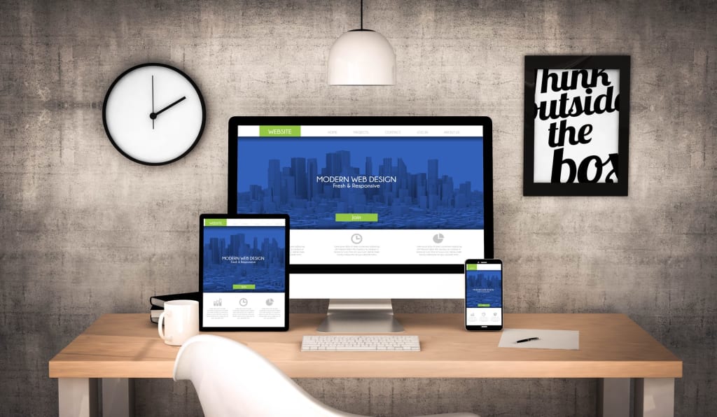
In the digital age, having a strong online presence is essential for businesses and individuals alike. A well-designed website not only needs to be visually appealing but also optimized for search engines (SEO) and adaptable across various devices (responsive design). This guide will explore the key elements of creating an SEO-friendly responsive design for your website, ensuring that it ranks well in search results and provides an excellent user experience.
Understanding SEO-Friendly Design:
SEO involves optimizing your website's content, structure, and technical aspects to improve its visibility in search engine results. To create an SEO-friendly design, keep the following points in mind:
- Keyword Research: Identify relevant keywords related to your content and incorporate them naturally into your website's text, headings, and metadata.
- Quality Content: Develop high-quality, engaging content that addresses your audience's needs and provides value. Search engines reward informative and original content.
- Meta Tags and Descriptions: Craft unique and compelling meta-titles and descriptions for each page to entice users to click through from search results.
Benefits of Responsive Design:
Responsive design ensures that your website looks and functions well on different devices, including desktops, tablets, and smartphones. Here's why it's crucial:
- Improved User Experience: A responsive design adapts to the user's device, offering a seamless and consistent experience. This reduces bounce rates and increases user engagement.
- Mobile-First Indexing: Search engines prioritize mobile-friendly websites in their rankings, as more users access the internet from mobile devices.
- Single URL: With responsive design, you maintain a single URL for your website across all devices, making it easier for search engines to index your content.
- Implementing Responsive Design Techniques: To create a responsive design, consider the following techniques:
- Fluid Grids: Use relative units like percentages for layout elements, allowing them to adapt to various screen sizes.
- Flexible Images: Resize images using CSS to prevent them from overflowing or becoming too small on different devices.
- Media Queries: Apply CSS media queries to apply different styles based on the device's screen size, orientation, and resolution.
Technical SEO for Responsive Design:
To ensure your responsive design is also SEO-friendly from a technical perspective:
- Mobile-Friendly Test: Use Google's Mobile-Friendly Test tool to verify that your website is compatible with mobile devices.
- Page Speed Optimization: Optimize images, minimize code, and leverage browser caching to improve page loading times.
- Structured Data Markup: Implement structured data markup to help search engines understand your content better and display rich snippets in search results.
Frequently Asked Questions (FAQs) about SEO-Friendly Responsive Design
Q1: What is SEO-friendly responsive design?
SEO-friendly responsive design refers to creating a website that not only looks great on various devices but also follows best practices for search engine optimization. It ensures that the website is easily discoverable by search engines and provides an excellent user experience on desktops, tablets, and smartphones.
Q2: Why is responsive design important for SEO?
Responsive design is important for SEO because it improves user experience by adapting to different screen sizes and devices. Google and other search engines prioritize mobile-friendly websites in their rankings, making responsive design a crucial factor for better search visibility.
Q3: How does responsive design affect mobile SEO?
Responsive design positively impacts mobile SEO by ensuring that your website is accessible and user-friendly on mobile devices. It helps in avoiding issues like slow loading times, distorted layouts, and frustrating navigation, which can lead to higher bounce rates and lower search rankings.
Q4: What are media queries in responsive design?
Media queries are CSS techniques used to apply different styles to a webpage based on the characteristics of the user's device, such as screen size, resolution, and orientation. They allow you to optimize the design for various devices and ensure a consistent experience across them.
Q5: How can I optimize images for responsive design?
To optimize images for responsive design, use CSS to resize images proportionally based on the viewport size. Additionally, consider using responsive image formats like the Web that offer better compression and quality for various devices.
Conclusion
In today's digital landscape, combining an SEO-friendly approach with responsive design is essential for a successful website. By prioritizing keyword research, quality content, responsive techniques, and technical SEO, you'll create a website that not only ranks well in search results but also provides an excellent user experience across all devices.
About the Creator
Sam pinkman
Hey there! I'm Sam, a tech writer who thrives on untangling the complexities of the ever-changing tech world. I translate those breakthroughs into clear, engaging stories that keep you informed and excited about the future.
Keep reading
More stories from Sam pinkman and writers in Education and other communities.
Best Practices for Responsive Web Design
In today's digital era, smartphones and tablets have become integral parts of our daily lives. Therefore, it is crucial for businesses to embrace responsive web design. This means creating websites that adjust and respond to different screen sizes and devices, ensuring an optimal user experience. This article will discuss the most efficient ways of implementing responsive web design, ensuring that your website delivers a seamless browsing experience on all platforms.
By Sam pinkman3 years ago in Education
The Credit Reset: Why Portugal is Embracing the USD 239.35 Million ‘Buy Now, Pay Later’ Wave
Walking through the Chiado district in Lisbon or scrolling through a Portuguese fashion boutique online, you’ll notice a significant change at the checkout. The traditional credit card is no longer the undisputed king. Instead, a new player has arrived: Portugal Buy Now Pay Later.
By Neeraj kumar6 days ago in Education
Why A2 Milk Is Changing the Way People Think About Dairy?
Recent developments in dairy consumption have been towards health and digestibility, with one of the most important developments in recent years being an increase in popularity of A2 milk. Once thought to be a niche product for people with difficulty digesting regular milk, an A2 following has developed among families, athletes and the health-conscious.
By Akshay Kumar6 days ago in Education


Comments
There are no comments for this story
Be the first to respond and start the conversation.