
8 Common Mistakes to Avoid When Designing Apron Mockups
8 Common Mistakes to Avoid When Designing Apron Mockups

Apron mockups are an essential tool for showcasing custom designs, branding elements, and marketing visuals for businesses, designers, and print-on-demand sellers. A high-quality apron mockup helps customers visualize how a design will look in real life, making it a crucial part of product presentations. However, many designers make mistakes that reduce the effectiveness of their mockups, leading to unappealing results.
A well-crafted apron mockup should be realistic, detailed, and visually engaging. Whether you are selling personalized aprons, branding restaurant uniforms, or creating promotional merchandise, avoiding common design mistakes can enhance the professionalism of your mockups. Below, we explore the most common errors and how to fix them.
1. Using Poor-Quality Images
One of the most common mistakes designers make is using low-resolution images for their apron mockups. A pixelated or blurry design can make your product look unprofessional and unappealing. High-quality mockups should have sharp details, smooth textures, and realistic shading.
To ensure top-notch quality:
- Always use high-resolution mockup templates with at least 300 DPI (dots per inch).
- Avoid images with artifacts, blurriness, or distortion.
- If editing in Photoshop, export in high resolution to maintain clarity.
- A professional mockup should look as close to a real-life product as possible, ensuring customers get an accurate representation of the design.
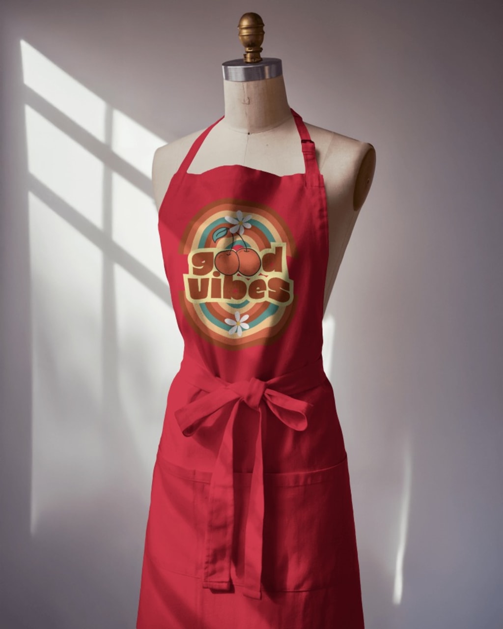
2. Ignoring Fabric Texture and Natural Folds
Aprons are made from different materials, such as cotton, polyester, or canvas, each with its own texture and behavior. Many designers make the mistake of placing a flat, rigid design onto the apron without considering how it would react to the fabric.
How to fix this:
- Choose apron mockups that accurately depict fabric folds and stitching.
- Use warp and distortion tools in design software to adjust graphics naturally to the fabric’s movement.
- Avoid placing logos or artwork on areas with heavy creases unless they are designed to be flexible.
- Ignoring these details can make the apron appear unrealistic, which reduces the credibility of your design.
3. Poor Color Contrast and Design Visibility
Your design should stand out against the apron fabric. If the contrast is too low, details can get lost, making the design hard to read. For example, a dark blue logo on a black apron might not be noticeable, while a light-colored design on a white apron may lack impact.
To fix this issue:
- Always test different color variations to ensure clarity.
- Use mockup generators that allow color customization to preview multiple options.
- Add an outline or shadow around text and graphics to improve readability.
- If your design blends too much with the fabric color, consider adjusting its hue or placing it within a contrasting background shape.
4. Overlooking Shadows and Lighting Effects
Lighting plays a crucial role in making apron mockups look professional and realistic. Many designers either ignore lighting or use mockups with unnatural shadows, making the apron appear flat or artificial.
To create a more natural look:
- Choose mockups with well-balanced lighting and realistic highlights.
- Avoid overexposed or underexposed images that can wash out details.
- If editing manually, add subtle drop shadows to give depth to the fabric and design.
- Lighting should enhance the texture of the apron and make the design look as though it is truly printed or embroidered onto the fabric.
5. Selecting an Unnatural Perspective or Angle
An apron mockup should mimic real-life usage. Some designers use awkward angles that distort the apron’s proportions, making it look stretched or unrealistic.
For better presentation:
- Use mockups that feature natural poses, such as an apron being worn by a model or laid flat on a surface.
- Avoid extreme angles that make the apron look too wide or too narrow.
- If showcasing a 3D mockup, ensure that the design aligns properly with the apron’s shape.
- A well-angled apron mockup helps customers visualize how the design will appear when worn, boosting confidence in the final product.
6. Forgetting About Branding Elements
If you are designing aprons for branding purposes, it is important to incorporate all necessary elements, such as logos, taglines, or small decorative details. Some designers focus only on the front design and forget to showcase branding on pockets, straps, or back panels.
To improve branding visibility:
- Use a mockup template that allows multiple views (front, side, and back).
- Place logos strategically in areas where they are easily visible but not overwhelming.
- Experiment with different placements to see what looks best on the apron.
- A well-branded apron can significantly enhance the professional appeal of a business, whether it’s for a café, restaurant, or promotional merchandise.
7. Not Optimizing for Different Platforms
An apron mockup that looks perfect on a high-resolution screen might not appear the same on mobile devices, e-commerce platforms, or social media. Many designers forget to resize and optimize images for different display formats.
To ensure consistency across platforms:
- Adjust the image size according to the platform’s recommended dimensions.
- Save images in web-friendly formats like PNG or JPEG to maintain quality while reducing file size.
- Test how your apron mockup appears on both desktop and mobile screens.
- Optimizing your mockup for various platforms ensures it looks sharp and professional everywhere, from Behance portfolios to product listings on e-commerce sites.
8. Ignoring the Background and Presentation
The background of an apron mockup plays an essential role in making the design pop. Some designers place the mockup on a cluttered or irrelevant background, distracting viewers from the main product.
To fix this issue:
- Use a neutral or thematic background that complements the apron’s style.
- If selling on an e-commerce platform, consider using a white or transparent background for a clean look.
- Add a relevant setting, such as a kitchen or café environment, to give context to the apron’s usage.
- A well-thought-out background enhances the professionalism and aesthetic appeal of your apron mockup.
Conclusion
Designing an apron mockup may seem simple, but small mistakes can make a big difference in how professional and appealing the final product appears. Avoiding common errors such as low-quality images, poor lighting, unnatural perspectives, and unoptimized branding can help create a visually stunning and effective presentation.
To make the process easier and ensure high-quality results, consider using an apron mockup generator. It allows you to quickly create realistic, high-resolution mockups with customizable elements, saving time while enhancing your product showcase. Start designing today and make your apron mockups stand out effortlessly!
also read:
About the Creator
ladali official
I am a content creator with a love for storytelling and turning ideas into visuals that captivate and connect. I focus on creating engaging, high-quality content that speaks to audiences across platforms
Keep reading
More stories from ladali official and writers in Education and other communities.
How to Create a Crop Top Mockup
In the competitive world of fashion, presentation is key. No matter how unique or stylish your designs are, if they are not displayed effectively, they might not attract the right audience. This is where crop top mockups come in handy. A well-crafted mockup helps bring your designs to life without the need for costly photoshoots or physical samples. Whether you are launching a new clothing line or running a print-on-demand store, using crop top mockup can elevate your brand's appeal and professionalism. In this guide, we will take you through the process of creating a crop top mockup that looks stunning and ready for marketing.
By ladali official11 months ago in Education
How Social Media Helps Small Businesses Grow Faster
Small businesses need smart ways to grow without large budgets. Social media offers one of the fastest and most affordable paths. When used well, it helps small brands reach new customers, build trust, and drive steady sales. Growth that once took years can now happen in months.
By Michael Kazma5 days ago in Education
Prevention First: How Proactive Medical Care Builds Stronger Communities
Preventive medical care plays a critical role in shaping healthier communities. When people receive care before illness develops, they avoid many severe conditions. This approach improves quality of life and reduces strain on healthcare systems. Moreover, prevention supports long-term wellness rather than short-term treatment. Communities that prioritize preventive care experience lower rates of chronic disease. As a result, individuals remain active and productive. Preventive care, therefore, serves as the foundation for sustainable public health.
By St. John's Community Healtha day ago in Education
The Devil's Cut
“Comrade, finally you’re awake.” The voice was smooth, sensual. A flickering incandescent bar was all that lit the white, sterile room. All Vladimir remembered was everything going black. He tried to move his arms and found them strapped to the gurney.
By Matthew J. Fromm7 days ago in Fiction


Comments (1)
I’ll avoid these mistakes for sure! Great work!