
The Chicago Font: A Timeless Design in Digital Typography
The Chicago


The Chicago font is an iconic typeface that holds a special place in the history of digital typography. Designed by Susan Kare in 1984, it was originally developed for Apple Inc.’s Macintosh computer.
As the default system font for early versions of the Mac operating system, Chicago became synonymous with the groundbreaking era of personal computing. Let’s delve into its origins, characteristics, and legacy.
Origins of the Chicago Font
Susan Kare, a graphic designer and pioneer in digital interface design, crafted Chicago as part of a suite of fonts for Apple’s first Macintosh. The font’s name follows Apple’s tradition of naming typefaces after major cities.
Chicago was designed with readability in mind, ensuring it was legible on low-resolution screens of the 1980s. Its pixelated structure and bold, sturdy strokes made it a practical choice for the technology of the time.
Chicago first appeared in the original Macintosh operating system and was later featured in other Apple products, including the early iPod interfaces. Its association with Apple and its ubiquitous presence during the dawn of graphical user interfaces cemented its status as a cultural and technological milestone.
Key Characteristics of the Chicago Font
Pixel-Optimized Design: Chicago was specifically designed for low-resolution displays, with each character carefully crafted to be legible even in small sizes.
Bold and Sturdy Appearance: The font’s bold strokes and simple shapes were instrumental in making text stand out clearly on early computer screens.
Sans-Serif Structure: As a sans-serif font, Chicago has clean lines and no decorative flourishes, contributing to its readability.
Monospaced Attributes: Chicago’s fixed-width characters provided a uniform and balanced appearance, a feature valued in early user interfaces.
Legacy and Modern Usage
Although Chicago was eventually phased out of Apple’s operating systems, its influence remains. It set a precedent for digital font design, emphasizing clarity and functionality. Chicago’s pixel-based aesthetic has also inspired nostalgia among designers and tech enthusiasts.
Today, the font occasionally resurfaces in retro-inspired designs and projects aiming to evoke the early days of personal computing. Its association with Apple and the revolutionary Macintosh ensures its enduring legacy in the world of typography.
Conclusion
The Chicago font is more than just a typeface; it’s a symbol of technological innovation and design ingenuity. Created for an era of technological constraints, it managed to transcend its utilitarian purpose to become a timeless icon. Whether viewed as a functional solution for early computing or a piece of design history, Chicago’s impact on typography and user interface design is undeniable.
FAQs About the Chicago Font
Who designed the Chicago font?
Chicago was designed by Susan Kare in 1984 as part of Apple’s original Macintosh interface.
Why is it called the Chicago font?
The font follows Apple’s tradition of naming typefaces after major cities.
What made the Chicago font unique for its time?
Its pixel-optimized design ensured legibility on low-resolution screens, a critical feature during the early days of personal computing.
Where was the Chicago font used?
It was used in Apple’s Macintosh operating systems and the early interfaces of the iPod.
Is the Chicago font still in use today?
While not in active use on modern systems, it remains popular in retro designs and among enthusiasts.
What type of font is Chicago?
Chicago is a sans-serif font, characterized by clean lines and a lack of decorative elements.
Can I download and use the Chicago font today?
Yes, the font can be found online, often as part of retro font collections, though licensing terms may vary.
About the Creator
Jillur Rahaman
Jillur Rahman is the creative mind behind FontOrbit. This website is a vibrant hub for typography enthusiasts. With a CSE degree and over a decade of experience in web design & development, Jillur got passion for sharing knowledge.
Keep reading
More stories from Jillur Rahaman and writers in Art and other communities.
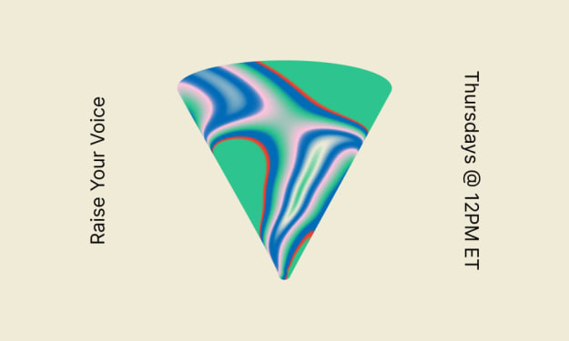
📢 Raise Your Voice Thread: 01/22/2026
Our “Raise Your Voice Threads” are hosted most alternating Thursdays at 12PM ET to offer creators more avenues to uncover exceptional stories on Vocal. As we are continuously searching for fresh creators and inspiring stories, this thread provides an opportunity to exchange and discuss the stories that have moved and motivated us on Vocal.
By Raise Your Voice by Vocal5 days ago in Resources

Comments
There are no comments for this story
Be the first to respond and start the conversation.