
Custom Packaging with Consistent Brand Colors: is maintaining a unified colour scheme across the brand important?
Learn how trademarked colours and cohesive branding in custom packaging drive recognition, emotional connection, and competitive advantage for brands.
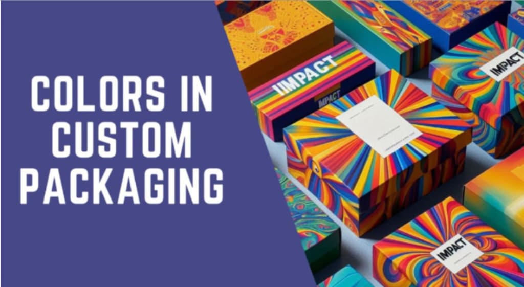
Key Insights on Custom Packaging and Trademarked Colors
What colour comes into your mind when you think of Ferrari?
Red.
The specific red of Ferrari, Rosso Corsa that beautifully contains the powerful engine inside also contains the power of the brand. Rosso Corsa, translated as Racing Red represents the lifeblood of the brand and racing heritage of Italy. Out of 1000 Ferraris produced almost 421 are red, projecting it as an iconic brand-specific colour that has effectively achieved the targeted consumer perception.
Consumers’ perception of a brand is one of the strongest performance measures of brand success and the development of favourable consumer perception depends on a synergic use of several marketing strategies. In today's visually driven market, it is also crucial to understand the role of colours in establishing recognition or association with a particular brand concerning its psychological implications and industry-specific applications as a key branding feature.
Colour consistency refers to the uniform use of specific colours across all branding platforms and is an especially significant form of communication through custom packaging. In the realm of custom packaging, visual vocabulary is one of the key elements that contribute towards the development of brand identity. Targeted association of colors such as in product boxes or logo printing on custom boxes helps in creating a lasting impression on the consumers. The list of global brands that have been able to create a unique identity through a unified colour scheme is long which only goes to show that this is a fruitful branding strategy albeit being hard to achieve.
This makes maintaining a consistent colour scheme across a brand not just an aesthetic choice but also a strategic one, that can have a significant influence and lasting impact on the brand's performance. Your brand colors should stand out and consumers should quickly be able to recognize and eventually trust the brand.
With the importance of the colour scheme for your brand’s custom boxes introduced, let’s delve into the detail of how colours impact consumer psychology, what classifies as a unified colour scheme and its impact on branding and finally how you, as a brand, can make use of a consistent colour scheme to maximize brand equity.
The psychology of colours
The bridge between colours and emotions helps brands curate an outlook of how they want their products to be perceived by their targeted audience. This particularly includes custom packaging that simultaneously serves as a branding tool.
When brands customise a box for their products, it helps build an instant connection between the company and its consumers. In some cases, it can even become an iconic association with the particular brand, some popular examples include The Ordinary Skincare, Oatly, Allbirds and Ben & Jerry’s.
The consistent use of a colour palette can reinforce these emotional cues - creating a sense of familiarity and comfort with the brand’s custom packaging and product. Every colour has a distinct impact on the viewer and different colour combinations have the power to evoke different feelings and associations.
Let’s imagine colours for the next few minutes:
● Yellow is bright, attention-grabbing, and joyful. Brands like McDonald's use it to convey friendliness and optimism, which aligns with the brand’s appeal to families and young consumers. Due to its vivid appearance, yellow is also used for hazard warning signs.
● Red: Bold, energetic, and passionate. Employed by brands like Coca-Cola to evoke excitement and connection.
● Blue: Trustworthy, secure, and calming. Utilised by financial institutions like PayPal and American Express to convey reliance and stability.
● Green: Natural, growth-oriented, and harmonious. Associated with eco-friendly brands and health-conscious companies.
● Purple: Luxurious, creative, and sophisticated. Used by premium brands like Cadbury and Hallmark.
The Importance of Consistent Color Scheme in Custom Packaging
Brand-centric customized packaging is of immense importance as it is a physical introduction of the brand to the consumers. For example, custom boxes used to pack Barbie dolls will always include the same Barbie Pink colour as the Shining Star. During the 2024 wave of the “Hello Barbie” trend, photo booths, backdrops, clothing and accessories were only a few elements where the audience engaged with the exact colour scheme adding only more brand power to an existing portfolio.
How did Mattel make it happen?
The first branding tactic is to ensure the same visual outlook for a brand the uniformity in colour appearance should remain indistinguishable in various contexts or conditions. This concept is crucial in fields like printing, photography, and digital design, where the perception of colours should remain stable regardless of lighting conditions, display devices, or materials. The primary, secondary, and accent colours employed for brand representation are carefully selected from a well-defined colour palette and laid out in a brand style guide.
The primary colour associated with the brand is then used in logos to help consumers associate the colour with the brand name. Other key branding elements such as the print on custom boxes and/or the custom packaging inserts are empowered with secondary and accent colours that work to accentuate the primary colour. When brands customise a box in the same colour palette that is made to resonate with the brand's values, they are working towards creating a synergistic impact in the market. A consistent colour palette can create:
1. Instant Recognition
It not only helps maintain a strong visual identity but allows the brand to maintain a cohesive message making brand recognition and recall easier even from a distance or at a single glance.
2. Brand Identity and Emotion
Consistent use of a colour palette can reinforce these emotional cues, creating a sense of familiarity and comfort with the brand while building a sense of continuity. The brand’s presence in the market is strengthened with this familiarity, making it a more probable choice for consumers over competitors. This also extends to the unified use of colors in custom boxes associated with the brand's product.
3. Trust and Credibility
Color consistency helps maintain visual coherence across different platforms and ensures the brand’s identity is reinforced in every consumer and brand interaction through its custom packaging. This means that when consumers see the brand’s colours in different contexts, whether on social media, a billboard, or custom boxes/ packaging there is an immediate connection drawn to the product and brand.
4. Differentiation
The association between colours and emotions helps brands shape how they want to be perceived by their audience hence colour associations are not accidental they are a result of deliberate and consistent use of colours over time, making them integral to the brand’s identity and recognition.
The Role of Trademarked Colors in Establishing Brand Exclusivity and Identity
The practice of trademarking colours is a great example of effectively grasping the significance of utilising a unique or exclusive colour palette in branding.
Brands move to trademark certain colours to gain legal ownership of use or protected exclusivity of a single or set of colours. This is to ensure that copycat and competitive brands are unable to dilute the brand’s identity by producing material in the same colours. Because such organizations understand deeply the value of a sharp connection between a brand and its colours, they are willing to financially investing in protecting their exclusivity.
Some examples of trademarked colours are:
1. Tiffany Blue – Tiffany & Co.: The hard-to-miss custom boxes of Tiffany’s & Co. feature a light Robin's egg blue, associated exclusively with Tiffany and Co. for packaging and other promotional material making it easily identifiable with the brand
2. Coca-Cola Red – Coca-Cola: Its distinctive red custom packaging was originally chosen to differentiate Coke’s barrels from alcoholic spirits but has now become the identity for the entire black carbonated drinks category.
3. McDonald's Red and Yellow: Red and yellow is a trademarked combination and is very closely associated with the brand. The bright red custom box of the popular Happy Meal is very significant to the brand’s identity.
4. Cadbury Purple – Cadbury: The specific shade of purple used by Cadbury, known as Pantone 2685C, is protected in the UK for use on custom packaging for Cadbury chocolates.
5. Barbie Pink – Mattel: Since the launch of the first doll by Mattel the shade Panton 219 C has been associated with the doll and its significant pink custom box. Despite not being registered as a trademark it gained trademark protection.
For companies with iconic brand identities, trademarked colours are central to the brand's visual vocabulary and customized packaging that helps build an emotional connection with its targeted audience.
Successful brands leverage colour consistency to their advantage by developing custom boxes in colours and images that resonate across different demographics.
Is colour consistency crucial in branding?
According to researchers based on colour psychology, colours can boost brand recognition by up to 80% as visual vocabulary is easier for the human mind to comprehend and recall compared to words or numerics (Forbes, 2013). In the chaos of daily life, snippets of visual information seen by us are captured and stored allowing recognition or recall upon a similar interaction. This is why it is essential to partner with a custom packaging manufacturer who thoroughly understands the right use of colours when you customize a box for your brand.
Inconsistency in colour branding can become visually confusing for consumers. Frequent changes in colour palette or failure to maintain uniformity across different platforms can sometimes make it harder for consumers to form a lasting connection with the brand, as they may struggle to identify and differentiate the packaging from others in a physical setting or otherwise.
Using a unified colour scheme across different custom boxes for the brand eases reliability, and this principle extends to visual branding as well particularly custom-packed goods because appearances can be a game changer for marketing and have a lot of potential to create success in the market based on looks only.
References
Forbes. (2013). 16 Ways To Use Color To Bolster Your Personal Brand, Available at https://www.forbes.com/sites/williamarruda/2013/08/12/16-ways-to-use-color-to-bolster-your-personal-brand/
About the Creator
Auther
i am guest post provider
How Tattoo Parlours in Cape Town Help Clients Feel Comfortable and Informed
Walking into a tattoo parlour in cape town for the first time can feel strange. You are trusting someone with your skin, your story, and a design you might wear for life. It is normal to feel excited and scared at the same time.
By Tools of Trade Studios5 days ago in Art
Smart phones, Humans and Aliens.
WARNING. I will be tapping into one of your favorite creative tensions: The absurdity of humans worshipping their glowing rectangles as if they were tiny oracles. There’s something deliciously poetic about that contradiction, and it lends itself beautifully to an instructive proviso.
By Novel Allen5 days ago in Poets


Comments
There are no comments for this story
Be the first to respond and start the conversation.