
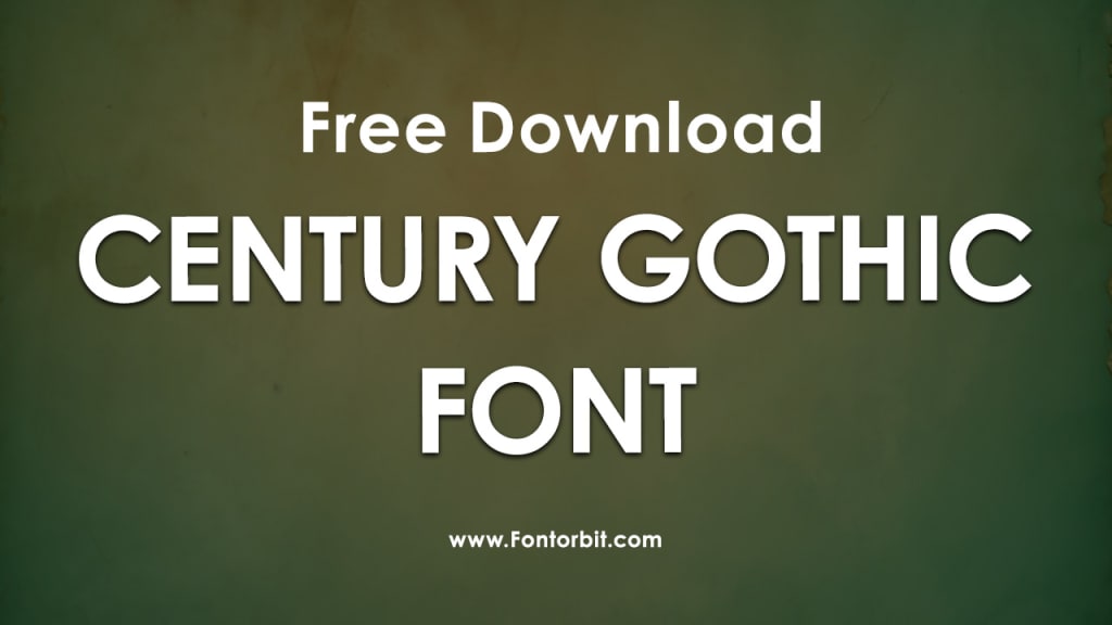
Century Gothic Font: A Modern Classic in Typography
Century Gothic Font

Century Gothic is a sans-serif typeface that has gained widespread popularity in the world of typography and design.
Known for its clean, geometric design and contemporary appeal, Century Gothic has carved a unique niche in both print and digital media. This article explores the origins, characteristics, uses, and significance of this iconic font, along with a few considerations for its application.
Origins and History
Century Gothic was released by Monotype Imaging in 1991 as a modern reinterpretation of the classic geometric sans-serif fonts of the 1920s and 1930s, such as Futura and Avant Garde.
Its design emphasizes simplicity and readability while maintaining an elegant and futuristic aesthetic. The font's development was driven by the need for a versatile typeface that would perform equally well on screen and in print, particularly in small sizes.
Key Characteristics
Geometric Simplicity: Century Gothic is defined by its geometric shapes, with letters like "O," "C," and "G" perfectly circular and other characters showcasing symmetry.
Uniform Weight: The font features consistent stroke weights, making it visually balanced and harmonious.
Wide Letter Spacing: Its slightly wider letter spacing enhances legibility, particularly in body text.
Minimalist Design: The absence of serifs and additional embellishments aligns it with modernist principles.
Versatile Glyphs: Century Gothic supports a broad range of characters, symbols, and diacritical marks, making it suitable for multilingual use.
Common Uses
Century Gothic is a versatile typeface that finds application across a variety of mediums:
Advertising and Marketing: Its clean, modern look makes it ideal for headlines, posters, and brochures.
Web Design: Century Gothic’s readability and scalability ensure a seamless user experience on digital platforms.
Education and Academia: Frequently used in presentations, reports, and educational materials due to its clarity.
Branding and Logo Design: The font’s sleek aesthetic complements contemporary branding efforts.
Print Media: From magazines to business cards, it’s a go-to choice for designers seeking a professional yet approachable feel.
Considerations for Use
While Century Gothic is celebrated for its modern appeal, there are some factors to consider:
High Ink Usage: Its wide letters can consume more ink in print, which may not be cost-effective for large-scale projects.
Limited Formality: The font’s casual tone may not suit highly formal or traditional contexts.
Accessibility Issues: While visually pleasing, Century Gothic may present challenges for individuals with visual impairments due to its uniform stroke width.
Conclusion
Century Gothic stands out as a modern classic in the typography landscape. Its geometric simplicity and contemporary design make it a favorite among designers and typographers.
While it may not be the best fit for every project, its versatility ensures a wide range of applications. Whether you’re designing for print, web, or branding, Century Gothic is a reliable choice that brings elegance and clarity to your work.
FAQs About Century Gothic Font
1. What is the origin of Century Gothic?
Century Gothic was designed by Monotype Imaging in 1991 as a modern reinterpretation of geometric sans-serif fonts from the early 20th century.
2. Is Century Gothic free to use?
Century Gothic is not a free font; it’s typically included in Microsoft Office packages or available for purchase through licensed font providers.
3. Can Century Gothic be used for web design?
Yes, Century Gothic is well-suited for web design due to its readability and clean appearance, though licensing considerations may apply.
4. What are the best alternatives to Century Gothic?
Futura, Avant Garde, and Avenir are excellent alternatives, offering similar geometric sans-serif styles.
5. Why is Century Gothic considered eco-friendly?
Due to its thinner strokes, Century Gothic uses less ink compared to other typefaces, making it an eco-friendly option for printing.
6. Does Century Gothic support multiple languages?
Yes, Century Gothic includes a wide range of characters and diacritical marks, making it suitable for multilingual text.
7. What are the drawbacks of using Century Gothic?
Its wide letterforms can lead to increased ink usage in printing, and its casual tone may not suit all formal contexts.
About the Creator
Jillur Rahaman
Jillur Rahman is the creative mind behind FontOrbit. This website is a vibrant hub for typography enthusiasts. With a CSE degree and over a decade of experience in web design & development, Jillur got passion for sharing knowledge.
Keep reading
More stories from Jillur Rahaman and writers in Art and other communities.
John LoPinto on Travel as Perspective
Travel is often viewed as leisure or escape, but John LoPinto sees it as something more purposeful. For him, travel is a tool for perspective. By exploring new markets, cultures, and operating environments, leaders sharpen their strategic thinking and gain insights that are difficult to access from a distance. Exposure to unfamiliar contexts challenges assumptions and strengthens decision making.
By John LoPinto5 days ago in Art


Comments
There are no comments for this story
Be the first to respond and start the conversation.