
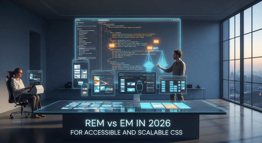
Rem vs Em in 2026 for Accessible and Scalable CSS
Learn when to use rem and em in 2026 to build accessible, zoom-safe, and scalable interfaces across modern devices.

Modern web development in 2026 has moved entirely away from static sizing. Foldable devices and ultra-high-density displays are now everywhere. Strict accessibility laws are also in place. Choosing between em and rem is no longer a matter of preference. It is now a functional requirement for inclusive design.
For developers at the Middle of the Funnel (MOFU) stage, this is critical. You are moving from "making it look right" to "making it work everywhere." Understanding these relative units is the first step toward professional-grade CSS.
The State of Web Sizing in 2026
In 2024, many developers still leaned on pixels (px) for component sizing. By 2026, browser-level zoom is the primary way users interact with the web. User-defined font sizes are also very common. In the past, browsers defaulted to 16 pixels. Users can now easily change this default setting.
If you hardcode a button to 20px, you cause a problem. You are overriding a user’s choice to see text larger. This creates a barrier for those with visual impairments. Hardcoded pixels do not scale when a user adjusts their settings. This makes your site non-compliant with 2026 accessibility standards.
The shift toward container queries is now complete. "Fluid typography" means that units must be relative to something. They reference either the root font size or the parent element. This is where rem and em serve distinct purposes. They are not interchangeable.
The Rem Unit: The Foundation of Global Consistency
The rem unit stands for Root EM. It is relative to the root element. For web documents, the root element is the <html> tag. This tag serves as the base for the entire page. In most modern browsers, the default root size is 16px.
How it works in practice: If your root is 16px, then 2rem equals 32px. It always references the root. It remains consistent throughout the entire document. It does not matter how many nested containers an element sits inside. It ignores the font size of parent elements. It only looks back at the <html> tag.
Why it is the 2026 standard for layout:
- Predictability: You don’t have to worry about "compounding" issues. Font sizes will not get progressively smaller or larger by accident.
- Accessibility: A user might change their browser’s default font size to 20px. Every rem unit will then scale proportionally. Your layout stays perfectly balanced.
- Maintenance: You can change a single value at the root level. This updates the entire application's spacing instantly. It also updates typography at the same time. This saves businesses hundreds of hours in maintenance.
The Em Unit: Localized Flexibility for Components
The em unit is relative to the font size of its parent element. This sounds similar to rem. However, its behavior is context-dependent. It looks at the nearest container rather than the root.
How it works in practice: Suppose a <div> has a font size of 20px. An inside padding of 1em will be exactly 20px. If you change that <div> font size to 30px, something happens. The padding automatically grows to 30px. You do not have to write another line of code.
Where em excels:
- Component Scalability: It works for icons or buttons that should grow with text. If the label gets bigger, the icon follows.
- Media Queries: Using em in @media rules is a 2026 best practice. It accounts for browser zoom levels more accurately than pixels. It even beats rem in certain legacy engines.
Real-World Implementation: Rem for Layout, Em for Details
To build a professional interface, you must use both. A common mistake is using only one or the other.
Hypothetical Scenario: The Scalable Card Component Imagine you are building a pricing card. You want the overall structure to stay consistent across the site. Use a grid for this. But you want the internal padding to scale. You also want the icon size to scale. This helps if you make a "Featured" version of the card with larger text.
- Use rem for the margin: This ensures the gap between cards stays consistent. It matches the rest of your site’s layout. It uses the global spacing rule.
- Use em for internal padding: Increase the card's font size for a "Pro" version. The internal spacing will then breathe naturally. The padding grows because it is relative to the card text. It does this without manual adjustment.
AI Tools and Resources
- PostCSS Pixel-to-Rem: This is a build tool. It automatically converts your px values to rem. It does this during the compilation phase. It is essential for developers who think in pixels. It helps them ship accessible code.
- Stylelint-Scalable: This is a 2026-standard linting plugin. It flags hardcoded pixel values in your CSS. It then suggests the appropriate relative unit. It bases this on your project's configuration.
- Modern Fluid Type Generators: These are browser-based AI tools. They calculate "clamp" functions using rem. This creates typography that scales smoothly. It works between mobile and desktop resolutions. You don't need dozens of media queries.
Risks, Trade-offs, and Limitations
The biggest risk in using relative units is the Compounding Effect of em. This happens when you nest tags. Imagine you nest three elements. Set each one to 0.5em. The first is 50% of the parent. The second is 50% of that 50%. The third becomes tiny. The innermost text will be very small. It will be 1/8th the size of the original. This is a common failure scenario. It happens in complex navigation menus. It also happens in nested comment threads.
Warning Signs of Unit Mismanagement:
- Your layout "shatters" when the user zooms to 200%.
- You find yourself using "hacky" pixel overrides. This usually happens to fix text that is too small.
- You are manually calculating decimals like 0.625rem. You should be using a consistent design system instead.
For companies scaling their digital presence, architectural CSS decisions matter. Technical debt grows when units are inconsistent. This is vital when considering mobile app development Houston or other high-growth tech hubs. These choices are the difference between a high-performing site and a rewrite. You don't want to rewrite your code in twelve months.
2026 Authority Takeaways
- Default to Rem: Use rem for global layout needs. This includes margins, heights, and general font sizes. It provides the most stable accessibility foundation.
- Reserve Em for Components: Only use em for specific property scaling. Use it when a property should be tied to the text size. This applies to padding or icon widths inside specific containers.
- Abandon Pixels for UI: Pixels are for very small borders only. These are borders of 1px or 2px. In 2026, a pixel-based layout is considered a broken layout.
- Test at 200% Zoom: Always verify your rem and em logic. Do this by increasing browser font settings. If your containers don't expand, you have a bug. It is a "hidden" fixed-width bug that needs fixing.
About the Creator
Keep reading
More stories from Devin Rosario and writers in 01 and other communities.
Babylonjs vs Threejs Code Quality Simplicity
Choosing between Babylon.js and Three.js goes beyond just features—it's about how clean your code stays as projects grow. Both frameworks power stunning 3D web experiences, but they approach code organization and developer experience very differently.
By Devin Rosario2 months ago in 01
Why Museums Are Turning to Mixed Reality and AI to Engage Gen Z Visitors
Museums face a structural challenge. The demographic profile of their visitors is shifting. Generation Z, people born between 1997 and 2012, requires different methods of engagement than previous generations. This group uses digital interfaces to access information. They do not respond well to static displays. They expect active participation.
By ViitorCloud Technologies6 days ago in 01
When the Shelter Closes
Across the street from my house, a man slept under a tree, his dog by his side. My first, naive thought: he must be traveling through. But he kept coming back, often sleeping there during the day. Then it hit me—that person might not have a home.
By Bride of Sound6 days ago in Humans


Comments
There are no comments for this story
Be the first to respond and start the conversation.