
Line Height and Letter Spacing — Fine-Tuning Your Text for Maximum Readability
This article is part of a free full CSS Course: Beginner to Expert

Typography is the soul of web design, and two often-overlooked heroes in text styling are line height and letter spacing. While choosing the right font and size grabs the spotlight, these subtle adjustments determine whether your text feels crammed or breezy, chaotic or elegant.
In today’s post, we’ll explore how line height (the space between lines of text) and letter spacing (the space between individual characters) can dramatically improve your text’s readability and overall design. These are the finishing touches that can make or break your web typography.
1. What Are Line Height and Letter Spacing?
Let’s start with a quick breakdown:
- Line Height: This is the vertical space between lines of text in a block. Too little line height makes text hard to read, while too much can make it look disconnected.
- Letter Spacing: Also known as tracking, this refers to the horizontal space between characters in a word. Adjusting it can create a cleaner look or make certain text stand out.
Together, these properties are like the air your text breathes — get them right, and your design will feel light and accessible.
2. Line Height: Giving Text Room to Breathe
The line-height property controls the amount of space above and below each line of text in a block. This is especially important for multi-line text, like paragraphs or lists, as it affects how easy your content is to read.
2.1 Syntax of Line Height
Here’s how you set line height in CSS:
line-height: 1.5; /* recommended default */
You can specify line-height using different units:
Unitless Number: This multiplies the font size. For example, line-height: 1.5; means the line height is 1.5 times the font size.
Percentage: Specifies the line height as a percentage of the font size. Example: line-height: 150%;.
Fixed Units: Sets a specific line height in px, em, etc. Example: line-height: 24px;.
2.2 Why Line Height Matters
Imagine reading a paragraph where the lines are crammed together — your eyes would strain, and the text would feel overwhelming. On the flip side, excessive spacing between lines makes the content feel disjointed.
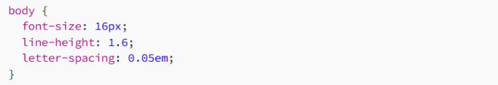
A good rule of thumb is to set line height between 1.4 and 1.6 times the font size for most body text. This strikes the perfect balance between readability and aesthetic.
2.3 Examples of Line Height
Standard Line Height for Body Text
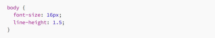
This creates a line height 1.5 times the font size, which is perfect for reading long paragraphs.
Tight Line Height for Headlines
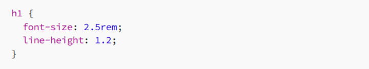
Headlines often benefit from a slightly tighter line height, giving them a bold and impactful look.
2.4 Adjusting Line Height for Different Fonts
Different fonts have varying natural line spacing, so don’t assume the same line-height will work for all. A serif font like Times New Roman might need a bit more space than a sans-serif font like Arial.
Example:
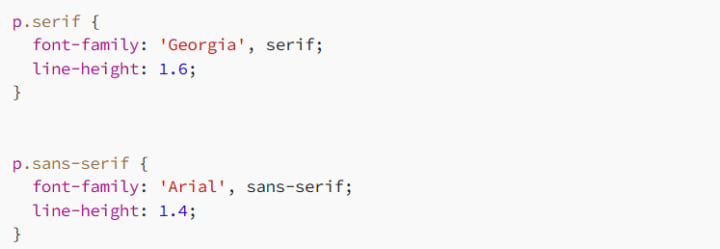
Here, we’ve adjusted the line height based on the font’s unique characteristics.
3. Letter Spacing: Fine-Tuning Character Spacing
The letter-spacing property adjusts the horizontal spacing between characters in text. Whether you’re looking to create a sophisticated title or improve readability for long-form content, letter spacing is a powerful tool.
3.1 Syntax of Letter Spacing
Here’s the basic syntax:
You can use any unit for letter spacing, but relative units like em are preferred because they scale with the font size.
3.2 Why Letter Spacing Matters
Proper letter spacing improves legibility, especially in all-uppercase text or large headlines. Without enough spacing, letters can look cramped, making the text hard to read. On the flip side, too much spacing can feel disconnected and visually jarring.
3.3 Examples of Letter Spacing
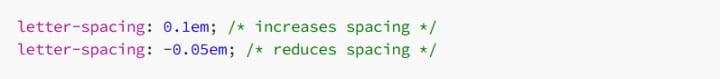
Expanding Letter Spacing for Headlines
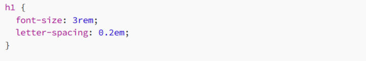
Adding extra space between letters in headlines can create a modern and elegant look.
Tightening Letter Spacing for Compact Text
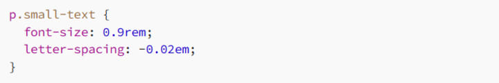
When working with small text, slightly reducing letter spacing can make it feel more cohesive and easier to read.
Uppercase Text with Adjusted Letter Spacing
Uppercase text often benefits from increased spacing to improve readability:
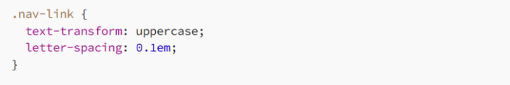
This creates clear, easy-to-read navigation links.
3.4 Letter Spacing Pitfalls
- Too Tight: Negative letter spacing can make letters overlap, reducing readability.
- Too Loose: Excessive spacing makes words feel disconnected and harder to scan.
4. Combining Line Height and Letter Spacing
For truly polished typography, you need to balance line height and letter spacing together. Here’s an example of how these properties can work in harmony:
This setup ensures your body text is easy to read, with enough breathing room between both lines and characters.
Example: Styling a Blog Post
Here’s a practical example of using these properties for a blog post:
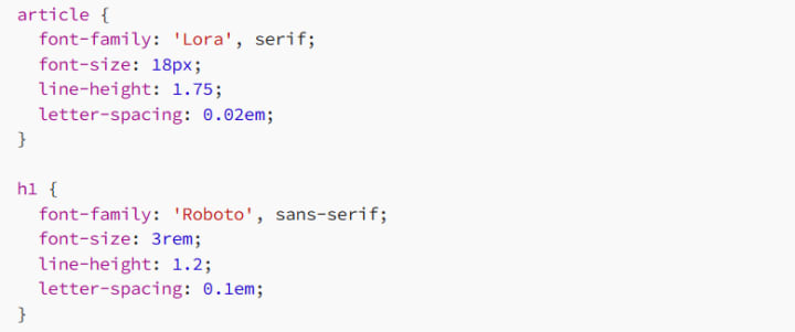
In this example:
- The article body uses a serif font with generous line height and subtle letter spacing for readability.
- The headline uses a sans-serif font with tighter line height and increased letter spacing for impact.
5. Responsive Typography with Line Height and Letter Spacing
On smaller screens, text often requires tighter adjustments to ensure readability. You can use media queries to tweak these properties for different devices.
Example: Mobile-Friendly Typography
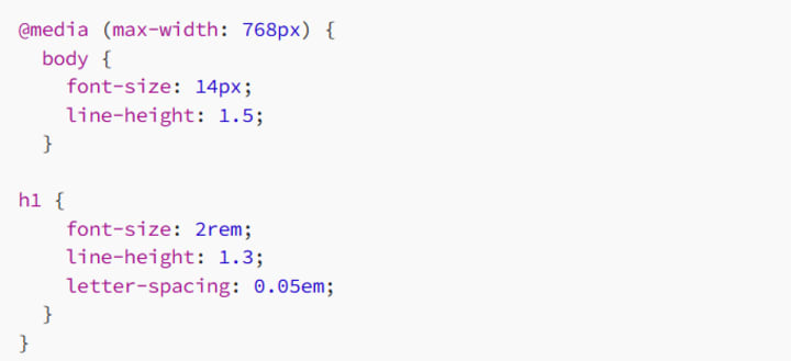
Here, we’ve slightly reduced the font size and line height for body text and headlines on smaller screens to make them fit better.
6. Best Practices for Line Height and Letter Spacing
6.1 Aim for Readability
Use a line height of 1.4–1.6 for body text.
Add subtle letter spacing (0.02em–0.05em) for clarity.
6.2 Keep Headlines Bold and Balanced
Tighter line height (1.1–1.3) works best for headlines.
Adjust letter spacing for impact, especially in uppercase text.
6.3 Test Across Devices
Typography looks different on various screen sizes, so always test your line height and letter spacing for readability on both desktop and mobile.
7. Conclusion: Typography That Feels Just Right
Line height and letter spacing are subtle but powerful tools that can transform your text from “just okay” to absolutely stunning. They ensure your typography is readable, balanced, and visually appealing, no matter the context.
So go ahead — experiment with spacing, find that sweet spot, and watch your web designs come to life!
Happy coding, and remember: great typography is all about the details!
About the Creator
MariosDev
Hi, I’m Marios! I’ve been a developer for over 9 years, crafting cool stuff and solving tricky tech puzzles. I’m a total tech enthusiast and love sharing my thoughts and tips through blogging. Also, in love with my bike!
A System That Isn’t Working Challenge Winners
Systems promise order. They organize behavior, distribute opportunity, and suggest that if everyone follows the rules, things will work. The entries in A System That Isn’t Working look closely at what happens when that promise begins to slip.
By Vocal Curation Team3 days ago in Resources


Comments
There are no comments for this story
Be the first to respond and start the conversation.