
How to Make a WordPress Website Mobile-Friendly?
Simple Steps to Ensure Your WordPress Site Shines on Any Device
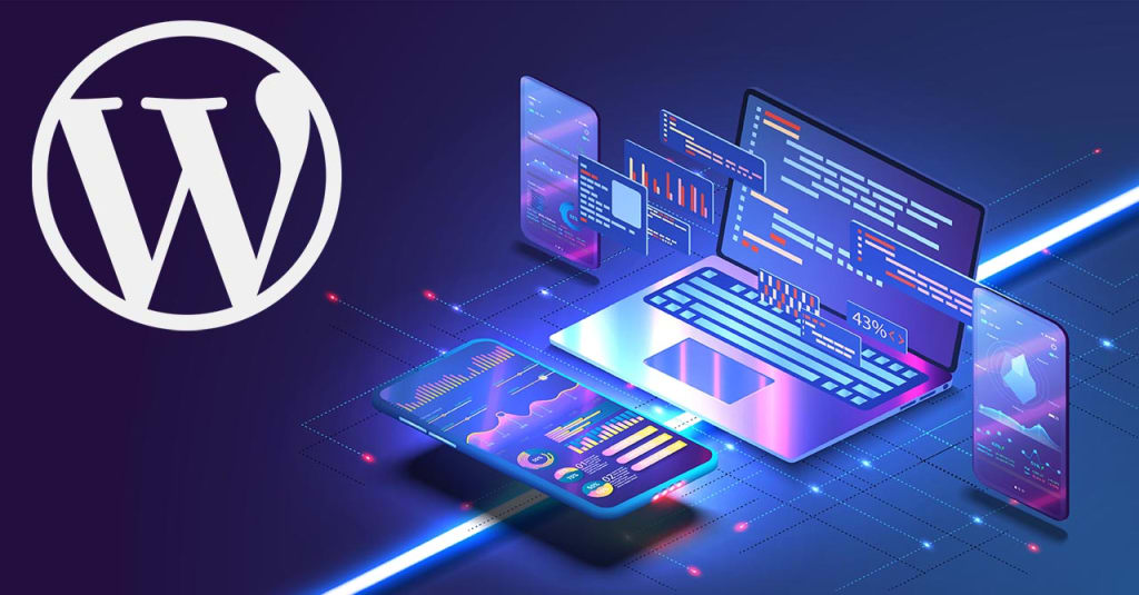
In today’s digital world, creating a mobile-friendly WordPress website is essential for attracting and retaining visitors, as more people browse on mobile devices than ever before. Ensuring your website performs well on smaller screens improves user experience, search engine ranking, and overall engagement. Here, we’ll walk through actionable steps to make your WordPress site mobile-friendly, from choosing the right themes to using local WordPress development environments to test mobile responsiveness.
Why Make WordPress Site Mobile-Friendly?
Increasing Mobile Usage
With mobile device usage surpassing desktop, optimizing for mobile is crucial. People are constantly on the move, relying on phones and tablets to access information. By making your WordPress site mobile-friendly, you can capture this growing audience and increase engagement.
Better User Experience
A mobile-friendly site ensures users can easily navigate and consume content without endless scrolling or resizing. This enhanced experience keeps visitors engaged and encourages them to explore more of your site.
Better Search Engine Ranking
Google’s mobile-first indexing prioritizes sites that perform well on mobile devices, meaning a mobile-friendly WordPress site can improve your search ranking. This is essential for visibility and attracting organic traffic.
How to Check if Your WordPress Site is Mobile-Friendly?
To determine whether your WordPress site is mobile-friendly, start by using Google’s Mobile-Friendly Test tool. Enter your website’s URL to get a detailed report on its mobile responsiveness. Additionally, you can use local WordPress development environments to view your site as it appears on different screen sizes and identify any issues before making changes live.
How to Make a WordPress Site Mobile-Friendly?
Choose a Responsive WordPress Theme
The foundation of a mobile-friendly site begins with a responsive theme. Look for a WordPress theme designed to adapt seamlessly to various screen sizes, from desktops to smartphones. Many responsive themes are available directly through the WordPress Theme Directory, and testing them in local WordPress development environments is a great way to see how they perform on mobile before deployment.
Use Plugins to Optimize for Mobile
Mobile optimization plugins can transform your WordPress site for smaller screens. Popular options include WPtouch and Jetpack’s mobile theme, which instantly make your site more responsive. Additionally, consider using local WordPress development environments to test plugins for any compatibility issues that could affect the site’s mobile performance.
Use Mobile-Friendly Design Elements
Elements like larger fonts, button sizes, and simple navigation are essential for mobile-friendly design. Avoid tiny text or complicated navigation menus that frustrate mobile users. Instead, create large, tappable buttons and concise menus that make it easy for users to navigate on their phones.
Test and Optimize Your Site for Mobile
Testing and optimizing your site is crucial for improving mobile performance. Local WordPress development environments are ideal for testing, allowing you to experiment with site layouts, images, and plugins before going live. Additionally, using browser-based developer tools (like Chrome’s Inspect Element) can simulate various device views to help you ensure your site looks great across devices.
Tips for Creating a Mobile-Friendly WordPress Site
- Optimize Images: Large images slow down loading times, which can hurt your mobile experience. Use tools like TinyPNG or WordPress plugins like Smush to compress images without sacrificing quality.
- Reduce Pop-Ups: Pop-ups can be intrusive on mobile devices. Use them sparingly and ensure they don’t interfere with the user’s ability to view the content.
- Implement AMP (Accelerated Mobile Pages): AMP simplifies your pages for faster loading on mobile, improving both user experience and SEO. Plugins like AMP for WP make implementation easy.
- Leverage Local WordPress Development Environments: Local development environments enable testing changes on your WordPress site without affecting the live version. This is particularly helpful for adjusting mobile settings and experimenting with different design tweaks.
- Use Lazy Loading: Lazy loading postpones image loading until they appear on the user’s screen, improving site speed for mobile users.
To Conclude
Optimizing your WordPress site for mobile is essential not only for accessibility but also for enhancing user experience across devices. By choosing responsive themes, integrating mobile-friendly plugins, and utilizing local WordPress development environments for testing, you can ensure your site performs seamlessly on any screen. For tailored results, hire WordPress developers who can fine-tune your site’s mobile experience effectively.
About the Creator
How to Convert RS232 to RS485
Have you ever tried connecting two industrial devices only to discover that one communicates through RS232 while the other uses RS485? This situation is extremely common when integrating legacy equipment with modern industrial networks.
By ethernet-network2 days ago in 01
Zomato-Like Food Delivery App Development Cost and Tech Stack Guide
The rapid growth of on-demand services has completely transformed how people order food. Customers now expect fast delivery, real-time tracking, digital payments, and personalized restaurant recommendations directly from their smartphones. Businesses looking to enter this competitive market are increasingly investing in Food Delivery App development to build scalable and user-friendly platforms.
By keith laurance6 days ago in 01
The BAFTA Awards
By now, in a stunning departure from recent years, most of the world is aware of what happened at the BAFTA film awards. Social Media Headlines will tell you the bare bones: that John Davidson, a Tourette's Syndrome advocate, shouted a racial slur at two Actors of Colour, Michael B Jordan and Delroy Lindo.
By Natasja Rose4 days ago in Psyche


Comments