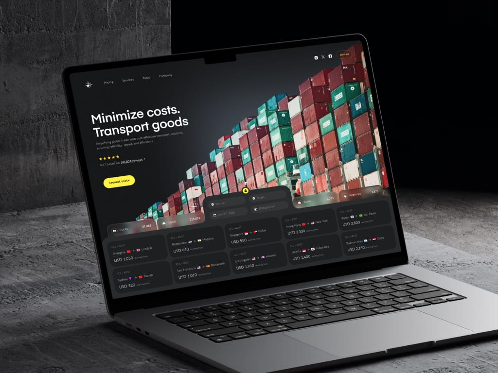
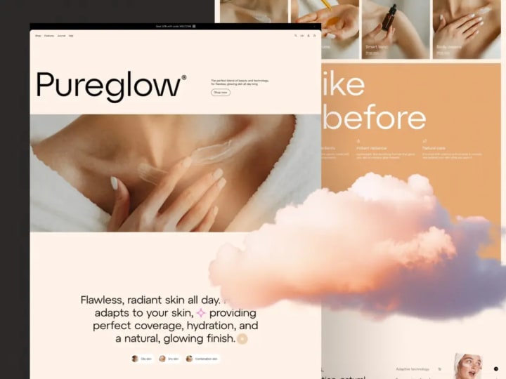
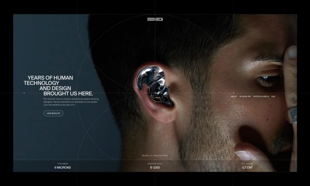
How Conversion-Focused Web Design Impacts Revenue
Learn how the design of your website affects the sales of your product and how to make it more conversion-focused.

How often have you found yourself reviewing your site metrics, frustrated that your visually refined website isn’t driving sales? You devoted considerable time and energy to crafting a product with genuine appeal—yet traffic arrives and disappears in moments. So, where’s the disconnect?
The answer frequently lies in overlooking a conversion-centric design strategy. This mindset shifts your site from a static online presence into an intentional pathway that guides visitors smoothly toward purchase—cutting reliance on costly ad spend with underwhelming returns. For founders balancing tight budgets, overflowing to-do lists, and high-stakes decisions, integrating this approach isn’t optional; it’s foundational.
Stay with us as we clarify this pivotal shift, break down the core principles of purpose-built web design, and offer clear, affordable steps to bring this strategy to life for your business.
What Conversion-Focused Web Design Really Is
Conversion-Focused ≠ Pushy or Deceptive
No, it’s not about pressuring visitors or using psychological gimmicks. If your version of “boosting conversions” relies on fake countdown timers, blaring autoplay videos with loud calls to action, or pop-ups that require multiple clicks to dismiss—you’re off track. While these tactics might inflate short-term numbers, they damage trust, and once that’s lost, no amount of A/B testing can restore it.
True conversion-oriented design is subtle, thoughtful, and deeply human. It hinges on clarity, relevance, and alignment with user intent. When someone lands on your page, do they immediately grasp what you offer, who it’s meant for, and what they should do next? Do they sense that you genuinely understand their challenge—not just aiming to harvest their email before they leave?
In reality, the highest-performing pages often feel like a calm, supportive dialogue rather than a high-pressure sales pitch. They preempt concerns before they arise, present clear next steps without being overbearing, and ultimately earn the user’s action.
Design as a Framework for Decision-Making
Your website functions as an environment where decisions are shaped. Every visual element—every word, pixel, and even empty space—plays a role in directing attention, easing uncertainty, and guiding users toward a confident choice.
Each design layer serves a specific purpose:
- Layout determines what captures attention first—and what remains hidden.
- Visual hierarchy leads the eye through a natural flow: headline → key benefit → proof points → call to action.
- UX micro-elements—such as form length, button color contrast, or even copy tone—can be the deciding factor between hesitation and action.
For instance, many businesses use generic phrases like “Learn more” styled identically to their main CTA, making it impossible for visitors to distinguish primary actions from secondary ones. It’s no surprise conversion rates stall when users can’t tell what matters most. (We’ll explore common pitfalls like this in more detail shortly.)
Ultimately, conversion-focused design structures user behavior by minimizing mental effort. It removes friction so people can quickly understand your offering and whether it fits their needs. When done right, visitors don’t just convert—they feel genuinely supported.

The Clear Connection Between Web Design and Revenue
Smoothing the Path to “Yes”
Your revenue hinges on those critical seconds just before a visitor decides to convert. Too often, that decision slips away—not because of a lack of interest, but due to small, easily correctable points of friction.
Consider your sign-up flow. If you’re asking for a company name, phone number, and detailed use case before someone has even experienced your product, you’re likely turning away exploratory users rather than identifying truly interested ones. Switching from a six-field form to a minimal two-field version—just “email + password”—and collecting additional details later, once trust is established, can significantly boost trial sign-ups.
Now look at your demo request page. If it’s tucked away in a submenu, uses vague corporate language like “schedule a discovery call,” or leaves visitors guessing about what comes next, you’re losing high-intent leads. Replacing that with a clear, inviting message like “See how it works in 10 minutes” above a straightforward calendar widget can turn hesitation into action—and prevent tabs from being closed.
Pricing pages are another common pitfall. Labels like “Starter,” “Pro,” and “Enterprise” mean little without concrete distinctions. And if you’re a self-serve product but hide actual prices behind a “Contact Sales” barrier, you’re making users do the work you should’ve done for them—increasing cognitive load and reducing conversions.
Building Trust Through Thoughtful Design
People choose to buy from brands they trust—even when that brand is represented only by a digital interface. While trust takes time to build, smart design can lay a strong foundation through consistency, social proof, and predictability.
Conversion-focused UX strengthens credibility by:
- Featuring real customer logos alongside tangible outcomes (“Used by X to achieve Y”)
- Maintaining uniform button styles and action language site-wide, so users never second-guess whether a click is safe or meaningful
- Placing security indicators—like SSL badges or payment certifications—exactly where concerns might arise, such as near checkout fields
This is especially vital in high-stakes industries like fintech, healthcare, or legal tech, where users are naturally cautious. In these sectors, effective design must delicately balance regulatory compliance, crystal-clear communication, and seamless conversion. Because in moments of doubt—even a fleeting one—your prospect is already gone.

Proven UX Patterns That Drive Real Conversions
Front-Load Your Value—Fast
Visitors form their first impression within the top 600 pixels of your page. If they can’t instantly understand what you offer, who it’s for, and what action to take—all within about five seconds—you’ve already lost their attention.
Effective conversion-focused design demands sharp prioritization. Your headline must directly answer the visitor’s unspoken question: “Does this solve my problem?”
For example: “Automatically recover 15% of abandoned carts for e-commerce brands.” Immediately back that up with a concise subheading stating the core benefit, a visual that illustrates the result, or a single, well-placed call-to-action aligned with the user’s likely goal.
Your message should be clear, believable, and actionable—so visitors can instantly decide whether your solution is worth their time.
Structure Pages Around User Intent—Not Just Aesthetics
Treating every page the same leads to average results. Instead, each page should have a distinct role in your conversion funnel, shaped by what the user needs at that moment—not just your brand style guide.
- Homepage: Focus on awareness and self-identification. Help visitors quickly recognize themselves in your messaging (“Yes, I’m a SaaS founder struggling with churn”) and guide them to the next logical step.
- Pricing page: Enable easy comparison and build confidence. Present plans clearly, highlight the best-value option, and spell out what’s included without forcing users to scroll endlessly.
- Case study page: Reduce perceived risk. Showcase real outcomes, name actual clients, and reflect the reader’s industry or specific challenge to build relevance and trust.
Guide Users with Progressive Disclosure and Micro-Steps
Nobody enjoys a six-step onboarding marathon. But if each step feels lightweight and relevant and clearly moves them closer to value, they’ll keep going.
This is the power of progressive disclosure: only ask for essential information upfront, and introduce complexity only when it adds value. Take Slack, for instance—it doesn’t bombard new users with questions about team size or use case during sign-up. Instead, it lets them in immediately, shows an empty channel, and gently prompts them to invite teammates only after they’ve experienced the product firsthand.
Apply the same principle to forms:
- Start with just an email → verify it works → then request a name → then company details.
- Use real-time validation (e.g., checking email format as they type) instead of generic error messages after submission.
- Break lengthy processes into labeled stages with visible progress indicators.
Small, low-effort actions—like “Watch a 90-second demo” instead of “Book a sales call,” or trying a feature inside the app before upgrading—build momentum and reduce drop-off.
Remember: conversions rarely happen in one dramatic leap. They’re the result of a series of tiny, frictionless steps that keep users moving forward—confidently and willingly.

Why Conversion Rate Optimization Begins with Design—Not A/B Testing
A/B Testing Can’t Rescue a Flawed User Experience
A/B testing is undoubtedly valuable—but only when built on a strong user experience foundation. Running experiments on a poorly structured or confusing interface is like repainting a house with a crumbling foundation: it may look better temporarily, but the underlying problems remain and will eventually undermine any gains.
In practice, teams that address fundamental UX issues before diving into CRO consistently achieve 3 to 5 times greater improvements from their tests. Why? Because when the baseline experience is logical and user-centered, every optimization actually moves the needle in a meaningful way.
Design Is the Bedrock of Effective CRO
Think of web design as the stage and CRO as the performance. Even the most talented performer can’t captivate an audience on a chaotic, dimly lit set with no clear pathways. Similarly, users can’t convert effectively if your page is cluttered, inconsistent, or lacks direction.
Conversion-focused design establishes clarity, aligns with user intent, and creates a seamless journey. Only then does A/B testing reveal true behavioral insights. For instance, if you’re testing a new headline, its impact can only be accurately measured if the rest of the page isn’t working against it—through conflicting visuals, unclear next steps, or competing calls to action.
A well-structured layout ensures that what you’re testing stands out clearly, so results reflect genuine user preferences—not noise from distractions. Likewise, a thoughtful visual hierarchy prevents your main CTA from getting lost among multiple “primary” buttons that dilute focus.
In essence: design determines your conversion ceiling; CRO helps you reach it. If your current approach feels like randomly throwing tests at the wall to see what sticks, it’s time to step back. First, streamline the user flow, sharpen your messaging, eliminate friction points—and then fine-tune with data-driven experiments.

Design Pitfalls That Sabotage Conversions
Style Over Substance
It’s tempting to make your site look cutting-edge—think smooth animations, intricate micro-interactions, or a translucent navigation bar that glows like a futuristic tech deck. But when visual flair isn’t grounded in purpose, it becomes distraction, not delight.
Many startups invest months crafting “brand-led” designs that dazzle in Figma but baffle real users. Imagine a hero section with a high-resolution looping video that takes eight seconds to load—and still doesn’t explain what your product actually does.
In the realm of conversion-driven design, clarity trumps creativity every time. If an element doesn’t actively reduce uncertainty, direct attention, or support a specific user action, it’s just ornamental—and won’t contribute to your bottom line.
CTA Overload Without Direction
Have you ever landed on a page bombarding you with conflicting prompts? “Sign up now!” “Book a demo!” “Read the case study!” “Download the ebook!” When everything screams for attention, nothing stands out. This is the breeding ground for decision paralysis—users either scroll past everything or abandon the page entirely.
Effective conversion-focused design provides a clear, intentional path. Ask: What’s the single most relevant action for this visitor at this stage? On a features page, it might be “Watch a demo.” On pricing, it should be “Start free trial.”
Choose one primary goal per page and give that CTA visual prominence. Relegate secondary options to less dominant placements or label them explicitly as alternatives (e.g., “Not ready? Read our guide instead”).
Neglecting Speed and Performance
One of the stealthiest conversion killers isn’t visible in heatmaps or session recordings: slow load times.
Even if your copy is crystal clear, your CTA perfectly placed, and your testimonials backed by NASA, a 4-second page load will cost you nearly half your audience before they even see it. Worse, sluggish performance silently damages credibility—visitors equate slow loading with outdated technology, poor engineering, or indifference to their time.
Page speed isn’t just a technical metric; it’s a powerful conversion lever. Every additional second erodes user confidence, especially on critical pages like pricing, sign-up, or checkout. If you haven’t reviewed your Core Web Vitals recently—or if the term sounds unfamiliar—it’s time to prioritize performance. Because speed, user trust, and revenue are deeply intertwined.

Conversion-Focused Design Is a Catalyst for Growth
Revenue isn’t just the result of smart marketing or sharp sales—it’s also a direct outcome of user experience.
Even with an exceptional product, ideal pricing, and a perfectly defined ideal customer profile (ICP), none of it will convert if your website causes visitors to hesitate, scroll away, or question whether you’re right for them. Real growth hinges on those subtle, split-second decisions—when someone thinks, “Alright, I’ll try this.”
It’s the clarity of your message, the intuitiveness of your flow, and the trust you establish before asking for anything that transforms casual traffic into sign-ups, sign-ups into loyal customers, and loyal customers into long-term advocates.
Put simply, conversion-centered web design amplifies everything else you do: it makes your ad dollars go further, maximizes your sales team’s efficiency, and unlocks your product’s full potential.
So stop viewing web design as a cosmetic afterthought or a final “polish” step. Start seeing it for what it truly is—a quiet but powerful revenue engine, fueled by thoughtful, human-first design decisions.
About the Creator
Shakuro
We are a web and mobile design and development agency. Making websites and apps, creating brand identities, and launching startups.


Comments
There are no comments for this story
Be the first to respond and start the conversation.