
CSS Course 4.4: Linear and Radial Gradients — Bring Your Backgrounds to Life
This article is part of a free full CSS Course: Beginner to Expert

When it comes to adding depth, drama, and style to your web design, gradients are your secret weapon. Linear and radial gradients are two powerful tools in CSS that allow you to create smooth color transitions that can instantly elevate the look of your website. From creating beautiful backgrounds to enhancing UI elements, gradients can transform the feel of your site with just a few lines of code.
This article is part of a free full CSS Course: Beginner to Expert
In this article, we’ll break down what linear and radial gradients are, how to use them effectively, and share some pro tips to make your designs pop. Let’s get started!
1. What Are Gradients?
Gradients are a way to create smooth transitions between two or more colors. Rather than having a single solid color, you can blend multiple colors together, creating a more dynamic and visually engaging effect.
There are two main types of gradients in CSS:
- Linear Gradients: Gradients that transition along a straight line.
- Radial Gradients: Gradients that transition outward from a central point.
Gradients can be applied to backgrounds, buttons, borders, text, and more. They are a versatile and effective way to add dimension and interest to your designs.
2. Linear Gradients — The Smooth Fade Across a Line
A linear gradient transitions colors along a straight line. The gradient can move horizontally, vertically, or at any angle. Think of it like blending a rainbow from one side of the screen to the other.
Syntax

direction: Defines the angle or direction of the gradient (optional, default is top to bottom).
color1, color2, …: The colors that transition in the gradient.
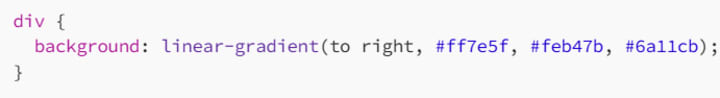
Example
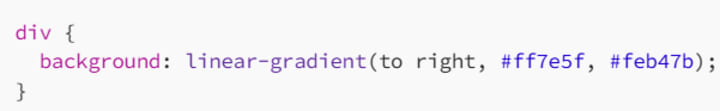
In this example, the background will transition from a soft coral color (#ff7e5f) to a warm yellow-orange (#feb47b) from left to right.
2.1 Direction in Linear Gradients
You can control the direction of the gradient by specifying an angle or using keywords like to top, to bottom, to left, or to right.
Example with Angle
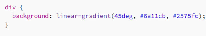
In this example, the gradient starts from the top-left corner and moves diagonally towards the bottom-right, blending from purple (#6a11cb) to blue (#2575fc).
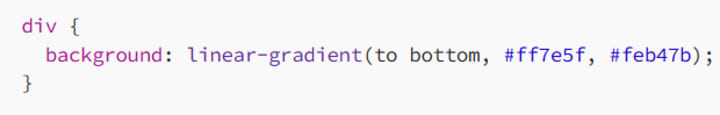
Example with Keywords
2.2 Multiple Color Stops
You can have more than two colors in a linear gradient. Simply add more color stops to the gradient.
Example
Here, the gradient smoothly transitions from coral to yellow-orange, then into purple.
3. Radial Gradients — A Circular Burst of Color
Radial gradients transition colors outward in a circular or elliptical shape from a center point. They are great for creating soft, rounded color transitions or a glowing effect.
Syntax

- shape: Defines the shape of the gradient. It can be circle (default) or ellipse.
- size: Defines the size of the gradient. Common options are closest-side, farthest-corner, and cover.
- position: Specifies the starting position for the gradient (optional).
- color1, color2, …: The colors that transition in the gradient.
Example
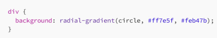
In this example, the gradient will transition from coral in the center to yellow-orange as it moves outward in a circular pattern.
3.1 Radial Gradients with Shape and Size
You can control the shape of the gradient, either as a circle or an ellipse, and adjust the size to make it more dynamic.
Example with Shape and Size
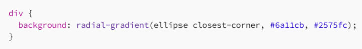
Here, the gradient forms an ellipse and transitions from purple to blue as it reaches the closest corner of the element.
3.2 Multiple Color Stops in Radial Gradients
Like linear gradients, radial gradients can also have multiple color stops, allowing for more complex transitions.
Example with Multiple Colors
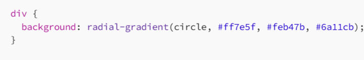
The gradient here starts with coral in the center, then blends into yellow-orange, and finishes with purple.
4. Gradient Control: Fine-Tuning with Additional Properties
While linear and radial gradients are visually striking on their own, you can enhance them further with additional CSS properties.
4.1 Using Opacity in Gradients
You can add transparency to your gradients by using RGBA or HSLA values, allowing you to create semi-transparent effects.
Example with RGBA
div {
background: linear-gradient(to right, rgba(255, 126, 95, 0.7), rgba(254, 180, 123, 0.9)); /* Semi-transparent gradient */
}
This example creates a gradient that transitions from a semi-transparent coral to a more opaque yellow-orange.
4.2 Using Gradients for Text and Borders
You’re not limited to background images when using gradients. They can also be applied to text and borders, creating unique effects.
Example for Text
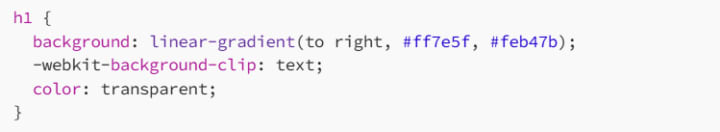
This example applies a gradient to the text, making it appear as if the letters are filled with color. The -webkit-background-clip: text; property clips the gradient to the text itself.
Example for Borders
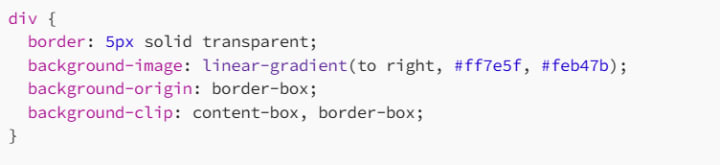
Here, a gradient is applied to the border of the div, creating a smooth transition effect on the edges.
5. Pro Tips for Working with Gradients
Now that you understand how to use linear and radial gradients, here are some advanced tips for maximizing their impact:
5.1 Experiment with Color Stops
Don’t be afraid to play around with different color stops and positions. The right mix of colors and their placement can drastically change the feel of your design.
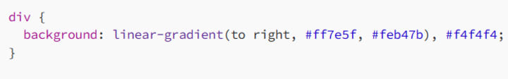
5.2 Combine Gradients with Solid Colors
You can combine gradients with solid colors to create layered effects or to ensure readability over complex backgrounds.
Example
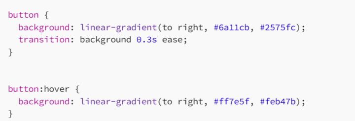
5.3 Use Gradients for Hover Effects
Gradients can make your buttons and links more interactive. By changing a button’s background on hover, you can create an engaging, dynamic effect.
Example
6. Conclusion: Gradients Are Your New Best Friend
Linear and radial gradients are fantastic ways to inject color, depth, and visual interest into your web designs. Whether you’re creating smooth color transitions across your background, adding subtle effects to buttons, or experimenting with text gradients, CSS gradients are a versatile tool in any designer’s toolkit.
With the ability to adjust direction, shape, size, and even opacity, gradients give you full creative control to enhance the visual appeal of your site. Don’t be afraid to experiment, mix and match colors, and use gradients in unexpected ways to surprise and delight your users.
Now go ahead — play with gradients and make your designs stand out with that extra bit of flair!
Happy styling, and may your gradients always be smooth and stunning!
About the Creator
MariosDev
Hi, I’m Marios! I’ve been a developer for over 9 years, crafting cool stuff and solving tricky tech puzzles. I’m a total tech enthusiast and love sharing my thoughts and tips through blogging. Also, in love with my bike!
How to Build a Fitness App That Keeps Users Coming Back
The fitness app market in 2026 is no longer a battle of content. It is no longer about who has the most workout videos. It is now a battle of who can sustain user motivation. Data from the 2025 Global Digital Health Report is clear. Initial downloads for health apps remain high. However, nearly 60% of users drop off within thirty days. This happens if the experience feels generic.
By Del Rosario6 days ago in 01


Comments (1)
Gradients are a great way to add style to web design. I've used them to make backgrounds more interesting. Linear gradients are especially useful for that smooth fade. It's cool how you can control the direction. Can you share an example of using a linear gradient to enhance a UI element like a button? Would love to see how it turns out. Also, I'm curious about radial gradients. How do they compare to linear gradients in terms of complexity to implement?