
CSS Course 5.1 : Understanding the Box Model
Have you ever laid out a webpage, thought everything looked perfect… and then BAM! Boxes are overlapping, padding is bloated, and margins are acting like they’ve had too much coffee. Don’t worry — you’re not alone.


Let me introduce you to your new best frenemy: the CSS Box Model. Understanding how the box model works is one of the most fundamental skills in web development. Once you get it, everything from spacing to layout will finally click.
Let’s unpack it, layer by layer — like a delicious digital lasagna.
🧱 What Is the Box Model?
Every HTML element on a webpage is essentially a box. Even the text you’re reading now is nestled inside multiple boxes. CSS uses the box model to wrap content in invisible layers that define how elements behave and how they interact with other boxes on the page.
Here are the four main parts of the box model, from the inside out:
- Content: The actual stuff — text, images, inputs, etc.
- Padding: The comfy space around the content (like your element’s personal bubble).
- Border: The line around the padding (it’s like the frame around your art).
- Margin: The outermost layer — space between your box and the next box.
Each of these layers plays a role in the final size and position of your element.
🧩 The Layers of the Box Model
Let’s break down each layer in a little more detail. Visualizing the box model helps, so let’s think of each element as a gift box. 🎁
1. Content
This is what you’re displaying — text, an image, a button, whatever. It’s the gift inside the box.
<div class="box">Hello, world!</div>
By default, the size of the content depends on the element. For a block-level element like a <div>, it takes up the full width available unless styled otherwise.
2. Padding
Padding is the wrapping paper around the gift. It creates space between the content and the border.
.box {
padding: 20px;
}
Padding adds to the overall size of the box. If you add padding: 20px on all sides, the element gets 40px taller and wider (20px for each side).
🎁 Pro tip: Padding is inside the box. It pushes the border outward, not the content inward.
3. Border
The border is like the ribbon around the box. It surrounds the padding and defines the outer edge of the element.
.box {
border: 2px solid red;
}
You can customize the border’s width, color, and style (solid, dashed, dotted, etc.). Like padding, the border adds to the total size of the box.
4. Margin
Margin is the table space between your gift box and others. It’s the outermost layer and doesn’t affect the box’s size directly — but it does affect spacing.
.box {
margin: 10px;
}
Margins can collapse (we’ll talk about this weird party trick in a second), and they’re super useful for separating elements without changing their actual dimensions.
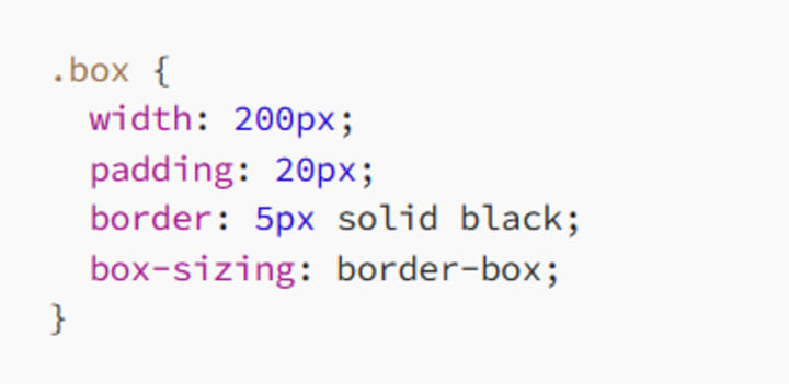
📏 How CSS Calculates Size
Here’s the golden rule: by default, width and height only apply to the content.
Let’s say you write:

What’s the final width of the .box?
- Content: 200px
- Padding: 20px left + 20px right = 40px
- Border: 5px left + 5px right = 10px
- Total Width = 200 + 40 + 10 = 250px
💥 That’s right. The total size is bigger than you specified. This surprises a lot of developers (and leads to a lot of debugging-induced coffee binges).
🛠 Enter box-sizing: A Life-Saver
To avoid padding and borders messing with your width, use this:
* {
box-sizing: border-box;
}
Now, width includes padding and border. So if you set:
The total width stays 200px, with the content shrinking to fit inside the padding and border.
🧲 Margin Collapsing (a.k.a. The Mystery Bump)
Margins have a quirky behavior known as margin collapsing — especially with vertical margins.
If two vertical margins meet (like the bottom margin of one element and the top margin of the next), only the larger margin is applied. Not both.
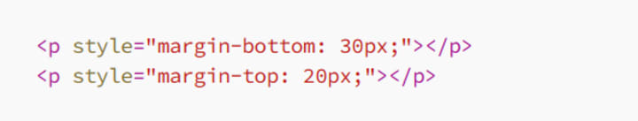
You’d expect 50px between the paragraphs. But nope — you only get 30px. The larger one wins.
Think of it as CSS saying, “Let’s not be greedy. One margin is enough.”
🧮 A Real-World Example
Here’s a simple styled box:
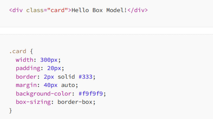
Let’s calculate:
- Width: 300px (includes padding and border because of border-box)
- Padding: 20px inside
- Border: 2px
- Margin: 40px top and bottom, auto on sides (centers the box)
This results in a centered box with total width of 300px and comfortable spacing. With box-sizing: border-box, you can sleep well at night knowing your layout won't jump out of bounds.
🎯 Why the Box Model Matters
Understanding the box model helps you:
✅ Avoid layout bugs
✅ Create consistent spacing
✅ Design flexible, responsive layouts
✅ Use padding and margins with confidence
✅ Control the exact size and behavior of every element
Once you grasp this model, you’ll stop fighting with CSS and start designing with purpose. Your boxes will finally behave — and you’ll finally feel like a layout wizard. 🧙♂️
🧵 Final Thoughts
The box model is the unsung hero of CSS. It seems simple at first — just a few layers around content — but it has a massive impact on how your elements look and interact.
If you’re ever frustrated by weird spacing, overflowing containers, or mysterious gaps, the box model is usually the culprit. But now? You’re prepared.
So go ahead — open your browser’s developer tools, inspect those boxes, and show them who’s boss.
Happy boxing! 🥊
About the Creator
MariosDev
Hi, I’m Marios! I’ve been a developer for over 9 years, crafting cool stuff and solving tricky tech puzzles. I’m a total tech enthusiast and love sharing my thoughts and tips through blogging. Also, in love with my bike!
Top Dog Training Essentials: Extra Large Dog Bowl, Leather Lead & Dog Treat Pouch
Training a dog is one of the most rewarding responsibilities a pet owner can undertake. Whether you have a playful puppy or an energetic adult dog, the right tools can make the training process smoother, more effective, and enjoyable for both you and your canine companion. While techniques and consistency are essential, having the proper equipment can significantly improve communication, control, and motivation during training sessions.
By Von Ultimate Dog Shopa day ago in 01
5 Best Mobile App Development Companies in Pittsburgh (2026)
Pittsburgh has quietly become one of the most compelling technology cities in the United States. What was once known for steel mills and bridges is now home to a thriving ecosystem of software engineers, AI researchers, and product builders. Carnegie Mellon University alone pumps world-class computer science and machine learning graduates into the local workforce every single year, and a growing number of them are choosing to stay and build here rather than relocating to the coasts.
By Samantha Blake4 days ago in 01


Comments
There are no comments for this story
Be the first to respond and start the conversation.