
CSS Course 4.2: Applying Background Colors — Setting the Stage for Your Web Designs
This article is part of a free full CSS Course: Beginner to Expert


Background colors in CSS are like the canvas for your masterpiece. They set the tone for your website, highlight key areas, and guide user attention. Whether you’re adding a splash of color to a button or crafting a stunning hero section, background colors are essential for creating engaging web designs.
In this article, we’ll break down everything you need to know about applying background colors in CSS. You’ll learn the basics, dive into advanced techniques, and discover tips for combining colors like a pro.
1. Why Background Colors Matter
Background colors do more than fill space — they establish hierarchy, create contrast, and evoke emotion. Consider these key roles:
- Highlighting Sections: Use colors to differentiate between headers, footers, and content areas.
- Improving Readability: Light backgrounds with dark text, or vice versa, make content easier to read.
- Setting Mood: Cool tones feel calming, warm tones add energy, and neutrals provide balance.
A good background color strategy ensures your website is visually appealing and easy to navigate.
2. The Basics: Setting Background Colors in CSS
The background-color property is your starting point. You can apply it to any HTML element, from the body to specific sections, divs, or buttons.
Syntax

Example
3. CSS Color Values for Backgrounds
CSS allows multiple ways to define colors. Each method provides flexibility depending on your design needs.
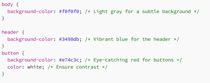
3.1 Hexadecimal Colors
Hex codes are precise and commonly used in web design.
Example

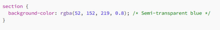
3.2 RGB and RGBA
Use rgb() for color and rgba() for transparency. Transparency (alpha channel) ranges from 0 (fully transparent) to 1 (fully opaque).
Example
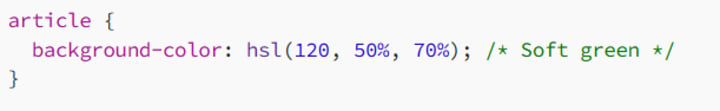
3.3 HSL and HSLA
hsl() is intuitive for designers, allowing you to tweak hues, saturation, and lightness.
Example
3.4 Named Colors
CSS supports 140 named colors like skyblue, coral, or lavender.
Example

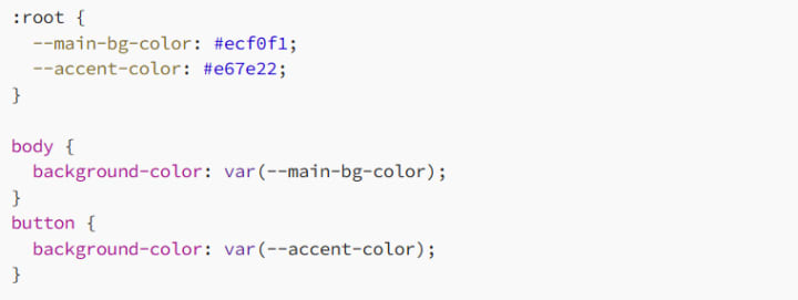
3.5 CSS Variables for Reusability
Define colors in one place and reuse them across your stylesheets.
Example
4. Advanced Techniques for Background Colors
Once you’ve mastered the basics, elevate your designs with these advanced tricks.
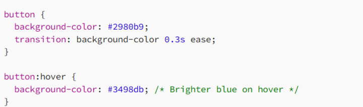
4.1 Hover Effects
Change background colors on hover to indicate interactivity.
Example
4.2 Transparent Backgrounds
Create subtle overlays with semi-transparent colors.
Example

This is useful for adding text over images or videos.
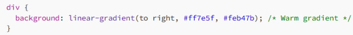
4.3 Combining Background Colors with Gradients
Blend colors seamlessly using gradients.
Example
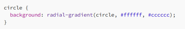
Radial gradients are great for spotlight effects:
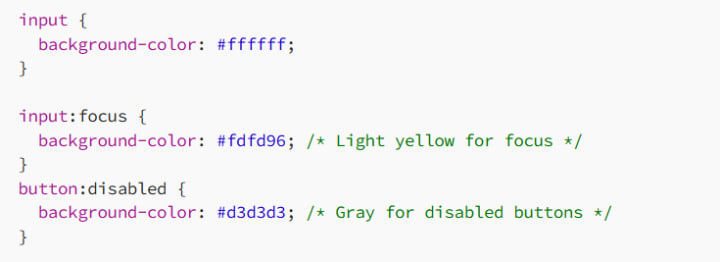
4.4 Background Colors for Specific States
Define colors for states like :focus, :active, or :disabled.
Example
5. Accessibility and Background Colors
When choosing background colors, prioritize readability and usability for all users.
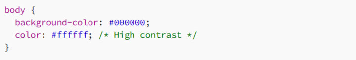
5.1 Ensure Sufficient Contrast
Your background and text colors must have enough contrast to be legible. Use tools like WebAIM Contrast Checker to test your color combinations.
Example
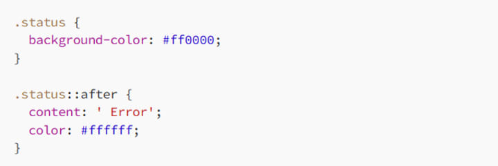
5.2 Avoid Color-Only Indicators
Don’t use color as the sole method to convey information. Pair it with text or symbols.
Example
6. Tips for Choosing Background Colors
6.1 Stick to a Palette
Pick a consistent color scheme for a cohesive design. Use tools like Coolors to create harmonious palettes.
6.2 Use Neutral Backgrounds for Text
Neutral colors like white, gray, or beige are best for content-heavy areas. They reduce visual strain and let text stand out.
Example

6.3 Highlight Key Areas
Use bold or vibrant colors sparingly to draw attention to calls-to-action or important sections.
Example

7. Common Mistakes to Avoid
Too Many Colors: Keep your design clean by limiting the number of background colors.
Poor Contrast: Always test readability on different devices.
Ignoring Accessibility: Ensure your site works for all users, including those with visual impairments.
8. Conclusion: Make Your Background Shine
Background colors in CSS are more than just filler — they’re the foundation of your web design. By mastering color values, experimenting with gradients, and prioritizing accessibility, you can create designs that are visually stunning and user-friendly.
So, grab your favorite colors and start painting your digital canvas! And remember: a great background doesn’t steal the spotlight — it makes everything else look better.
Happy styling, and may your backgrounds always pop!
About the Creator
MariosDev
Hi, I’m Marios! I’ve been a developer for over 9 years, crafting cool stuff and solving tricky tech puzzles. I’m a total tech enthusiast and love sharing my thoughts and tips through blogging. Also, in love with my bike!
How to Hire a Mobile App Developer in St. Louis 2026
The regional tech landscape has shifted significantly. The decision to hire a mobile app developer in St. Louis 2026 is now a strategic choice. St. Louis has evolved from a traditional manufacturing hub. It is now a center for agtech and geospatial technology. Financial services also drive the local economy forward.
By Del Rosario5 days ago in 01
TUS NUA - ch 53
TUS NUA – ch 53 New Beginnings – Mia and Midnight (*)(*)(*) Finola knew Ali’s brother-in-law needed to put his mind at rest. She fed her arm through his and led him outside. “We’ll sit here. If you like, I can put a block around us so our conversation will be private.”
By Margaret Brennan6 days ago in Fiction


Comments
There are no comments for this story
Be the first to respond and start the conversation.