
5.2. Box Sizing: Content-Box vs. Border-Box
This article is part of a free full CSS Course: Beginner to Expert


Because sometimes, size really does matter (in CSS).
If you've ever sized a box in CSS and thought, "Why is this thing so big?!" - welcome to the wild world of box-sizing. It's a subtle little property that makes a big difference in how elements behave on your page.
Let's break it down so you can finally tame those tricky layouts and sleep peacefully knowing your divs won't go rogue.
First, a Quick Recap: The Box Model
Before we dive into box sizing, remember this:
Every HTML element is a box. That box has four layers:
- Content
- Padding
- Border
- Margin
By default, when you set a width or height, you're only setting the content size. Padding and borders get added on top of that, like bonus toppings you didn't order but still have to pay for.
This is where the box-sizing property comes in to save the day.
What Is box-sizing?
The box-sizing property tells the browser how to calculate the size of an element.
It has two main values:
- content-box (default)
- border-box (preferred by most modern developers)
Let's look at both and see how they behave.
content-box – The Default
This is how CSS used to roll back in the day (and still does unless you tell it otherwise).
When you write:
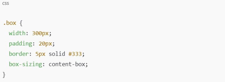
Here's how the browser calculates the total size:Content: 300px
Padding: 20px left + 20px right = 40px
Border: 5px left + 5px right = 10px
Total Width = 300 + 40 + 10 = 350px
Sneaky, right?
You told it 300px, but the actual size is 350px wide. This can really mess up your layout - especially when trying to line things up in grids or side-by-side containers.
border-box – The Hero We Deserve
With box-sizing: border-box, the width you define includes padding and border. Now that's more intuitive!
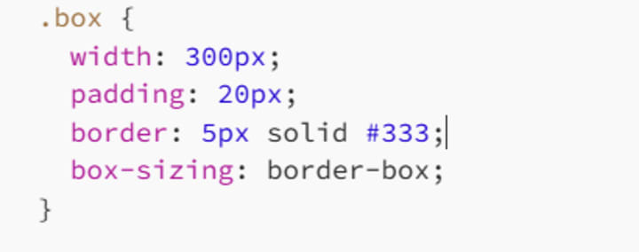
Now the calculation goes like this:
- Total Width = 300px
- Border: 5px each side = 10px
- Padding: 20px each side = 40px
- Content Width = 300–40–10 = 250px
So the content shrinks to make room inside the box, keeping the whole thing exactly 300px wide. Hallelujah!
Why This Matters (Like, A Lot)
If you're building responsive layouts, grids, or card-style interfaces, using content-box is like measuring a bookshelf with the books already on it. You're setting yourself up for a spacing disaster.
With border-box, everything fits just as you expect. You tell CSS, "Make this box 200px wide," and it actually is. You don't need a calculator or aspirin.
Use This Golden Line
You'll often see this magic snippet in CSS resets:
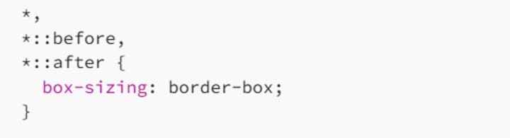
What does it do?
It applies border-box to all elements and pseudo-elements (::before, ::after).
It helps your layouts become predictable and easier to manage.
It's basically a love letter to your future self.
This little trick saves lives - or at least hours of debugging.
Try It Yourself
Here's a quick example you can drop into CodePen or a browser dev tool:
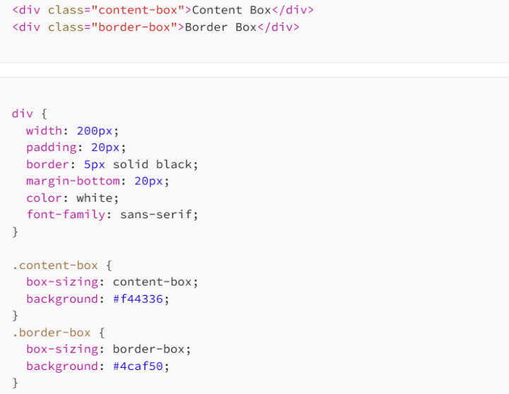
You'll see right away that .content-box stretches wider than .border-box, even though both are "200px" wide.
So, Which One Should You Use?
Let's be real - border-box is the go-to for modern layouts. It's predictable, clean, and works with the way we think CSS should behave. Rarely will you find a practical need for content-box - unless you're doing some very specific sizing tricks or legacy design work.
If you want layout control, simplified media queries, and fewer surprises, border-box is your best friend. In fact, most frameworks (like Bootstrap and Tailwind) use box-sizing: border-box by default for exactly this reason.
Final Thoughts
Understanding box-sizing is one of those things that turns a beginner into a confident web designer. It's a small property, sure - just a single line of CSS - but it can completely change how your layouts behave.
No more head-scratching over "mystery padding." No more broken boxes pushing past their containers. Just solid, predictable, beautifully behaved layout boxes.
And now that you've got this in your toolbox, you're one step closer to mastering CSS like a pro.
So go forth and build fearlessly. The box is yours to conquer.
Happy coding! 👩💻👨💻
About the Creator
MariosDev
Hi, I’m Marios! I’ve been a developer for over 9 years, crafting cool stuff and solving tricky tech puzzles. I’m a total tech enthusiast and love sharing my thoughts and tips through blogging. Also, in love with my bike!
Cost to Develop an App Like Tinder: Your 2026 Guide
Building a dating app right now feels like trying to catch lightning in a bottle. Y'all probably think it is just about swiping, but the tech underneath has grown quite thick lately. I reckon you are looking at a massive range of prices.
By Sherry Walker4 days ago in 01
The Technology Driving Interactive Education Apps
Education has evolved significantly in recent years, largely due to rapid advancements in digital technology. Traditional classroom learning is no longer the only method for gaining knowledge. With the rise of smartphones, tablets, and high-speed internet, learning has become more accessible, flexible, and engaging. Interactive education apps are at the center of this transformation, offering students and educators innovative ways to connect, learn, and share knowledge anytime and anywhere.
By Nayel Basim Al Shehhi6 days ago in 01


Comments (1)
I've been there with sizing boxes in CSS. The default content-box can be a real pain. Switching to border-box made my layouts so much easier to manage. It's crazy how something like box-sizing can make such a big difference. Have you ever had a layout nightmare because of the default sizing? What other CSS properties trip you up?