
10 Best Technology Logos and How to Make Your Own in 2022
How to Make Your Own in 2022

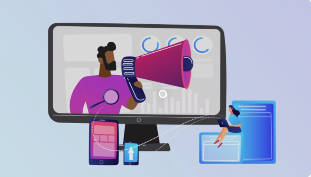
Ten of the best logo designs we’ve seen of technology companies and how you can use their designs and themes to incorporate them into your very own logo.
Intro to Tech Company Logos
Every now and then, the entrepreneurial spirit awakens in individuals who then try to build their own technology startup company in the hopes of achieving success. The foundations of a strong start up lies in their well-defined business goals and objectives, as well as their initial brand identity. Your brand identity is what the general public looks at when they see you. It is the first impression that you make! Designing a solid logo is no mean feat, as it must represent your purpose, your goals, and your philosophy. Today we’re going to be listing down elements that can be found in tech companies with inspired logo designs.
A Picture is Worth a 1000 Words!
When asked by logo design, the community shared their valued opinions which formed the 5 Principles of Effective Logo Design. Which are Simplicity, Memorability, Versatility, Timelessness, and Pertinency. We’ll be keeping these basic principles in mind as we breakdown and review these logos.
1. Apple Inc:
Let’s start this off with one of the most iconic logos ever designed. The apple logo has become synonymous with class and elegance. This mega-iconic logo has everything a logo needs. It is Simple, Versatile, Timeless, and Memorable. When Rob Janoff was asked to design a logo for Apple Inc. A good logo should be scalable as well. It needs to look distinctive no matter how big or small it is, which is why he was at a loss when the Apple logo could be mistaken for a cherry if it was small enough. Then he made one small decision that would prove to be monumental. He took a small bite out of the apple which made it a globally recognized brand name today.
2. Team Viewer: -
Another example of exemplary logo design is the TeamViewer Logo. TeamViewer is a company which developed a software that allows remote access of computers. Therefore their logo needs to represent a strong link between objects and show their technological background. The two-way arrow exemplifies this aspect of the company and the blue color is synonymous with technology. Overall, the logo is Simple, Memorable, and Relevant.
3. CircleCI: -
Most netizens must already be familiar with this company because of their recent magnificently animated ads on Youtube. CircleCI is a continuous integration and development platform that allows efficient and rapid development of code Their logo needs to represent something bold to stand out from the competition. They need to show that they are a complete and whole package of development. With a strong focus on integration. Their wonderfully designed logo conveys that exact message. The mirrored circle with an “i” in the middle. Simple, Memorable, and Relevant!
4. GENER8: -
This is a startup that was famously featured on BBC’s Reality TV Show “Dragon’s Den”. Their logo is another wonderful example of a subtle but classic logo design. This company created a browser extension that basically allows you to control the type of ads you see online and how you can use those ads to “generate” money for yourself. The cool wordplay of generate and the number 8 represents a technological POV and the little projections on it make it seem like a dollar sign to represent the ability to generate money for yourself.
5. Disney+ : -
The titan of the entertainment industry exploded into the streaming industry with Disney Plus. The iconic arch of Walt Disney ending in a little plus is just perfect.
6. WinRAR:-
The famous software that everyone uses but nobody seems to buy has the perfect logo which captures exactly what the software does. It compiles and compresses files together which makes it one of the best designed logos out there.
7. Binance:
One of the world’s largest cryptocurrency exchange platforms. The little chain of blocks in the middle of the logo represent Blockchain technology while the two arrows signify exchange.
8. Amazon: -
Nobody can ignore this mega corporation, Amazon which is worth roughly 1.65 trillion USD has the most iconic logos ever designed. The company which provides a platform that sells virtually everything from A to Z has a logo with an arrow pointing from a to z while also functioning as a smile. Simple and Effective design!
9. Digit App: -
An app used to handle finances and plan out budgets, Digit shows the plus minus symbols to represent transactions and the little smile to appeal to users and gain their trust.
10. Microsoft: -
Microsoft has gained worldwide renown for their operating system and their Windows line of products. It stands to reason that the product that put Microsoft on the map is represented in the Microsoft logo with the colorful four squares representing a window.
Designing Your Startup Logo!
So, with all that in mind, when you are thinking up a design for your own startup it is important to keep those five principles in mind. You need to be simple but relevant to be iconic! For a digital design logo of a startup, you’ll definitely need help from professionals as they can incorporate all of the points mentioned above. Remember the importance of logos and brands as you head out into the cutthroat world of capitalism.
About the Creator
Keep reading
More stories from writers in 01 and other communities.
Daniel Raphael Dreamporting Reviews: What Participants Are Saying
Personal development programs often inspire curiosity—and skepticism—in equal measure. Dreamporting, founded by Daniel Raphael, is no exception. Positioned within the mindfulness and consciousness-based growth space, the program has generated a wide range of responses from participants. Some describe it as insightful and grounding, while others remain uncertain about its value or structure.
By Jeffrey D. Gross MD3 days ago in 01
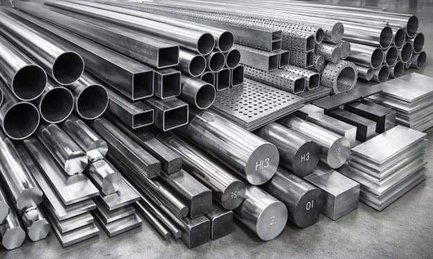
The Most Popular Types of Steel in Industry
Steel remains the backbone of modern industry. From towering skyscrapers to precision surgical instruments, this versatile alloy shapes our world in countless ways. But not all steel is created equal. Different compositions and treatments yield materials with vastly different properties, each suited to specific industrial applications.
By Sommersang4 days ago in 01
🅼🅸🅳🅽🅸🅶🅷🆃 🆂🅽🅰🅲🅺🆂
"It's 10 in Tuscon! We all know what that means... It's Time for Midnight Snacks with your man, Gerald Gee! Ready to spend the night together? Me too! I'm full of snacks and can't wait to regurgitate them all back into your hungry ears. Crack a brew! Pop some corn! Anything to get ready for one hell of a show where the talk maybe cheap but the words cut deep...
By Lamar Wiggins2 days ago in Fiction
Thoughts on Vocal and the way the world is
"Death cannot stop true love, only delay it." – Wesley in The Princess Bride. I decided to come back to Vocal on a very cold and dark night at the end of December. I had been, and still am, convalescing from a horrible staph infection that had gone misdiagnosed for months. This, paired with the increasing challenges of being healthy, making the best choices for my co-parented child, being a wife, and being a director at a new job, was a lot to manage.
By Jazzy 6 days ago in Confessions


Comments
There are no comments for this story
Be the first to respond and start the conversation.