
This challenge has got me craving a burger now!
A css burger

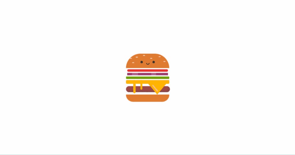
Inspiration
Alright, I'm diving into the world of CSS wizardry to whip up a burger that'll make you drool—complete with melty cheese and veggies dancing on top! 🍔
Journey
Designed the "Burger", converted sketches to HTML/CSS, focused on details like colors and shapes, learned CSS techniques, proud of the attention to detail, aiming to improve efficiency in future projects.
Absolute Positioning:
Imagine you’re building a burger with different layers (bun, tomato, onion, etc.). Absolute positioning is like placing each ingredient exactly where you want it on the burger.
In CSS, it’s like saying, “Put the tomato slice right here, on top of the bun.”
Example:
.tomato {
position: absolute;
top: 20px;
left: 50px;
}
Container Styling:
Think of the burger as being inside a box (the container).
We make sure the box has a fixed size (200px by 200px) and is centered both horizontally and vertically on the table.
Example:
.container {
margin: auto;
width: 200px;
height: 200px;
}
Burger Components Styling:
Each part of the burger (like the bun, cheese, and ham) gets its own special look.
For example, we give the bun a textured appearance to mimic sesame seeds or a baked texture.
Example:
.bun {
background-image: radial-gradient(rgba(255, 255, 255, 0.7) 7%, transparent 8%);
}
Pseudo-elements (:before and :after):
Pseudo-elements are like invisible helpers that add extra details to an element.
In our burgers, we use them to create eyes and a mouth for the face.
Example
.face:before,
.face:after {
position: absolute;
content: '';
}
Box Shadow and Inset Shadow:
The .ham class applies a box shadow with an inset effect to create a shadowed appearance for the ham patty.
Example
.ham {
box-shadow: inset -5px -5px 5px rgba(68, 68, 68, 0.3);
}
CSS Animation (@keyframes):
An animation named melting is defined using @keyframes.
The .melt class applies this animation to create a melting cheese effect that translates (moves) vertically.
Example
@keyframes melting {
100% {
transform: translateY(15px);
}
}
.melt {
animation: 5s melting ease infinite;
}
About the Creator
Keep reading
More stories from Sukhpinder Singh and writers in Writers and other communities.
How to Make Money from Unused Internet
What is Grass and How Does it Work? Grass is the underlying infrastructure that powers AI models. By installing the Grass web extension, the application will automatically sell your unused internet to AI companies, who use it to scrape the internet and train their models. The result? You share in the growth of AI, earning a stake in the network for selling a resource you didn’t even know you had.
By Sukhpinder Singh2 years ago in Writers
A Transparent Look at Vocal Challenges and Top Stories
Almost three years ago, we shared a resource article that served as a place for people to suggest new challenge prompts. We thought it would be a good idea to refresh that thread, and take the opportunity to answer a few common questions about top stories, how challenges are judged and how submissions are reviewed.
By Vocal Curation Team3 days ago in Resources


Comments
There are no comments for this story
Be the first to respond and start the conversation.