
Color Psychology: How to Choose Colors That Set the Mood
"Mastering Color Psychology: Selecting Shades That Enhance Your Space and Elevate Your Mood"
The colors you choose for your home have a profound effect on the way you feel and interact with your environment. Whether you’re looking to create a calm retreat, boost creativity, or energize your space, understanding color psychology is essential for transforming your home into a place that supports your lifestyle. At KD Space Designs, we believe in the power of color to shape mood and enhance the experience of a room. Here’s how to choose the right colors for each area of your home, based on their psychological effects.
Understanding Color Psychology
Color psychology is the study of how colors affect human behavior and emotions. Different colors can evoke specific feelings and responses, and incorporating them thoughtfully into your space can help you achieve the ambiance you desire.
Let’s dive into some of the most common colors and their psychological effects to help you choose the right hues for your home.
1. Red: Passion and Energy
Red is a bold, dynamic color that stimulates energy and excitement. It’s a great choice for spaces where you want to encourage social interactions and activity. Consider using red in your living room, dining room, or home office. While too much red can feel overwhelming, incorporating it in accent pieces like throw pillows, rugs, or wall art can create a vibrant, passionate atmosphere.
Tip: Pair red with neutral tones like white, gray, or beige to balance its intensity.
2. Blue: Calm and Tranquility
Blue is known for its calming and soothing qualities. It’s a color that promotes relaxation and peace, making it ideal for bedrooms, bathrooms, or meditation spaces. Lighter shades of blue can make a room feel airy and expansive, while deeper blues evoke a sense of stability and luxury.
Tip: Pair blue with soft whites, creams, or even wood tones to enhance its tranquil effect.
3. Yellow: Optimism and Creativity
Yellow is often associated with happiness, positivity, and creativity. It’s a perfect color for spaces where you want to inspire energy, optimism, and mental clarity. Yellow works particularly well in kitchens, home offices, or creative spaces like studios. However, it’s important to use yellow in moderation, as too much can feel overwhelming.
Tip: Use soft, muted yellows to avoid overwhelming the space and pair them with neutral colors for balance.
4. Green: Growth and Balance
Green symbolizes nature, growth, and harmony. It’s the perfect color for spaces where you want to feel grounded and connected to nature. Lighter greens promote calm and relaxation, while darker greens evoke sophistication and wealth. Green is ideal for living rooms, bedrooms, and even home offices, where you want to create a sense of balance and tranquility.
Tip: Bring in natural plants to complement green walls or accents for a more holistic, calming vibe.
5. Purple: Luxury and Spirituality
Purple is often linked to luxury, royalty, and spirituality. It’s a rich and calming color that can elevate a space, making it feel elegant and sophisticated. Lighter shades like lavender are perfect for bedrooms or areas where you want a peaceful atmosphere, while deeper purples work well in statement pieces or accents for a touch of opulence.
Tip: Balance purple with neutrals like gray or gold to avoid overpowering the space with too much richness.
6. White: Purity and Simplicity
White is the epitome of purity and simplicity. It makes spaces feel clean, open, and spacious. It’s a timeless color that works well in any room, particularly in areas where you want to foster a sense of clarity and simplicity. White also serves as an excellent backdrop for showcasing furniture, art, and other vibrant colors.
Tip: Incorporate white with textures (like wool rugs, wooden furniture, or textured walls) to prevent the space from feeling too sterile.
7. Gray: Sophistication and Calm
Gray is a versatile, sophisticated color that pairs well with almost any other hue. It’s perfect for creating a neutral and modern atmosphere, and it works well in living rooms, dining areas, and home offices. Gray promotes calm and focus without being overpowering. It’s a great base color for accentuating other elements in the room.
Tip: Use gray in combination with warmer tones like mustard, blush, or gold for added warmth and interest.
8. Pink: Warmth and Comfort
Pink is often associated with warmth, compassion, and love. It’s a soothing color that works well in spaces where comfort and nurturing are important, such as bedrooms, nurseries, or cozy sitting areas. Soft pinks can create a calming environment, while bolder pinks add energy and playfulness.
Tip: Combine pink with natural elements like wood or greenery to balance its softness.
Choosing the Right Colors for Each Room
Now that you’re familiar with the psychological effects of color, it’s time to consider which hues will work best in each area of your home:
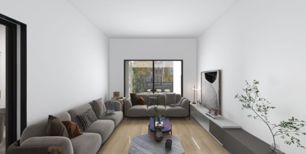
Living Room: Opt for warm, welcoming colors like beige, soft yellows, or light greens to create a space for conversation and relaxation.
Bedroom: Choose calming colors like blue, lavender, or soft greens for a restful atmosphere.
Kitchen: Bright and energizing colors like yellow or orange can stimulate appetite and conversation.
Home Office: Use blues and greens to foster productivity, or a touch of yellow to spark creativity.
Bathroom: Light blues, whites, or greens are great for creating a tranquil, spa-like feel.
Final Thoughts
The colors you choose for your home can dramatically impact your mood, energy, and overall experience in a space. By understanding the psychological effects of different colors, you can create an environment that enhances your well-being and supports your lifestyle. At KD Space Designs, we specialize in helping clients choose the perfect colors for their spaces, combining functionality with aesthetic appeal.
If you’re ready to transform your home and set the mood with color, contact us today to start designing a space that’s as vibrant, calming, or energizing as you want it to be!
About the Creator
Keep reading
More stories from writers in Writers and other communities.


Comments
There are no comments for this story
Be the first to respond and start the conversation.