Beyond the Logo: How Packaging Design Builds a Recognizable Brand Identity
How Packaging Design Builds a Recognizable Brand Identity

In the fiercely competitive retail landscape, a brand's logo is often seen as the cornerstone of its identity. It's the swift visual shortcut that allows consumers to recognize a company at a glance. However, the true mark of a powerful brand lies in its ability to be instantly recognizable even when its logo is not in the spotlight. This is the profound power of exceptional packaging design.
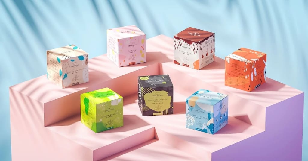
Far from being a mere protective layer for a product, a strategically crafted packaging approach leverages the consistent application of colors, fonts, and imagery to forge a subconscious and deeply effective brand identity. It's a silent yet potent form of communication that narrates a brand’s story and cultivates a lasting, emotional bond with consumers.
The Symphony of Color and Consistency
Color is the most immediate and emotionally resonant component of packaging design. Think of the iconic red of a Coca-Cola can, the unmistakable orange of an Hermès box, or the serene blue and white of a Tiffany & Co. jewelry box. These colors are so deeply embedded in our collective memory that they can evoke the brand's essence before we even see its name. A successful packaging strategy extends beyond simply selecting a brand color; it demands the unwavering application of that color across every single product line.
Whether it’s a flagship item or a limited-edition collaboration, maintaining a consistent color palette ensures that consumers can effortlessly spot the brand on a crowded shelf. This visual consistency serves as a powerful anchor, fostering a sense of familiarity and trust that transcends individual product offerings.
Typography as a Brand's Voice
Just as a brand's logo has a specific typeface, so too does its packaging. The careful selection of typography communicates a brand’s personality, its tone, and its core values. A high-end luxury brand might choose an elegant, classic serif font to convey sophistication and heritage, while a modern, playful brand might opt for a bold, clean sans-serif typeface. The key to building an instantly recognizable brand identity is the meticulous and consistent use of this typography across all packaging.
When a consumer encounters a new product from a familiar brand, the consistent font choice acts as a silent reassurance of the product’s origin and inherent quality. This subtle visual cue effectively reinforces brand recognition and builds customer loyalty. This consistency creates a visual harmony that links all of the brand's products together, making them feel like an integral part of a cohesive family. The typography on the packaging becomes a recognizable "voice," speaking volumes to the consumer without a single word being consciously read.
Imagery and Texture: Telling a Story Without Words
Beyond the crucial elements of colors and fonts, the imagery and tactile properties of packaging play a pivotal role in brand recognition. A brand’s unique visual language—be it a specific illustrated pattern, a particular photographic style, or a distinctive texture—can be just as impactful as its logo. Consider brands that utilize a certain type of illustration to convey an artisanal or handcrafted feel, or those that employ minimalist designs to project a sense of premium quality and exclusivity. These visual cues are not arbitrary; they are meticulously chosen to align perfectly with the brand's overarching narrative.
When a consumer holds a product, the feel of the box, the texture of the paper, or the subtle embossing on the lid all contribute to the overall brand experience. This multi-sensory approach ensures that the brand identity is not only seen but also felt, forging a more memorable and lasting impression. This consistent use of imagery and texture across diverse product lines creates a unified aesthetic that enables consumers to instantly recognize a brand’s new offering, even if the product itself is a completely new concept for them.
From Unboxing to Unwavering Recognition
The unboxing experience has rapidly evolved into a critical aspect of modern consumerism. It is the moment where all the carefully planned elements of packaging design converge to create a truly memorable and highly shareable experience. For brands, this is a golden opportunity to cement their identity.
By ensuring that every single detail—from the custom tissue paper to the product insert—is perfectly aligned with the brand's consistent use of colors, fonts, and overall aesthetic, companies can transform a simple delivery into a powerful brand-building event. This cohesive experience not only delights the consumer but also reinforces the brand’s deep commitment to quality and exceptional attention to detail. This unified approach makes the brand instantly recognizable and establishes a strong mental connection, turning a one-time purchase into the foundation of a loyal relationship.
In an era where user-generated content reigns supreme, a thoughtfully designed unboxing experience encourages consumers to share their discovery online, further amplifying brand recognition far beyond traditional marketing channels. Ultimately, packaging is far more than a simple container; it is a powerful, silent, and consistent tool that works tirelessly to build a brand identity that is recognized, remembered, and deeply trusted, long after the logo has faded from the conscious mind.


Comments
There are no comments for this story
Be the first to respond and start the conversation.