
The most practical clothing color matching
Clothing color matching skills


In addition to the style of the clothing, there is nothing that affects the look and feel more than the color scheme of the clothing.
The most important thing is to have a good look. Today we bring to you in the daily clothing with, more practical clothing color matching skills. These are based on the color science foundation of clothing color matching dry goods, can instantly enhance the clothing, to create a stylish look.
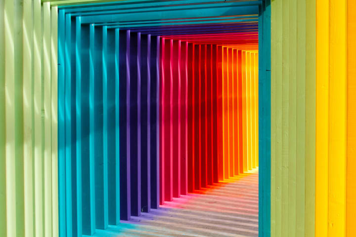
First of all, let's introduce a concept - "color ring".

A color ring is a long sequence of spectra in the color spectrum that connects the first and last to form a ring-like figure that mixes the base colors (the three primary colors - red, green and blue) by a certain ratio to produce other colors.
We must be clear about one key word - color spectrum; so in the color ring diagram we see there is no black, white, gray three colors, these three colors are also "colorless system".
Through the color ring diagram can be seen, the closer the color ring periphery of the darker, or we often say "high saturation color"; the closer the color ring center of the lighter color, or even more tend to no color, or we often say "low saturation color".
In the daily color matching of clothing, the most used color matching is in the difference color, contrast color, neighboring color, neutral color; in this first statement, when discussing the color matching of clothing, do not consider the style and shape of clothing.
1、Medium color clothing color scheme
Medium-difference color refers to the color scheme that is 90 degrees apart in the color ring.
Take any color in the color ring as the base point, and the two colors that are about 90 degrees apart from this color are the mid-difference colors
In the daily color matching, the most commonly used mid-difference colors are orange and green, green and blue, etc.
Mid-difference colors are brighter and have a great visual effect of color tension. This color scheme is more likely to show a bright, lively sense of leap, but also suitable for matching with no color.
In the daily clothing with, the color scheme is also more suitable for spring and summer sunny season selection, there is a good effect of ageing.
2, contrast color clothing color scheme
Contrast color is, in the color ring between 120-180 degrees apart in the color scheme.
Take any one color of the color ring as the base point, and the two colors that are about 120-180 degrees apart from this color is the contrast color. In clothing color matching, it is recommended that the angle of separation between two colors be controlled at about 120 degrees; of course, if you like stronger visual conflict, this point can be ignored.
Contrasting colors have a visual impact and a strong and sharp clash effect on the senses. This color scheme can present a warm, passionate visual sense, but also can show the positive, upward energy.
In the daily clothing, contrasting color scheme is also suitable for spring and summer this sunny season selection, there is a good effect of age reduction.
3, neighboring color clothing color scheme
Adjacent colors are colors that are 60 degrees apart or within three positions of each other in the color ring.
The color that is 60 degrees or within three positions from any color in the color ring is the neighboring color
In the daily clothing color scheme, the most commonly used color scheme is pink, pink purple, orange and so on.
In addition, secretly tell the fairies, according to my research, this year's popular color to pink tone is the main Oh!
The neighboring colors belong to the kind of you have me, I have you, the color similarity, warm and cold consistent, uniform tone, the same emotional characteristics.
The color scheme is suitable for any season of the year, the contrast effect of this color scheme is not as strong as the visual impact of the contrast color, so in the clothing with the choice, you can add some similar to the "denim" cool tones or colorless, increase the level of change in the modeling. 4, neutral color clothing color scheme
Strictly speaking, neutral colors are colorless (black, white, gray); but in the clothing color scheme, the range of neutral colors is broader, including: colorless, earth tones and low-saturation colors. Some fairies may say, on a neutral color color ring chart to see, remember the key words we mentioned at the beginning - "color spectrum" not? For neutral colors, let's look at them one by one.
As the most commonly used color scheme, colorless is applicable to almost all seasons of the year. At the same time, this color scheme has also produced many classic matches, such as "black and white with" and so on.
Colorless clothing color scheme is easy to make clothing too monotonous, with a sense of dullness; so in the daily collocation, you can choose to add shades of accessories to accent; or more directly, plus a little earth tone or low-saturation color accessories to do accents, will not be wrong.
The most representative colors of earth colors are brown, curry, khaki. This color looks more "dull", very suitable for the season's clothing color choice. At first glance, it is easy to remind people of the fallen leaves in late autumn ......
The same can be said for the different shades of accessories to neutralize this "dullness". Personally, I feel that try to choose colorless accessories to embellish, low-saturation color scheme seems a little bit of a mismatch.
Low-saturation colors as a kind of colored, is to add gray to colored, so that the color does not look so bright. There is nothing more representative than the popular "macron color" in recent years.
This color scheme of clothing is also not picky about the season, you can choose all year round; at the same time, this color is also easier to highlight the elegant, gentle sense of temperament, but also a certain age reduction, youthful effect.
Master these practical clothing color scheme, you can easily choose the right color clothing, but also to match a more fashionable look.
About the Creator
Heise Chafetz
The so-called listening to God is a confirmed despair.
Keep reading
More stories from Heise Chafetz and writers in Styled and other communities.
Are Ponchos in Style?
Ponchos are not just in style — they’ve evolved. What was once considered a purely practical layer has returned as a refined outerwear choice, especially during colder seasons. The modern poncho is structured, versatile, and intentionally styled. It no longer feels oversized or shapeless. Instead, it feels architectural.
By BTK COLLECTION3 days ago in Styled
How to Care for Your Solitaire Diamond Engagement Ring to Keep It Sparkling
A solitaire diamond engagement ring is appreciated for its simplicity and sophistication. Since there is only one diamond at the center, all aspects, from brilliance to clarity, remain exposed. Moreover, there are no other diamonds to cause distractions, so any accumulation, no matter how small, will not go unnoticed. It needs to be handled well to ensure its durability.
By sofia jones6 days ago in Styled
Tatt~Master
— Assembly Line Tatt Machine ~ Impressions to Impress — As I begin to understand more about the Tattoo Phenomenon. I've written silly, yet verbatim, dating site anecdotes in 'Frazzled.' So let me ask you: Would you be More attracted to someone slathered with tattoos, or Less?
By Jay Kantor5 days ago in Humor


Comments
There are no comments for this story
Be the first to respond and start the conversation.