
The Best Fonts for Real Estate Flyers in 2025
Fonts for Real Estate Flyers

Real estate marketing is a constantly evolving field, with visual design playing a pivotal role in attracting and engaging potential buyers or tenants. Among the many design elements, typography stands out as one of the most critical factors in creating impactful real estate flyers. In 2025, the best fonts for real estate flyers are those that balance style, readability, and the ability to convey professionalism. This blog delves into the top font choices for real estate flyers, how to pair them effectively, and tips for maximizing their impact.
Why Typography Matters in Real Estate Marketing
Typography is more than just selecting a font; it’s about creating an emotional connection, ensuring readability, and establishing trust. In real estate, a flyer’s goal is to communicate property details while evoking a sense of aspiration or urgency. Fonts can:
Capture Attention: Bold, unique fonts stand out and can make a flyer visually appealing.
Enhance Readability: Clear typography ensures that important details, such as prices and contact information, are easily understood.
Reflect Branding: Fonts convey professionalism and style, mirroring the image of your real estate agency or property.
Drive Action: Well-chosen fonts guide readers toward calls to action, such as scheduling a viewing or visiting a website.
Characteristics of Effective Fonts for Real Estate Flyers
When selecting fonts for your real estate flyers in 2025, consider the following characteristics:
Readability: Potential buyers should quickly grasp key details without straining their eyes.
Versatility: The font should work well across digital and print formats.
Modernity: Using trendy yet timeless fonts ensures your flyers remain fresh.
Emotionally Resonant: Fonts can evoke luxury, warmth, or simplicity, depending on the property being advertised.
Top Fonts for Real Estate Flyers in 2025
1. Montserrat
Why it works:
Montserrat remains a favorite due to its clean lines, geometric shapes, and modern aesthetic. Ideal for luxury or contemporary properties, it exudes professionalism and clarity. It works especially well for headings and subheadings.
Best for:
Luxury condos
Modern townhouses
Pair with:
Roboto for body text
Playfair Display for an elegant touch
---------------------------------------------------------------------------------------
2. Playfair Display
Why it works:
This serif font blends classic elegance with modern sophistication, making it perfect for upscale properties. It adds a sense of grandeur and is particularly effective for high-end homes or historic properties.
Best for:
Historic mansions
High-end listings
Pair with:
Lato for readability
Open Sans for simplicity
---------------------------------------------------------------------------------------
3. Roboto
Why it works:
Roboto’s clean and versatile design makes it a go-to choice for real estate flyers. Its balance of modernity and readability ensures it’s suitable for a wide range of properties, from family homes to commercial listings.
Best for:
Suburban homes
Multi-use properties
Pair with:
Montserrat for a sleek look
Merriweather for a warm tone
---------------------------------------------------------------------------------------
4. Lora
Why it works:
Lora is a serif font with a friendly, approachable vibe. Its subtle curves and readability make it ideal for properties that emphasize comfort and charm, such as cozy cottages or family homes.
Best for:
Family-friendly homes
Countryside properties
Pair with:
Raleway for headings
Open Sans for body text
---------------------------------------------------------------------------------------
5. Raleway
Why it works:
Raleway is a sans-serif font known for its slim, stylish appearance. It’s excellent for creating a polished, minimalist look, making it suitable for modern properties or eco-friendly homes.
Best for:
Contemporary apartments
Sustainable housing
Pair with:
Roboto for versatility
Georgia for a touch of tradition
---------------------------------------------------------------------------------------
6. Open Sans
Why it works:
Open Sans is a highly legible and neutral font, making it one of the most versatile choices for real estate flyers. Its understated design ensures the focus remains on the property images and details.
Best for:
Commercial properties
Broad audiences
Pair with:
Playfair Display for sophistication
Montserrat for modernity
---------------------------------------------------------------------------------------
7. Merriweather
Why it works:
Merriweather’s warm and welcoming design is ideal for properties with a homey feel. Its serif style brings a touch of traditional charm, perfect for listings that emphasize comfort.
Best for:
Family homes
Rural properties
Pair with:
Roboto for contrast
Lora for cohesion
---------------------------------------------------------------------------------------
8. Poppins
Why it works:
With its geometric sans-serif design, Poppins is both bold and inviting. Its round shapes and clean lines make it a favorite for modern, vibrant flyers.
Best for:
Urban apartments
Trendy spaces
Pair with:
Lora for balance
Open Sans for practicality
---------------------------------------------------------------------------------------
9. Baskerville
Why it works:
Baskerville’s timeless serif style exudes elegance and tradition. It’s particularly effective for high-end listings or properties with a rich history.
Best for:
Luxury estates
Historic properties
Pair with:
Raleway for contrast
Roboto for readability
---------------------------------------------------------------------------------------
10. Nunito
Why it works:
Nunito’s balanced sans-serif design is approachable yet professional. It’s excellent for creating friendly, inviting flyers that still maintain a polished look.
Best for:
Starter homes
Family-focused properties
Pair with:
Montserrat for style
Lora for warmth
---------------------------------------------------------------------------------------
Tips for Pairing Fonts
The right font pairing can elevate your flyer’s design. Follow these tips to create harmony and impact:
Limit to Two Fonts: Too many fonts can make a flyer look chaotic. Stick to one font for headings and another for body text.
Combine Serif and Sans-Serif: Mixing these styles creates visual contrast and interest.
Maintain Hierarchy: Use bold or larger fonts for headings to guide readers’ eyes to important details.
Test Readability: Ensure text remains legible on both digital screens and printed materials.
Leveraging Typography in Flyer Design
Once you’ve chosen your fonts, integrate them effectively into your flyer:
Highlight Key Details: Use bold fonts for prices, contact information, or special offers.
Create Visual Flow: Align text consistently and avoid overcrowding.
Match the Property’s Style: For instance, a luxury property may benefit from elegant serif fonts, while modern apartments suit clean sans-serif designs.
Staying Ahead in 2025’s Real Estate Market
Typography trends in 2025 emphasize simplicity, clarity, and a connection to modern design aesthetics. By using the fonts recommended here, you can ensure your real estate flyers stand out in a competitive market. Remember, the best fonts not only enhance readability but also resonate with your target audience and reflect the unique character of the properties you’re promoting.
In a world where first impressions matter, let your typography speak volumes. The right fonts can transform your flyers into powerful marketing tools that inspire action and drive results.
Conclusion
Typography is more than just a design choice; it’s a strategic tool in real estate marketing. The best fonts for real estate flyers in 2025 not only look great but also communicate the essence of the properties being advertised. By carefully selecting and pairing fonts that align with your brand and property type, you can create compelling flyers that capture attention and drive engagement.
Remember to stay updated on typography trends and to test your designs across different mediums to ensure effectiveness. Whether you’re marketing a cozy family home or a luxurious urban condo, the right font choices will make your flyers stand out and help you connect with your target audience. In a competitive market, where every detail counts, mastering typography is an investment in success.
About the Creator
Keep reading
More stories from Jack Dawson and writers in Styled and other communities.
How a Weekly Planner Template Can Boost Your Productivity
In today’s fast-paced world, staying organized can be a major challenge. With countless tasks, deadlines, and personal commitments, it’s easy to feel overwhelmed. This constant chaos often leads to missed deadlines, stress, and ultimately, decreased productivity.
By Jack Dawsonabout a year ago in Styled
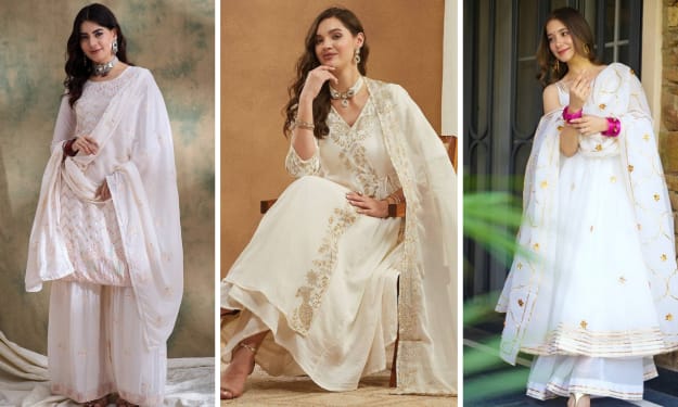
Reel-Ready White Salwar Kameez Styles That Photograph Beautifully
For social media and festive fashion in 2026, white salwar kameez is a favourite option for women looking for outfits that are as flattering IRL as they appear on camera. And whether you are posting a reel from a family party, festival celebration or Sunday brunch with your friends, the perfect white salwar kameez style can give you stunning visuals with minimal effort no matter how styled up (or down) it appears.
By Amit Mandal5 days ago in Styled


Comments
There are no comments for this story
Be the first to respond and start the conversation.