
Exploring the Wonderful World of Lilac Color
Exploring the Wonderful World of Lilac Color

For your artistic endeavors or just to add some flair to your design, lilac is a stunning hue that lends a sense of tranquility, refinement, and elegance to anything. This shade, which is gentle and delicate, is widely used to convey feelings of romance, creativity, or serenity. But do we know much about this multifunctional color? In this article, we shall delve into the interesting world of lilac. It will help us find the origins, meanings, complementary colors, and their application in design. Hopefully, you may feel inspired to apply it in your next creative endeavor. You can use lilac as a background color for your Instagram stories while adding multiple photos.
What is Lilac?
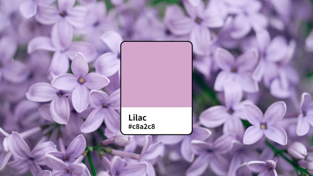
Lilac is a soft, pale purple color that is comprised of the cool tones of blue and the warmth of red. The name for this color was first recorded in 1775 when it derived from the lovely lilac flowers, often associated with the color. It's lighter and not as bright as many other shades of purple, so a softer, more gentle alternative.
In terms of color composition, lilac is a mix of blue and red in different proportions. Like all purple hues, it has both warm and cool qualities. While lilac is somewhat similar to lavender, there is a main difference: lavender has more of a blue undertone, while lilac tends toward pink, giving a softer and more romantic feel.
The essence of the flower lilac has an imaginative and soft, ethereal allure that captures one's sense with its soothing and imaginative forces. The color is synonymous with innocence, spirituality, youth, and serenity, making it very effective for many purposes in the realms of design, fashion, and interior design. You can create album covers using PhotoCut with the lilac color.
What Does Lilac Symbolize?
Lilac has been used to represent many emotions and qualities throughout history, depending on the context. Purple shades were a color of royalty, wealth, and power in the past, mainly because it was difficult and expensive to get purple dyes in ancient times. In this respect, lilac was also seen as elegant and classy.
- Youth and Innocence: Lilac is often associated with youth, innocence, and purity because of its gentle, pastel-like hue. In environments like infant nurseries or designs aimed at young people, this hue is meant to arouse feelings of gentleness or nostalgia.
- Spirituality and Serenity: Lilac is mild, and at the same time, it represents blue, a color of peace, and red can be that color which sometimes can be interpreted as passion or warmth. Color psychology sometimes describes lilac as a calming color-one, which bestows peace, calms the mind, and allows for a balance in one's emotional being.
- Romance and Emotional Expression: The color lilac, because it is associated with the flower, is associated with romanticism. When giving flowers of lilac to someone, in the language of flowers, it has been symbolic of the very early love or the sprouting of new relationships. The depth of emotion the lilac expresses makes it a wonderful color for showing affection, care, and tenderness.
- Elegance and Nurturing: Lilac is also associated with nurturing, care, and compassion. It is often used in designs meant for women as it carries a sense of warmth and softness.
What Colors Pair Well with Lilac?
Lilac is an adaptable color that works well with a range of colors, from complementary colors to more subtle pairings. Be it a bold, modern design or a soft, romantic atmosphere, lilac offers opportunities to explore creativity in design.
- Lilac and White: It is paired excellently with white, for it presents a fresh, clean, and serene atmosphere. This color combination is normally used for design elements where minimalist elegance style is in question. Here, white forms a neutral background which permits the soft beauty of lilac.
- Lilac and Yellow: The combination of lilac's gentle tones and yellow's brightness creates a highly pleasing and eye-catching contrast. Bringing excitement and optimism, the end effect is a bright, cheery, and upbeat mood that may be popular in spring and summer projects.
- Lilac and Orange: The combination of lilac and orange is unusual, yet the two colors work well together. It gives a retro, playful look to any design and brings warmth to the coolness of lilac. This pair is especially stunning in interior design or modern graphic design.
- Lilac and Green: Lilac is also a great color with olive and sage green shades. The earthy, natural quality of green combines well with the soft, calming aspect of lilac to make this a perfect pairing for designs that try to evoke serenity and harmony.
- Lilac with Other Shades of Purple: Lilac goes well with darker purples or even lavender for a monochromatic look. This can give a soft, dreamy effect layered with different shades and can be great for more romantic or ethereal designs.
- Lilac and Pink: Since lilac is in between pink and purple in the color range, it harmoniously matches most colors of pink. Combining lilac with pink tones would give a romantic feminine look that could be best suited for wedding designs, invitations, or fashion products.
Lilac Color in Design
It's very nice for designers to apply lilac to their works because it gives them a delicate and calming feel for anything created. From branding to product design, from interior decoration to graphic design, there is the ability to apply it to a wide variety of contexts.
- Fashion Design: Lilac is a fashion color preferred for spring and summer lines. It's associated with softness, femininity, and elegance, therefore great for dressing, accessories, and formal clothes. However, it also can serve to create some amazing contrast against darker shades like navy or charcoal.
- Interior Design: In home design, lilac is such an atmosphere that can easily provide peace and serenity inside the room. It seems pretty suitable for bedrooms, living rooms, and bathroom design because the objective here is to create a restful, soothing atmosphere. Such neutral shades as beige and light gray can be harmonized with lilac on the walls or accents of the interior.
- Branding and Marketing: The soft yet different nature of lilac makes it perfect for branding purposes, especially in the beauty, wellness, or luxury sectors. It suggests characteristics such as reliability, class, and glamour, making it perfect for companies looking to convey care and luxury.
- Graphic Design: Lilac is popular in graphic design because it gives one a feel of a dreamy and whimsical atmosphere. It is used for event invitations, greeting cards, and even social media graphics as a source of warmth and sophistication. You can induce lilac in the creation of anime art using PhotoCut’s AI.
Create Stunning Graphics with the Lilac Color
The right shade of lilac can be quite difficult to find, especially when it is meant to match some specific colors or complement the colors that already exist in your project. PhotoCut's color palette generator is a wonderful online tool that helps you do exactly that. With this AI-powered tool, you can try different shades of lilac and find complementary colors that would work great with your designs.
Here is how you can use PhotoCut's color palette generator to make amazing graphics:
- Upload a Photo: First, upload a photo you would like to edit with lilac. Whether it's a product image or graphic, PhotoCut's tool will assist you in making the necessary color adjustments.
- Pick Your Lilac Shade: To determine which lilac shade is perfect for your project, use the color picker. Lilac comes in a wide range of colors, from light pastels to richer, more intense tints.
- Complementary Colors: Once you've decided on a lilac hue, PhotoCut will provide complementary hues that go well with lilac. This may make it quite simple to produce a well-balanced, eye-catching design.
- Save Your Colors: You can save your favorite lilac shades and color combinations for later use, which will make your design process much easier.
- Download Your Work: Finally, when you like the way your design turned out, just click on "Download" to get the final creation in high resolution.
Conclusion
Lilac is a soft, versatile color that brings peace, elegance, and creativity to any project. From fashion, interior design, and branding to graphic design, lilac can be a color that brings powerful emotions and the best visual experiences. But, with tools like PhotoCut's color palette generator, one can explore the full scope of lilac and make it appear perfectly in the creative works. We hope this article inspired you to experiment with lilac and see where these soothing, elegant qualities may lead!
FAQs
Q1. What is the difference between lilac and lavender?
Ans. The difference in undertones marks the key difference between lilac and lavender. Lilac tends to be pinkish compared with the bluish tone lavender presents. Both are varieties of purple, though but tend to look softer, and warmer when lilac compared with lavender.
Q2. What emotions does the color lilac evoke?
Ans. The color lilac reminds us of peace, serenity, creativity, and also tender love. It is symbolized by spirituality, innocence, and romance.
Q3. Can lilac be used in corporate branding?
Ans. Of course! Lilac can be used for branding, especially in enterprises such as beauty, wellness, and luxury. It speaks of beauty, trust, and elitism.
Q4. Is lilac suitable for interior design?
Ans. Absolutely! Lilac is a fantastic color for bathrooms, living rooms, and bedrooms in particular. It creates a calming atmosphere and complements neutral hues to create a well-balanced appearance.
Q5. What other colors go well with lilac?
Ans. White, yellow, orange, green, pink, and even deeper tones of purple complement lilac. For a glitzy look, it also complements metallic hues like silver or gold.
About the Creator
PhotoCut
AI Photo Editing Tool - Remove or Change your Background & Enhance Product Photos
Keep reading
More stories from PhotoCut and writers in Photography and other communities.
10 Ideas to Make Your Profile Picture Unique
Personal and professional relationships in today's internet society are greatly governed by social media. No matter if the interest is on Instagram, Facebook, Twitter, LinkedIn, or whatever site, you first come to notice about someone when visiting their profile is what his or her profile picture looks like. It's your online introduction and can say a lot about who you are. A good profile picture can provide a great impression and attract followers. It makes the audience more connected to your work.
By PhotoCutabout a year ago in Photography
Why Printed Photographs Still Matter: The Art and Value of Preserving Memories in Print
In a world where most photographs live on phones, laptops, and cloud storage, it is easy to assume that printing pictures is a thing of the past. Yet something meaningful gets lost when memories stay locked inside a device. A photograph printed on high quality paper carries a weight and warmth that no screen can fully replicate. It can be held, shared, framed, and passed down through generations.
By The Iconabout 8 hours ago in Photography
The Gold Tone (Orotone) Technique
She picked it up from a dusty shelf at an estate sale, thinking it was just an old frame. Then the light caught it. The image glowed, not like a print, not like a painting, but like something that seemed to carry its own inner warmth. That was her first encounter with an Orotone, and she bought it without asking the price.
By CurlsAndCommas4 days ago in Photography
Why Didn't Anyone Tell Us
Men, move along. This is not for you. This is for the women. I was forty-five when I began menopause. It is pretty young for that to be going on in a woman’s life, but I had undiagnosed PCOS, my entire life. Thank you to all the gynecologists I had seen my entire life. That in itself should encourage women to keep seeking second opinions, especially when you are not getting correct answers or any at all.
By Alexandra Grant6 days ago in Humans


Comments (1)
Thank you so much for being transparent about using AI 😊