
Design Inspiration with Violet, Navy Blue, and Orange Using AI Tools
Design Inspiration with Violet, Navy Blue, and Orange Using AI Tools


Color theory has always been a vital aspect of designing practice, one whose implications relate to almost anything, like fine art, interior design, fashion, or simple space decoration. When complementary colors are applied in a composition, they create balance, harmony, and visual intrigue. The complementary colors of three colors that speak volumes, including violet, navy blue, and orange, will be explored in this article, as well as how to make designs look loud and pleasing using AI design generators and interior design software such as PhotoCut.
Make your photos look aesthetically vintage with PhotoCut’s Vintage Effects.
Understanding Complementary Colors
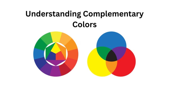
A quick review of complementary color theory is necessary before delving into the complementary color wheel of orange, navy blue, and violet. These hues are identified by their immediate opposites on the color wheel. Complementary colors emphasize each color's strength by creating contrast and balance when positioned next to one another.
- Yellow/purple, blue/orange, and red/green are the complementary primary colors.
- Yellow-orange-purple or blue-green-red-orange are examples of secondary complementaries.
The complementary colors are responsible for the balance in the practical sense, while bringing the colors out. Now, let us discuss each of the three colors, violet, navy blue, and orange, for their respective complementary colors.
Create customized Pokémon characters with PhotoCut’s AI Pokémon Generator.
Violet and Its Complementary Colors
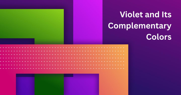
Located between blue and purple on the color wheel, violet is a rich and striking hue. This hue represents richness, intrigue, and inventiveness. Because yellow is the color wheel's direct opposite of violet, tones of yellow are typically considered complementary colors for violet. However, certain violet variants, such as deeper purples or lighter lavenders, may have somewhat different complementary hues. Here are some:
- Yellow: This is the true complementary color of violet and offers a high contrast. A deep, rich purple paired with a bright, vibrant yellow creates a striking visual loudness that commands attention.
- Yellow-green: Much softer, much quieter, as a complementary color, yellow-green (or chartreuse) would still enliven violet tones without competing with them. This combination would fit in modern design, where a lot of subtlety is required.
- Lime green: Lime green would be a much more playful and rallying color to use with violet. The two colors hold such energetic contrast, their interplay expresses creativity and fun.
- Soft Yellow-Orange: A warm, golden yellow-orange can be said to be a fine complement to violet. The association here would suit designs that are cozy and welcoming in appearance.
When integrated with these complementary colors in different design arenas, such as fashion, graphic design, or interior design, the resulting pieces will be head-turning and bold. The use of photo-editing tools such as PhotoCut, which allows the cutout of images to be joined with complementary colors, aids in achieving stunning visuals.
Navy Blue and Its Complementary Colors
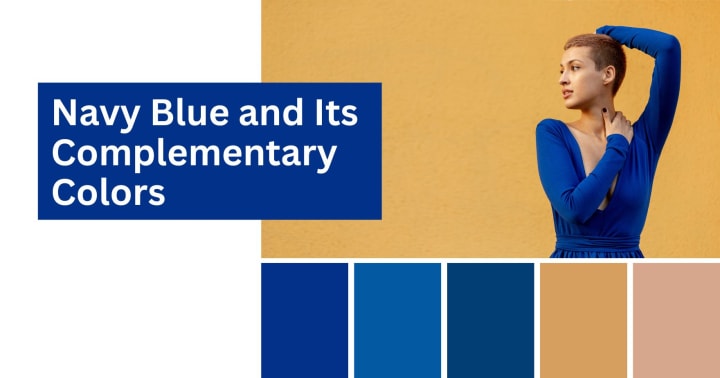
By nature, navy blue is deep and sophisticated while projecting professionalism, stability, and tranquility. Being the darker end of the blue spectrum, navy blue has slightly different complementary colors from lighter blues. The direct opposite complementary color of navy blue is orange, but, just like violet, there are shades and tints of orange that may slightly change the complementary color.
- Orange: The complementary color of navy blue is orange, which provides a great visual contrast against this dark blue. Boldness can be emphasized with shades like burnt orange or tangerine that stand out from the calm, cool tones of navy blue. This combo works for fashion design, sports team logos, and modern interiors.
- Peach: In a softer, more subdued scheme for navy blue, peach would do the job nicely. The warmth of peach tones complements the coolness of navy blue, thereby rendering a serene, unpretentious feel to that design. This would suit an elegant, contemporary interior.
- Copper: Copper works well with metallic, rich hues. This combination may provide a sense of refinement and coziness to opulent decor. Copper is a fantastic accent hue for fashion and home décor because of its depth-giving metallic luster.
- Soft Yellow: A soft yellowish color with certainly muted characteristics, like gold or ochre, would complement navy blue. The effect produced here would tend to be more traditional and elegant, especially in the field of interior design for spaces such as living rooms and bedrooms.
Generally, navy blue would be effectively implemented in an interior where an elegant or timeless look is required. Through the aid of an AI system, the interior design generator helps to visualize how the complementary schemes of navy blue, orange, peach, or copper would play out in a room. With the use of AI tools, including PhotoCut, there is a chance to experiment with different opposing colors along with navy blue to test what goes well with your style or project requirements.
Learn how to easily draw a dragon online for free without expert skills.
Orange and Its Complementary Colors
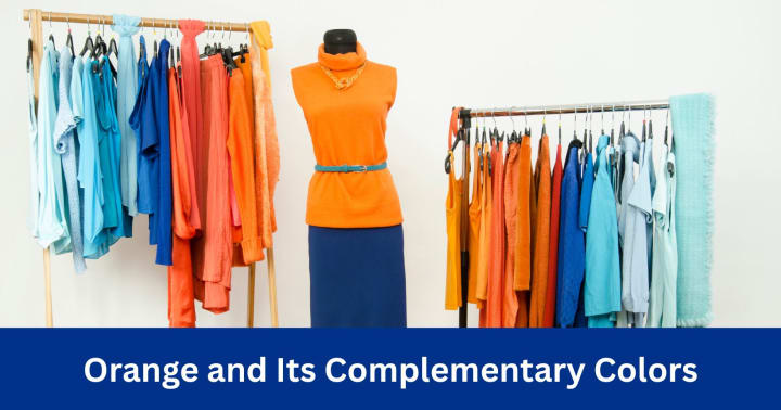
Orange is a warm and lively color that reflects the great energy and qualities of positivity. It is situated between red and yellow on the color wheel, orange is complementary to blue. When set next to blue, both colors enhance each other in brightness, resulting in a spectacular view. Let us discuss the complementary colors to orange.
- Blue: A complementary shade, blue makes the classic combination with orange. Whether pure royal blue or a muted denim shade, it contrasts with the warmth and brightness of orange. This combination is prevalent in sports team uniforms, logos, and other lively designs.
- Teal: Deep hues of teal and beautiful blends of blue and green complement orange, subtler than most other shades. The coolness of teal balances the warmth of orange, giving an exciting contrast visually and soothing to the eye. This color combination is for calming yet stimulating designs, and teals play an important role here, especially in interior spaces.
- Navy Blue: A darkish hue of blue, as navy blue, makes a more subtle and yet dramatic counterpoint to orange. Such a color scheme is typical for finer and more sophisticated styles, formal spaces, high-end branding, and professional settings.
- Light Blue: Pale or sky blue is pretty excellent to round off oranges, especially in designs that need a fresh, airy feel. This combination works best in sun-inspired interiors or beach-inspired spaces.
Using an AI design generator like PhotoCut can create images of how these complementary colors will work together. Whether designing a brand logo, planning a room makeover, or curating an art piece, AI tools allow for easy experimentation with color pairings and create visualizations of the results.
Creating Designs with the AI Design Generator
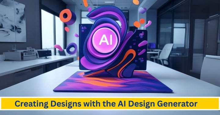
This is an amazing tool because it helps its users play with their colors freely; color schemes, layouts, and compositions will be the new best buddies. Tools like PhotoCut help in generating unique designs by mixing good complementary colors, gradient alterations, brightness, and saturation of different hues, and much more. Here is how AI design generators can be beneficial and to the point in fulfilling your innovative vision:
- Test Out Several Color Combinations: AI generators become very useful for quickly creating multitudes of alternatives to a particular color scheme. Importantly, when it comes to planning a logo, a collection of fashion, or a design for an interior space, it becomes possible to visualize instant previews showing how complementary colors, such as violet and yellow or navy blue and copper, work together.
- Save Time: AI tools can also make the design process more efficient by giving instant suggestions and avoiding long hours spent searching for the right color pairings using manual methods. They also use sophisticated algorithms to predict trends and suggest the best color combinations.
- Real-time Feedback: Many AI design generators do provide the service of real-time feedback, which brings about the possibility of a design change at any point in the course of the work. With AI-generated complementary color suggestions, the possibilities are endless for creativity.
Clear up things with extremely rich combinations of violet with yellow, navy blue with copper, and orange with teal, which help create very rich and seamless designs. Such tools as PhotoCut make it much easier to play with this idea and facilitate finding the right color combinations for any project.
Create customized VTuber avatars with PhotoCut’s VTuber Maker.
Creating Interior Designs with the AI Interior Design Generator
Interior design is another branch of complementary colors that largely transitions mood and aesthetics into a space. These are very widely emerging AI interior design generator tools for the population seeking betterment in their homes and offices using good-colored designs that are artistic yet functional. With an AI-powered interior design app such as PhotoCut, visualization can become easier as to how many different complementary colors would play out in one room. Violet and yellow in a living room instantly brings that vibrant energy, and maybe mix navy blue with copper for a bedroom scenario where you want a little more luxury and relaxation.
Furthermore, you can try some furniture styles, wall colors, and decorative accents using the complementary color schemes mentioned here. Through an AI-powered interior design generator, you can see how colors play out practically in different room settings without having to paint the walls or buy new furnishings.
Conclusion
The necessary implication of complementary colors in any design process must be understood to enhance the quality of all the works. Indeed, the relationship between certain combinations of colors like violet and yellow, navy blue and orange, or teal and orange flips a simple design over to an extraordinary, if not magical one. The use of AI design generators like Photocut can be a considerable help in trying the color duos efficiently and artistically, thereby ensuring the realization of a vision in no time.
So, once the art of using complementary colors is mastered, one can indulge in creating stunning designs that are not only visually enticing but also find a harmonious touch between personal and professional requirements, be it space designing, branding, or designing art.
Learn the easiest ways to add stickers to your photos.
FAQs
Q1. Why are violet and yellow termed complementary colors?
Ans. Complementary colors produce visual excitement, causing each other to look brighter. Yellow enhances violet by making it richer and more luminescent; in return, violet makes yellow look brighter.
Q2. What are the best ways to work with violet and yellow together in design?
Ans. You could combine the two by selecting violet as the main color with little yellow accents, or try the reverse. While looking at various shades and tints of the hues to emphasize the feeling, for instance:
- Lavender and pale yellow for an easy, calm feel
- Deep violet and pure yellow for a strong, dramatic contrast
- Amethyst and lemon yellow for an energetic play and unreserved ambience.
Q3. What is it in navy blue and orange that creates a harmonious relationship?
Ans. The stark contrast caused by the navy's cool, stern blue and complete orange fosters a sense of balance and interest. In pairing a strong navy with pure orange, the orange may appear overwhelming; however, together, they balance out each other nicely.
Q4. What tint of Orange goes with Navy Blue?
Ans. Depending on the effect you want, pretty much any tint of orange is going to work.
- Burnt Orange: A calm, earthy feel.
- Bright Orange: Dynamic high contrast.
- Coral: A bit softer and more feminine.
- Tangerine: Peppy and has a lot of energy.
Q5. What are some common color schemes that incorporate orange and blue?
Ans. Here are some common color schemes:
- Rustic: Burnt orange and muted denim blue.
- Modern: Bright orange and navy blue.
- Coastal: Coral and turquoise.
- Eclectic: A mix of various shades of orange and blue, often with other complementary colors.
Q6. What colors should you avoid when using orange and blue together?
Ans. It depends on the specific shades, but generally, avoid:
- Clashing greens or reds: These can compete with the orange and blue, creating a visually jarring effect.
- Muddied versions of already dull colors: These can make the color palette feel drab and uninspired.
Q7. What types of designs can I create with an AI design generator?
Ans. Many AI design generators can create:
- Logos
- Websites
- Social Media Graphics
- Posters
- Presentations
- Marketing Materials
- Abstract Art
Q8. Are AI design generators free?
Ans. Some AI design generators offer free trials or limited free plans. Others require a subscription or a one-time payment. The features and quality of the designs may vary depending on the pricing plan.
Q9. What are the benefits of using an AI interior design generator?
Ans. Its benefits include:
- Visualization: Enables you to see how distinct design decisions will appear in your space before undertaking any expensive buying or renovation.
- Inspiration: Sparks new ideas and helps you explore design styles that never crossed your mind.
- Time-saving: Because it produces design concepts rapidly, it spares you the time and effort that traditional design techniques need.
- Cost-effective: In comparison to employing a professional interior designer, it could be less expensive.
Q10. What are the limitations of AI interior design generators?
Ans. Here are the limitations:
- Accuracy: With the capabilities available, the quality characteristics of the portrait and the input parameters you supply may have an impact on how the AI interprets your surroundings.
- Personalization: You can modify a few design components, but the AI cannot understand how these modifications capture your individuality or satisfy your desires.
- Practical factors: It does not always account for things like construction codes, plumbing, and electrical wiring.
- Aesthetic Bias: One may argue that the artificial system has opinions on a particular aesthetic that could or might not align with your aesthetic.
About the Creator
PhotoCut
AI Photo Editing Tool - Remove or Change your Background & Enhance Product Photos
Keep reading
More stories from PhotoCut and writers in Photography and other communities.
The Ultimate Guide to Free Apps and Tools for Your Digital Needs
In a digital world filled with numerous tools at your disposal, these tools can enhance your creativity and productivity or can even be fun! Some applications and websites can cater to your every need, from modifying your photos to fixing QR codes, from beautifying your desktop with anime wallpapers to meme-making. This article covers some of the best free options for these tasks, including face morphing apps, PNG websites, tools to fix blurred QR codes, anime wallpaper sites for your PC, and meme maker apps. Along the way, we'll also highlight how PhotoCut can be an excellent tool for enhancing your photos and working with PNGs.
By PhotoCut11 months ago in Photography
The Photographer's Code
You decide to visit your local park. You have become a close confidant to the homeless people who gather there most days. While talking to Cleo and Reed, you notice a new face in the crowd. It belongs to a stick-thin, middle-aged woman. She has her hand on her forehead as if taking her temperature.
By Paul Aaron Domenick7 days ago in Photography
The Gold Tone (Orotone) Technique
She picked it up from a dusty shelf at an estate sale, thinking it was just an old frame. Then the light caught it. The image glowed, not like a print, not like a painting, but like something that seemed to carry its own inner warmth. That was her first encounter with an Orotone, and she bought it without asking the price.
By CurlsAndCommas3 days ago in Photography
Why Didn't Anyone Tell Us
Men, move along. This is not for you. This is for the women. I was forty-five when I began menopause. It is pretty young for that to be going on in a woman’s life, but I had undiagnosed PCOS, my entire life. Thank you to all the gynecologists I had seen my entire life. That in itself should encourage women to keep seeking second opinions, especially when you are not getting correct answers or any at all.
By Alexandra Grant5 days ago in Humans


Comments
There are no comments for this story
Be the first to respond and start the conversation.