
THUMB RULES FOR SELECTING THE COLOR PALETTE FOR A HOUSE
color combination guide for beginners.

Choosing a color may sound simple but quite troublesome, especially when we are trying to choose the color for a brand new place or thinking to renovate, then mostly we might end up being confused by all the wide range of options in the color palette. Coloring isn't simple, it's a work of art.
Color speaks to us. Without being aware, color affects us psychologically, they evoke emotions and impact our daily decisions. We spend most of our time in the house, a house reflects who we are. So color your world wisely. So, Choosing a color is an art. And that's why we are here to break out the anatomy of color and make the process a bit easy for you.
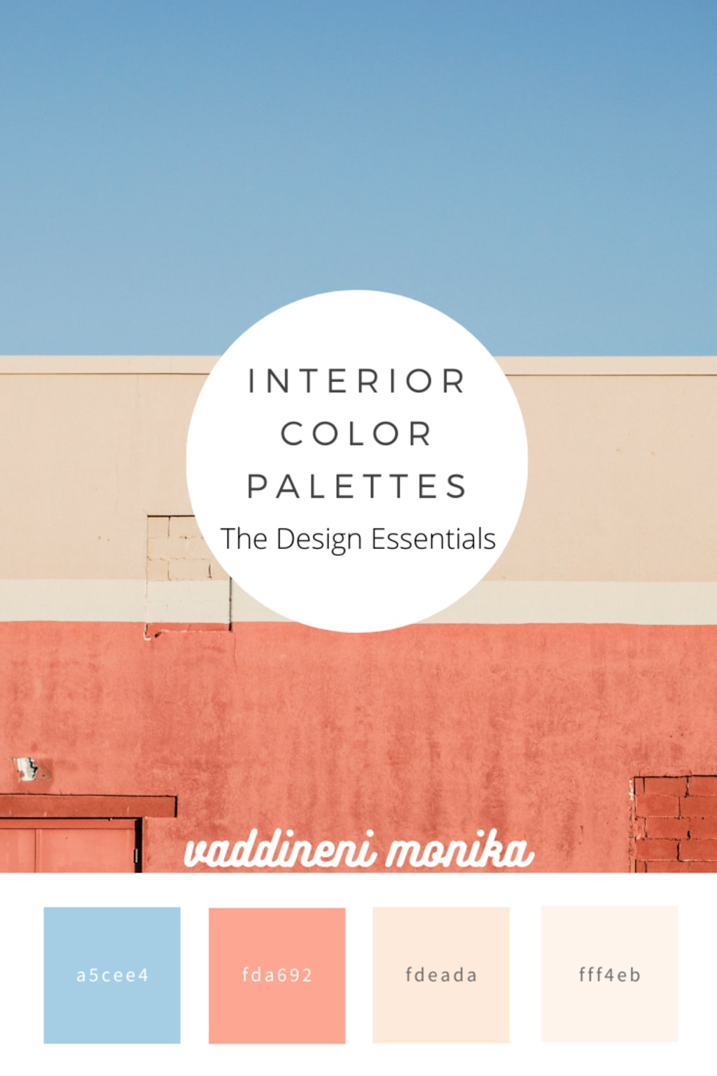
Image & Suggestions: Flow Interio, Hyderabad
Inspire from nature
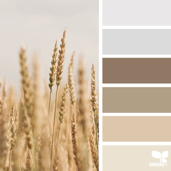
Who doesn't feel peaceful and relaxed just by looking into nature? Sadly we can't bring nature into our busy lives so why not bring those colors into the house. You don't get to pay extra for taking inspiration from nature, all those soothing colors textures form patterns whatnot, every little thing can be inspired by nature. On top of it, most designers practice this. A nature-inspired color palette can never go out of style.
Consider lighting and ventilation
Ventilation and lighting take the top tier in the list while thinking about coloring a room. Never go for dark color if the room has less ventilation and if the room has good ventilation, we can color the way we want the room to look. And the placement of the room matters too, like if the openings are in the south then we have a pretty good chance of getting strong sunlight. So choose a color that decreases the glace and if the openings are in the north then go for neutral or light colors.
Size of the room matters
Colors can change the face of the room. Just by adding a light color, a small room can look big, and by adding a darker color a big room gets to look a bit small. We can create illusion just by colors, so every factor is important while coloring the walls.
Look around while picking a color (fixed elements)
Balancing all the elements is the key for designing, so try to balance the color palette with fixed elements like furniture, flooring, etc and designs should be done accordingly. so choose a color that can complement the existing elements or else all the work for choosing a color scheme goes in vain.
Golden ratio
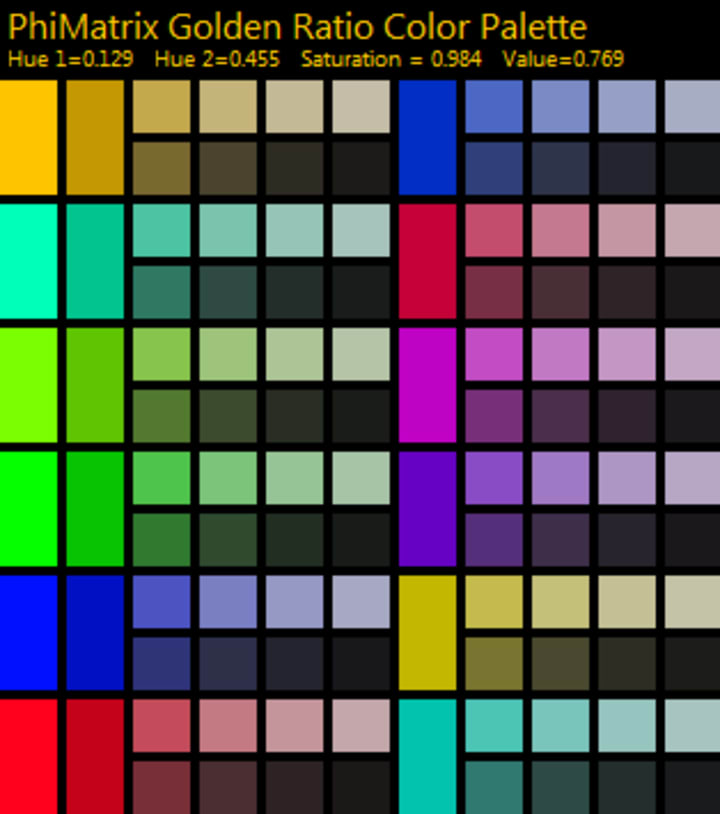
Too many colors overpower the space so never go for too many colors until and unless you have a specific theme. Not only for the artist, but the golden ratio can also come to an advantage to anyone even while selecting the color scheme, where we get to choose two or three colors and play with them for the entire house to bring out the vibrancy of the place. It's the 60-40 or 60-30-10 rule, if we choose two colors then 60% of the space is covered by one color and 40% by another color. If we choose three colors then 60% of the whole space is covered by one color, 30% of the space by another, and 10% by the third color.
For more about the golden ratio of colours visit: phimatrix
Use color theory to your advantage
Try to use the color theory to your fullest to come up with your color palette. Make sure, the color palette we choose follows the color scheme like monochromatic, triad, analogous, complementary and split complementary, etc. If you want to play safe, go with neutral color, they never go wrong, and add color to accent elements like furniture, carpets, accessories, etc. But the risk comes up when playing with bold colors, try to match carefully because if we use bold colors then a few of our options might get limited and the tip to make the space picture-perfect, highlight the bold color using a light color.
Focal points
Color acts as one of the main focal points which grabs the visual attention right away when we enter a space mainly walls, immediately followed by all the other elements like furniture, wall arts, décor items, etc. If you want to highlight some specific space then color the wall differently from others. Complementary colors may work to make the wall powerful and bold.
Little things
Never forget to consider living elements like kids or dogs because while designing or choosing a color, every detail matter. If you have kids or pets better go for spot erasable colors, which are available in the market.
Try the testers before choosing a color
In most cases, the color we see in the catalog doesn't look the same when we paint. So, always get a sample before applying it directly on the wall and then decide which hue, tint tone, or shades of the color you want.
Few things that might save the day
Use virtual painting apps to your advantage to see whether the colors go with the place or not.
Never choose colors or design which goes out of the style easily.
Try using the paint calculator site, to know how much it might take to color the space.
References:
https://www.heytherehome.com/8-tips-choosing-right-paint-color/
https://www.mymove.com/home-inspiration/decoration-design-ideas/choose-right-color-palette-home/
https://www.thespruce.com/dos-donts-of-decorating-with-color-797862
About the Creator
Keep reading
More stories from The Design Essentials and writers in Lifehack and other communities.
HOW TO SHAPE UP A CO-WORKING SPACE
Every startup, freelancer, and small-scale business nowadays is eyeing co-working spaces. It’s a perfect place to design or enlarge a business without worrying about the minimal things require for an office all in one space. They not only give flexibility but also a chance to network.
By The Design Essentials5 years ago in Journal
Top Things to Do in North Potomac for Families
Known for its quiet neighborhoods and welcoming atmosphere, North Potomac appeals to families who value space, safety, and a strong sense of community. Whether you are new to the area or have lived here for years, there are plenty of activities that families can enjoy together.
By House Doctor6 days ago in Lifehack
Ludacris and Nelly draw backlash over bookings at MAGA-coded music festival
Ludacris and Nelly headlining a mostly right-wing event is good for them. It’s also great for the genre of hip hop. The two rap veterans have showcased their talents on other stages. Why can’t they perform for mostly MAGA folks and grab that bag?
By Skyler Saunders3 days ago in Beat


Comments
There are no comments for this story
Be the first to respond and start the conversation.