
How to Choose the Right Paint Colors for Your Home
Transform Your Home into a Stylish Haven with the Right Paint Colors

Choosing the right paint colors for your home is one of the most exciting yet challenging aspects of home design. The right hues can transform a space, setting the mood, enhancing architectural features, and reflecting your personality.
The challenge intensifies when considering large-scale projects like warehouse painting, where practicality and aesthetics must go hand in hand. But with endless options and color theories, it's easy to feel overwhelmed.
This guide will help you navigate the world of paint colors, ensuring you make informed and inspired choices that will bring your home to life.
10 Ideas for Choosing the Right Paint Colors
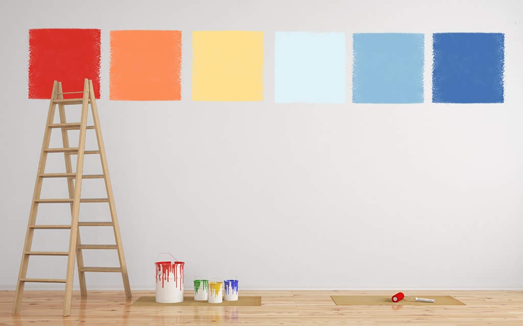
1. Understand the Basics of Color Theory
Before diving into specific colors, it's essential to understand some basic principles of color theory. The color wheel is your best friend when it comes to selecting harmonious color schemes. Here are a few key concepts:
• Primary Colors: Red, blue, and yellow. These are the base colors that cannot be created by mixing others.
• Secondary Colors: Green, orange, and purple, made by mixing two primary colors.
• Tertiary Colors: Created by mixing a primary and a secondary color.
• Warm Colors: Red, orange, and yellow, which tend to evoke warmth and energy.
• Cool Colors: Blue, green, and purple, which create a calm and soothing atmosphere.
Understanding these basics will help you create a balanced and pleasing palette for your home.
2. Consider the Mood of Each Room
Different colors evoke different emotions and moods. Before selecting a paint color, think about the purpose of each room and the atmosphere you want to create:
• Living Room: Often the social hub of the home, this room can benefit from warm, welcoming colors like soft yellows, warm neutrals, or even a bold accent wall in a deep, rich color.
• Bedroom: This is a space for relaxation and rest, so cool, calming colors like soft blues, greens, or lavenders work well here.
• Kitchen: Vibrant colors like red or yellow can stimulate appetite and energy, making them great choices for a kitchen.
• Bathroom: Light, fresh colors such as aqua, pale blue, or soft greens can create a spa-like atmosphere.
• Home Office: Productivity is key here, so opt for colors that boost focus and creativity, like muted blues, greens, or even a sophisticated gray.
3. Take Inspiration from Your Surroundings
Sometimes, the perfect color palette is right outside your window. Nature offers an endless array of color inspiration. Whether it's the blue of the sky, the green of the trees, or the earthy tones of a rocky landscape, nature-inspired colors tend to be both calming and universally appealing.
You can also draw inspiration from your existing decor, like a favorite piece of artwork, a patterned rug, or even the color of your furniture. This approach ensures that the colors you choose will harmonize with the elements already in your space.
4. Test Paint Colors in Your Space
One of the biggest mistakes people make when choosing paint colors is selecting a shade based solely on how it looks in the store or on a paint chip. Colors can look very different depending on the lighting in your home, the size of the room, and the other colors in the space.
Here’s how to test paint colors effectively:
• Use Paint Samples: Purchase small paint samples and apply them to different walls in the room. Observe how the color looks at different times of the day, under natural and artificial lighting.
• Consider Sheen: The finish of the paint (matte, eggshell, satin, gloss) can also impact how the color appears. Higher sheens reflect more light and can make a color appear brighter.
• View from Different Angles: Walk around the room and view the color from various angles to get a full sense of how it interacts with the space.
5. Use the 60-30-10 Rule
A tried-and-true formula in interior design, the 60-30-10 rule helps create a balanced color scheme. Here's how it works:
• 60% Dominant Color: This should be the primary color used in the room, typically on the walls.
• 30% Secondary Color: This is usually applied through upholstery, furniture, or large accents.
• 10% Accent Color: This final color should be bold and is best used sparingly on smaller items like cushions, artwork, or decorative accessories.
This rule ensures that your color scheme feels cohesive and well-balanced.
6. Consider the Flow Between Rooms
When choosing paint colors, think about how each room connects to the others. If your home has an open floor plan, it’s important to select colors that create a seamless transition from one space to another. This doesn’t mean all rooms need to be the same color, but they should complement each other.
For example, you might choose a soft gray for the living room, a slightly darker gray for the dining area, and a pop of color in the adjacent kitchen. This approach maintains flow while allowing each space to have its own identity.
7. Don't Be Afraid of Bold Colors
While neutrals are a safe and timeless choice, don’t shy away from bold colors if they speak to you. A vibrant hue can add personality and energy to a space. If you’re hesitant, start small—consider using a bold color on an accent wall, or in a smaller room like a powder room or entryway.
Bold doesn’t have to mean bright; deep, rich colors like navy blue, emerald green, or charcoal can create a dramatic and sophisticated look without being overpowering.
8. Mind the Undertones
Undertones are the subtle hues that can influence how a color appears. For example, a beige might have pink, yellow, or green undertones, which can affect how it looks in your space. Always compare your paint choices with other elements in the room, such as flooring, countertops, or furniture, to ensure the undertones complement each other.
9. Think About the Long-Term
Trends come and go, but paint colors can last for years. While it’s tempting to choose the latest trendy color, consider how you’ll feel about it in the long run. If you love the trend but are unsure about its longevity, use it in smaller, more easily changeable areas like accents or accessories.
Classic, timeless colors like soft grays, beiges, whites, and blues have lasting appeal and can be easily updated with accessories and décor.
10. Seek Professional Advice
If you’re still unsure about which colors to choose, don’t hesitate to seek professional advice. Interior designers and color consultants can provide expert guidance tailored to your specific space and needs. They can offer insights into color combinations, trends, and the latest products that you may not have considered.
Conclusion:
Choosing the right paint colors for your home is a deeply personal process that requires careful consideration. By understanding color theory, considering the mood and purpose of each room, testing colors in your space, and thinking about the long-term, you can make choices that will enhance your home’s beauty and reflect your unique style.
Don’t be afraid to take your time and explore different options—after all, the right color can transform your house into a home.
About the Creator
Ankit Kapoor
Interior design enthusiast, part-time blogger, and a panda lover. I have mission to explore the trending architectural and interior design ideas to the world.
Keep reading
More stories from Ankit Kapoor and writers in Lifehack and other communities.
How to Find the Best Architects in Hyderabad
Hyderabad, the capital city of Telangana, is a vibrant metropolis known for its historical landmarks, burgeoning IT industry, and rapidly growing urban landscape. Finding the best architect in Hyderabad can be a crucial step in ensuring the success of your construction or renovation project.
By Ankit Kapoorabout a year ago in Lifehack
When Architecture Speaks: The Billionaire Home as a Mirror of Self
In the realm of the ultra-wealthy, owning a home is rarely about square footage or resale value. It’s about creating a physical embodiment of the self. For billionaires, architecture becomes a language—each material, structure, and spatial rhythm part of a larger, intentional narrative. These homes are not simply bought or designed; they are composed to reflect personal values, intellectual pursuits, and emotional states. They go beyond luxury to articulate identity in form.
By Inspirata Group7 days ago in Lifehack


Comments (1)
Now that's what we call a real lifehack! Very helpful article, thanks for sharing!