
What Research Says About Interpreting Pareto Charts Analysis
How to Read Pareto Chart
The Pareto chart analysis is nothing but a graphical statistical technique that is used to map and rank various business issues ranging from the most frequent (common) one to the least common one.
This identification is solely based on the factors that generate high impacts. To do this effectively, you need to apply the Pareto principle, which is also called as 80/20 rule.
Furthermore, the Pareto analysis is applied in a very straightforward technique that helps in prioritizing the main issue or the problem-solving. This is done in a way that the first part resoles the number of problems.
It is entirely based on the 80% of the problems may be caused by only a few as 20% of the causes. To analyze this, you first need to list all the problems, followed by the scoring and mapping every single problem by the main issue, then summarizing every group's scores.
At this stage, you should know the source of the issues and then work accordingly to find the root cause. The Pareto analysis will identify the issue and give the use of a rating system to identify how difficult it is for the problem to resolve.
Six Sigma Deployment Plan:
The use of Pareto charting is nothing but an analytical method of charting and counting the severity and the frequency of problem occurrences. These solutions help to detect various problems of business, products, and the quality of concerns.
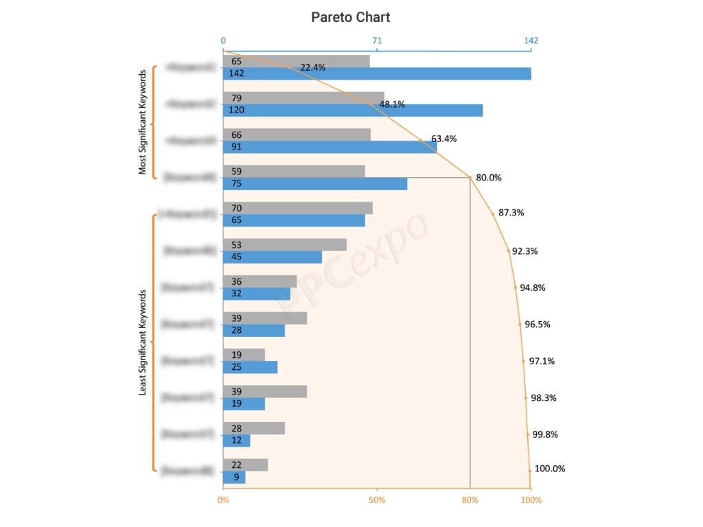
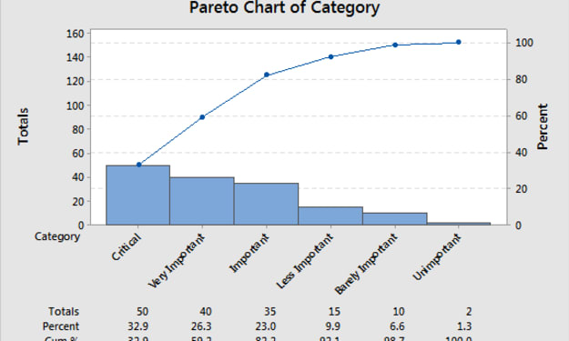
The Pareto principle will state a small number of issues that are responsible for most of the issues and problems. Here the data is shown in the bar graph and is ordered from highest to the lowest number of occurrences.
The ranking of the severity is another action that is conducted by businesses that have information to give ranking to each serious problem. You should also consider how these areas impact the cost of quality into the manufacturing operations as their main issue of failure.
Origin Of Pareto Chart Analysis:
The Pareto chart is derived from the Pareto principle, which was identified by the Romanian-born American management consultant named Joseph Juran during World War II.
However, its name was given by the Italian economist Vilfredo Pareto. The main purpose of the Pareto is to separate the significant aspects of the problems from the major ones.
By separating them graphically, you will have a better idea about where the issue needs improvement and where you need to focus more. Minimizing the large bars of the diagram, you will be able to make overall improvements in the business.
Pareto Can Be Analyzed In Two Ways:
Counts Pareto: In this type of Pareto, you will learn about which category causes the main issue. For this, you need to do a counts Pareto diagram, and to create the counts, you should know the categories and how often every category occurs.
Cost Pareto: In this type of analysis, if you want to identify which category is causing more problems and which one is more expensive in terms of the cost. Further, a cost pareto gives details about the impact of a particular category, then a count Pareto can.
For instance, you have 50 different occurrences of one issue and 3 for another issue. With the Pareto, you will tackle the issue that has occurred 50 times than the one that occurs 3 times.
However, if the problem that has occurred 50 times costs $.50 per occurrence and the problem has occurred three times, it has cost $50 each time. Depending upon the cost, you can easily tackle the more expensive issues first.
Pareto Chart Procedure:
Here are few things to keep in mind when deciding the procedure for the Pareto chart:
• The category that you will use to group different items
• The measurements that are important in the analysis; the common measurements are quantity, time, cost, and frequency
• The overall period that the Pareto will cover like one week cycle of the full day?
• Gather all data, recordings of the category and assemble data that is already in your hand
• Total of all the measurements in each category
• The appropriate scale for the measurements that you have collected
• Constructing and labeling the bars of each category
• Calculating the percentage of each category and drawing the vertical axis, and labeling it with the percentage
• Calculating the cumulative sum; adding the subtotal of the first and second category
Advantages Of Using The Pareto Chart:
• It helps in identifying the root cause of the problem
• It helps in prioritizing the main issue for every problem and trying to eliminate it
• It gives an idea of the total impact on the issue
• You can plan and correct the issue
• Practo gives a clear, simple, and focused method of identifying the important issues.
• It helps to improve the effectiveness of the quality management
• Useful in every form of leadership
• Helps in time management
• Used for planning, analyzing, and troubleshooting issues
• Helps in the change management and time management
Steps To Create A Pareto Chart:
Select The Data: Choose data that need to be compared. It can be a list of issues, items, or any other category.
Measure the data: Data can be measured in different forms like:
1. Frequency- it will define the total number of times a problem has occurred
2. Duration: How long does it take
3. Cost: How many resources have been utilized or used.
Choose The Timeframe: The next step involves choosing the duration in which the data has to be analyzed in a month, quarter, or year.
Calculate The Percentage: Once you have the data, put it in an Excel sheet and calculate each issue's percentage with respect to the frequency.
Conclusion:
Also known as the 80/20 principle, the Pareto is extremely helpful in finding and resolving issues in the business. You can identify the 20% of the company's processes that are causing 80% of the issues. By identifying the big issues, you can ensure that the company's overall processes are running more effectively while resolving the issue. It is also used to demonstrate how things have changed with time and how to resolve issues related to them.
About the Creator
Keep reading
More stories from Hollie Taylor and writers in Journal and other communities.
10 Easy Steps to Creating a Pareto Chart Analysis
The major objective of the Pareto chart is to identify the problem by prioritizing it so that the root cause of the problem can be identified. The Pareto analysis is also popularly known as the 80/20 rule. It is an amazing tool that finds out the causes of certain problems to make a better to create a better management style.
By Hollie Taylor5 years ago in Journal
Heritage in Motion and Highland Calm
Planning a trip to Kandy is not about cramming temples, viewpoints, and performances into a frantic schedule. Kandy is layered, ceremonial, and quietly dramatic. It rewards travellers who approach it with intention rather than urgency. The city sits at the intersection of living culture and highland scenery, and the magic lies in allowing both to unfold at a measured pace. A well-planned trip balances structure with flexibility, leaving room for ritual, nature, and unplanned moments that feel distinctly Kandy.
By Jeewanthi Armstrong7 days ago in Journal
TUS NUA - ch 53
TUS NUA – ch 53 New Beginnings – Mia and Midnight (*)(*)(*) Finola knew Ali’s brother-in-law needed to put his mind at rest. She fed her arm through his and led him outside. “We’ll sit here. If you like, I can put a block around us so our conversation will be private.”
By Margaret Brennan3 days ago in Fiction


Comments
There are no comments for this story
Be the first to respond and start the conversation.