
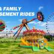
Designing Kiddie Fair Rides That Captivate Through Color Psychology
Using Color Psychology to Craft Engaging, Safe, and Emotionally Resonant Kiddie Fair Rides
Designing amusement rides that attract children requires more than mechanical ingenuity or safety engineering. It demands a deep understanding of how color shapes perception, emotion, and engagement. In the context of kiddie fair rides, color acts as a silent persuader—stimulating curiosity, reducing fear, and reinforcing joy. Successful funfair ride manufacturers leverage this understanding to create visual experiences that feel instinctively exciting and safe for young audiences.
The Emotional Spectrum of Color in Children's Design
Children interpret color differently from adults. Their associations are less influenced by cultural conditioning and more by instinctive reactions. Bright, high-saturation colors are perceived as friendly and approachable. Muted tones, conversely, may seem dull or even intimidating in a play environment.
- Red evokes energy and speed but can become overwhelming if used excessively. It’s most effective in accent details—buttons, seats, or control panels.
- Yellow conveys warmth, optimism, and creativity. It encourages exploration, making it ideal for central components or surrounding décor.
- Blue provides calmness and trust. For rides that may cause anxiety, such as gentle spinners or flying-themed attractions, blue accents help create reassurance.
- Green represents balance and nature. It’s useful for rides with animal or adventure themes, softening intense visual schemes.
- Pink and Purple offer fantasy appeal, associated with imagination and playfulness, particularly effective in storytelling-themed rides.
A calculated mixture of these hues establishes visual balance—inviting children to interact without overstimulation.
Visual Hierarchy and Attention Mapping
Children’s attention spans are brief and highly responsive to visual hierarchy. A ride’s color scheme should guide the eye intuitively from the point of entry to the most interactive or exciting areas. This is accomplished through contrast placement—juxtaposing bright focal colors against neutral backgrounds.
For instance, a kiddie fair ride shaped like a rocket might employ a vibrant red body, white fins, and blue lighting details. The contrast not only enhances aesthetic clarity but also improves visibility from a distance. Funfair ride manufacturers frequently use this method to ensure that each ride stands out amid a crowded fairground.
In addition, color-coded zones can help with cognitive mapping. Entry ramps painted in warm hues signal invitation, while exit paths in cooler shades denote calmness and conclusion. This subtle use of color psychology enhances both operational flow and user experience.
Creating Emotional Safety Through Color
A child’s first impression of a ride often determines their willingness to participate. Overly dark or aggressive tones can imply danger or discomfort. Designers mitigate this by integrating pastel gradients and soft color transitions that foster a sense of security.
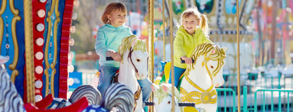
For example, gentle rides like carousels and mini trains benefit from a palette of sky blue, butter yellow, and mint green—tones that signal serenity. Even the shadows and lighting surrounding the ride contribute to perceived safety. Diffused LED illumination in complementary hues reduces harsh contrasts, maintaining the sense of calm necessary for young riders.
The application of color temperature is also critical. Warm colors such as orange and coral are inviting but must be balanced with cooler tones to prevent visual fatigue. This equilibrium sustains the child’s attention while minimizing anxiety.
Integrating Theme and Narrative Through Color
Successful kiddie fair ride tell a story. Whether it’s a journey through space, an underwater adventure, or a safari expedition, color sets the tone of that narrative. Cohesive color mapping aligns visual storytelling with emotional engagement.
A ride themed around the ocean, for example, employs multiple shades of blue with accents of coral pink and pearl white to evoke aquatic depth and wonder. A jungle-themed ride relies on earthy greens, soft browns, and flashes of gold to suggest vitality and exploration. Consistency in color storytelling strengthens thematic immersion, transforming a mechanical experience into an imaginative one.
Funfair ride manufacturers increasingly employ digital visualization tools to test these palettes in virtual prototypes. This allows designers to simulate lighting effects, crowd density, and environmental reflections before production—ensuring that color interactions remain harmonious under various conditions.
Age-Specific Color Strategies
Children at different developmental stages respond uniquely to visual cues. Toddlers (ages 2–4) gravitate toward primary colors due to their simplicity and strong contrast. For this group, clarity outweighs complexity. Rides targeting this demographic—such as miniature carousels or slow-motion vehicles—benefit from block color compositions.
As children mature (ages 5–8), their aesthetic preferences diversify. They begin to appreciate nuance, gradients, and mixed palettes. Rides designed for this segment may integrate complementary tones—like turquoise and orange or lavender and lime—to sustain interest while stimulating visual sophistication.
Designers should also consider gender-neutral palettes. While traditional marketing once relied heavily on pink-blue dichotomies, modern funfair ride manufacturers now prioritize inclusivity. Balanced color schemes using teal, coral, and lemon provide universal appeal without reinforcing stereotypes.
Material and Finish Considerations
Color perception is influenced not only by hue but also by surface texture and reflectivity. Gloss finishes amplify brightness and draw attention, while matte finishes convey softness and stability. For kiddie fair rides, a hybrid approach is often optimal.
Glossy paint on moving parts enhances motion visibility, making the ride appear dynamic and lively. Meanwhile, matte surfaces on handrails or seating areas minimize glare and add a tactile sense of comfort. Incorporating UV-resistant coatings ensures longevity and preserves chromatic integrity under prolonged sunlight exposure.
Lighting further refines color perception. LED arrays with adjustable tones can adapt to varying ambient conditions, maintaining consistency throughout the day. The ability to manipulate color temperature dynamically also allows operators to shift atmospheres—from vibrant daylight exuberance to twilight calmness.
Branding and Cohesive Park Aesthetics
Beyond individual rides, color psychology supports broader branding strategies. Consistent color theming across multiple attractions builds visual identity and memorability. A coordinated palette creates psychological continuity, enabling visitors to associate a particular hue spectrum with the park or manufacturer.
Funfair ride manufacturers often integrate branding subtly—through accent lines, signage borders, or lighting halos—without compromising thematic integrity. This approach strengthens recognition while preserving the ride’s independent visual narrative.
A well-planned color system also simplifies maintenance and refurbishment. When color standards are documented and consistently applied, future repainting or component replacements remain faithful to the original design intent.
The Measurable Impact of Color-Driven Design
Empirical studies in child psychology confirm that environments enriched with harmonious color combinations improve engagement, reduce anxiety, and extend dwell time. For amusement operators, this translates into increased ride participation and positive emotional recall. Children who feel visually comfortable are more likely to revisit and recommend the experience.
Moreover, color-optimized design contributes to operational safety. High-contrast elements—such as brightly colored restraints or platform edges—enhance visibility for attendants, reducing the likelihood of accidents. Thus, aesthetic decisions intertwine with functional outcomes.
Conclusion
Designing kiddie fair rides that appeal to children is a multidisciplinary pursuit where color psychology serves as a core design language. Each hue, gradient, and contrast carries psychological weight, guiding emotion and behavior. When applied thoughtfully, color transforms mechanical motion into emotional resonance—turning a simple ride into a lasting memory.
For funfair ride manufacturers, mastering this language is not optional but essential. The future of children’s amusement design will continue to evolve toward environments where safety, joy, and psychology intersect—illuminated, quite literally, by the power of color.
About the Creator
Beston Amusement Rides
As a leading amusement facility manufacturer, we provide safe and interesting amusement equipment to customers around the world, including roller coasters, Ferris wheels, pirate ships and so on.
Website:https://bestonamusementrides.com/
Keep reading
More stories from Beston Amusement Rides and writers in Journal and other communities.
The Art of Balance: Navigating Excitement and Safety in Modern Entertainment
Thrill and safety exist in constant tension. Every engineered experience—from a towering roller coaster to a simple pirate ship fair ride—demands equilibrium between exhilaration and control. The pursuit of excitement drives innovation in entertainment design, yet without rigorous attention to safety, the thrill can quickly turn perilous. The modern amusement industry exemplifies how engineering precision, human psychology, and regulatory oversight intersect to create experiences that are both electrifying and secure.
By Beston Amusement Rides3 months ago in Journal
Federal government consulting services checklist for agency leaders?
When internal systems begin missing deadlines and compliance demands increase faster than teams can manage, federal leaders face more than a resource issue. They face a challenge in getting results. Federal government consulting services step in to solve this by offering operational clarity, strong vendor oversight, structured planning, and measurable execution. Yet not every consulting provider delivers what agencies truly need. Some bring confusion. Others fail to follow through. So how can you tell which consulting partner will actually support your mission and not slow it down? This checklist helps agency leaders focus on what matters, eliminate guesswork, and choose partners that drive real outcomes.
By Brandon Honey5 days ago in Journal


Comments
There are no comments for this story
Be the first to respond and start the conversation.