
Color Psychology in Front-End Web Design Evolution
The Evolution of Color Psychology in Front-End Web Development
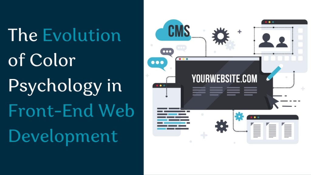
Color is more than a visual tool—it’s a psychological instrument that deeply influences user behavior, perception, and trust in digital platforms. In front-end web development, color psychology has matured from being an aesthetic afterthought to a critical, data-informed element in crafting high-performing digital experiences.
Key Takeaways
- Color choices now impact conversions, UX, and emotional responses more than ever.
- Accessibility and cultural sensitivity are essential in modern color schemes.
- Future-forward trends include AI-driven emotional color adaptation and personalization.
In this article, we trace the journey of color psychology in front-end web development, exploring how it affects everything from user experience (UX) to emotional response, accessibility, and even AI-driven personalization. We provide examples, tools, and insights to help businesses and developers harness the full power of color.
1. Early Web: Aesthetics Over Psychology

In the 1990s and early 2000s, web design was driven by experimentation and personal preference. Websites often used bright colors, clashing combinations, and flashing elements. There was little to no attention given to how users interpreted colors emotionally or culturally.
Example:
A GeoCities page from 1998 might feature lime green backgrounds, red text, and animated GIFs. Although visually memorable, these choices often hindered readability and drove users away.
Limitations:
- Poor contrast ratios
- No universal design systems
- Inconsistent user experience
- Lack of emotional connection to users
During this era, designers lacked access to modern tools and research on how users interact with visual elements. As a result, color schemes were often disjointed and failed to serve functional purposes, such as guiding user flow or emphasizing calls-to-action (CTAs).
At TechVerdi, we understand that impactful front-end design goes far beyond aesthetics—it’s rooted in strategy, emotion, and behavioral science. Our team leverages advanced knowledge of color psychology, UX/UI principles, and accessibility standards to craft web experiences that not only look exceptional but also perform with measurable results. Whether it's selecting high-converting CTA colors or designing emotionally resonant interfaces, we translate visual design into business outcomes.
2. UX Design Era: Function Meets Emotion (2005–2015)

As digital experiences matured, so did user expectations. The introduction of UX (User Experience) principles brought structure and science into front-end development. Designers began using colors deliberately to:
- Guide user attention
- Establish a visual hierarchy
- Trigger specific emotional responses
- Create seamless user flows across devices
Emotional Color Meanings:
- Blue: Trust, reliability (e.g., Facebook, PayPal)
- Green: Success, go-ahead signals (e.g., WhatsApp, Trello)
- Red: Urgency, errors, attention (e.g., YouTube, sale banners)
- Yellow: Optimism, caution (e.g., McDonald’s, road signs)
- Purple: Luxury, creativity (used in design-focused apps)
- Black/Grey: Sophistication, neutrality (common in tech and luxury branding)
Example:
Amazon frequently tests CTA button colors. Red "Buy Now" buttons often perform better during flash sales due to the urgency red conveys. Meanwhile, blue and grey tones dominate their payment and review pages to emphasize security and neutrality.
Influence of UX Tools:
The emergence of UX platforms like Adobe XD, Sketch, and InVision enabled teams to prototype and test interfaces quickly, leading to faster color iterations and A/B testing.
3. The Rise of Data-Driven Color Psychology

With the rise of A/B testing and behavior tracking, companies started leveraging data to optimize color schemes for performance. Colors became conversion tools backed by evidence rather than guesswork.
Key Strategies:
- Use heatmaps to understand eye tracking and color focus
- Analyze conversion rates for different CTA colors
- Match brand emotion with palette psychology
- Combine color with copy and animation for improved effectiveness
Example:
Spotify’s consistent use of green evokes growth and vitality. Their interface's vibrant energy promotes engagement and long-term user retention. Even their CTA buttons for subscribing or trying premium are intentionally colored to evoke confidence and positivity.
Recommended Tools:
- Google Optimize (A/B testing)
- Hotjar (heatmaps)
- Crazy Egg (scroll & click tracking)
- Optimizely (multi-variant testing)
- FullStory (session recording + heatmap combo)
With a proven track record of working with startups, enterprises, and global tech brands, TechVerdi applies data-driven and user-first approaches to every digital solution we build. From A/B tested color choices to accessible design that complies with WCAG, our developers and designers ensure every detail enhances user trust, engagement, and satisfaction. We also incorporate the latest innovations, such as AI-driven personalization and an adaptive color system, to keep your product future-ready.
4. Accessibility & Inclusivity-Driven Color Design

As web development shifted toward user-first design, accessibility and inclusivity gained prominence. The WCAG (Web Content Accessibility Guidelines) mandates proper contrast ratios, readable fonts, and compatibility for users with visual impairments. Color is no longer just a design choice but a legal and ethical responsibility.
Inclusive Color Practices:
- Contrast ratio of at least 4.5:1 for normal text
- Avoid relying on color alone for conveying information
- Use patterns and labels for color-blind friendliness
- Enable light/dark mode switching for different environments
Tools for Accessibility Testing:
- Stark (Figma/Sketch plugin)
- Color Oracle (color blindness simulator)
- Wave (web accessibility evaluation)
- Accessible Colors (browser extension)
Example:
Slack allows users to customize their UI colors, including high-contrast themes for improved legibility. Similarly, LinkedIn provides a dark mode to reduce eye strain in low-light environments, enhancing the user experience for users with light sensitivity.
5. Future Trends: AI, Personalization & Emotional UI

As artificial intelligence (AI) becomes integrated into design systems, color psychology is entering a dynamic and responsive era. Websites can now respond to user data in real time to alter color schemes for optimal emotional impact.
Emerging Capabilities:
- Emotion recognition: Adaptive colors based on facial expressions or mood tracking
- Time-based theming: Calmer colors during night hours, energetic tones during the day
- Cultural adaptation: Automatically adjust palettes based on user location or preference
- Neuro-aesthetic interfaces: Designs that evoke specific neural responses through color
Example:
Meditation apps like Calm change their background gradient based on time of day and user activity, creating a tailored, calming experience. Additionally, platforms like Netflix use dark backgrounds to emphasize content and reduce fatigue during extended viewing.
Tools & Frameworks:
- Figma AI integrations
- Tailwind CSS (for adaptive color classes)
- Adobe Sensei (predictive design insights)
- Google Material You (dynamic color extraction from wallpapers)
At TechVerdi, we specialize in delivering high-performance, scalable, and future-ready front end web development services that elevate user experiences across all digital platforms. Our developers are proficient in modern frameworks like React, Vue.js, and Angular, and we follow agile methodologies to build fast, responsive, and visually compelling user interfaces tailored to business goals.
Conclusion
Color psychology in front-end web development has evolved from a subjective art to a scientifically informed design discipline. With advancements in user experience design, accessibility standards, and AI, colors are now capable of influencing emotional behavior, improving usability, and increasing conversions. As more brands seek to differentiate their digital products, the role of color will only become more significant. Businesses that invest in understanding and applying color psychology will gain a competitive edge in delivering personalized, emotionally resonant, and high-converting user experiences.
FAQs (Feature Snippet Optimized)
1. What is color psychology in web design?
Color psychology in web design refers to how different colors affect user emotions, perceptions, and behaviors on websites.
2. Why is color important in front-end development?
Colors impact readability, accessibility, emotional reactions, and conversions, making them critical to front-end design.
3. Which color increases conversion rates the most?
Red and orange are often used to drive urgency and conversions, especially in e-commerce and CTAs.
4. How does accessibility affect color usage in web design?
Accessible color design ensures all users, including those with vision impairments, can understand and interact with content effectively.
5. What tools help test color accessibility?
Stark, Color Oracle, Wave, and Accessible Colors are popular tools for testing color accessibility and WCAG compliance.
6. What colors are best for tech websites?
Blue and grey are ideal for tech sites as they convey trust, professionalism, and clarity. Green is also popular for signaling growth and innovation.
7. How can AI improve color design in web development?
AI tools suggest optimized palettes based on data like user behavior, time of day, or emotional intent. They personalize the UI for better engagement.
8. What are examples of good color psychology in UI?
Spotify’s green promotes engagement, Calm's gradients evoke tranquility, Amazon’s red CTAs create urgency, and Netflix’s dark theme enhances focus.
About the Creator
Theo's Blogs
Passionate about SEO and Software Development, I help businesses grow with cutting-edge web, mobile, and AI solutions. Working at TechVerdi.
Keep reading
More stories from Theo's Blogs and writers in Journal and other communities.
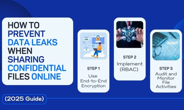
Prevent Data Leaks When Sharing Files Online
How to Prevent Data Leaks When Sharing Confidential Files Online (2025 Guide) Sharing private files has become a daily requirement for businesses in today's hyperconnected digital world. However, convenience also carries risk; according to international cybersecurity reports, data leaks have increased by more than 35% since 2023.
By Theo's Blogs5 months ago in Journal


Comments
There are no comments for this story
Be the first to respond and start the conversation.