
A Bold New Look for Android: Unpacking the Upcoming UI Overhaul
New Android UI Incoming: First Look at the Changes
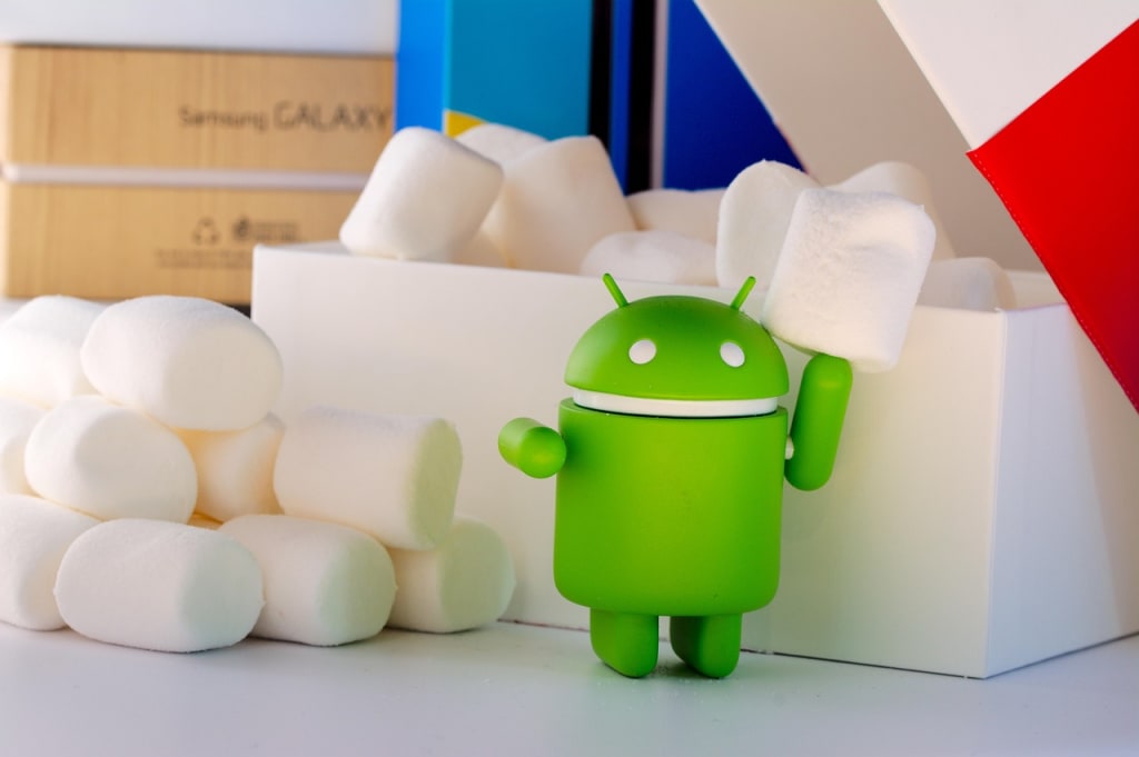
Android, the world's most popular mobile operating system, is on the cusp of a significant visual transformation. After years of iterative updates, Google is reportedly working on a comprehensive user interface (UI) overhaul that promises to refresh the look and feel of the platform. Early glimpses of this redesign have surfaced, offering a tantalizing preview of the changes in store for Android users. This article delves into the details of this upcoming UI overhaul, exploring the key changes and their potential impact on the Android experience.
A Focus on Visual Harmony and Modern Aesthetics
The early look at the Android UI overhaul suggests a strong emphasis on visual harmony and modern aesthetics. Several key elements point towards this direction:
Extensive Use of Background Blur: One of the most prominent changes appears to be the increased application of background blur effects throughout the system. This includes areas like the Quick Settings panel, notifications, the app drawer, the PIN entry screen, and even the lock screen. This blurring effect aims to create a sense of depth and allow the underlying wallpaper to subtly peek through, adding a touch of personalization and visual interest. The intensity of the blur may vary across different elements to maintain readability and focus on important information. For instance, the blur beneath the Quick Settings tiles is reportedly less intense than in the notification area. In light mode, this blur effect is expected to evoke a frosted glass appearance, while in dark mode, it will likely adopt a darker, more transparent gray.
Refined Status Bar: The status bar, a constant presence at the top of the screen, is also slated for a makeover. Leaks suggest new, bolder icons for elements like Wi-Fi, mobile data, and airplane mode. The Wi-Fi and mobile data icons are now segmented, potentially offering a clearer visual representation of signal strength. The battery icon is also expected to be more vibrant, possibly featuring a green background when charging and turning red when the battery is low, drawing inspiration from iOS in its visual cues. Furthermore, the clock font in the status bar is also being tweaked for a more modern look, and it might be repositioned to the left side, appearing larger than in previous versions.
Streamlined Quick Settings and Notifications Panel: The combined Quick Settings and notifications panel is undergoing significant refinements. While the basic layout might remain similar, the visual presentation is set to change dramatically with the introduction of the aforementioned background blur. Beyond aesthetics, there are also functional improvements. These include resizable Quick Settings tiles, a more organized tile editor, and convenient one-click toggles for Wi-Fi and Bluetooth. The brightness slider is also expected to receive a redesign, adopting a thinner appearance.
Cleaner and More Compact Lock Screen: The lock screen is also being subtly yet meaningfully redesigned. The date and weather information are being repositioned, appearing either below or beside the clock, depending on its placement. The contextual information complication, which previously occupied the bottom, will now reside at the top when no notifications are present, shifting below the clock when notifications appear. Additionally, there's a new optional "Compact Notification shelf" that presents notifications as a small translucent button, offering a less obtrusive way to view them. The PIN entry screen will also feature a blurred background and dynamic colored dots for each entered number, aligning with Material You theming. The numbers themselves are also becoming slightly larger and bolder, mirroring the updated clock font.
Modernized Volume and Media Output UI: The volume and media output controls are also getting a contemporary refresh. The thick, pill-shaped volume sliders are being replaced with thinner sliders featuring distinct handles, aligning with Material Design 3 principles. The "Connect a device" button in the media output switcher is being moved to a more prominent position, and the connected device's name will now appear above the slider instead of within it. The large pill shapes enclosing devices under the "Speakers & Displays" header are also being removed, contributing to a cleaner look.
More Expressive Settings App: The Settings app, often a utilitarian part of the OS, is also receiving a visual upgrade. This overhaul aims to make the settings easier to navigate and more visually appealing. Key changes include the return of colorful icons on the homepage, the implementation of newer Material Design 3 switches, and the placement of each menu item within separate cards. Right-facing arrows will also be consistently used to indicate subpages, improving visual hierarchy and clarity. The page header will also appear at the very top by default, allowing more settings items to be immediately visible.
New Icon Shape Options: For users who enjoy customization, Google is reportedly introducing new icon shape options for the Pixel Launcher. While full customization might not be available, users will have a choice of five new shapes in addition to the default circle: square, four-sided cookie, seven-sided cookie, arch, and complex clover. These new shapes will be reflected both on the home screen and in the app drawer, offering a greater degree of personalization.
Potential Impact and Future Outlook
This significant UI overhaul has the potential to inject a fresh and modern feel into the Android operating system. The emphasis on visual consistency, subtle animations (implied by the blur effects), and refined typography could contribute to a more polished and enjoyable user experience. The functional improvements in areas like Quick Settings also promise to enhance usability and efficiency.
While these early glimpses provide an exciting preview, it's important to remember that these are still potentially early designs. Google might refine or even alter some of these elements before the final release. The timing of this UI overhaul is also not definitively confirmed. While some reports suggest it might debut with Android 16, others speculate it could arrive in a later quarterly update.
The official Google I/O developer conference, scheduled later this month, might offer more concrete details and a clearer timeline for this highly anticipated UI refresh. Android users will undoubtedly be eager to see how these changes materialize and the overall impact they have on their daily mobile experience. This UI overhaul signifies Google's commitment to continually evolving and improving the Android platform, ensuring it remains a visually appealing and user-friendly operating system for millions world
About the Creator
Arif Islam
Blog Writer/Storyteller/Write stores and short srories.
Keep reading
More stories from Arif Islam and writers in Journal and other communities.
Tom Cruise's 'Massive Breakfast' Fuels Death-Defying 'Mission Impossible' Airplane Stunts
Tom Cruise, the seemingly ageless 62-year-old Hollywood icon, is once again pushing the boundaries of cinematic action with his death-defying stunts in the upcoming installment of the Mission: Impossible franchise, titled Mission: Impossible – The Final Reckoning. Known for his unwavering commitment to performing his own stunts, Cruise has now revealed the surprising fuel behind his high-octane performances – a "massive breakfast."
By Arif Islam11 months ago in Journal
Author’s Advice
If you would’ve asked me 20 years ago did I know I’d become a writer and an author, I would’ve said “nope, ain’t happening”. As fate would have it I did become an author and I can honestly say I’m loving it so far. It really does feel good to be a writer. I’ve learned a lot on this journey and I feel like with even me being as new to this world as I am, there’s some wisdom I need to share with every other aspiring author.
By Joe Patterson3 days ago in Journal
5 Things That Could Excuse You From the Draft — And 5 That Surprisingly Wouldn’t
Although the United States hasn’t had an active military draft since 1973, men ages 18–25 still have to register with the Selective Service System. If a draft were ever reinstated, there are certain circumstances that could excuse someone from service — and others that many people assume would work, but actually wouldn’t.
By Navigating the World4 days ago in Journal


Comments
There are no comments for this story
Be the first to respond and start the conversation.