
Steam Visual Survival Guide for Indie Devs: Hard Truths & Essential Tips
Mastering Steam Graphics: Essential Tips to Make Your Game Stand Out


Ever scrolled through Steam, clicking on a game just because the thumbnail looked incredible—only to realize you have no clue what the game is actually about? That’s the power of store visuals.
For indie devs, your Steam graphics aren’t just eye candy—they’re your game’s dating profile picture. First impressions make or break everything. Whether someone clicks, wishlists, or buys often depends on whether your visuals immediately scream, “This is exactly the game you’ve been waiting for.”
I’ve been through this grind more than once, and trust me, your first attempt probably won’t be perfect (mine definitely wasn’t). So here’s a straight-to-the-point guide on the key visuals Steam requires, what actually works, and the pitfalls to avoid—packed with hard-earned lessons from my own mistakes.
1. Key Types of Steam Graphics (and How Not to Screw Them Up)
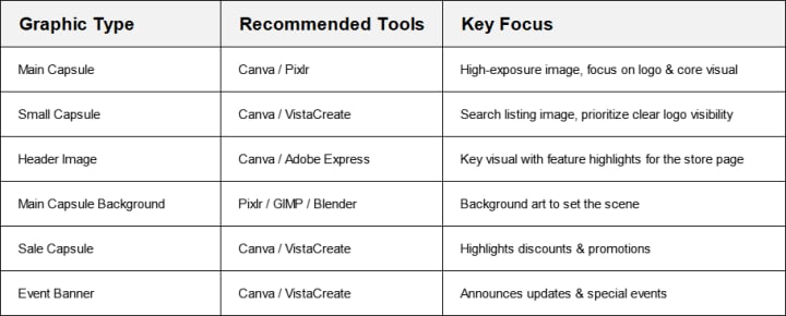
Main Capsule (The MVP)
Size: 616 × 353 px
Where It Lives: Top of your Steam page, front and center
Tools I Use: Canva, Adobe Express, Pixlr, GIMP
What Actually Matters:
- Big, clear logo—make it readable on both desktop and mobile
- Less is more—this isn’t your concept art portfolio
- Feature one clear visual hook: a character, scene, or symbol that screams your game
- Optional tagline if it fits (but keep it snappy)
True story—my first capsule had a gorgeous background, some cool effect layers, and... no one could find the game title. Never again.
Small Capsule (Tiny but Deadly)
Size: 231 × 87 px
Where It Lives: Search lists, recommendations, discovery queues
Tools I Use: Canva, VistaCreate
What Actually Matters:
- Logo takes the spotlight—nothing else really matters here
- Strong contrast—dark logo on light background or vice versa
- Keep backgrounds simple—gradients or solid colors work best
This tiny rectangle is weirdly important. I’ve had players DM me saying they clicked just because my logo popped more than the game next to it. Sometimes standing out is all it takes.
Header Image (Your Store Page Billboard)
Size: 460 × 215 px
Where It Lives: Top of your game’s store page
Tools I Use: Canva, Adobe Express, Pixlr
What Actually Matters:
- Show off your best scene or most striking visual
- Game name should jump out—and it’s fine to add a bonus phrase like “Co-op Dungeon Crawler”
- Text has to pop against the background—don’t let fancy art bury your message
Think of this one as the movie poster for your game—if it doesn’t make people want to scroll down, you’ve already lost.
Main Background (The Stage Setter)
Size: 1438 × 810 px
Where It Lives: Background of your store page
Tools I Use: Pixlr, GIMP, Blender (for the 3D crowd)
What Actually Matters:
- Set the vibe with environmental art or concept pieces
- Skip the logo—Steam slaps your title on top anyway
- Keep it clean—too much detail just distracts
This one’s all about mood. It’s not supposed to be the star, just the quiet stage behind your game’s core content.
Sale Capsule (The Attention Grabber)
Size: 374 × 448 px
Where It Lives: Sales pages, seasonal events, homepage promotions
Tools I Use: Canva, VistaCreate
What Actually Matters:
- Bold, clear discount—players are scanning for the %-off more than anything
- Eye-catching contrast colors—don’t be subtle
- Customize for events (winter sales, spooky discounts, etc.)
Pro tip: I once made a sale capsule with subtle typography. It looked elegant. Nobody clicked. Don’t be me.
Event Banner (Update Hype Machine)
Size: 1920 × 622 px
Where It Lives: Announcements, update logs, event pages
Tools I Use: Canva, VistaCreate
What Actually Matters:
- Bold, clear event title—“New DLC!” or “Big Update” works better than cute wordplay
- Simple animations or visual flair can help (but don’t overdo it)
- Use these banners aggressively for big updates—silence is death on Steam
If you’re dropping a major patch and don’t scream it from the rooftops, don’t be surprised when nobody notices.
2. My Favorite Tools (and Why)
3. Practical Survival Tips (Learned the Hard Way)
Don’t Cheap Out on Source Files
If you start with low-res assets, your life will be misery later. Always demand—and save—the highest-res versions of everything.
Logo Visibility = Survival
If your logo isn’t crystal clear in every size, you’re dead in the water. Test it everywhere.
Keep a Consistent Visual Identity
Your store graphics are a set—they should look like they belong to the same game. Fonts, colors, styles—all synced.
Test It Tiny
Steam shrinks a lot of your images—if your design doesn’t work at half-size, fix it before release.
Templates Are Your Friend
Canva and similar tools aren’t cheating—they’re time savers. Use them, customize heavily, and move on.
If you’re gearing up for your first Steam release, getting your visuals in shape now will save you painful revisions later. Got your own horror stories or unexpected wins from Steam graphics? Drop them in the comments—I’m always down to swap war stories.
About the Creator
Clara Price
I write stories that explore human nature, creating characters that feel real and narratives that stay with you. When I’m not writing, I’m lost in a book or sipping coffee. I hope my stories resonate with you and stay in your heart.
Keep reading
More stories from Clara Price and writers in Gamers and other communities.
10 Essential Tools for Indie Game Developers
Breaking into indie game development is an exciting but demanding endeavor. As an indie developer, you often wear multiple hats—designer, artist, programmer, sound engineer, and project manager—all at once. Managing these diverse aspects efficiently requires the right set of tools. With the right software, you can streamline workflows, enhance creativity, and bring your game ideas to life more effectively.
By Clara Priceabout a year ago in Gamers
10 Board Games That Aren’t Boring
Ethnos This game is a mix between Lord of the Rings and Risk, but I do not like Risk and I love this game. With certain cards, you put a token on a city and gain points each round from how many tokens you put on that certain city or other cities. If you play with more than two people, you get three rounds. Depending on the types of cards you choose, you can steal others, play twice, place tokens wherever you want, etc. This game is very entertaining and strategic.
By Rich Burtonabout 5 hours ago in Gamers
U4gm MLB The Show 26: A Complete Evolution of Baseball Gaming
MLB The Show 26 takes baseball simulation to an entirely new level. This year’s edition isn’t just a simple update — it represents a full evolution of the franchise, combining realism, strategy, and fun in one polished package. From career journeys to competitive online play, every mode has been refined, making the game more immersive and rewarding than ever before.
By Billo Naliabout 17 hours ago in Gamers


Comments (1)
Glad I found this blog. Was struggling to get high quality designs, Pixlr literally saved the day